Customize your metrics chart visualization in OMS
Summary: Learn how to customize your metrics chart visualization in OMS by adding labels, units, and logarithmic scale.
Good morning everyone, Leyla Kazemi here, and today I want to talk about new ways to customize your metrics visualization.
Add units
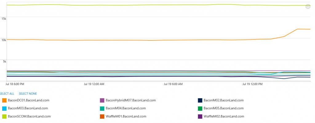
One of the new capabilities that is available in metrics chart view is the ability to add units to your chart. Let’s say that I’m looking at the available Mbytes across all my servers. To learn more about how to do an on-demand metrics aggregation query, see the On-demand metric aggregation and visualization in OMS blog post.
Type:Perf CounterName="Available MBytes" | measure avg(CounterValue) by Computer Interval 1HOUR

Because I’m looking at Available MBytes, I want to be able to view the chart in the same unit (that is, bytes) to get a better understanding of what happened. Thus, I click on the chart setting gear on the top right side of the chart.

On the Unit type drop down, I select Bytes. Because the metric scale that I’m looking at is in MBytes, I pick MB from the Current unit scale drop-down. Finally, I can pick which scale I want to convert to. I can also select Auto to let the chart do this automatically.

I can now see the chart unit is changed to GB, which makes it more readable. The unit is also shown next to the Y axis.
Add logarithmic scale
I can also pick logarithmic scale for my charts now. All I need to do is to click the Logarithmic option in the Scale section. Going back to the memory example, you can see that the chart is shown in logarithmic scale.

Add labels
You can now add labels to the Y axis of the metrics chart. There are two ways you can add labels.
- Add labels by using the chart setting
- Add Labels by using the query language
To add labels by using the chart setting, all you need to do is to fill in the Label box with the label that you want to see on the Y axis. In this example, I’ve added the label Available MBytes.

You can also do the same thing by using the “as” keyword in the query language:
Type:Perf CounterName=" Available MBytes " | measure avg(CounterValue) as Average by Computer Interval 1HOUR
However, the label is only added to the chart if one aggregation function is used. If more than one aggregation function is used, it is ambiguous which label should be added to the Y axis.
Note that if both labels (that is, the query and chart setting) are used, the label in the chart setting overwrites the label that’s used in the query.
Set min and max bounds for the chart
Finally, you can also bound your Y-axis to a certain range by picking the min and max of the Y axis in the chart setting.

That is all I have for you today. Join me next time when I’ll talk about more fun things you can do with metrics in OMS.
Leyla Kazemi
Microsoft Operations Management Team
Comments
- Anonymous
July 24, 2016
More on this topic read here - Linear or Logarithmic View for Performance Data in OMS Log Analytics? https://cloudadministrator.wordpress.com/2016/07/13/linear-or-logarithmic-view-for-performance-data-in-oms-log-analytics/ - Anonymous
July 26, 2016
Is there a reason for the unit types drop down list is limited to these (very) few values? I do miss at least Watt (Power Consumption) and degree (Celsius or Fahrenheit) with optional conversion (Watt to BTU/H and °C to °F). Power Consumption of Servers for instance can be measured with 'Power Meter(_Total)\Power'. - Anonymous
September 20, 2016
Why Does these settings doesn't persists when I save the query and run it later?- Anonymous
July 25, 2017
How can you create the graph with a max of 100. For instance if you are creating a graph for the % free space, in comparison to other servers, you would want all visualizations to use the same scale (max 100%, min 0%) .
- Anonymous
- Anonymous
April 10, 2017
Why is it possible to set the min and max bounds for a chart at the log search but not not in tiles and views?