The Chart is the Message
Did you know that someone once wrote a book entitled How to Lie With Charts? It’s true; check it out. The book was a tongue-in-cheek welcome gift when I took over Excel program management. Truth be told, I haven’t read it. It could be quite good; the reviews on Amazon.com would suggest that it is. Maybe after we’ve shipped Office 2008 I’ll find time to give it a once over. Then again, a small mountain of books piled up over the last few years. Reading about charts may not be that high on my list after Macworld!
The reason I write about it today is that the book (which occupies a prominent spot on my shelf) subversively illuminates an Office pillar: communication. I think we take charts for granted; pies and columns and bars have woven themselves into our pop culture fabric. We see them in newspapers, magazines, and television. Charts help us make important decisions, they can make us laugh, and they inspire us to think about things differently. Like any medium, charts can be used to misinform or illuminate. People choose the message; charts are but one way to express a point.
I’m a designer by experience, so I “get” charts. A line going up versus down speaks volumes to me. I must have created thousands of charts over the twenty years I’ve used Mac Excel (but who really tracks exact numbers for that kind of thing; not me, I suppose). I fancied myself something of an expert when it came to chart creation. I knew how to manipulate Office to create what I then thought to be great looking results. Heck, for years the only way you could create a chart with transparent fills was to use Mac Excel! I didn’t think we had room to improve, at least not in any significant way.
In 2004, when I read that Windows Office 2007 was revamping their charting engine, the skeptic in me snickered. They’d catch up with us at best, I thought. Maybe they’d finally be able to do transparency! Then I saw a few chart examples from our friends across the way. Photoshop mockups, I muttered to myself, nothing more. But they kept at it and darned if I wasn’t a fool for making silly assumptions. The fact is, the new charts in Office 2007 look great.
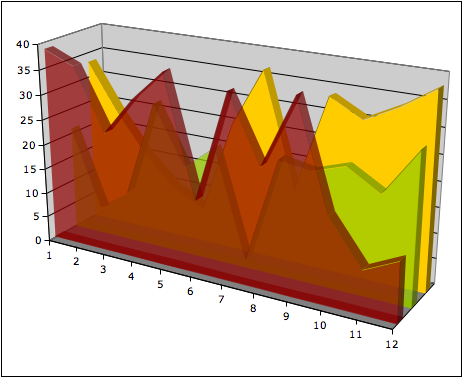
Fast forward to the present day. Over the last few years we’ve rebuilt our charting engine from the ground up. Every dialog, button, and pixel has been reborn. Charts looked great in Mac Office 2004. In Mac Office 2008 they look spectacular! Check it out – here’s a chart from Excel 2004:

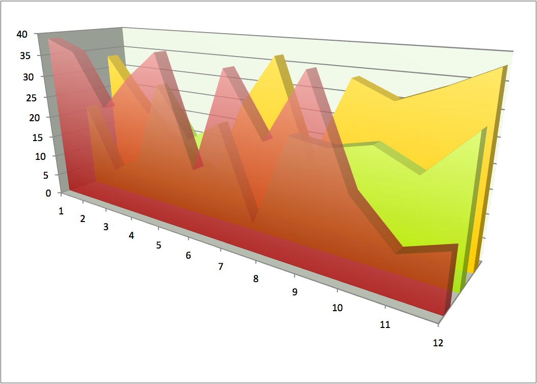
I spent a lot of time getting that chart to look a certain way, and I wasn’t born with that skill. Now, the same chart in Excel 2008:

To be fair, the angle is slightly different, but you get the effect (and the above shot is from a recent build of Excel 2008). I think the difference is incredible – and humbling. The Windows Office team did great work, and our top-notch engineering team brought it to the Mac (and, soon, to you).
Of course, this wasn’t a simple job of porting code. Sure, we share some things in common with our Windows Office counterparts. That’s important, because you want your chart layout to look the same on Mac and Windows. But Mac Office leverages Apple’s Quartz APIs to render breathtaking results – as you can plainly see, above.
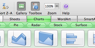
Better still, we’re still using the Mac Office user interface Mac users are familiar with. For starters, putting a chart in any Office file is a whole lot easier. You can pick from a variety of charts in the Elements Gallery, which is available in Word, PowerPoint, and Excel:

Once you do that, all the major formatting controls are a mouse-click away in the Formatting Palette. If you prefer, deeper control is available through formatting dialogs. And, with Office 2008, all formatting can be done directly inside Word or PowerPoint in addition to Excel. This will let you format the chart in the file you’re working on, as opposed to switching back and forth from app to app. Really, all you need Excel for is to change the data itself. I’m pretty happy with it, and I suspect many of you will be, too.
Of course, we’re still not done. It’s been a long road to get to the point we’re at now. I guess it’s not surprising that rebuilding a major component of Office would be rather hard. Even so, we’ve got an incredible team of smart people working hard every day. I know, because I get questions from them all the time! Charts are full of twists, turns, and special cases. Working on this has been a lot of fun, despite some really (really) long days.
I walked into this challenge naively assuming I knew most everything about charting. Over time I've come to see that no communication tool is simple, especially one that conveys numerical data visually in so many different ways. Maybe that’s obvious to some, but it was a lesson in humility for me. A chart isn’t a picture it’s a language. That’s why a book can teach people how to lie with them. The grammar of charts is what allows comedians to be funny and thinkers to make decisions. In the end, I understand that charts are a phenomenally powerful medium. I can’t wait to see your ideas!
Comments
Anonymous
October 05, 2007
PingBack from http://www.artofbam.com/wordpress/?p=5634Anonymous
October 05, 2007
Breathtaking?!? Sorry, not even remotely close. Besides which, I think the Excel 2004 version is easier to read.Anonymous
October 06, 2007
exchange clientAnonymous
October 06, 2007
"The difference is incredible - and humbling" you say. Yes, the difference IS incredible. In the 2004 chart, you can actually see what the yellow curve is doing (albeit barely). In the 2008 chart, you can't see the dips in the yellow curve any more. So if the goal of the chart is to hide the data, then 2008 is surely an improvement over 2004. Downright humbling.Anonymous
October 06, 2007
Have you all considered making a chart option with "fatter" bars? I've found that I really, really like the bar charts created by Apple's Numbers -- the fat bars feel much easier to read than Excel's narrow bars (which are often dwarfed by the inter-bar gaps). I've used both Excel and Numbers to create charts for publication in my articles, and while Excel's data manipulation is undoubtedly richer, Numbers creates more aesthetically pleasing charts to my eye. While it's certainly far too late to create a fatter bar style for Office '08, you might want to consider it for an update at some point. Compare and contrast the charts in my SoftRAID review: http://www.macintouch.com/reviews/softraid/ ....with the charts in my AirPort Extreme 802.11n review: http://www.macintouch.com/reviews/airportn/ ...and the Mac Pro Follow-up: http://www.macintouch.com/reviews/macpro/followup.htmlAnonymous
October 06, 2007
The comment has been removedAnonymous
October 07, 2007
I thought it was just me... I, too, thought the new version of the chart was less defined with faded colors and, thus, more difficult to read than the "old" version. I'm hoping that maybe the graphics got switched because if that's considered an improved look...Anonymous
October 07, 2007
I was in Excel 2007 all day messing with probability and cause for winning the lottery next week. I decided to try out the transparency effects one more time to see if it works, I just never seem to get it from the beta 1 release of Excel 2007 since I made a suggestion during the Office 11 for Windows beta to make chart transparency be an option. I tried it this evening and after messing around, I got it to work! Its really a beautiful feature. For Office Excel 2007 users, do the following, because its so hidden and hard to find and there are multiple Transparency options that make it confusing to find and do.
- Select the data you want to make in to the chart.
- Select "Insert" tab
- Under the Charts gallery, click the Area chart icon.
- Click 3D-Area
- Click the Move Chart button to move the chart into its own sheet, makes manipulating much better.
- click an individual 3D-Area, right click "Format Data series"
- Click Fill from the Series Option
- Under Fill in the right pane, choose "Solid"
- Choose desired color and use the slider to adjust the intensity of the transparency.
- Select each 3D Area and apply 6 - 9 instructions for the rest. Note, you don't have to close "Format Data Series" dialog.
Anonymous
October 08, 2007
Charts are surely less than 1% use of people's real use of Office apps. As someone else asks, can we see Entourage acting like a true Exchange client please. Then I'll get excited.Anonymous
October 08, 2007
In the example you give, with the 2004 version of the chart, it's possible to follow the rearmost yellow chart where it's dipping behind the middle green chart. This isn't the case in the 2008 version. It may look prettier, but it is worse at conveying information. I'm rather concerned that this is a good example that you chose to show off.Anonymous
October 08, 2007
Frankly, I am starting to worry. Back in July (July 11th, to be exact) a posting on MacMojo clearly staed that they know that what we want is information on Entourage/Exchange. Three months on, barely any new information. Which leads me to wonder as to why not? Part of me wonder if there's a release-schedule, whether official or voluntary, as to what info gets released when. But if so, even a "we aren't allowed to (or don't want to) tell you about yet" would be a slight improvement. At the very least it would give the impression that our requests (and pleading/begging/etc) for information are being noted. Either that or they have the answer and it's not what we want to hear. But even so, even if Entourage doesn't have the features we want/need, we need to know the details soon. And people have made genuinely rational reasons as to why the information really needs to be available as soon as possible. I just don't know. There's no way they can't know what we're waiting to hear about. So there's obviously a reason that it's not been announced yet. And that worries me.Anonymous
October 08, 2007
The comment has been removedAnonymous
October 08, 2007
Patrick, if you have used 3D-Charts in Excel, you will no there is the option to interact and rotate your 3D-Chart. You can do that with 2D. So it gives the user perspective when it comes dealing with data from a trend point of view, especially if its dynamically being updated.Anonymous
October 08, 2007
The comment has been removedAnonymous
October 08, 2007
I really think you should read that book. From a summary of the very book you cite: http://www.lapuerta.tv/ChartRead.htm How to Lie with Charts:
- Make everything 3D "When you get around to selecting a chart type in PowerPoint, if you want to mislead or distort, choose dimensional pies or bars. It’s virtually impossible to make a 3D chart that doesn’t give a wrong impression. In a 3D pie chart, the slice with the thickest edge will always seem larger than its true percentage. (Chapter 2 will tell you why.) In a 3D bar chart, it’s a challenge to find a rotation at which the short bars are still visible but the tall bars aren’t distorted by the perspective. Judging the heights of bars in a perspective view is a real challenge. So your audience can’t reliably estimate values (do visual take-offs) from your dimensional bars. (See Chapter 4.) Unfortunately, 3D bars are now the staple of the wildly popular “dashboard” displays of executive information systems. Managers are actually making operational and strategic decisions based on this type of reporting. It’s scary."
Anonymous
October 09, 2007
3D charts are truly tools of Evil. Not evil, but Evil with a capital "E" and said in the same sort of sentence as "the fru-its of the De-vil." They look nice but (as has been said already) hide data and I've only seen them used in business to make a bad situation look better.Anonymous
October 11, 2007
The comment has been removedAnonymous
October 17, 2007
Will Mac Excel 2008 be on par with Windows Excel for pivot tables, charting from pivots, & other useful deep features of this sort?Anonymous
October 21, 2007
The comment has been removedAnonymous
November 02, 2007
The comment has been removedAnonymous
November 13, 2007
I really wish you would integrate "pivot charts" that are currently only available on the Windows version.Anonymous
November 21, 2007
One more desire for charts in the next release of Excel -- a proper logarithmic scale optionality. The version, which has been around for ages, is totally unusable, as it restricts gridlining to the powers of 10. There shall be a more intelligent algorithms for scaling gridlines and axis marks. Look how it is implemented in math or financial software (Matematica, MatLab or Metastock). Shall be a fairly easy thing to implement, even with some customization. Business types and consultants do not use logarithms indeed, but the rest of the users miss this feature desperately.