Big head, long tail
Here's a graph of the population size of the one hundred largest urban areas in Canada: (Click on the graph for a larger version.)
Notice how there is an enormous spiky "head" on this graph: Toronto, Montreal and Vancouver are quite large cities by any measure. Then there is an immediate sharp drop to a mass of a dozen or so largish urban areas, including my home region of Kitchener-Waterloo-Cambridge. And then there is a very long tail. The most populous urban area with five million people is about 200 times larger than the 100th, with about 25 thousand people. Were we to extend this list out to the next hundred urban areas you can imagine that tail growing ever fainter and more indistinct.
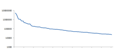
It is very hard to read a graph like this, where there is a difference of a factor of 200 between the largest and smallest datum and the data are for the most part all crammed up against the axes. When data span multiple orders of magnitude it is a good idea to plot it on a log scale. I'm also going to abandon the bar chart format; even though this is not continuous data, let's plot it as a line:
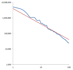
OK, that's easier to read. We still get the idea that there's a big head here followed by a long tail, but because we've made the "thin" bits much "thicker" it is easier to see what is going on. Making the vertical axis logarithmic works out well. What gets really interesting though is if we make the horizontal axis also logarithmic. (Again, remember, this is not actually continuous data and there are only ten discrete data points in the left half of the graph, and the remaining ninety in the right half.) Notice how even though we are cramming most of the data points into a much smaller space, subtle details are even easier to read in the log-log scaling than the log scaling:
It is almost a straight line! And how I love straight lines on log-log charts! You know what that original graph resembles? That thing sure looks like a hyperbola. Let's graph that against an actual hyperbola, which of course is a straight line (of slope -1) on a log-log chart. Here I've added the hyperbola y = 4000000 / n :
Uncanny! To a reasonable approximation, the population of the nth largest urban area in Canada has 1/n of the population of the largest area.
I also grabbed from Wikipedia a list of approximate sales figures of the hundred best selling books. If we graph those figures (in millions) on a log-log scale against a hyperbola we get:
The first few data points are outliers, partly because the records of worldwide book sales from the last two centuries are not accurate and partly because at the top end there are only so many purchases of The Lord of the Rings that weren't accompanied by a purchase of The Hobbit. Frankly, 200 million copies of Dickens seems very low. But the rest of the data certainly seems to at least roughly conform to our long tail. Again, to a reasonable approximation the sales numbers of the nth most popular book are 1/n of the sales of the most popular book.
This is why I am never going to become wealthy writing a book. The "long tail" of the publishing industry is immensely long, even if you only consider the best selling books in a given year (instead of for 150 years, as I have here.) Obviously only a select few ever get to the exalted first couple dozen positions in the ranking in any given year; if your book isn't on the top 1000, then odds are you will be getting far less than 1/1000th of the sales of the best selling book.
Data sets which have the property that when sorted into descending order, the nth member has 1/n the size of the first member are called Zipf's Law (*) data sets. George Zipf was a linguist who noticed that the frequency of a word's usage in English is approximately proportional to its position on the frequency list. That is to say, if the most common word, "the", is 70000 of every million words in a corpus then the second then "of" makes up 35000 (half), "and" makes up 23000 (a third), and of course then there is the extraordinarily long tail of words that are used only once every thousand, ten thousand or hundred thousand words on average. (**)
Just because none of us are going to get rich writing books is no reason not to love the Zipf's Law distribution; there are up sides as well. Here's another graph:
As you can see, this is slightly shallower a curve than a perfect hyperbola; the head isn't quite so huge and the tail isn't quite so sparse, but it is the same basic "big head, long tail" shape.
You know how when you install a new piece of software, often there is a checkbox in the installer that says "help us make this software better"? And you know how when an application crashes, you get the option to automatically report the crash to Microsoft? We have automated software that analyzes all those reports and attempts to figure out which "bucket" each crash report goes into. The log-log graph above is the relative frequency distribution of the top 100 automatically reported crashes in Visual Studio (which of course includes crashes both from Visual Studio proper, and from third-party components.) Because this forms a Zipf's Law distribution, it means that we can concentrate our bug-fixing efforts on the big head first. The considerable majority of crashing bugs that are actually experienced by users is the result of only a few dozen actual bugs, which are then prioritized extremely highly.
Please, if you're not doing so already, get in the habit of turning on the software metrics and crash reporting. It is an enormous help to us in determining how to concentrate our efforts on fixing flaws in our own products, and working with our partners at other companies to help them fix their problems as well. In my opinion no crashing bug is acceptable, but in a world where we have finite effort at our disposal, it's really important to get rid of the big head before tackling the long tail.
(*) Of course Zipf's Law is no more a "Law" than the equally misnamed "Benford's Law" or "Moore's Law". Unlike the laws of physics, there is no external reality enforcing an inverse power distribution on city sizes, word distributions or book sales. Really it should be Zipf's Observation, or Zipf's Distribution.
(**) A commenter points out that of course no real data sets actually can follow Zipf's Law if the number of items is reasonably large because then the fractions do not add up to 100%! In fact 1/2 + 1/3 + 1/4 + 1/5 ... and so on diverges; it goes to infinity. Proving this is easy. Clearly 1/4 + 1/4 + 1/8 + 1/8 + 1/8 + 1/8 + 1/16 + 1/16 + 1/16 + 1/16 + 1/16 + 1/16 + 1/16 + 1/16 + 1/32 ... is less than 1/2 + 1/3 + 1/4 + 1/5 ... But equally obvious is that 2 * (1/4) + 4 * (1/8) + 8 * (1/16) + 16 * (1/32) ... is 1/2 + 1/2 + 1/2 + 1/2... which diverges. Zipf's Law data sets do not actually strictly conform to the exact hyperbola shape; they cannot. The point is that Zipf's Law gives a good quick estimate of order of magnitude, not an exact result.
Comments
Anonymous
December 05, 2010
The comment has been removedAnonymous
December 05, 2010
The comment has been removedAnonymous
December 05, 2010
One very important point to make related to Visual Studio is that crashes, although annoying when occurring, are still relatively rare compared to non-crashing bugs and overall annoyances (memory leaks, anyone?). Though much harder to prove with actual numbers, I would say from experience that those kind of issues are much more important to end users. I'm you guys have ways to factor in this difference as well?Anonymous
December 06, 2010
The comment has been removedAnonymous
December 06, 2010
+1 from me on the problems with reporting VS2010 bugs mentioned above - I always hit cancel, for exactly the reasons described - they need to be be saved immediately and then BITSed later.Anonymous
December 06, 2010
If you repeatedly see the same bug (like say right clicking in VS2008 causing regular crashes), should it be reported repeatedly, or are duplicate crashes from the same person ignored? Is it even worth reporting VS2008 crashes?Anonymous
December 07, 2010
The comment has been removedAnonymous
December 07, 2010
That was a rather elaborate sales pitch ;) But I liked it nonetheless.Anonymous
December 07, 2010
Eric, your blog is too cool!Anonymous
December 07, 2010
It would be nice to have the option of refusing a dump report upfront, and not to wait that it's done to tell the modal dialog not to send it. A very interesting post.Anonymous
December 07, 2010
re: comments above - I always untick restart visual studio, click send error report and then start visual studio again. I'm guessing that since I post 3-6 visual studio crash reports every day (and I have all the hotfixes installed) that hopefully it's just a single bug - are the visual studio developers making some progress towards a SP? Any idea what the time frame is?Anonymous
December 07, 2010
@Luke P - I believe a beta of the VS SP1 is now available through MSDN - so its on its way.Anonymous
December 11, 2010
By this law, Canada have an infinite number of inhabitants. It doesn't however, so at some point the distribution must deviate from it. I can see two main candidates for ways in which Canadian cities exhibit non-Zipfian behaviour:
- There's a cut-off because you can't have dwellings with fractional people in it. However, this still overestimates Canada's population with a factor two.
- Estimating by eye from the graph, I'd say the exponent is closer to -1.1 than -1. This actually yields a population estimate of 33M; the actual value is 34M so that's surprisingly close.
Anonymous
December 13, 2010
"1/4 + 1/4 + 1/8 + 1/8 + 1/8 + 1/8 + 1/16 + 1/16 + 1/16 + 1/16 + 1/16 + 1/16 + 1/16 + 1/16 + 1/32 ... is greater than 1/2 + 1/3 + 1/4 + 1/5 ... But equally obvious is that 2 * (1/4) + 4 * (1/8) + 8 * (1/16) + 16 * (1/32)" don't you mean "less than"?Anonymous
December 18, 2010
The comment has been removedAnonymous
December 18, 2010
Amnon: That's kind of like saying that there's no point in voting in an election because enough other people will vote for the same person as you that your vote won't make a difference. Of course that's true, but obviously if everybody felt the same as you then there wouldn't be anybody voting!Anonymous
January 10, 2011
LOG Graphs looks terrible, when values are near to zero. Watch this: http://ff.im/wtbs5Anonymous
November 26, 2012
The crash reporting gives you not the slightest idea of what problems are encountered by actual users. It only tells you about the crashes. It doesn’t tell you about all the UI bugs, the auto-formatting bugs, the syntax highlighting bugs, the bugs in the debugger, etc.etc. which every developer encounters every day but you have no idea of their impact because you have no automated measuring for it. First off, crashes are by far the worst bugs encountered by users, so those are prioritized. Second, we have additional mechanisms for automatically detecting and reporting other classes of bugs. We have a very good idea of their impact. -- Eric


