Parameters for What-If Scenarios in Power BI
Scenario
If we increase the current forecast by 5%, what would have happened with the variance to forecast? If we had reduced by 3% instead, then what? How can we provide an input parameter to calculate variables and see the impact of that change in the charts and trends?
Let’s start from a simple report that shows Actual and Forecast in Euros for the year, and its Variance in EU and %. The first column shows the current values, the second column in blue shows our estimations after we input a parameter of change (they are the same at start). The Waterfall chart shows the cumulative variance per region. The bars shows actuals, and the lines will show current (black) versus estimated (red) forecast (they overlap at start):
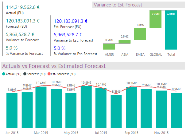
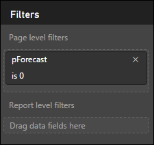
There’s also a filter at the page level for our input parameter, which starts at 0:
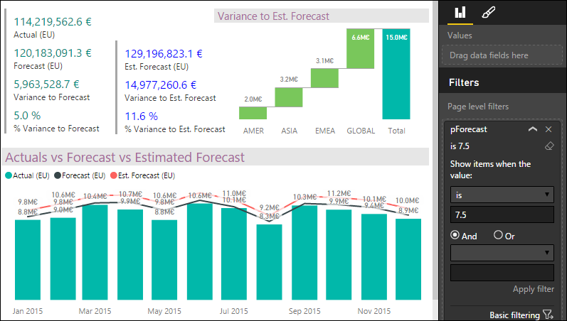
So, if we enter a 7.5 value on that parameter, the Estimated Forecast will increase by 7.5%, and this would have been the hypothetical impact:
- Total variance to forecast would have been 11.6% or almost 15MM EU.
- The red line of the estimated forecast now departs from the black one.
HowTo
We start with the measures in green on the first column, then we need to implement the selection of the parameter, and finally the estimated measures using the chosen value.
1. The current measures
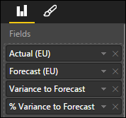
We start with these four measures on the “Plans” table: Actuals, Forecast, and Variance in Euros, and also Variance in %:


2. The parameter
Power BI Desktop doesn’t support parameters yet, so how can we simulate it for our specific purpose? What if we had a list of values to chose from? So then we could filter that list with our selection, and we can use that filtered value in our calculations.
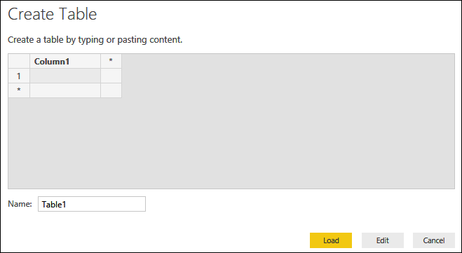
We can use a couple features of Power BI Desktop that allows us to create a table by entering our own data (manually or copy/paste from i.e. Excel). This feature is called “Enter Data” in the “External Data” group on the “Home” ribbon:
Which opens the “Create Table” dialog, in which you can name the table, create columns, and enter data for it (or copy/paste from i.e. Excel):
Let’s say we want in our model to choose What-If values in the range of –15 to 15 in 0.5 increments… this list can easily be build in Excel:

Now we select this list of values (including the label that will become the name of the field we enter on creating the table), and paste it:
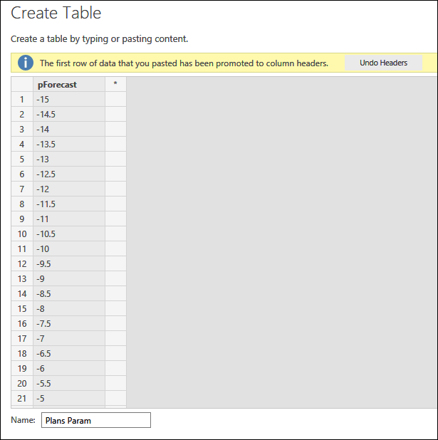
The “Load” button will create the table; the “Edit” button will open the table in Query Editor in case we want to make additional modifications.
How will we use this table? We’ll add the “pForecast” field to the page filter area, where the users will be able to enter their chosen value. (We could also use this list of values as a Filter on the canvas, see example in this blog post).
3. The estimation measures
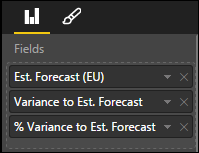
Now we can calculate the measures for “estimated” values given the selections on the parameter. These are how we define them:

- We increase (if the selection in the parameter was positive) or decrease (if negative) the previous value for Forecast, by converting the selected value of the parameter to percentage first.
- The “MIN” function would ensure that in case the user selected multiple options, only the first will be considered in subsequent calculations (this would only happen if we use this as a Filter list on the canvas, as in the blog post referenced earlier; otherwise it has no ill effect).
- An improvement to this formula could be to account for the user entering values that don’t exist in the list.


With these, we can build the visualizations… a Multi-row Card for current values:
A Multi-row Card for estimated values:
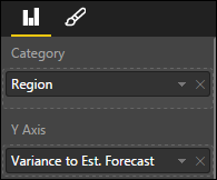
A Waterfall Chart for the regions:
And a Line and Stacked Column Chart for actuals versus the two forecasts:
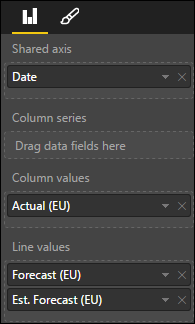
Result
Now… what if we reduce the forecast (thus saving some budget) by 5%? We enter “-5” on the parameter:
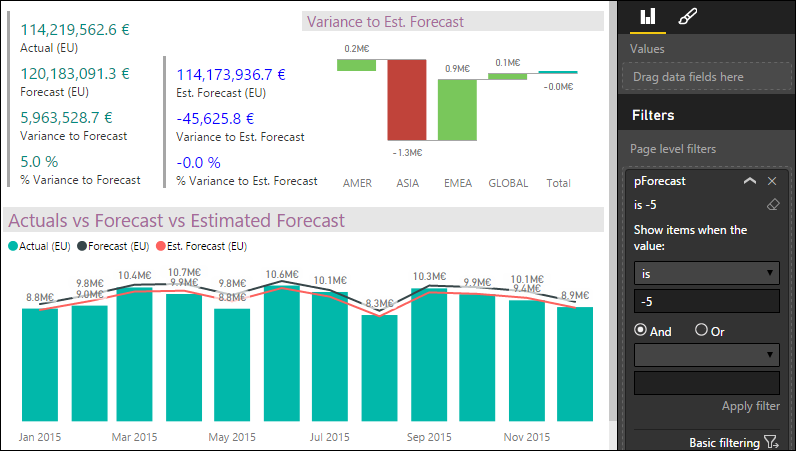
- We clearly see that Asia will go out of budget by 1.3MM EU.
What if we reduce by 3%?
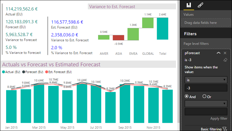
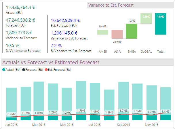
And if we select the bar for Europe, the cross-filtering will give us the information for Europe:
Comments
- Anonymous
April 06, 2016
Is it possible for the User who is using the dashboard to enter a Forecast Value/revenue/Stock price based on the value entered.. Please let me know if there are any oprtions. - Anonymous
January 20, 2017
The comment has been removed - Anonymous
February 26, 2017
do you have a copy of the solution?

