Silverlight Layouts Part 1
This is the third in a series of posts on Silverlight. The text focuses on creating a basic interface for a Silverlight application and explores simple ways to work with Grid controls that are divided up into Rows and Columns.
So far, I’ve added the following posts to the Silverlight series:
- Silverlight Post 1
- Creating a Silverlight Project
- Silverlight Layouts Part I (This Post)
- Silverlight Simple Animation
Related Posts
Source Code
- Download the source for this post from the LINQ Farm on Code Gallery.
UserControls
Silverlight 2.0 projects typical use a combination of XAML and C# or VB code. XAML stands for Extensible Application Markup Language. It is pronounced Zamel, and it rhymes with the word camel.
When you create a new Silverlight project, the following XAML is produced:
 <UserControl x:Class="SilverlightApplication3.Page"
    xmlns="https://schemas.microsoft.com/winfx/2006/xaml/presentation"
    xmlns:x="https://schemas.microsoft.com/winfx/2006/xaml"
    Width="400" Height="300">
    <Grid x:Name="LayoutRoot" Background="White">

    </Grid>
</UserControl>
Here you see two controls:
- A UserControl
- And inside it, a Grid
A UserControl is a standard Silverlight type from which developers can derive their own custom controls. You can derive any type of control you want from a UserControl. However, the UserControl shown in the code quoted above usually acts as a container for your interface. Typically, developers fill this container with a series of Buttons, Textboxes and other simple elements that define an interface of some type.
You can draw a very rough analogy between a Form in a Windows Forms application and this UserControl in a Silverlight application. Just as you use a Form to define the interface for Windows application, you use a UserControl to define the interface for your Silverlight application.
It’s important to remember, however, that this control is, by default, embedded inside an ASP.NET Web Application Project. You could, therefore, also view the control as an interface element inserted into an ASP.NET web application. In our case, however, we are focusing exclusively on the Silverlight portion of the application, so the Windows Forms analogy is not too inappropriate, so long as you don’t take it overly literally, and so long as you remember that UserControls can be used for entirely different purposes in other contexts. You can create any type of custom control you want from a UserControl, but in this context, the UserControl is a container for your interface.
Grids
Inside the UserControl is a Grid. If you want, you can use this grid as the host for most of the controls in your program. You could, for instance, place a button inside it:
<UserControlx:Class="SilverlightApplication11.Page"
xmlns="https://schemas.microsoft.com/winfx/2006/xaml/presentation"
xmlns:x="https://schemas.microsoft.com/winfx/2006/xaml"
Width="400"Height="300">
<Gridx:Name="LayoutRoot"Background="White">
<ButtonContent="OK"/>
</Grid>
</UserControl>
This XAML code produces the following output:
Figure 01: A Grid control hosting an OK button.
This seems like a good start, but if you try to add another button, you will see that things don’t work out as you might have expected. Here is the code for adding a second button:
 <UserControl x:Class="SilverlightApplication11.Page"
    xmlns="https://schemas.microsoft.com/winfx/2006/xaml/presentation"
    xmlns:x="https://schemas.microsoft.com/winfx/2006/xaml"
    Width="400" Height="300">
    <Grid x:Name="LayoutRoot" Background="White">
        <Button Content="OK"/>
        <Button Content="Cancel"/>
    </Grid>
</UserControl>
The output from this code looks like this:
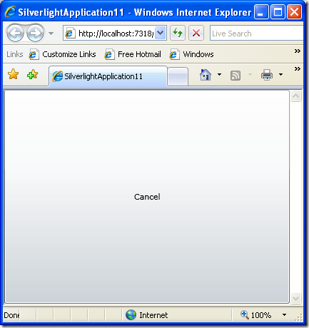
Figure 02: A Grid control that hosts a Cancel button which obscures an OK button.
There is our Cancel button, as big as life. But what happened to the OK button? It appears to be obscured by the Cancel button. In other words, the Grid control is not allowing us to display two buttons at once, but instead is taking one button, and allowing it fill the entire interface. In same situations, this might be exactly what we want, but in this case it is working at cross purposes to our goal.
As you have no doubt surmised, the Grid control, as it is currently configured, will not produce the behavior we want. There are, in fact many ways to get the grid control to display multiple buttons. Here is one way:
 <Grid x:Name="LayoutRoot" Background="White">
    <Grid.RowDefinitions>
        <RowDefinition></RowDefinition>
        <RowDefinition></RowDefinition>
    </Grid.RowDefinitions>
    <Button Grid.Row="0"  Content="OK"/>
    <Button Grid.Row="1" Content="Cancel"/>
</Grid>
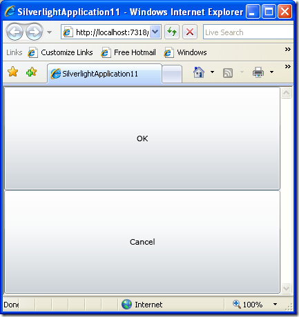
This code defines two rows in the grid: one fills the top half of the grid, and the second fills the bottom half. We have added code to our Button declarations asking the Ok button to be hosted in Row 0, and the Cancel button to be hosted in Row 1. Here is the result:
Figure 3: A Grid control with two rows. The first row hosts an OK button, the second a Cancel button.
If you need columns, rather than rows, then use this code:
 <Grid x:Name="LayoutRoot" Background="White">
    <Grid.ColumnDefinitions>
        <ColumnDefinition></ColumnDefinition>
        <ColumnDefinition></ColumnDefinition>
    </Grid.ColumnDefinitions>
    <Button Grid.Column="0"  Content="OK"/>
    <Button Grid.Column="1" Content="Cancel"/>
</Grid>
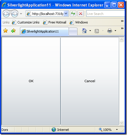
Here is the result:
Figure 4: A Grid control with two columns, each of which hosts a button.
If you want both rows and columns, then write code like this:
 <UserControl x:Class="SilverlightApplication11.Page"
    xmlns="https://schemas.microsoft.com/winfx/2006/xaml/presentation"
    xmlns:x="https://schemas.microsoft.com/winfx/2006/xaml"
    Width="400" Height="300">
    <Grid x:Name="LayoutRoot" Background="White">
        <Grid.ColumnDefinitions>
            <ColumnDefinition></ColumnDefinition>
            <ColumnDefinition></ColumnDefinition>
        </Grid.ColumnDefinitions>
        <Grid.RowDefinitions>
            <RowDefinition></RowDefinition>
            <RowDefinition></RowDefinition>
        </Grid.RowDefinitions>

        <Button Grid.Column="0" Grid.Row="0" Content="OK"/>
        <Button Grid.Column="1" Grid.Row="0" Content="Cancel"/>
        <Image Grid.Column="0" Grid.Row="1" Source="Images/BlueLight.png" />
        <Image Grid.Column="1" Grid.Row="1" Source="Images/RedLight.png" />
    </Grid>
</UserControl>
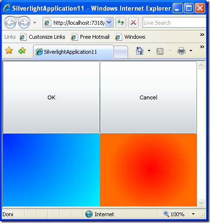
This interface produces four sections inside the grid. We could have left the two new spaces empty, but I thought it would be less confusing if I put something inside them. To keep the code simple, I’ve added two Image controls and placed two simple bitmaps in them. I then use both the Grid.Column and Grid.Row properties in the Button and Image controls to designate where I want the images and buttons to appear.
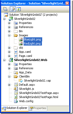
Note that I store that Images in a directory called Images. You can create project directories of this type by writing clicking on your project in the Solution Explorer, and choosing Add | New Folder. After you copy the bitmaps into the Images directory, click the Show All Files button at the top of the Solution Explorer to make the bitmaps visible. Then right click on the images and explicitly add them to your project. When you are done, your work Solution Explorer might look something like this:
Figure 5: Creating an Images directory that contains two bitmaps.
Taken together, all of the XAML code shown in the previous examples produces the following results, where the blue and orange areas are the bitmaps that I stored in the Images directory:
Figure 6: A Grid control with two rows and two columns. The control hosts two buttons and two images, one in each quadrant of the Grid.
Summary
That’s probably enough for this post. There is obviously a great deal more to be said about Grid controls in particular, and Silverlight interfaces in general, but this can serve as an introduction to the topic. The next article in this series will continue in this same vein, discussing, layouts, Grid controls, and StackPanels.
References
Download the source for this post from the LINQ Farm on Code Gallery
Comments
Anonymous
April 19, 2009
You've been kicked (a good thing) - Trackback from DotNetKicks.comAnonymous
April 19, 2009
Simple and straight forward. Good jobAnonymous
April 20, 2009
Nice work... Thanks for the info..Anonymous
April 21, 2009
9efish.感谢你的文章 - Trackback from 9eFishAnonymous
May 11, 2009
The example seems to be good and easy to learn basic things of the SilverLight. ThanksAnonymous
May 12, 2009
Surely a good starting point for anyone looking to build a SilverLight application would be WPF, since what you have done here is give a real basic introduction to WPF.Anonymous
May 12, 2009
Just to clarify my previous post ... the point I was making is with regards to building the user interface for a SilverLight applicationAnonymous
May 18, 2009
Hi, Very nice post and to help you more at http://www.xamltemplates.net/ you can find themes for all the Silverlight and also for WPF controls.Anonymous
June 20, 2010
Nice post for starters. to learn quickly this web site will help you, you can find some useful videos on <a href="http://www.videozcorner.com">silverlight </a> Hope this helps!!!

