A New Look for MSDN
With the announcement of Visual Studio 2010 Beta 2 availability couple of weeks ago, you probably notice the different look on MSDN (Microsoft Developer Network). Although the site’s main audience has been developers, recently I’ve found more designers are visiting the site to get knowledge on Silverlight, WPF, Windows 7, and other UX platform and technologies.
First, we have a new logo for MSDN, which is called the Network Wave. I like the new logo design because it captures the movement of different pieces of developer knowledge coming together. :) It’s also an organic design that works well with the .NET 4, VS 2010, and Silverlight logos. It’s a cohesive branding for our development family.
Besides the new logo and color theme of the site, the re-design is trying to address the following top use scenarios and improve the overall user experience:
- Help users quickly solve their technical questions or find reference documentations
- Connect and engage users on the site who have similar technical interests and connect MSDN users with product teams
- Get users to the downloads they need fast
- Connect users to the product so that they can easily provide feedback, get deep technical information about the product, and so on
- Keep users updated with new technology information and enhance their learning experience
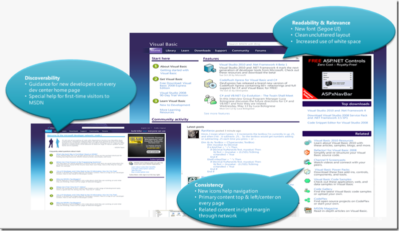
For example, to help users quickly find technical reference, the new design improved discoverability by providing guidance for new developers and MSDN first-time visitors. See the diagram below.
As the weeks to come, more improvements will be visible on the Canadian localized version of MSDN. Make sure you check out the new MSDN site and tell us what you think!
Technorati Tags: MSDN,MSDN redesign


