So You Want to Create Some Awesome Looking Visio SCOM Dashboards?
The number one thing I am always being asked by customers and co-workers is how do I configure and make good looking Visio Dashboards? What are some tips, tricks and things to remember? So I’ve thought I would put a few things here for everyone.
If you do not have the Pre-Requisites then I suggest the following; these are my to go blogs when I configuring my SharePoint Server, SCOM and Visio.
Ken Lince – Fun With SCOM 2012 Dashboards …SharePoint & Visio Included…
Nathan Olmstead – Creating a Visio Dashboard and Publishing To SharePoint
Tim McFadden – Creating SCOM 2012 Dashboards Using Visio 2010 or Visio 2013
Kevin Holman – Publishing SCOM 2012 Dashboards to SharePoint
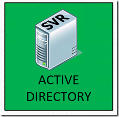
Things to know ahead of time, the more data you put into the dashboard, the more data that has to be pulled from the ‘OperationsManager’ database. Other things to think about as well, how many people have the dashboard open at once, what is the refresh rate of the dashboard as well as what are the available resources in the environment that might slow or prevent the dashboard from refreshing. You should Also know that some of the stencils don’t really work so good when you are building dashboards, I try to stay away from stencils, but if I need to use them I will place them in a shape and not link it to anything; only the shape gets linked. Like so:
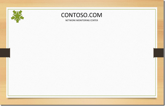
Usually I plan how the dashboards are going to look, I want to make sure that they uniformed, nice, and clean. identify who is going to be the audience that will be using the dashboards? I start with the “Page Settings” in Visio, and build out the Background I want every page to use. You can have more than one background in Visio to choose from. Every page will use the background I created. For this post I am using a theme from Power Point, that I screenshot and pasted it to my Visio Background page. I’ll apply my background and any other visual information I want to display on each page. For this blog, I will be using this as my template.
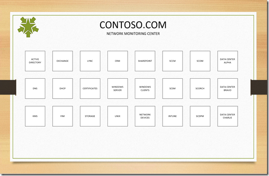
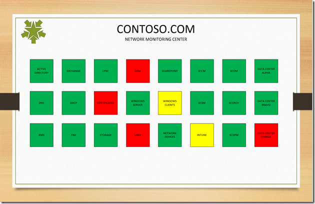
Next, I build out my Main Page that I would like to show the higher ups. There is not much details here other than listing each technology being monitored in Operations Manager. Most of the shapes are linked to a Distributed Application that I have built a head of time so that each system reports as a service. The only ones I don’t have to create are the Active Directory and Exchange, and a few other that came with the management packs. Here is what my main page looks like right now with nothing linked to the shapes.
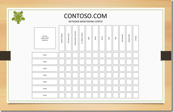
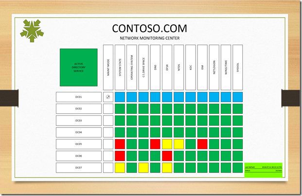
If I don’t need a Main page like the one above but would like to have one build for each team like Active Directory, I could take a page out of Nathan Olmstead blog and create a page like this:
Next I want to link each shape to an object, So I will link the Main Page to a distribute Application and the Active Directory page I’ll link to individual objects. Hopefully everyone knows how to do this part, if not I’ll blog on how this is done. After you finish, your dashboard will start to look like this:
For the Maintenance Mode shape, I am linking the Windows Server name to each shape.
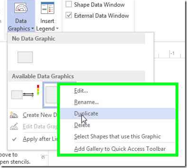
Let’s make it pretty now; we will need to modify the Data Graphic; by default there are three or four available data graphics already listed. Do Not modify these at all, these should remain your templates to reference as needed. if you make modifications and lose track how to get back, you might not be able to recover the defaults without starting new drawing or unless you know Visio really good. I would recommend right clicking on the ones you want to mimic and Duplicate it. You can do this many times and only edit the duplicates.
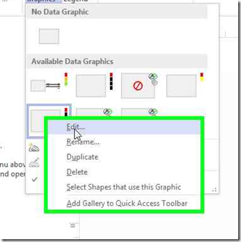
Once you duplicated the ones you want to modify, right click and edit the data graphic of the duplicate you made.
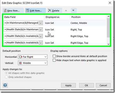
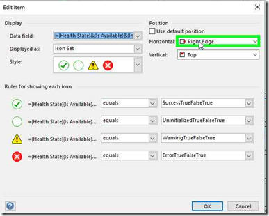
Edit each of the data field you want to modify, and make sure that there is no two Data Fields that share the same Position. If they do share the same position, your graphics will be off because they can not occupy the same space of another.
Once you configured each of your data graphics the next step is to apply them to your shapes. Click and highlight each shape and apply the data graphic you want. Make sure that you provide a legend so everyone knows what each color and icon means what.
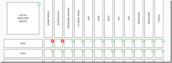
Above is what my dashboard looks like when a system is in Maintenance Mod or healthy. I am using a combination of icons and colors for each shape. By changing the data graphics a little bit the dashboard now looks like the below. I am just using colors except the Maintenance Mode shape, which is only using an icon.
(SME Team Dashboards)
(High Level Dashboard)
And there you, two dashboards that upper managers like and another that is functional for the Subject Matter Experts.
Here are some other ideas people over look as well.
1. Before you apply any data graphics to the drawing, you can save the image as a jpeg, then import into a topology dashboard and then identify all the objects in the drawing. You’ll need to move each of the objects to its location to complete. Now you have a topology view that will open up the same way each time someone opens it.
2. If you are hosting the dashboard on a SharePoint site, create a web view and link to the Visio page on the SharePoint site. I create a folder for all the dashboards were everyone can go to view their teams page.
Comments
- Anonymous
September 04, 2016
Excellent Lynne well explained.
