Command.Keytip property
Represents the keytip for a control.
Usage
<Command.Keytip>
  child elements
</Command.Keytip>
Attributes
There are no attributes.
Child elements
| Element | Description |
|---|---|
| String |
May occur at most once |
Parent elements
| Element |
|---|
| Command |
Remarks
Optional.
May occur at most once for each Command element.
Command.Keytip can contain a value of type xs:string constrained to any sequence of Unicode characters, including white space.
A Command.Keytip can begin with a number only when associated with a control within a Tab or the Quick Access Toolbar.
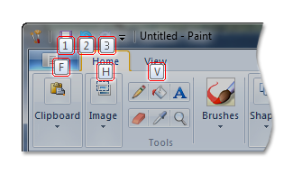
To display the keytips that are valid for the current state of the ribbon, press and hold the ALT key. The following screen shot shows the initial, or first level, keytips that are displayed in Microsoft Paint for Windows 7. After a first-level keytip has been selected, only second-level keytips are displayed.

Command.Keytip acts as the keyboard accelerator for a command unless that command is exposed through a menu item. In this case, the framework ignores the Command.Keytip value and instead uses a character preceded by an ampersand as specified by Command.LabelTitle or UI_PKEY_Label. If no ampersand is specified by Command.LabelTitle or UI_PKEY_Label, no keytip or keyboard accelerator is exposed.
If no value is supplied for Command.Keytip, the String child element is required.
Note
If Command.Keytip contains both a value and a String child element, String takes precedence.
By default, the following letters are used by the framework to automatically generate keytips:
- F is assigned to the Application Menu.
- Y is assigned to any command that does not have a keytip specified by the application.
- Z is assigned to each Group control and cannot be customized. A Group keytip is displayed only when the ScalingPolicy for the control specifies a Popup size option. For more information, see Customizing a Ribbon Through Size Definitions and Scaling Policies.
Note
None of these letters are reserved by the framework. Each can be assigned to one or more commands as required.
The framework resolves keytip conflicts in the following ways:
- If one or more Tab controls are associated with the same keytip, a number is appended to each keytip, starting at 1, and increasing sequentially (2, 3,...) for each control in the order of declaration. If any Tab controls are assigned the letter F as a keytip, the Application Menu is assigned F1 with the remaining keytips adjusted as described.
- When associated with a single control within a Tab, the keytip F is valid for both the control and the Application Menu. The default Application Menu keytip is not changed, but precedence is given to the control on the active tab.
- If one or more controls within a Tab are associated with the same keytip, the framework automatically refactors the keytips of those controls, as described previously.
Note
A slight variation in text color is used to highlight refactored keytips in a standard ribbon implementation. For a nonstandard ribbon implementation where the ribbon color has been customized, this framework behavior is overridden and all keytips are displayed with the same text color. For more information, see Customizing Ribbon Colors.
The maximum length is unbounded.
Examples
The following example demonstrates the markup for a Command element with a Command.Keytip declaration.
<Command>
<Command.Name>cmdSave</Command.Name>
<Command.Symbol>ID_FILE_SAVE</Command.Symbol>
<Command.Comment>Save</Command.Comment>
<Command.Id>25003</Command.Id>
<Command.LabelTitle>
<String>
<String.Content>Label for Save</String.Content>
<String.Id>59999</String.Id>
<String.Symbol>strSave</String.Symbol>
</String>
</Command.LabelTitle>
<Command.TooltipTitle>Tooltip title with && for Save Command</Command.TooltipTitle>
<Command.TooltipDescription>Tooltip description for Save Command.</Command.TooltipDescription>
<Command.Keytip>s1</Command.Keytip>
</Command>
Requirements
| Requirement | Value |
|---|---|
| Minimum supported client |
Windows 7 [desktop apps only] |
| Minimum supported server |
Windows Server 2008 R2 [desktop apps only] |