SharePoint Framework v1.19 release notes
This release focuses on new features within the Viva Connections side and evolving existing capabilities within the other areas on building Microsoft 365 solutions with SharePoint Framework (SPFx).
Released: April 30, 2024
Important
This page addresses details related to a specific SPFx release version. This page doesn't include additional SPFx prerequisites that must be installed in order to develop SPFx solutions, including Node.js, Yeoman, and other tools.
To learn more about these prerequisites, see Set up your SharePoint Framework development environment.
Install the latest version
Install the latest official release of the SharePoint Framework (SPFx) by using the @latest tag
npm install @microsoft/generator-sharepoint@latest --global
Upgrading projects from the SPFx v1.18 to v1.19
In the project's package.json file, identify all SPFx v1.18.x packages. For each SPFx package:
Uninstall the existing v1.18.x package:
npm uninstall @microsoft/{spfx-package-name}@1.18.xInstall the new v1.19 package:
npm install @microsoft/{spfx-package-name}@latest --save --save-exact
Tip
The CLI for Microsoft 365 provides an easy step-by-step guidance to upgrade your solutions to latest SharePoint Framework version.
New features and capabilities
New Data Visualization Card Template for Adaptive Card Extensions
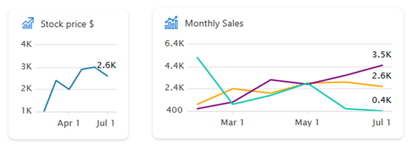
We introduce a new data visualization Card View for Adaptive Card Extensions that is intended to be used for charting scenarios. Use new Data Visualization Card Template in the generator to get started.

Related updated documentation for the SPFx v1.19 release:
- Create a Data Visualization Adaptive Card Extension (tutorial): Step-by-step guide on creating Data Visualization Adaptive Card Extension.
- Introducing new Viva Connections chart card layout option (video) - This video focuses on the creation of ACE data visualization cards with SPFx and also showcases the future plans within this area. Example charts are also demonstrated in the context of example Viva Connections experience.
New samples showcasing the new data visualization ACE template:
- Chart Card - Page Creation: This Adaptive Card Extension displays a line chart showing pages and news creation history on the current SharePoint site.
- Chart Card - Three Series: Baseline example of the chart card rendering options, which was introduced as part of the SPFx 1.19 release. Chart card can be used to render simple charts directly in the Card View, so that you can include graphical details on your business situation directly in the Viva Connections dashboard.
Webpack 5 support
The tooling was upgraded from Webpack 4 to Webpack 5.
Note
If you have webpack configuration customizations in your project - reference the official Webpack documentation for the migration details.
Build time packages release is decoupled from the SPFx release
From this release forward, the build time packages are decoupled from the SPFx release. This means that the build time packages are released independently from the SPFx release. This change allows us to release new features and fixes to the build time packages without waiting for the next SPFx release.
This includes packages like @microsoft/eslint-plugin-spfx, @microsoft/sp-module-interfaces, and other similar build time packages.
Optional footer for the Search Adaptive Card Extension
You can now skip footer for the Search adaptive card extension.
ariaLabel property for the Property Pane's Checkbox control
PropertyPaneCheckbox now supports ariaLabel property.
imageAlt property for the Property Pane's ChoiceGroup option
You can now specify imageAlt property for the Property Pane's choice group option.
ariaDescription property for the Property Pane's Dropdown control
PropertyPaneDropdown now supports ariaDescription property.
disabled property for the Property Pane's Icon Picker and Thumbnail Picker controls
PropertyPaneIconPicker and PropertyPaneThumbnailPicker now support disabled property.
inlineLabel property for the Property Pane's Toggle control
PropertyPaneToggle now supports inlineLabel property that specifies whether the label (not the onText/offText) should be positioned inline with the toggle control. Left (right in RTL) side when on/off text provided vs. right (left in RTL) side when no on/off text.
Note
When not providing on/off text user may get confused in differentiating the on/off states of the toggle.
Deprecations
- Node.js v16 isn't supported with the SPFx v1.19 and forward.
Fixed Issues
No new updates.
Related guidance
We are also providing guidance on how to handle the font settings applied within the SharePoint Brand Center in the custom SPFx solutions. Please see following video as the demonstration on how you can use CSS custom properties within your solution to ensure that the custom solution is following the site level font settings.
- Using SharePoint Brand center font settings in custom SPFx solutions (video) - This video focuses on making custom SPFx solution aware of the font settings applied from the SharePoint Brand Center.
Feedback and issues
We're interested on your feedback around the release. Do let us know any findings or other feedback using the SPFx issue list.
Happy coding! Sharing is caring! 🧡