TwoPaneLayout Jetpack Compose component for foldables
Important
This article describes functionality and guidance that is in public preview and may be substantially modified before it's generally available. Microsoft makes no warranties, express or implied, with respect to the information provided here.
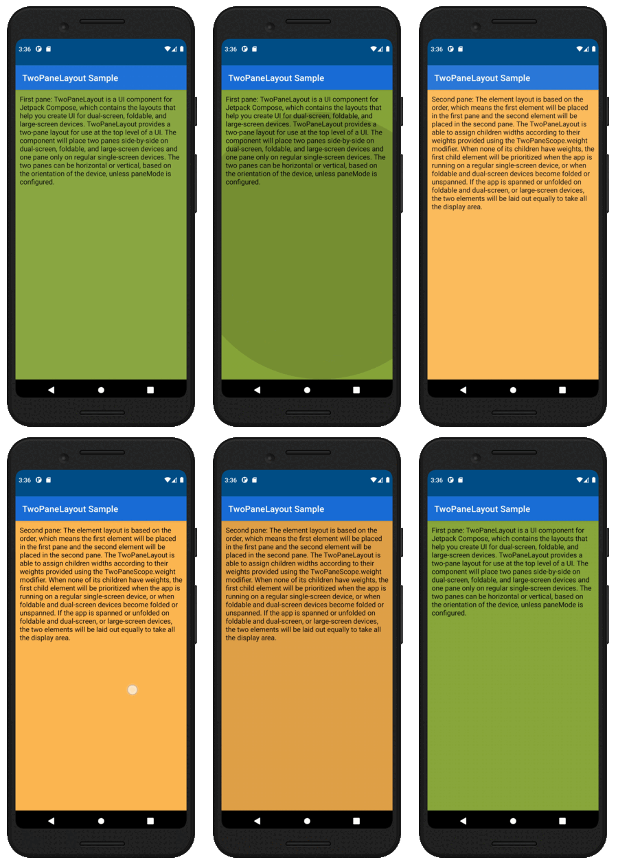
TwoPaneLayout is a Jetpack Compose component that helps you create UI for dual-screen, foldable, and large-screen devices. TwoPaneLayout provides a two-pane layout for use at the top level of a UI. The component will place two panes side-by-side when the app is spanned on dual-screen, foldable and large-screen devices, otherwise only one pane will be shown. These panes can be horizontal or vertical, depending on the orientation of the device and the selected paneMode.
Note
TwoPaneLayout considers a device to be large-screen when the width window size class is expanded, meaning greater than 840 dp.
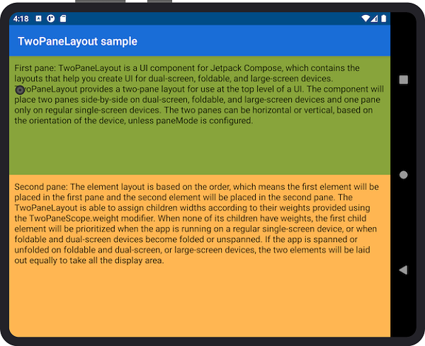
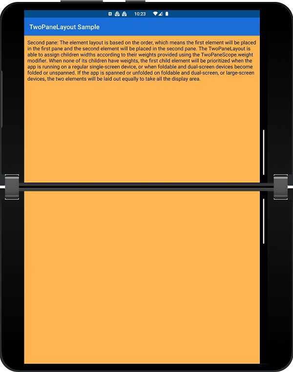
When the app is spanned across a separating vertical hinge or fold, or when the width is larger than the height of the screen on a large-screen device, pane 1 will be placed on the left, while pane 2 will be on the right. If the device rotates, the app is spanned across a separating horizontal hinge or fold, or the width is smaller than the height of screen on large-screen device, pane 1 will be placed on the top and pane 2 will be on the bottom.
Add dependency
Make sure you have the
mavenCentral()repository in your top-level build.gradle file:allprojects { repositories { google() mavenCentral() } }Add dependencies to the module-level build.gradle file (current version may be different from what's shown here):
implementation "com.microsoft.device.dualscreen:twopanelayout:1.0.1-alpha05"Also ensure the
compileSdkVersionis set to API 33 and thetargetSdkVersionis set to API 32 or newer in the module-level build.gradle file:android { compileSdkVersion 33 defaultConfig { targetSdkVersion 32 } ... }Build layout with
TwoPaneLayoutorTwoPaneLayoutNav.Please refer to the TwoPaneLayout sample and TwoPaneLayoutNav sample for more details.
Use TwoPaneLayout in your project
There are several important concepts to consider when using TwoPaneLayout in your projects:
-
Depending on your application, there are three different TwoPaneLayout constructors you can use at the top level of your project: basic TwoPaneLayout, TwoPaneLayout with navController, and TwoPaneLayoutNav.
-
TwoPaneLayout offers two ways to customize how panes are displayed: weight and pane mode.
-
TwoPaneLayout also offers internal navigation methods that can control the content shown in each pane. Depending on which constructor is used, you will have access to either
TwoPaneScopeorTwoPaneNavScopemethods. Test TwoPaneLayout composables
To help test composables that use
TwoPaneScopeorTwoPaneNavScope, TwoPaneLayout offers test implementations of both scopes for use in UI tests.
TwoPaneLayout constructors
TwoPaneLayout should always be the top-level composable in your app for pane size to be computed correctly. There are three different TwoPaneLayout constructors available for use in different scenarios. For more API reference information, check out the TwoPaneLayout README.md.
Basic TwoPaneLayout
@Composable
fun TwoPaneLayout(
    modifier: Modifier = Modifier,
    paneMode: TwoPaneMode = TwoPaneMode.TwoPane,
    pane1: @Composable TwoPaneScope.() -> Unit,
    pane2: @Composable TwoPaneScope.() -> Unit
)
The basic TwoPaneLayout constructor should be used when you only need to display up to two screens of content. Within the pane1 and pane2 composables, you can access the fields and methods provided by the TwoPaneScope interface.
Example usage:
TwoPaneLayout(
    pane1 = { Pane1Content() },
    pane2 = { Pane2Content() }
)
TwoPaneLayout with navController
@Composable
fun TwoPaneLayout(
    modifier: Modifier = Modifier,
    paneMode: TwoPaneMode = TwoPaneMode.TwoPane,
    navController: NavHostController,
    pane1: @Composable TwoPaneScope.() -> Unit,
    pane2: @Composable TwoPaneScope.() -> Unit
)
The TwoPaneLayout with navController constructor should be used when:
- you only need to display up to two screens of content
- you need access to navigation information in your app
Within the pane1 and pane2 composables, you can access the fields and methods provided by the TwoPaneScope interface.
Example usage:
val navController = rememberNavController()

TwoPaneLayout(
    navController = navController,
    pane1 = { Pane1Content() },
    pane2 = { Pane2Content() }
)
TwoPaneLayoutNav
@Composable
fun TwoPaneLayoutNav(
    modifier: Modifier = Modifier,
    navController: NavHostController,
    paneMode: TwoPaneMode = TwoPaneMode.TwoPane,
    singlePaneStartDestination: String,
    pane1StartDestination: String,
    pane2StartDestination: String,
    builder: NavGraphBuilder.() -> Unit
)
The TwoPaneLayoutNav constructor should be used when you want to display more than two screens of content and you need customizable navigation support. Within each destination composable, you can access the fields and methods provided by the TwoPaneNavScope interface.
Example usage:
val navController = rememberNavController()

TwoPaneLayoutNav(
    navController = navController,
    singlePaneStartDestination = "A",
    pane1StartDestination = "A",
    pane2StartDestination = "B"
) {
    composable("A") {
        ContentA()
    }
    composable("B") {
        ContentB()
    }
    composable("C") {
        ContentC()
    }
}
Customize your layout
There are two ways to customize TwoPaneLayout:
weight- determines how to lay out the two panes proportionallypaneMode- determines when to show one or two panes in dual-screen mode horizontally and vertically
Weight
TwoPaneLayout is able to assign children widths or heights according to their weights provided using the TwoPaneScope.weight and TwoPaneNavScope.weight modifiers.
Example usage:
TwoPaneLayout(
    pane1 = { Pane1Content(modifier = Modifier.weight(.3f)) },
    pane2 = { Pane2Content(modifier = Modifier.weight(.7f)) }
)
Weight affects the layout differently on these different devices:
- large screens
- foldables
Large screens
When no weight is provided, the two panes are divided equally.
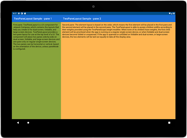
When weight is provided, the layout is split up proportionally according to the ratio of weights.
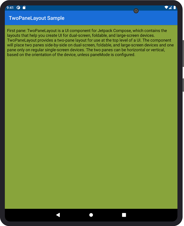
For example, this screenshot shows TwoPaneLayout on a tablet with a 3:7 weight ratio:
Foldables
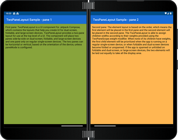
When a separating fold is present, the layout is split up according to the fold's boundaries, regardless of whether or not weight was provided.
If the fold is non-separating, the device is treated as a large or single screen, depending on its size.
For instance, this image shows TwoPaneLayout layout on a dual-screen device, which has a separating fold:
Pane mode
The pane mode affects when two panes are shown for TwoPaneLayout. By default, whenever there is a separating fold or a large window, two panes will be shown, but you can choose to show only one pane in these cases by changing the pane mode.
A separating fold means there's a FoldingFeature present that returns true for the isSeparating property.
A large window is one with a width WindowSizeClass of EXPANDED and a height size classs of at least MEDIUM.
Example usage:
TwoPaneLayout(
    paneMode = TwoPaneMode.HorizontalSingle,
    pane1 = { Pane1Content() },
    pane2 = { Pane2Content() }
)
There are four possible paneMode values:
TwoPaneHorizontalSingleVerticalSingleSinglePane
TwoPane
TwoPane is the default pane mode, and it always shows two panes when there is a separating fold or large window, regardless of the orientation
HorizontalSingle
HorizontalSingle shows one big pane when there is a horizontal separating fold or a portrait large window (combines top/bottom panes).
VerticalSingle
VerticalSingle shows one big pane when there is a vertical separating fold or a landscape large window (combines left/right panes).
SinglePane
SinglePane always shows one pane, regardless of window features and orientation.
Pane mode behavior table
To summarize, this table explains when one 🟩 or two 🟦🟦 panes will be shown for different pane modes and device configurations:
| Pane mode | Small window without separating fold | Portrait large window / horizontal separating fold | Landscape large window / vertical separating fold |
|---|---|---|---|
TwoPane |
🟩 | 🟦🟦 | 🟦🟦 |
HorizontalSingle |
🟩 | 🟩 | 🟦🟦 |
VerticalSingle |
🟩 | 🟦🟦 | 🟩 |
SinglePane |
🟩 | 🟩 | 🟩 |
Navigate within TwoPaneLayout
TwoPaneLayout provides two interfaces with options for internal navigation. Depending on which constructor you use, you will have access to different fields and methods.
TwoPaneScope- can be used with the basic TwoPaneLayout and TwoPaneLayout with navController constructorsTwoPaneNavScope- can be used with the TwoPaneLayoutNav constructor
TwoPaneScope
interface TwoPaneScope {
    ...

    fun navigateToPane1()

    fun navigateToPane2()

    val currentSinglePaneDestination: String

    ...
}
With TwoPaneScope, you can navigate between panes 1 and 2 in single pane mode.
You can also access the route of the current single pane destination, which will either equal Screen.Pane1.route or Screen.Pane2.route.
Example usage:
TwoPaneLayout(
        pane1 = { Pane1Content(modifier = Modifier.clickable { navigateToPane2() }) },
        pane2 = { Pane2Content(modifier = Modifier.clickable { navigateToPane1() }) }
)
TwoPaneNavScope
interface TwoPaneNavScope {
    ...

    fun NavHostController.navigateTo(
        route: String,
        launchScreen: Screen,
        builder: NavOptionsBuilder.() -> Unit = { }
    )

    fun NavHostController.navigateBack(): Boolean

    val twoPaneBackStack: MutableList<TwoPaneBackStackEntry>

    val currentSinglePaneDestination: String

    val currentPane1Destination: String

    val currentPane2Destination: String

    val isSinglePane: Boolean

    ...
}
With TwoPaneNavScope, you can navigate to different destinations in both single and two pane mode.
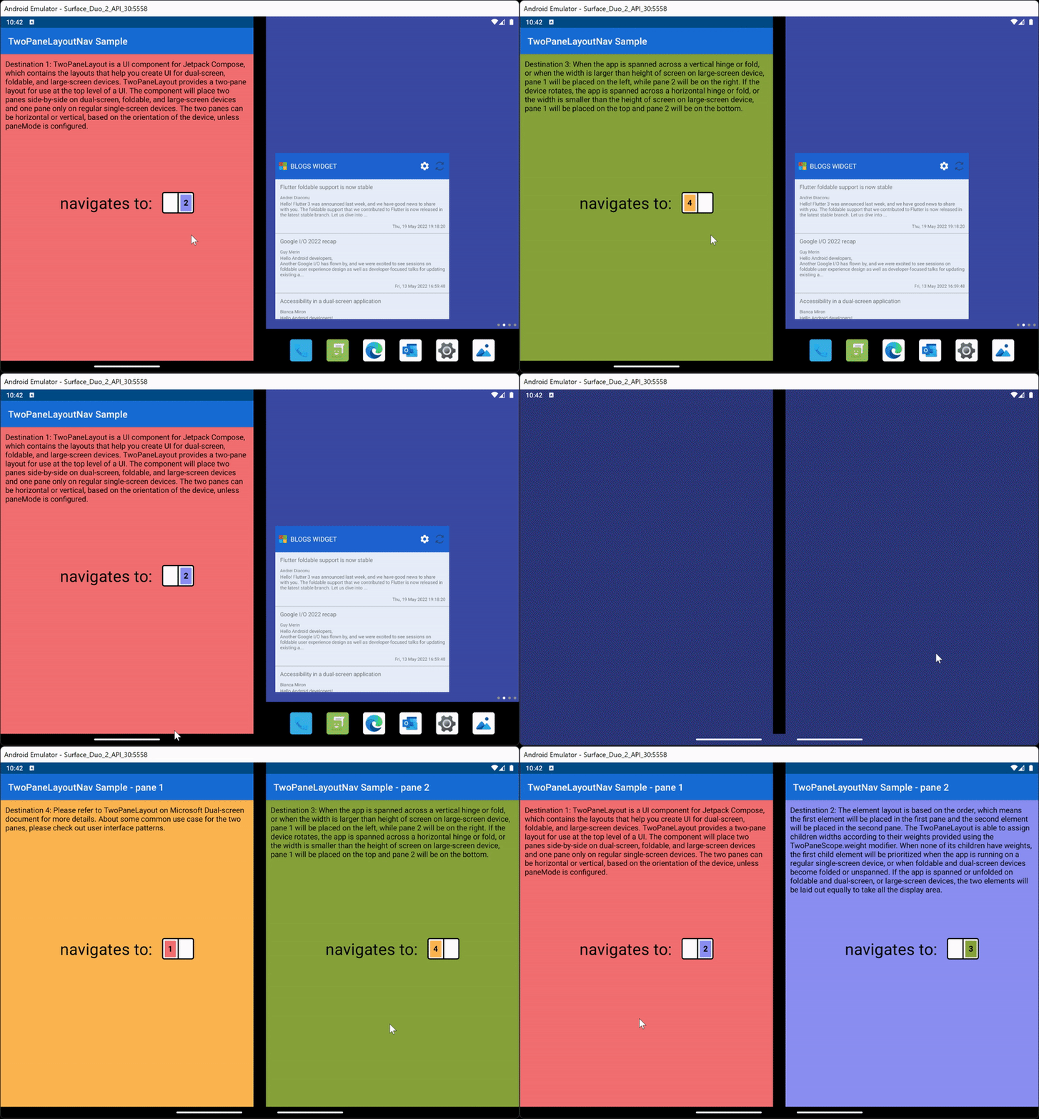
You can also access the routes of the current destinations, whether that's the single pane destination or the pane 1 and pane 2 destinations. These values will depend on the routes of the destinations passed into the TwoPaneLayoutNav constructor.
TwoPaneLayoutNav maintains an internal backstack, so navigation history will be saved when switching between one and two panes. The default component behavior supports back press only in single pane mode. If you want to add back press handling to two pane mode, or override the default behavior in single pane mode, create a custom BackHandler in your composable that calls navigateBack. This will ensure that the internal backstack is maintained correctly. The backstack is also exposed through the interface with the twoPaneBackStack field, so you can access backstack size and contents if needed.
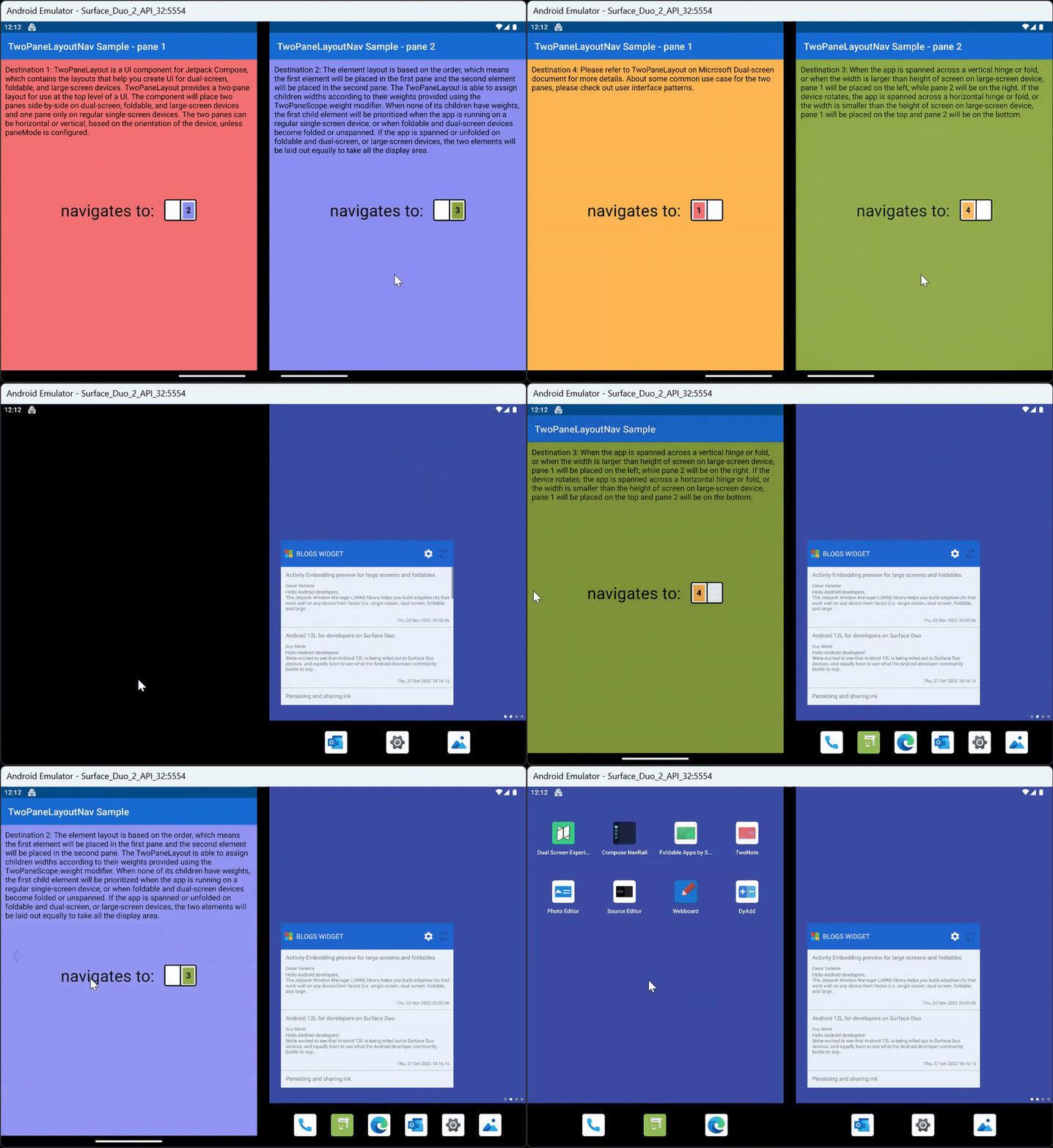
Example usage:
val navController = rememberNavController()

TwoPaneLayoutNav(
    navController = navController,
    singlePaneStartDestination = "A",
    pane1StartDestination = "A",
    pane2StartDestination = "B"
) {
    composable("A") {
        ContentA(Modifier.clickable { navController.navigateTo("B", Screen.Pane2) })
    }
    composable("B") {
        ContentB(Modifier.clickable { navController.navigateTo("C", Screen.Pane2) })
    }
    composable("C") {
        ContentC(Modifier.clickable { navController.navigateTo("A", Screen.Pane1) })
    }
}
Test TwoPaneLayout composables
When writing UI tests for composables that are used within TwoPaneLayout, you can use test scope classes to set up your tests. These classes, TwoPaneScopeTest and TwoPaneNavScopeTest, provide empty implementations for all interface methods and allow you to set field values in the class constructor.
class TwoPaneScopeTest(
    currentSinglePaneDestination: String  = "",
    isSinglePane: Boolean = true
) : TwoPaneScope

class TwoPaneNavScopeTest(
    currentSinglePaneDestination: String  = "",
    currentPane1Destination: String = "",
    currentPane2Destination: String = "",
    isSinglePane: Boolean = true
) : TwoPaneNavScope
Example usage:
// Composable function in app
@Composable
fun TwoPaneScope.Example() {
    if (isSinglePane)
        Text("single pane")
    else
        Text("two pane")
}

...

// UI test in androidTest directory
@Test
fun exampleTest() {
    composeTestRule.setContent {
        val twoPaneScope = TwoPaneScopeTest(isSinglePane = true)
        twoPaneScope.Example()
    }

    composeTestRule.onNodeWithText("single pane").assertIsDisplayed()
    composeTestRule.onNodeWithText("two pane").assertDoesNotExist()
}
