Visual Studio 2010 Beta 1 Start Page Customization
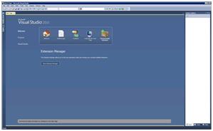
My name is Adrian Collier and I am the Program Manager responsible for the Start Page in the Visual Studio. One of the coolest things we can do in this release is to create custom start pages using WPF. This post details how to get up and running with this feature, along with some warnings on how this feature will be changing.
Process for using the custom Start Page feature:
1. Create a folder called ‘startpages’ in you’re my documents -> Visual Studio 10 folder.
2. Copy the contents of this folder : \Program Files\Microsoft Visual Studio 10.0\Common7\IDE\StartPages\en into your new start pages folder.
3. Load Visual Studio.
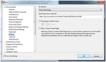
4. Go to Tools->Options->Start up and check the box to Allow Custom Start Pages.
5. Edit the StartPage.xaml file using Visual Studio – when you save any changes to the file, the start page in Visual Studio should update automatically.
Customization Warnings
We are changing the start page to use standard ‘out of the box’ WPF controls post Beta 1 so rather than having VS specific controls, such as the Tray Control we will be using a Styled Tab Control.
These Controls will be removed:
· <vs:Tray >
· <vs:TrayGroup>
· <vs:TrayGroupItem>
· <vs:RssRotator>
We will also be revising the resources we have defined in the page, so the advice is do not take any dependencies with the controls or resources that are provided in Beta 1.
Post beta 1 we will be consuming the shell functionality to detect if the page is being shown on remote desk top, allowing start page authors to tailor their pages to suite low color and low bandwidth scenarios, as well as responding to windows theme colors such as the High Contrast color setting.
An example of tying into the rendering capabilities property is shown below.
<DataTrigger Binding="{Binding Source={x:Static vs:EnvironmentRenderCapabilities.Current}, Path=AreAnimationsAllowed}"
Value="False">
</DataTrigger>
As this is essentially a WPF application inside Visual Studio, you can write all kinds of cool UI, however be careful with Styles and Dynamic templates, as errors will not be detected until runtime this can cause exceptions which will result in Visual Studio crashing. If this happens
· You can try and fix the problem by editing the file in notepad or another text editor
Or
· Rename the file, so you can get visual studio running again, then open the file in Visual Studio to try and locate the issue.
·
Example Page
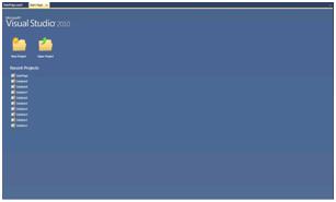
Here is an example of a custom start page I created, I’ve tried to include only items which we will be keeping in the Beta 2 version of the Start Page, this is just a quick and simple page which provides access to the recent projects and the ability to launch the Open and New project commands.
I’ve used the ‘Recent Projects’ control which was originally referenced in the Tray control via the inner content property. There will be updates to this control post Beta 1, primarily focusing the changes to the visualization of the items in the list. We plan to provide this control going forward from Beta 1 to RTM.
vsi:RecentProjects Width="Auto" Margin="0,15,0,0" Grid.Row="1" VerticalAlignment="Stretch" HorizontalAlignment="Left" Height="Auto" />
This control is located in the ShellUI.Internal dll, so you should add this to the solution references, it is located under this path:
\Program Files\Microsoft Visual Studio 10.0\Common7\IDE\Microsoft.VisualStudio.Shell.UI.Internal.dll
 <Grid xmlns="https://schemas.microsoft.com/winfx/2006/xaml/presentation"
      xmlns:x="https://schemas.microsoft.com/winfx/2006/xaml"
      xmlns:vs="clr-namespace:Microsoft.VisualStudio.PlatformUI;assembly=Microsoft.VisualStudio.Shell.UI"
      xmlns:vsi="clr-namespace:Microsoft.VisualStudio.PlatformUI;assembly=Microsoft.VisualStudio.Shell.UI.Internal"
      xmlns:sys="clr-namespace:System;assembly=mscorlib"
    >
    <Grid.Background>
        <LinearGradientBrush EndPoint="0.5,1" StartPoint="0.5,0">
            <GradientStop Color="#FF4B658F" Offset="0"/>
            <GradientStop Color="#FF516C97" Offset="1"/>
        </LinearGradientBrush>
    </Grid.Background>
    <Grid.Resources>
        <!-- Adding an inline style which shows both a text caption and the image for the button, with minimal state change for mouse over -->
        <Style TargetType="{x:Type vs:ImageButton}">
            <Setter Property="Focusable" Value="True"/>
            <Setter Property="Template">
                <Setter.Value>
                    <ControlTemplate TargetType="{x:Type vs:ImageButton}">
                            <StackPanel Orientation="Vertical">
                                <Image Source="{Binding ImageNormal, RelativeSource={RelativeSource TemplatedParent}}"/>
                                <TextBlock Text="{TemplateBinding Content}" Foreground="White"  Margin="0,8,0,0" VerticalAlignment="Center" />
                        </StackPanel>
                        <ControlTemplate.Triggers>
                            <Trigger Property="IsMouseOver" Value="True">
                                <Setter Property="Cursor" Value="Hand" />
                            </Trigger>
                        </ControlTemplate.Triggers>
                    </ControlTemplate>
                </Setter.Value>
            </Setter>
        </Style>
    </Grid.Resources>

    <Grid.RowDefinitions>
        <!-- Logo-->
        <RowDefinition Height="95" />
        <!-- Main Content Area -->
        <RowDefinition Height="Auto"/>

        <RowDefinition Height="*"/>
    </Grid.RowDefinitions>

    <!-- Logo  -->

    <Image Grid.Row="0" Grid.Column="0" Style="{DynamicResource {x:Static vs:StartPageResourceKeys.LogoImageStyleKey}}" />

    <Grid Grid.Column="0" Margin="15,15,0,15" VerticalAlignment="Stretch" Grid.RowSpan="1" Grid.Row="1" >
        <Grid.RowDefinitions>
            <RowDefinition Height="Auto"/>  <!-- Command Buttons for New Projects -->
            <RowDefinition Height="*"/>     <!-- MRU Row -->
        </Grid.RowDefinitions>

        <StackPanel Orientation="Horizontal" Grid.Row="0">

            <!-- Examples of using the built in Image Button Class, unfortunately there are no additional New and Open Icons as part of the Beta 1 page, however you can see from this example how you can change the image source for each state -->
            <vs:ImageButton Content="New Project"
                        Margin="20,0,20,0"
                        Command="{x:Static vs:VSCommands.ExecuteCommand}"
                        CommandParameter="File.NewProject"
                        ImageNormal="pack://application:,,,/Microsoft.VisualStudio.Shell.UI;component/Images/StartPage/07_newproject.png"
                        ImageHover="pack://application:,,,/Microsoft.VisualStudio.Shell.UI;component/Images/StartPage/07_newproject.png"
                        ImagePressed="pack://application:,,,/Microsoft.VisualStudio.Shell.UI;component/Images/StartPage/07_newproject.png">
            </vs:ImageButton>

            <vs:ImageButton Content="Open Project"
                        Margin="20,0,20,0"
                        Command="{x:Static vs:VSCommands.ExecuteCommand}"
                        CommandParameter="File.OpenProject"
                        ImageNormal="pack://application:,,,/Microsoft.VisualStudio.Shell.UI;component/Images/StartPage/06_openproject.png"
                        ImageHover="pack://application:,,,/Microsoft.VisualStudio.Shell.UI;component/Images/StartPage/06_openproject.png"
                        ImagePressed="pack://application:,,,/Microsoft.VisualStudio.Shell.UI;component/Images/StartPage/06_openproject.png">
            </vs:ImageButton>
        </StackPanel>

        <!-- this control does not play nice with the WPF designer, this will be fixed in Beta 2, comment this control out if you wish to use the designer-->
        <vsi:RecentProjects Width="Auto"  Margin="0,15,0,0"  Grid.Row="1" VerticalAlignment="Stretch" HorizontalAlignment="Left"  Height="Auto" />
    </Grid>
</Grid>
Thanks for your time. We will follow this up with a post about custom assemblies with the start page.
-Adrian
Comments
Anonymous
May 20, 2009
PingBack from http://asp-net-hosting.simplynetdev.com/visual-studio-2010-beta-1-start-page-customization/Anonymous
May 21, 2009
Thank you for submitting this cool story - Trackback from DotNetShoutoutAnonymous
May 21, 2009
Y bueno, la fiebre del Visual Studio 2010 ha comenzando, mas ahora que está disponible para todoAnonymous
May 22, 2009
You've been kicked (a good thing) - Trackback from DotNetKicks.comAnonymous
May 25, 2009
Thoughts on Windows 7 and VS 2010Anonymous
May 29, 2009
Nice topics.... :) Can we add Silverlight or movie into the start page...?
- Ping form: ArtDuane.Com
Anonymous
July 23, 2009
Is it possible to add a code-behind for the startpage? I keep getting an error saying that VisualStudio is not a member of Microsoft.....Anonymous
March 17, 2010
The comment has been removed


