Decomposition Tree: Contribution Analysis & Presentation
PerformancePoint Services for SharePoint 2010 introduces the decomposition tree, an interactive arrangement of bar charts that makes it easy to explore contribution relationships. It provides an effective alternative to the “Drill Down To” feature in analytic charts.
Flight delay: a simple analysis and presentation scenario
I’ve built a model using US Bureau of Transportation Statistics data on flight delays and a dashboard that identifies aircraft by tail number. (I used only a slice from 2004, not all the data.)
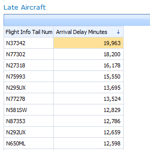
In the dashboard below, we see that N37352 has the highest amount of arrival-time delay, expressed in total minutes:
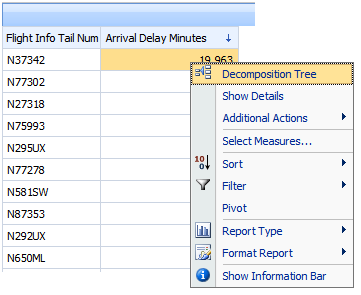
So, which cities cause delays for most delays for this aircraft? Drilling down several times in this grid would give us the answer, but from a presentation standpoint it’s more effective if we see origin city and destination city side by side. We’ll use Decomposition Tree, which is available from the right-click menu:
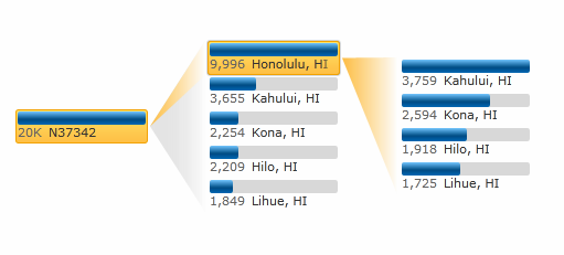
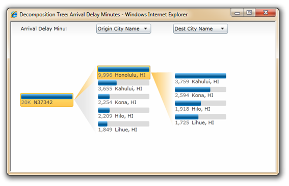
With two drilldowns - the first on Origin City Name and the second on Destination City Name - I see that N37352 did exclusively Hawaii-regional flights during this time period, and the Hololulu-to-Kahului route had the largest sum of delay minutes:
I wonder, then: does this one aircraft fully account for the overall delays, or is it just a drop in the bucket, so to speak? I can’t really tell from here.
So I drill up in the analytic grid (to All), then I use Decomposition Tree again. Now I see that N37342’s delay, when compared to all 4695 aircraft, is almost irrelevant (insignificant.)
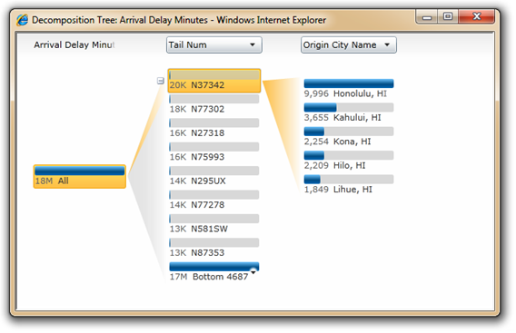
With a single click, I can quickly flip between other aircraft.In the process, I notice that the second-ranked aircraft is also Hawaii-origin:
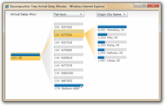
With a couple more clicks, I proceed down a different analysis path:
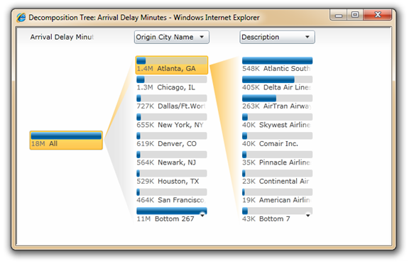
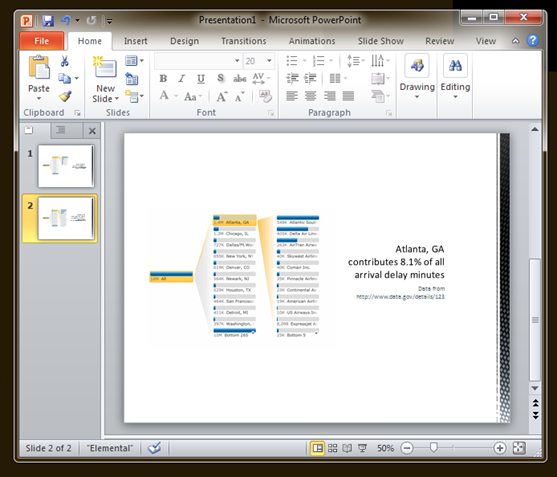
Having derived some useful presentation elements, I use PowerPoint 2010’s Insert Screenshot and Crop commands, and dress it up:
Enjoy!
Wade Dorrell
Program Manager, PerformancePoint Services
Decomposition Tree FAQ
Do I need ProClarity for this?
No. The decomposition tree shown above is built into the PerformancePoint Services web parts and the PerformancePoint Services service application for SharePoint 2010.
The “Decomposition Tree” option does not appear (or is disabled) in the right-click menu.What’s going on?
Microsoft Silverlight 3 enables the option. If Silverlight 3 is not installed, or disabled, the menu command will be hidden (analytic reports) or visible, but disabled (scorecards.) The “Drill Down” commands will be available regardless of Silverlight.
If you have Silverlight installed, enabled, and Decomposition Tree is still unavailable, please verify the following:
- If using a scorecard, the data mapping of the KPI's actual or target (whichever is to be analyzed) must be directly to an Analysis Services member or members,and the calculation-type must be set to “Data value" (which is not the default.)
- If using an analytic chart or grid, it must be designed using the Design tab, not the Query tab. (You might check to be sure that you need to use the Query tab; many common reports can be built with the Design tab alone and dashboard filters can be applied to the reports without adding "parameters" as you do in the Query tab... give it a try!)
If you’d like to know more about Silverlight deployment (PerformancePoint Services web parts are not the only SharePoint features that get better when Silverlight’s installed) we recommend taking a look at the Silverlight Enterprise Deployment guide.
Comments
Anonymous
June 11, 2010
Regarding the final item in the FAQ (Can I include these on my dashboards alongside a scorecard or chart (as opposed to via right-click?), this scenario got more ugly than is helpful by the time SharePoint 2010 released (it is not possible to do it with the Silverlight web part.) We aren't going in depth on how to do this until we've made it better.Anonymous
July 07, 2010
I would appreciate your help. I have set up "Data Value" as a calculation type but still I cannot get available neither "Decomposition tree" or "Show Details" option on a KPIAnonymous
July 08, 2010
Hi Stanislav, I did an update to the relevant FAQ part of the post. Let me know if that clarifies things. If no please let us know what options you do see in the place you are right-clicking in the scorecard (just to make sure I know where you're expecting it.)Anonymous
July 28, 2010
Hi Wade. I posted a comment but due to some mistake, it didnt show. So again ;) Thanks for your reply but still I am confused. I created three demo reports. One is a Adventure Works analytic chart. All analytic features are available including Decomposition tree. Then I have another chart which I created based on a very simple SSAS cube (made for our customer). No analytic features on this chart are available (change chart type, filter,..., decomp tree ... nothing) And when I come back to the scorecard in which I wanted to have a Decomposition tree option, there is no change yet. The only option that is available in this case is "Comment..." Any idea what am I doing wrong? I think that I am missing some prerecquisite during desing because all the reports mentioned above are deployed on the same machine. Thus, the analytic chart with no available option is deployed on another SharePoint Site Collection so maybe there is some setting wrong. Thanks in advance for your reply.Anonymous
September 30, 2010
I'd like to disable the decomp tree in certain instances. Is this possible?Anonymous
December 14, 2010
Default to Data Type was the setting I was missing. Great!!! But now I also see the "Show Details"...hmmm....how do I disable a user from seeing that, but stil need the Decomposition tree feature to be available. ThanksAnonymous
February 27, 2011
Thank you so much for this post. I couldnt get the Decomposition tree to show up and spent so much time looking through blogs and reading books and no matter what couldnt find the answer. After reading this and seeing that it was simply silverlight not being installed I finally got it to work!Anonymous
May 16, 2011
Is there anyway we can show the complete lable name of the measure title at the top of the Decomposition Tree? It's looks really bad graphically and we have not been able to find any solution to this? Any help would be much appreciated as our client has found quite a few graphical problems with PerformancePoint Services and this is just one of many...... ThanksAnonymous
May 17, 2011
Sara, we'll make sure that feedback gets to the team. There should be a way to get the full measure label when interacting with the decomposition tree at a minimum, and it doesn't appear to be working that way.Anonymous
May 25, 2011
Hi, I am facing a problem in decoposition tree. We all know that we can change the node value in a grid format by just clicking on the particular node. while doing that it was taking too much of time and finally resulting in a error page which says that "An unexpected error occured" I dont know how to solve this out. please help me out to resolve this problem. Thanks and Regards Sudipta GhoshAnonymous
June 02, 2011
The comment has been removedAnonymous
July 27, 2011
from Sara "Is there anyway we can show the complete lable name of the measure title at the top of the Decomposition Tree? It's looks really bad graphically and we have not been able to find any solution to this? Any help would be much appreciated as our client has found quite a few graphical problems with PerformancePoint Services and this is just one of many...... Thanks" reply from Wade Dorrell "Sara, we'll make sure that feedback gets to the team. There should be a way to get the full measure label when interacting with the decomposition tree at a minimum, and it doesn't appear to be working that way." Any news? this is a a really big annoying issueAnonymous
July 28, 2011
@Sara's colleague: We definitely hear you, and I double-checked with the development team... it's on the feedback list for visual design as well as accessibility. If you'd like to pursue this in hotfix, please do follow up with Microsoft support. A best practice to know (it won't help with decomposition tree visual design, but it makes for better information design) is to make sure the measure is known to users of the dashboard the decomposition tree's launched from. We don't want people to misunderstand the measure used in the visualizations that preceed the decomposition tree as a count vs. a sum for example! Turning on the "Information Bar" in analytic reports (or including the measure in the layout and making sure column auto-sizing is adjusted such that it can be read), and including something of the measure title in KPI naming for scorecards, are good approaches. Then, if they use decomposition tree to do analysis, people should be more confident they know the metric being decomposed.Anonymous
November 01, 2011
No chance to get a powerpoint template or add-in to enable building the decomposition tree bt. excel and/or powerpoint directly? Coaching for Performance www.iecoach.comAnonymous
April 27, 2012
Hi Wade, Thanks for a very nice post, although it was way back in 2009 but is still very relevant. I have a question, Is there a way to configure the Decomposition Tree to work correctly with Percentages and Averages. Although it works perfectly with percentages and averages but the problem comes when it shows incorrect percentage in the tooltips. e.g. in my case I have data in form of percentages but when I drill down and hover my mouse on any of the elements the tooltip shows wrong percentages like "143% of Parent". There must be a workaround for it. Please help! P.S. Some how my post was not submitted so I had to write it again.Anonymous
January 27, 2015
Hi, I verified that Silverlight 5 is installed and enabled. Also, changed the calculation type as 'Data Value' in KPI, but still 'Show Details' and 'Decomposition Tree' are disabled in the scorecard. Can anyone help me? Thanks.
