Calendar Control for Windows 8
A highly flexible Calendar Control for Windows 8 has been offered my ComponentOne. However I had trouble understanding this powerful control and hence am writing this tutorial on using and customizing it.
ComponentOne Calendar Control can be downloaded from the link below :
https://www.componentone.com/SuperProducts/CalendarWinRT/
The features of this control are:
1. Gesture-based Month Navigation - supports slide and flick gestures for month-to-month navigation. Or tap the navigation buttons to achieve the same effect.
2. Date Range Selection - Enable the user to select one day or many days through a default tap or hold and slide gesture. Control the number of days they can select using the MaxSelectionCount property.
3. Customizable Calendar Settings - Specify the starting day of the week, the work weekdays collection, and more. Visually distinguish between work days and weekends through special brush properties. Make any date bolded to highlight it to the end-user.
4. Easy and Flexible Styling Model - easily change control brushes without having to override templates. Each visible part of the control has its own brush, including adjacent days, weekends, selected days, the month header and more.
5. Customize Date Appearance and Content - You can alter the appearance of any individual day using a custom template and template selector.
6. Show Week Numbers
Step 1 : Creating an App with Calendar Control
1. Download the control from the above link and run the setup.
2. Once done, open new project (Blank Windows Store App) in visual studio.
3. Right References – Add Reference – Choose Windows – Extensions on the left panel – Select ComponentOne Studio for WinRT XAML.
4. Now you will see C1Calendar in your toolbox – drag and drop this element to your project. Name it Calendar and add a SelectedDateChanged event.
5. You can customize this control to give a specific color to the weekends using WeekendBrush or adding the week number by setting ShowWeekNumbers as equal to true. Many other customization are available which can be explored in the properties tab of the control.
6. Copy paste the below code <Page> and <Grid> or add to the already existing <Page.Resources>
<Page.Resources>
<!-- return custom DataTemplates for calendar days -->
<Calendar:DaySlotTemplateSelector x:Key="DaySlotTemplateSelector">
<Calendar:DaySlotTemplateSelector.Resources>
<ResourceDictionary>
<DataTemplate x:Key="BoldedDay">
<Grid>
<Grid.RowDefinitions>
<RowDefinition />
<RowDefinition Height="Auto"/>
</Grid.RowDefinitions>
<!-- show appointments information saved in the DaySlot.Tag property -->
<Border Background="LightGreen" Grid.Row="0" VerticalAlignment="Top" >
<TextBlock Text="{Binding Tag}" Margin="5" TextWrapping="Wrap" Foreground="Black" />
</Border>
<TextBlock Text="{Binding}" Grid.Row="1" Foreground="OrangeRed" HorizontalAlignment="Left" VerticalAlignment="Bottom" FontWeight="SemiBold" Margin="6,0,0,4"/>
</Grid>
</DataTemplate>
<DataTemplate x:Key="UnboldedDay">
<TextBlock Text="{Binding}" HorizontalAlignment="Left" VerticalAlignment="Bottom" Margin="6,22,0,4"/>
</DataTemplate>
</ResourceDictionary>
</Calendar:DaySlotTemplateSelector.Resources>
</Calendar:DaySlotTemplateSelector>
</Page.Resources>
7. Now go to the code behind and add using C1.Xaml.Calendar; to the list of assemblies.
8. Add :
private Dictionary<DateTime, string> _boldedDays = new Dictionary<DateTime, string>();
private DaySlotTemplateSelector _dayTemplateSelector = null;
as elements of the class – MainPage.
9. Add the below method as a part of the class.
private DaySlotTemplateSelector DayTemplateSelector
{
get
{
if (_dayTemplateSelector == null)
{
_dayTemplateSelector = Resources["DaySlotTemplateSelector"] as DaySlotTemplateSelector;
if (_dayTemplateSelector != null)
{
_dayTemplateSelector.BoldedDays = this._boldedDays;
}
}
return _dayTemplateSelector;
}
}
10. Add the below class to the namespace of your project, out of the MainPage class.
public class DaySlotTemplateSelector : C1.Xaml.Calendar.DaySlotTemplateSelector
{
public Dictionary<DateTime, string> BoldedDays = new Dictionary<DateTime, string>();
protected override DataTemplate SelectTemplateCore(object item, DependencyObject container)
{
DaySlot slot = item as DaySlot;
if (slot != null && BoldedDays.ContainsKey(slot.Date))
{
// put appointments information into tag, so that it is possible to show it in a day DataTemplate
slot.Tag = BoldedDays[slot.Date];
}
else
{
// clear appointments information
slot.Tag = null;
}
if (slot != null && !slot.IsAdjacent && slot.DayOfWeek == DayOfWeek.Saturday)
{
// set color for Saturday
((Control)container).Foreground = new SolidColorBrush(Windows.UI.Color.FromArgb(255, 0, 90, 255));
}
// the base class will select custom DataTemplate, defined in the DaySlotTemplateSelector.Resources collection (see MainPage.xaml file)
return base.SelectTemplateCore(item, container);
}
}
Step 2: Customizing and adding data to calendar
1. Now to customize how each Day Slot looks when its bolded and you have events to display, edit the part highlighted in red. And for those days that don't have any events, edit the part highlighted in green.
Notice that its just a grid so you may even add a listview or couple of textblocks or whatever you want.
2. Right now the Bolded Days is a dictionary of string and DateTime, with DateTime as the key. If you need more than a string to display say a list of stings or a customized object – define the object as a class in the project and change “string” to your object name in the parts which have been highlighted in blue.
Example:
public class obj
{
public List<string> x;
public int count;
}
public Dictionary<DateTime, obj> BoldedDays = new Dictionary<DateTime, obj>();
3. Now let’s bind the data in the XAML. Your object is available as the Tag. So Add the below statement to bind.
What you want to bind = "{Binding Tag.attritubeName}"
Example:
ItemSource = “{Binding Tag,x}”
<TextBlock Text = “{Binding Tag.count}”/>
4. <TextBlock Text = “{Binding}”/> gives the date.
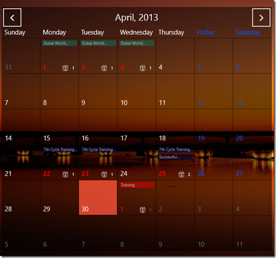
This is what I did with my control!
Explore and enjoy..
References:
1. https://our.componentone.com/2013/02/28/winrt-xaml-part-4-calendar/
2. https://www.componentone.com/SuperProducts/CalendarWinRT/
3. https://helpcentral.componentone.com/nethelp/CalendarWinRT/
Comments
- Anonymous
November 13, 2015
Thank you so much for this tutorial. It helped me a lot! I just had a few questions. How to create similar control like BoldedDay? I need some other controls like BoldedDay to so different types of event?
