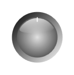
Rotary custom control
The RotaryControl is a sample WPF custom control in a class library project that you can open and build in the Blend 2 September Preview. You can use the control along with your own template and property settings as a base to make many different types of rotary dials and knobs and selectors. Once you’ve built the control, create a new WPF Application in Blend, add a reference to the built dll, then use the Asset Library to add an instance of the control to your scene.
The control comes with a default template which you can copy using the breadcrumb bar:

There are three parts to the template. PART_Background isn’t strictly a part because the control doesn’t actually look for this part. But it’s in the default template so you know where to put your background in correct z order. PART_Dial is important however. If you don’t have an element in your template named PART_Dial then the control won’t know which part of the template you want to be the part that rotates in response to the mouse . The dial part needs to sit in front of the background part in order to get mouse hits. PART_Foreground is optional and it’s the name of any element you wish to sit in front of the dial in z order but not to get mouse hits. In the default template I’ve placed a shiny highlight in the foreground layer but I haven’t bothered to set it to IsHitTestVisible = false. The code in the control will do that for me.
Select your control and look at the custom properties in the Miscellaneous category of the property inspector. If you want the dial to snap to certain angles then set SnapToSnapAngle to true and SnapAngle to the angle increments you want to snap to. By default the dial will rotate without constraint. If you want it to only rotate in the range between 0 and 90 degrees then set RotationIsConstrained to true, CounterClockwiseMostAngle to 0 and ClockwiseMostAngle to 90. You can set any of these latter two values to any positive or negative value but they will be stored internally in the range 0 to 360. RotationIsAnimated only really has an effect when you’re snapping; it controls whether or not the snapping is animated in a spring motion. You can use the Angle property to query the angle at any time.
If you are building a rotary selector such as an automobile air-con knob then you will want to associate some semantic value with each angle at which the dial can be oriented. For instance, MAX A/C is a more useful indication of where the dial is than, say, 270. Use the Values property to define a collection of strings. The Value property will then be set to the first string in Values when Angle is equal to CounterClockwiseMostAngle and it will be set to subsequent strings from the collection as the dial is moved clockwise by each increment of SnapAngle.
CursorAttractsNearestSnap has a useful function if your template is such that the values are shown on the dial itself and the indicator is on the background. In this situation it’s useful for the nearest value to spring to the mouse pointer when the mouse is clicked and while the dial rotates.
Next time I’ll show some fresh templates and property settings for the control to illustrate what it can do.
Steve White
Comments
Anonymous
October 13, 2007
PingBack from http://www.artofbam.com/wordpress/?p=8285Anonymous
October 13, 2007
Download the source code The RotaryControl is a sample WPF custom control in a class library projectAnonymous
October 15, 2007
Download the source code The RotaryControl is a sample WPF custom control in a class library projectAnonymous
October 16, 2007
The comment has been removed