User Experience Changes to Site Information Page
Based on feedback from usability studies and CardSpace users we made a number of changes to CardSpace in the .NET Framework 3.5 release. Some of these changes were designed to make CardSpace easier to use. The first of these changes we'll describe are to the page shown the first time you visit a site. This page provides you with information about that site to help inform your choice to either "Yes, choose a card to send" or "No, return to the site".
We've changed the Site Information Page to make it cleaner and to bring forward the most pertinent details to the user. We’ve also added several visual cues to alert the user to the level of security a particular site has.
The Site Information Page falls into 3 modes:
· Extended Validation (EV) SSL Certificate Mode
· Regular SSL Certificate Mode
· No Certificate Mode
Extended Validation SSL Certificate Mode:
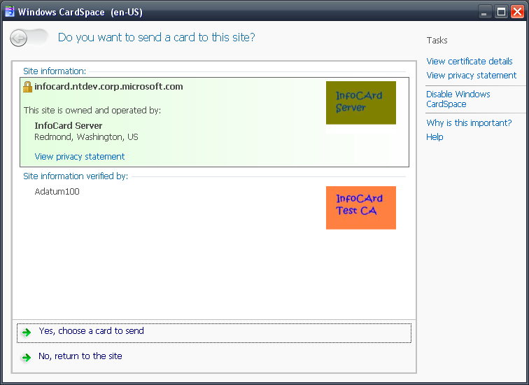
.NET Framework 3.0 Windows CardSpace Site Information Page (OLD):

.NET Framework 3.5 Windows CardSpace Site Information Page (NEW):

Green Background Color
Following the green address bar that web browsers have implemented for EV certificates, it helps create a consistent experience by following the same coloring scheme to display recipient information in.
Lock Symbol
We added the common lock symbol used to signify SSL protection.
Regular SSL Certificate Mode:
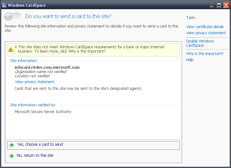
.NET Framework 3.0 Windows CardSpace Site Information Page (OLD):

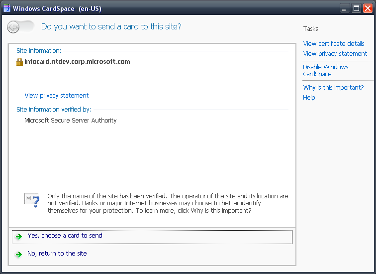
.NET Framework 3.5 Windows CardSpace Site Information Page (NEW):

Major Internet Business Warning
We have received a lot of feedback pertaining to the warning we show at the top of the page for sites that are protected by an SSL certificate but not an EV certificate, specifically that the wording was too strong. So we’ve downgraded the warning to a notice, while still trying to be true to the intent of the notice, to let the user know that the site could take advantage of stronger forms of verification. We removed the lines which state Organization/Location not verified and just don’t display that information to the user.
Lock Symbol
We added the common lock symbol used to signify SSL protection.
No Certificate Mode:
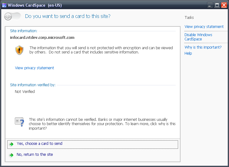
Since we didn’t support non-SSL sites in .NET Framework 3.0, there isn’t an old screenshot we can use to compare and contrast.
.NET Framework 3.5 Windows CardSpace Site Information Page (NEW):

No Protection/Encryption Warning
We wanted this page to really pop out to warn the user that there is no protection with this particular recipient and any data you send to this recipient will not be encrypted and will be sent in the clear.
//Toland Hon
Comments
- Anonymous
October 02, 2007
I would also like to see a screen shot of what a user sees if they've never visited a site before. I think this is the most useful defense that information cards can provide against phishing. If a user tries to go to his bank, Amazon, or anywhere else where he already has an account, getting a blatant signal that they've never been there before would hopefully give them a clue that something is amiss and that they should think twice about proceeding.How blatant a signal they should see is still a question. But I do think that the identity selector that pops up in this case should be "different enough" that the user will immediately be aware that it's different.Yes, I do think this would be more effective than EV certificates. Even though VeriSIgn and other CAs have a valid point about what a certificate certifies, I still think EV certificates are more a case of VeriSign having a hammer, so the problem is a nail. That doesn't mean they shouldn't be supported, though.Actually, I think being able to customize what a user sees for a particular site would be even more effective, but I doubt many users would actually go to the trouble. Note that I do mean customization by the user; that's not the same thing as certificates containing logos.Eric Norman - Anonymous
October 05, 2007
There is actually a different experience if you've visited the site before. This is actually the screen that you see if you've never visited the site before. If you've visited the site before and submitted a card, you'll open CardSpace directly to your list of cards, highlighting your last sent card.Therefore this will train users to notice that sites that they haven't been to before will display the Site Information Page.//Toland - Anonymous
October 17, 2007
In meinem vorletzten Post habe ich eine Einführung über das Thema Identity und Cardspace gemacht. Hier