Email popup basics: Why and how you should use them to boost your email list
Guest post by Greg d’Aboville, Head of Customer Success at WisePops, a smart popup builder.
If you’re serious about growing your subscriber list, using an email popup is a no-brainer.
Judge by yourself:
● On average, popup increase subscription rate by +300% (source: internal data)
● Email popups work on all devices
● According to an EMarketer study, Email ROI is still way higher than other channels
You’re convinced? Let’s review the best practices, step-by-step.
Display your email popup at the right time to the right person
Step 1: Choose the right trigger
Here are the main triggers and their strengths:
Trigger |
Triggers the popup when |
Works great for |
Landing |
Visitor loads the page | Ecommerce websites |
Exit |
Visitor shows signs of leaving your website | All kinds of websites (outperforms landing trigger by +5% on average. Source: internal data) |
After X pages viewed |
Visitor has seen X pages | Displaying mobile popups which comply with Google guidelines on mobile popups (Google penalizes full size popups on the landing page) |
Scroll |
Visitor has viewed X% of your page | Media websites wanting to collect emails at the end of articles.E-commerce websites with long marketing/product pages. |
On click |
Visitor clicks a link | B2B websites which want to create a lead magnet. |
Step 2: Choose the right page
You are an e-commerce/B2B website:
● If your campaign also aims at reducing cart abandonment, display it in the cart and checkout pages. You can also try them on product pages.
● If your campaign’s only objective is to collect more emails, display it on all pages. Only exclude your most sensitive pages so your popup does not interfere with key features of your website (checkout process, support contact, lead form…)
You run a media website: we recommend displaying your popups on all pages to maximize the number of visitors who will see it.
Later you can analyze your campaign performance page by page and exclude the pages where your campaign performs worst.
Step 3: Timing
You can set a delay before display so that your popup doesn’t appear right away. This allows you to catch the visitor when she/he’s most engaged.
To refine your popup timing, you have 3 options:
● Analyze the average on page time and target the users who stay the longest
● Analyze scrolling average and target the users who scroll below the average
● AB test multiple options
Step 4: Keep it simple and iterate
As a marketer, you might be tempted to elaborate a complex targeting strategy from the start. On the contrary we recommend keeping things simple at first. Our experience has shown that displaying simple email popups on landing can generate very satisfying results. For example, Exito, a top 5 ecommerce website in Latin America collected 200,000 emails with simple popups displayed on landing on all pages.
Once you have some first results with your campaign, we recommend using AB tests to iterate and improve your campaign performance. 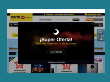
A simple optin campaign displayed on Exito
Design / format
Choose the right popup format
Your popup format will depend largely on newletter benefit for your visitors: if you can offer an immediate benefit, you don’t need to be too subtle (eg: free shipping, coupon, freebie, etc.)
If you don’t have any good benefits to convey, we recommend picking a format which is not too intrusive.
To help you, we ranked the different popup formats by subtlety:
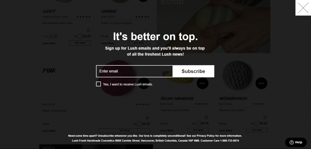
Full size popup:
Full-size popups, as their name suggest, are popups which take the entire screen of the user.
Subtlety: very low. Should be used on exit or when you have a very attractive offer.
Full-size popup on Lush.com
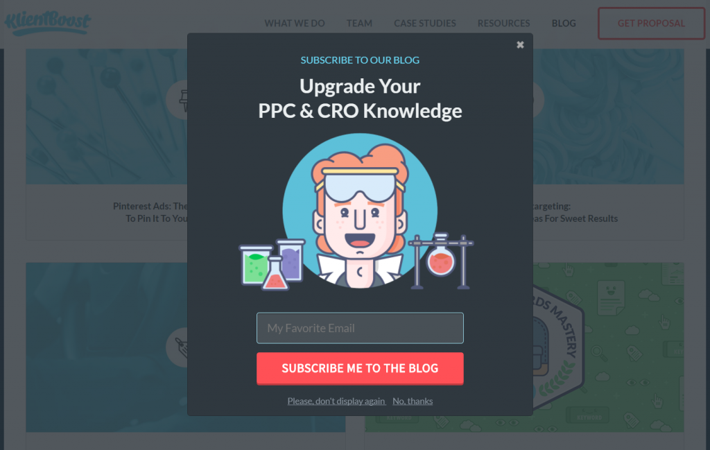
Lightbox: Named after a JS library, lightbox popups appear on top of the page’s content while the rest of the website is inactivated and dimmed out.
Subtlety: very low. Should be used only for key messages or with a precise targeting.
Lightbox popup on KlientBoost
Side banner:
A side banner is a full-height banner displayed on the side of the screen.
Subtlety: medium. Side-banners are particularly adapted to blogs. They avoid hiding the main content while providing a visible incentive to sign-up.
Our “Welcome Back Side” template
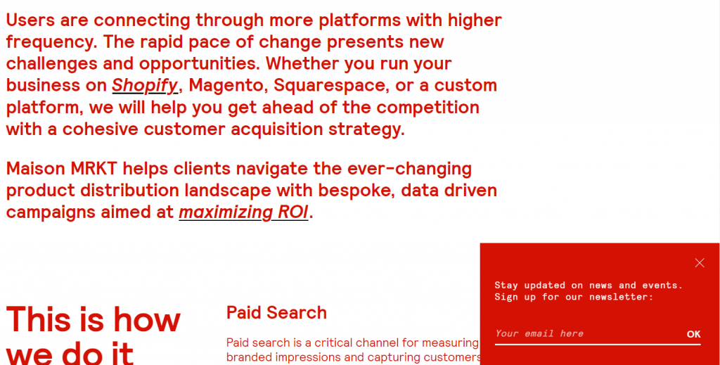
Slide in:
A slide-in popup appears at the bottom of the screen.
Subtlety: high. Traditionally, slide-in popups appear when the user scrolls down. They work great on blogs and media.
Slide in popup displayed on Maison MRKT
Bottom banner:
Subtlety: high. Displayed at the bottom of the screen, these popups are both subtle and highly visible. As they don’t hide the main content of the page, they can be displayed on all pages. Recommended for all kinds of websites.
Bottom banner displayed on mic.com
Tab:
The tab is a smaller popup that displays before your side popup or in one of the page corners.
Subtlety: very high. As such it is very discreet. But coupled with a compelling offer, it can be very successful. And it’s ideal on mobile devices where the space is scarce.
 An email popup with the activated tab on platypusshoes.com
Use Visuals
The design of your popup is as important as the rest. Even if you don’t have any design skills, these quick tips should help you do better.
Make sure your popup designs match your website design. Reuse the same colours. Also, don’t hesitate to add your logo to reassure your users.
Use visuals to add life to your popups. Here are a few ideas:
● In e-commerce popups: display visuals which drive attention to your message. Or simply visuals featuring your products.
● In B2B popups: in lead magnets insert a visual of the freebie your users will get.
● In blog popups: insert a picture the content’s author. It helps build trust. 
A striking example of a visual popup on dibruno.com
Content
To Coupon or not coupon?
Choosing to reward subscribers with a coupon is a difficult question.
On the plus side:
● You will get more subscribers. One our biggest clients, a leading ecommerce website, did a quick AB test: 3 variants with a coupon, one without. After a few days, the variant with the most generous coupon collected 5x more subscribers than the variant without.
● The coupon will contribute to boost your sales 
The results of the AB test ran by our client.
On the downside:
● Subscribers might unsubscribe more easily
● You might hurt your brand image in the long run
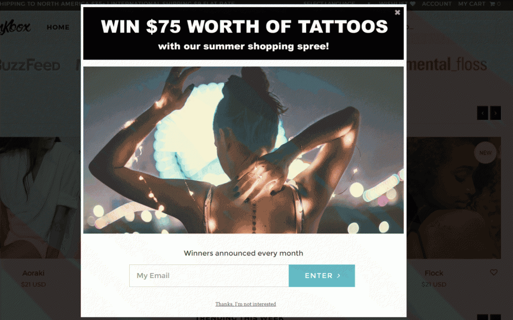
If you stick to the no-coupon option, there are some appealing alternatives:
● Hold sweepstakes
● Create a VIP program for subscribers (including exclusive deals, free shipping, etc)...
A sweepstakes campaign on inkbox.com
Choose your words carefully:
● Put yourself in your visitor's shoes. What are the benefits for her/him? (Get the latest news? Receive exclusive deals, etc.)
● Choose your words carefully. Your visitor’s attention is a precious resource. This a popup, not a blog post.
● Don’t hesitate to add a short reassurance sentence (“Your email won’t be shared” or “We hate Spam just as much as you do”)
Make the most of these new emails
Once you’re ready to collect emails, it’s time to dive into the details of your emailing solution.
Segment your subscribers:
To improve the performance of your future emails, we recommend segmenting your lists of subscribers. Of course, your German visitors shouldn’t receive the British newsletter. But you can go further than that and:
● Segment your subscribers by interest. In that case, you can add a drop-down or a radio button to help your user share his or her interests. Segmenting can be as simple as asking for the gender on e-commerce clothing website for example.
● Segment by subscription page. This is especially relevant for media websites and blogs. 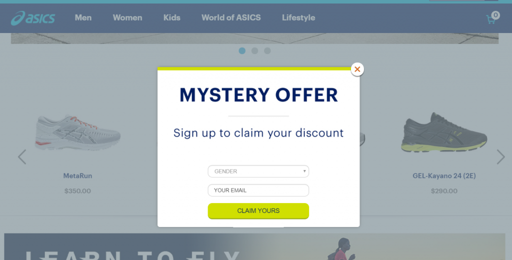
An email popup asking the subscriber gender on Asics.com.
Double optin tips and tricks:
If you activated double optin (it can be a good decision), you should do everything you can to maximize the numbers of users who confirm their subscription.
These two tricks should help:
● Most popup tools allow you to display a thank you message once the user subscribes. Use that opportunity to remind your users that they will have to confirm their email. A simple message such as “We’ve sent you an email asking you to confirm your subscription” can increase your confirmation rate.
● Customize your optin confirmation email to make it clear that your users 1) are not subscribed yet 2) won’t get their freebie or coupon until they confirm their subscription. Jennifer Bourn shared a brilliant example of that strategy on her blog.
Welcome email:
Preparing a welcome email for your new subscribers is essential.
This email is a good opportunity to:
● Share a welcome coupon if you advertised one in your opt-in popup
● Pave the way for the first purchase: to do so, it can be as simple as adding links to your main website categories. Or featuring your best sellers.
● Reinforce your branding: this email can be a good opportunity to communicate on your brand’s story or on your main commitments (free returns, free trial, money-back guarantees, etc.)
If you need further inspiration we recommend this article from Hubspot: 7 Great Examples of 'Welcome' Emails to Inspire Your Own Strategy.
