Content design basics for Windows apps
This article provides some practical tips and examples to help you design the content of your app: Windows spacing rationale, using the type ramp to demonstrate hierarchy, lists and grids, and how to group controls.
Spacing and gutters
The use of consistently sized spacing and gutters semantically groups an experience into separate components. These values map to our rounded corner logic and together help create a cohesive and usable layout.
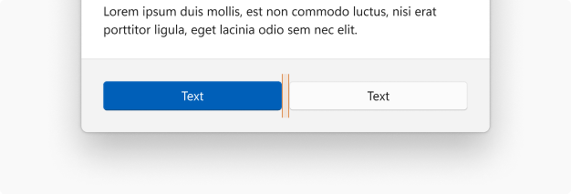
8epx between buttons
8epx between buttons and flyouts
8epx between control and header
12epx between control and label
12epx between content areas
16epx between surface and edge text
Text + hierarchy
Our type ramp (link) is designed to provide an array of sizes that can help communicate hierarchy within an app.

Using Title, Subtitle and Body with 12epx spacing.

When differentiating a title in a confined UI space, use Body Strong for the title without any additional spacing between text blocks.

Use caption size for very confined spaces where text is needed, such as command buttons.
Lists and grids
There are a variety of list and grid styles that can be created. Below are a variety of compositions used in Windows.
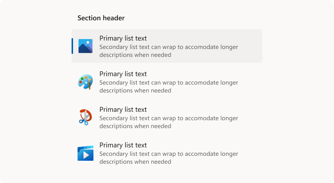
For multi-line lists, use Body and Caption from the type ramp, and 32epx icons.
Use Body Strong for section headers.
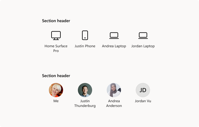
When using icons or person picture elements for grid items, use Caption text that is center-aligned.
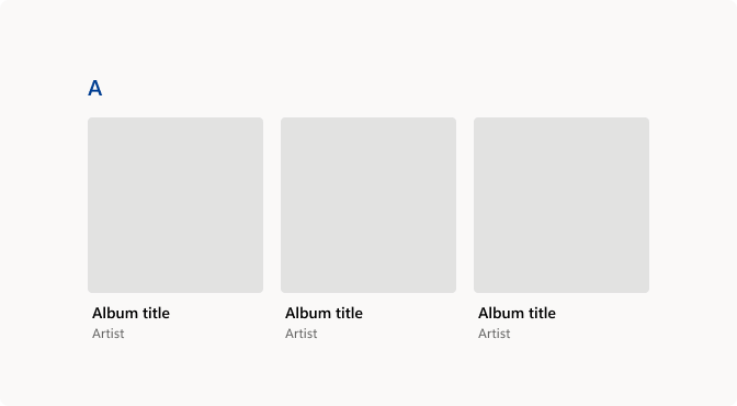
Use Body style for primary text and left-align to the image if your list contains large graphical elements with text.
Using controls
Some examples of how controls can relate to each other in common configurations.

Examples showing how to use an expander control (link) with list styles and common controls. Controls should be right-aligned with 16epx between the control and expander button.
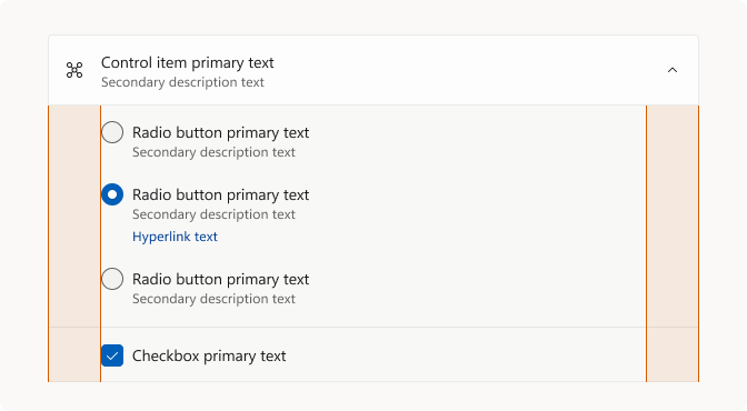
This example shows controls alignment when placed inside the expander. Indent the controls 48epx.
Windows developer
