Align the data in a paginated report chart in a table or matrix (Report Builder)
Applies to:
Microsoft Report Builder (SSRS)
Power BI Report Builder
Report Designer in SQL Server Data Tools
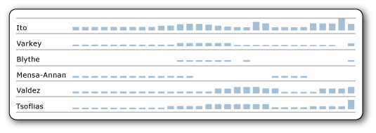
Sparklines and data bars are small, simple charts that convey information with little extraneous detail in a paginated report. In a paginated report, when you check this option, the values in your sparklines and data bars align across the different cells in the table or matrix. They align even if there are missing values in the data they're based on.

In this image, the column chart shows daily sales for each employee. For days that an employee has no sales, the chart leaves a blank and aligns subsequent days horizontally. It also aligns the charts vertically by making the sizes of the different charts relative to each other. For more information, see Sparklines and data bars (Report Builder).
Align the data in a sparkline or data bar
Add a sparkline or data bar to a table or matrix.
Select the sparkline or data bar, and then choose Horizontal Axis Properties or Vertical Axis Properties.
On the Axis Options tab, check the Align axes in box, and then in the list box, select the group on which to align the axis.
Select OK.