Consuming XAML Markup Extensions
XAML markup extensions help enhance the power and flexibility of XAML by allowing element attributes to be set from a variety of sources. Several XAML markup extensions are part of the XAML 2009 specification. These appear in XAML files with the customary x namespace prefix, and are commonly referred to with this prefix. This article discusses the following markup extensions:
x:Static– reference static properties, fields, or enumeration members.x:Reference– reference named elements on the page.x:Type– set an attribute to aSystem.Typeobject.x:Array– construct an array of objects of a particular type.x:Null– set an attribute to anullvalue.OnPlatform– customize UI appearance on a per-platform basis.OnIdiom– customize UI appearance based on the idiom of the device the application is running on.DataTemplate– converts a type into aDataTemplate.FontImage– display a font icon in any view that can display anImageSource.AppThemeBinding– consume a resource based on the current system theme.
Additional XAML markup extensions have historically been supported by other XAML implementations, and are also supported by Xamarin.Forms. These are described more fully in other articles:
StaticResource- reference objects from a resource dictionary, as described in the article Resource Dictionaries.DynamicResource- respond to changes in objects in a resource dictionary, as described in the article Dynamic Styles.Binding- establish a link between properties of two objects, as described in the article Data Binding.TemplateBinding- performs data binding from a control template, as discussed in the article Xamarin.Forms control templates.RelativeSource- sets the binding source relative to the position of the binding target, as discussed in the article Relative Bindings.
The RelativeLayout layout makes use of the custom markup extension ConstraintExpression. This markup extension is described in the article RelativeLayout.
x:Static markup extension
The x:Static markup extension is supported by the StaticExtension class. The class has a single property named Member of type string that you set to the name of a public constant, static property, static field, or enumeration member.
One common way to use x:Static is to first define a class with some constants or static variables, such as this tiny AppConstants class:
static class AppConstants
{
    public static double NormalFontSize = 18;
}
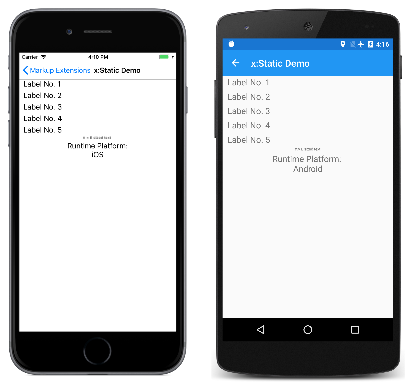
The x:Static Demo page demonstrates several ways to use the x:Static markup extension. The most verbose approach instantiates the StaticExtension class between Label.FontSize property-element tags:
<ContentPage xmlns="http://xamarin.com/schemas/2014/forms"
             xmlns:x="http://schemas.microsoft.com/winfx/2009/xaml"
             xmlns:sys="clr-namespace:System;assembly=netstandard"
             xmlns:local="clr-namespace:MarkupExtensions"
             x:Class="MarkupExtensions.StaticDemoPage"
             Title="x:Static Demo">
    <StackLayout Margin="10, 0">
        <Label Text="Label No. 1">
            <Label.FontSize>
                <x:StaticExtension Member="local:AppConstants.NormalFontSize" />
            </Label.FontSize>
        </Label>

        ···

    </StackLayout>
</ContentPage>
The XAML parser also allows the StaticExtension class to be abbreviated as x:Static:
<Label Text="Label No. 2">
    <Label.FontSize>
        <x:Static Member="local:AppConstants.NormalFontSize" />
    </Label.FontSize>
</Label>
This can be simplified even further, but the change introduces some new syntax: It consists of putting the StaticExtension class and the member setting in curly braces. The resulting expression is set directly to the FontSize attribute:
<Label Text="Label No. 3"
       FontSize="{x:StaticExtension Member=local:AppConstants.NormalFontSize}" />
Notice that there are no quotation marks within the curly braces. The Member property of StaticExtension is no longer an XML attribute. It is instead part of the expression for the markup extension.
Just as you can abbreviate x:StaticExtension to x:Static when you use it as an object element, you can also abbreviate it in the expression within curly braces:
<Label Text="Label No. 4"
       FontSize="{x:Static Member=local:AppConstants.NormalFontSize}" />
The StaticExtension class has a ContentProperty attribute referencing the property Member, which marks this property as the class's default content property. For XAML markup extensions expressed with curly braces, you can eliminate the Member= part of the expression:
<Label Text="Label No. 5"
       FontSize="{x:Static local:AppConstants.NormalFontSize}" />
This is the most common form of the x:Static markup extension.
The Static Demo page contains two other examples. The root tag of the XAML file contains an XML namespace declaration for the .NET System namespace:
xmlns:sys="clr-namespace:System;assembly=netstandard"
This allows the Label font size to be set to the static field Math.PI. That results in rather small text, so the Scale property is set to Math.E:
<Label Text="π × E sized text"
FontSize="{x:Static sys:Math.PI}"
Scale="{x:Static sys:Math.E}"
HorizontalOptions="Center" />
The final example displays the Device.RuntimePlatform value. The Environment.NewLine static property is used to insert a new-line character between the two Span objects:
<Label HorizontalTextAlignment="Center"
       FontSize="{x:Static local:AppConstants.NormalFontSize}">
    <Label.FormattedText>
        <FormattedString>
            <Span Text="Runtime Platform: " />
            <Span Text="{x:Static sys:Environment.NewLine}" />
            <Span Text="{x:Static Device.RuntimePlatform}" />
        </FormattedString>
    </Label.FormattedText>
</Label>
Here's the sample running:
x:Reference markup extension
The x:Reference markup extension is supported by the ReferenceExtension class. The class has a single property named Name of type string that you set to the name of an element on the page that has been given a name with x:Name. This Name property is the content property of ReferenceExtension, so Name= is not required when x:Reference appears in curly braces.
The x:Reference markup extension is used exclusively with data bindings, which are described in more detail in the article Data Binding.
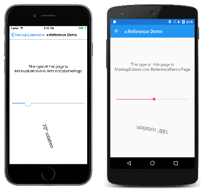
The x:Reference Demo page shows two uses of x:Reference with data bindings, the first where it's used to set the Source property of the Binding object, and the second where it's used to set the BindingContext property for two data bindings:
<ContentPage xmlns="http://xamarin.com/schemas/2014/forms"
xmlns:x="http://schemas.microsoft.com/winfx/2009/xaml"
x:Class="MarkupExtensions.ReferenceDemoPage"
x:Name="page"
Title="x:Reference Demo">
<StackLayout Margin="10, 0">
<Label Text="{Binding Source={x:Reference page},
StringFormat='The type of this page is {0}'}"
FontSize="18"
VerticalOptions="CenterAndExpand"
HorizontalTextAlignment="Center" />
<Slider x:Name="slider"
Maximum="360"
VerticalOptions="Center" />
<Label BindingContext="{x:Reference slider}"
Text="{Binding Value, StringFormat='{0:F0}° rotation'}"
Rotation="{Binding Value}"
FontSize="24"
HorizontalOptions="Center"
VerticalOptions="CenterAndExpand" />
</StackLayout>
</ContentPage>
Both x:Reference expressions use the abbreviated version of the ReferenceExtension class name and eliminate the Name= part of the expression. In the first example, the x:Reference markup extension is embedded in the Binding markup extension. Notice that the Source and StringFormat settings are separated by commas. Here's the program running:
x:Type markup extension
The x:Type markup extension is the XAML equivalent of the C# typeof keyword. It is supported by the TypeExtension class, which defines one property named TypeName of type string that is set to a class or structure name. The x:Type markup extension returns the System.Type object of that class or structure. TypeName is the content property of TypeExtension, so TypeName= is not required when x:Type appears with curly braces.
Within Xamarin.Forms, there are several properties that have arguments of type Type. Examples include the TargetType property of Style, and the x:TypeArguments attribute used to specify arguments in generic classes. However, the XAML parser performs the typeof operation automatically, and the x:Type markup extension is not used in these cases.
One place where x:Type is required is with the x:Array markup extension, which is described in the next section.
The x:Type markup extension is also useful when constructing a menu where each menu item corresponds to an object of a particular type. You can associate a Type object with each menu item, and then instantiate the object when the menu item is selected.
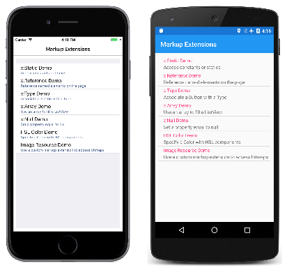
This is how the navigation menu in MainPage in the Markup Extensions program works. The MainPage.xaml file contains a TableView with each TextCell corresponding to a particular page in the program:
<ContentPage xmlns="http://xamarin.com/schemas/2014/forms"
             xmlns:x="http://schemas.microsoft.com/winfx/2009/xaml"
             xmlns:local="clr-namespace:MarkupExtensions"
             x:Class="MarkupExtensions.MainPage"
             Title="Markup Extensions"
             Padding="10">
    <TableView Intent="Menu">
        <TableRoot>
            <TableSection>
                <TextCell Text="x:Static Demo"
                          Detail="Access constants or statics"
                          Command="{Binding NavigateCommand}"
                          CommandParameter="{x:Type local:StaticDemoPage}" />

                <TextCell Text="x:Reference Demo"
                          Detail="Reference named elements on the page"
                          Command="{Binding NavigateCommand}"
                          CommandParameter="{x:Type local:ReferenceDemoPage}" />

                <TextCell Text="x:Type Demo"
                          Detail="Associate a Button with a Type"
                          Command="{Binding NavigateCommand}"
                          CommandParameter="{x:Type local:TypeDemoPage}" />

                <TextCell Text="x:Array Demo"
                          Detail="Use an array to fill a ListView"
                          Command="{Binding NavigateCommand}"
                          CommandParameter="{x:Type local:ArrayDemoPage}" />

                ···

        </TableRoot>
    </TableView>
</ContentPage>
Here's the opening main page in Markup Extensions:
Each CommandParameter property is set to an x:Type markup extension that references one of the other pages. The Command property is bound to a property named NavigateCommand. This property is defined in the MainPage code-behind file:
public partial class MainPage : ContentPage
{
    public MainPage()
    {
        InitializeComponent();

        NavigateCommand = new Command<Type>(async (Type pageType) =>
        {
            Page page = (Page)Activator.CreateInstance(pageType);
            await Navigation.PushAsync(page);
        });

        BindingContext = this;
    }

    public ICommand NavigateCommand { private set; get; }
}
The NavigateCommand property is a Command object that implements an execute command with an argument of type Type — the value of CommandParameter. The method uses Activator.CreateInstance to instantiate the page and then navigates to it. The constructor concludes by setting the BindingContext of the page to itself, which enables the Binding on Command to work. See the Data Binding article and particularly the Commanding article for more details about this type of code.
The x:Type Demo page uses a similar technique to instantiate Xamarin.Forms elements and to add them to a StackLayout. The XAML file initially consists of three Button elements with their Command properties set to a Binding and the CommandParameter properties set to types of three Xamarin.Forms views:
<ContentPage xmlns="http://xamarin.com/schemas/2014/forms"
             xmlns:x="http://schemas.microsoft.com/winfx/2009/xaml"
             x:Class="MarkupExtensions.TypeDemoPage"
             Title="x:Type Demo">

    <StackLayout x:Name="stackLayout"
                 Padding="10, 0">

        <Button Text="Create a Slider"
                HorizontalOptions="Center"
                VerticalOptions="CenterAndExpand"
                Command="{Binding CreateCommand}"
                CommandParameter="{x:Type Slider}" />

        <Button Text="Create a Stepper"
                HorizontalOptions="Center"
                VerticalOptions="CenterAndExpand"
                Command="{Binding CreateCommand}"
                CommandParameter="{x:Type Stepper}" />

        <Button Text="Create a Switch"
                HorizontalOptions="Center"
                VerticalOptions="CenterAndExpand"
                Command="{Binding CreateCommand}"
                CommandParameter="{x:Type Switch}" />
    </StackLayout>
</ContentPage>
The code-behind file defines and initializes the CreateCommand property:
public partial class TypeDemoPage : ContentPage
{
    public TypeDemoPage()
    {
        InitializeComponent();

        CreateCommand = new Command<Type>((Type viewType) =>
        {
            View view = (View)Activator.CreateInstance(viewType);
            view.VerticalOptions = LayoutOptions.CenterAndExpand;
            stackLayout.Children.Add(view);
        });

        BindingContext = this;
    }

    public ICommand CreateCommand { private set; get; }
}
The method that is executed when a Button is pressed creates a new instance of the argument, sets its VerticalOptions property, and adds it to the StackLayout. The three Button elements then share the page with dynamically created views:
x:Array markup extension
The x:Array markup extension enables you to define an array in markup. It is supported by the ArrayExtension class, which defines two properties:
Typeof typeType, which indicates the type of the elements in the array.Itemsof typeIList, which is a collection of the items themselves. This is the content property ofArrayExtension.
The x:Array markup extension itself never appears in curly braces. Instead, x:Array start and end tags delimit the list of items. Set the Type property to an x:Type markup extension.
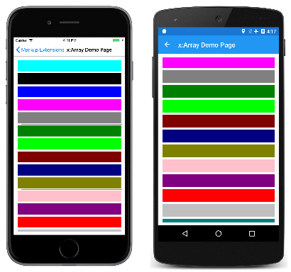
The x:Array Demo page shows how to use x:Array to add items to a ListView by setting the ItemsSource property to an array:
<ContentPage xmlns="http://xamarin.com/schemas/2014/forms"
             xmlns:x="http://schemas.microsoft.com/winfx/2009/xaml"
             x:Class="MarkupExtensions.ArrayDemoPage"
             Title="x:Array Demo Page">
    <ListView Margin="10">
        <ListView.ItemsSource>
            <x:Array Type="{x:Type Color}">
                <Color>Aqua</Color>
                <Color>Black</Color>
                <Color>Blue</Color>
                <Color>Fuchsia</Color>
                <Color>Gray</Color>
                <Color>Green</Color>
                <Color>Lime</Color>
                <Color>Maroon</Color>
                <Color>Navy</Color>
                <Color>Olive</Color>
                <Color>Pink</Color>
                <Color>Purple</Color>
                <Color>Red</Color>
                <Color>Silver</Color>
                <Color>Teal</Color>
                <Color>White</Color>
                <Color>Yellow</Color>
            </x:Array>
        </ListView.ItemsSource>

        <ListView.ItemTemplate>
            <DataTemplate>
                <ViewCell>
                    <BoxView Color="{Binding}"
                             Margin="3" />
                </ViewCell>
            </DataTemplate>
        </ListView.ItemTemplate>
    </ListView>
</ContentPage>
The ViewCell creates a simple BoxView for each color entry:
There are several ways to specify the individual Color items in this array. You can use an x:Static markup extension:
<x:Static Member="Color.Blue" />
Or, you can use StaticResource to retrieve a color from a resource dictionary:
<StaticResource Key="myColor" />
Towards the end of this article, you'll see a custom XAML markup extension that also creates a new color value:
<local:HslColor H="0.5" S="1.0" L="0.5" />
When defining arrays of common types like strings or numbers, use the tags listed in the Passing Constructor Arguments article to delimit the values.
x:Null markup extension
The x:Null markup extension is supported by the NullExtension class. It has no properties and is simply the XAML equivalent of the C# null keyword.
The x:Null markup extension is rarely needed and seldom used, but if you do find a need for it, you'll be glad that it exists.
The x:Null Demo page illustrates one scenario when x:Null might be convenient. Suppose that you define an implicit Style for Label that includes a Setter that sets the FontFamily property to a platform-dependent family name:
<ContentPage xmlns="http://xamarin.com/schemas/2014/forms"
             xmlns:x="http://schemas.microsoft.com/winfx/2009/xaml"
             x:Class="MarkupExtensions.NullDemoPage"
             Title="x:Null Demo">
    <ContentPage.Resources>
        <ResourceDictionary>
            <Style TargetType="Label">
                <Setter Property="FontSize" Value="48" />
                <Setter Property="FontFamily">
                    <Setter.Value>
                        <OnPlatform x:TypeArguments="x:String">
                            <On Platform="iOS" Value="Times New Roman" />
                            <On Platform="Android" Value="serif" />
                            <On Platform="UWP" Value="Times New Roman" />
                        </OnPlatform>
                    </Setter.Value>
                </Setter>
            </Style>
        </ResourceDictionary>
    </ContentPage.Resources>

    <ContentPage.Content>
        <StackLayout Padding="10, 0">
            <Label Text="Text 1" />
            <Label Text="Text 2" />

            <Label Text="Text 3"
                   FontFamily="{x:Null}" />

            <Label Text="Text 4" />
            <Label Text="Text 5" />
        </StackLayout>
    </ContentPage.Content>
</ContentPage>
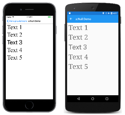
Then you discover that for one of the Label elements, you want all the property settings in the implicit Style except for the FontFamily, which you want to be the default value. You could define another Style for that purpose but a simpler approach is simply to set the FontFamily property of the particular Label to x:Null, as demonstrated in the center Label.
Here's the program running:
Notice that four of the Label elements have a serif font, but the center Label has the default sans-serif font.
OnPlatform markup extension
The OnPlatform markup extension enables you to customize UI appearance on a per-platform basis. It provides the same functionality as the OnPlatform and On classes, but with a more concise representation.
The OnPlatform markup extension is supported by the OnPlatformExtension class, which defines the following properties:
Defaultof typeobject, that you set to a default value to be applied to the properties that represent platforms.Androidof typeobject, that you set to a value to be applied on Android.GTKof typeobject, that you set to a value to be applied on GTK platforms.iOSof typeobject, that you set to a value to be applied on iOS.macOSof typeobject, that you set to a value to be applied on macOS.Tizenof typeobject, that you set to a value to be applied on the Tizen platform.UWPof typeobject, that you set to a value to be applied on the Universal Windows Platform.WPFof typeobject, that you set to a value to be applied on the Windows Presentation Foundation platform.Converterof typeIValueConverter, that can be set to anIValueConverterimplementation.ConverterParameterof typeobject, that can be set to a value to pass to theIValueConverterimplementation.
Note
The XAML parser allows the OnPlatformExtension class to be abbreviated as OnPlatform.
The Default property is the content property of OnPlatformExtension. Therefore, for XAML markup expressions expressed with curly braces, you can eliminate the Default= part of the expression provided that it's the first argument. If the Default property isn't set, it will default to the BindableProperty.DefaultValue property value, provided that the markup extension is targeting a BindableProperty.
Important
The XAML parser expects that values of the correct type will be provided to properties consuming the OnPlatform markup extension. If type conversion is necessary, the OnPlatform markup extension will attempt to perform it using the default converters provided by Xamarin.Forms. However, there are some type conversions that can't be performed by the default converters and in these cases the Converter property should be set to an IValueConverter implementation.
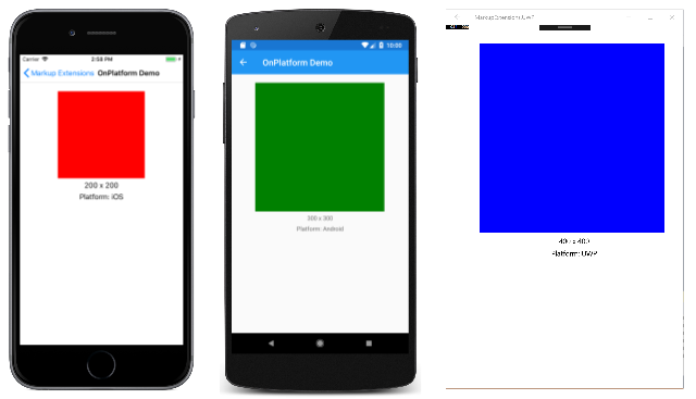
The OnPlatform Demo page shows how to use the OnPlatform markup extension:
<BoxView Color="{OnPlatform Yellow, iOS=Red, Android=Green, UWP=Blue}"
         WidthRequest="{OnPlatform 250, iOS=200, Android=300, UWP=400}"
         HeightRequest="{OnPlatform 250, iOS=200, Android=300, UWP=400}"
         HorizontalOptions="Center" />
In this example, all three OnPlatform expressions use the abbreviated version of the OnPlatformExtension class name. The three OnPlatform markup extensions set the Color, WidthRequest, and HeightRequest properties of the BoxView to different values on iOS, Android, and UWP. The markup extensions also provide default values for these properties on the platforms that aren't specified, while eliminating the Default= part of the expression. Notice that the markup extension properties that are set are separated by commas.
Here's the program running:
OnIdiom markup extension
The OnIdiom markup extension enables you to customize UI appearance based on the idiom of the device the application is running on. It's supported by the OnIdiomExtension class, which defines the following properties:
Defaultof typeobject, that you set to a default value to be applied to the properties that represent device idioms.Phoneof typeobject, that you set to a value to be applied on phones.Tabletof typeobject, that you set to a value to be applied on tablets.Desktopof typeobject, that you set to a value to be applied on desktop platforms.TVof typeobject, that you set to a value to be applied on TV platforms.Watchof typeobject, that you set to a value to be applied on Watch platforms.Converterof typeIValueConverter, that can be set to anIValueConverterimplementation.ConverterParameterof typeobject, that can be set to a value to pass to theIValueConverterimplementation.
Note
The XAML parser allows the OnIdiomExtension class to be abbreviated as OnIdiom.
The Default property is the content property of OnIdiomExtension. Therefore, for XAML markup expressions expressed with curly braces, you can eliminate the Default= part of the expression provided that it's the first argument.
Important
The XAML parser expects that values of the correct type will be provided to properties consuming the OnIdiom markup extension. If type conversion is necessary, the OnIdiom markup extension will attempt to perform it using the default converters provided by Xamarin.Forms. However, there are some type conversions that can't be performed by the default converters and in these cases the Converter property should be set to an IValueConverter implementation.
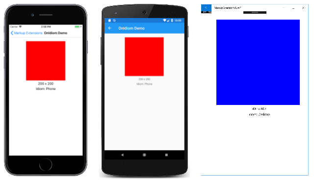
The OnIdiom Demo page shows how to use the OnIdiom markup extension:
<BoxView Color="{OnIdiom Yellow, Phone=Red, Tablet=Green, Desktop=Blue}"
         WidthRequest="{OnIdiom 100, Phone=200, Tablet=300, Desktop=400}"
         HeightRequest="{OnIdiom 100, Phone=200, Tablet=300, Desktop=400}"
         HorizontalOptions="Center" />
In this example, all three OnIdiom expressions use the abbreviated version of the OnIdiomExtension class name. The three OnIdiom markup extensions set the Color, WidthRequest, and HeightRequest properties of the BoxView to different values on the phone, tablet, and desktop idioms. The markup extensions also provide default values for these properties on the idioms that aren't specified, while eliminating the Default= part of the expression. Notice that the markup extension properties that are set are separated by commas.
Here's the program running:
DataTemplate markup extension
The DataTemplate markup extension enables you to convert a type into a DataTemplate. It's supported by the DataTemplateExtension class, which defines a TypeName property, of type string, that is set to the name of the type to be converted into a DataTemplate. The TypeName property is the content property of DataTemplateExtension. Therefore, for XAML markup expressions expressed with curly braces, you can eliminate the TypeName= part of the expression.
Note
The XAML parser allows the DataTemplateExtension class to be abbreviated as DataTemplate.
A typical usage of this markup extension is in a Shell application, as shown in the following example:
<ShellContent Title="Monkeys"
              Icon="monkey.png"
              ContentTemplate="{DataTemplate views:MonkeysPage}" />
In this example, MonkeysPage is converted from a ContentPage to a DataTemplate, which is set as the value of the ShellContent.ContentTemplate property. This ensures that MonkeysPage is only created when navigation to the page occurs, rather than at application startup.
For more information about Shell applications, see Xamarin.Forms Shell.
FontImage markup extension
The FontImage markup extension enables you to display a font icon in any view that can display an ImageSource. It provides the same functionality as the FontImageSource class, but with a more concise representation.
The FontImage markup extension is supported by the FontImageExtension class, which defines the following properties:
FontFamilyof typestring, the font family to which the font icon belongs.Glyphof typestring, the unicode character value of the font icon.Colorof typeColor, the color to be used when displaying the font icon.Sizeof typedouble, the size, in device-independent units, of the rendered font icon. The default value is 30. In addition, this property can be set to a named font size.
Note
The XAML parser allows the FontImageExtension class to be abbreviated as FontImage.
The Glyph property is the content property of FontImageExtension. Therefore, for XAML markup expressions expressed with curly braces, you can eliminate the Glyph= part of the expression provided that it's the first argument.
The FontImage Demo page shows how to use the FontImage markup extension:
<Image BackgroundColor="#D1D1D1"
Source="{FontImage , FontFamily={OnPlatform iOS=Ionicons, Android=ionicons.ttf#}, Size=44}" />
In this example, the abbreviated version of the FontImageExtension class name is used to display an XBox icon, from the Ionicons font family, in an Image. The expression also uses the OnPlatform markup extension to specify different FontFamily property values on iOS and Android. In addition, the Glyph= part of the expression is eliminated, and the markup extension properties that are set are separated by commas. Note that while the unicode character for the icon is \uf30c, it has to be escaped in XAML and so becomes .
Here's the program running:
For information about displaying font icons by specifying the font icon data in a FontImageSource object, see Display font icons.
AppThemeBinding markup extension
The AppThemeBinding markup extension enables you to specify a resource to be consumed, such as an image or color, based on the current system theme.
Important
The AppThemeBinding markup extension has minimum operating system requirements. For more information, see Respond to system theme changes in Xamarin.Forms applications.
The AppThemeBinding markup extension is supported by the AppThemeBindingExtension class, which defines the following properties:
Default, of typeobject, that you set to the resource to be used by default.Light, of typeobject, that you set to the resource to be used when the device is using its light theme.Dark, of typeobject, that you set to the resource to be used when the device is using its dark theme.Value, of typeobject, that returns the resource that's currently being used by the markup extension.
Note
The XAML parser allows the AppThemeBindingExtension class to be abbreviated as AppBindingTheme.
The Default property is the content property of AppThemeBindingExtension. Therefore, for XAML markup expressions expressed with curly braces, you can eliminate the Default= part of the expression provided that it's the first argument.
The AppThemeBinding Demo page shows how to use the AppThemeBinding markup extension:
<ContentPage xmlns="http://xamarin.com/schemas/2014/forms"
             xmlns:x="http://schemas.microsoft.com/winfx/2009/xaml"
             x:Class="MarkupExtensions.AppThemeBindingDemoPage"
             Title="AppThemeBinding Demo">
    <ContentPage.Resources>

        <Style x:Key="labelStyle"
               TargetType="Label">
            <Setter Property="TextColor"
                    Value="{AppThemeBinding Black, Light=Blue, Dark=Teal}" />
        </Style>

    </ContentPage.Resources>
    <StackLayout Margin="20">
        <Label Text="This text is green in light mode, and red in dark mode."
               TextColor="{AppThemeBinding Light=Green, Dark=Red}" />
        <Label Text="This text is black by default, blue in light mode, and teal in dark mode."
               Style="{StaticResource labelStyle}" />
    </StackLayout>
</ContentPage>
In this example, the text color of the first Label is set to green when the device is using its light theme, and is set to red when the device is using its dark theme. The second Label has its TextColor property set through a Style. This Style sets the text color of the Label to black by default, to blue when the device is using its light theme, and to teal when the device is using its dark theme.
Here's the program running:

Define markup extensions
If you've encountered a need for a XAML markup extension that isn't available in Xamarin.Forms, you can create your own.
