Layout for Tablet and Desktop apps
Xamarin.Forms supports all device types available on the supported platforms, so in addition to phones, apps can also run on:
- iPads,
- Android tablets,
- Windows tablets and desktop computers (running Windows 10).
This page briefly discusses:
- the supported device types, and
- how to optimize layouts for tablets versus phones.
Device Types
Larger screen devices are available for all of the platforms supported by Xamarin.Forms.
iPads (iOS)
The Xamarin.Forms template automatically includes iPad support by configuring the Info.plist > Devices setting to Universal (which means both iPhone and iPad are supported).
To provide a pleasant startup experience, and ensure the full screen resolution is used on all devices, you should make sure an iPad-specific launch screen (using a storyboard) is provided. This ensures the app is rendered correctly on iPad mini, iPad, and iPad Pro devices.
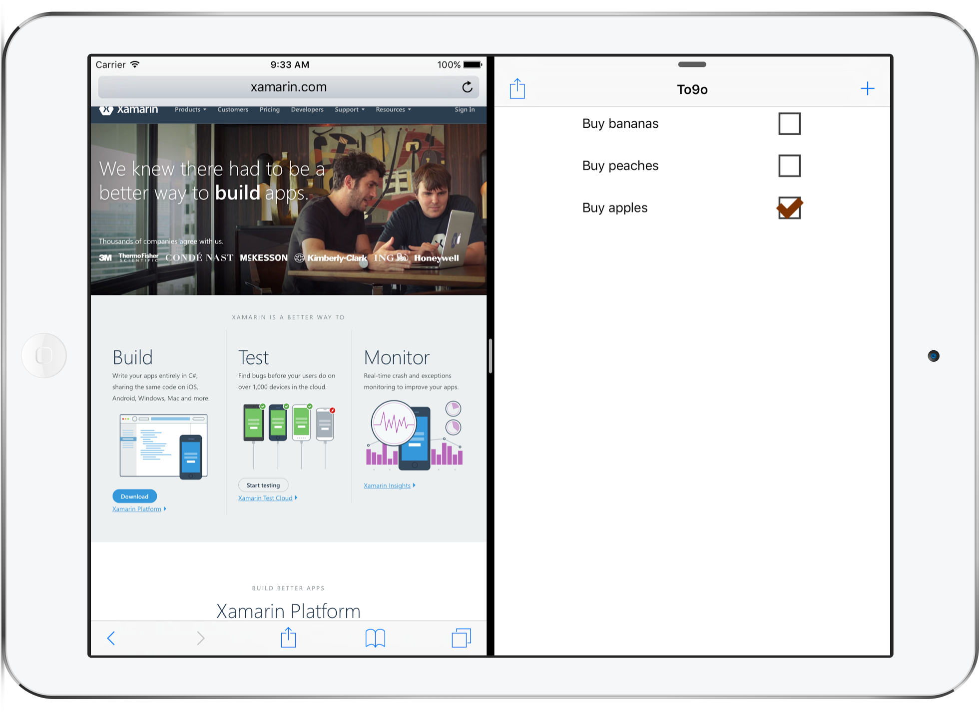
Prior to iOS 9 all apps took up the full screen on the device, but some iPads can now perform split screen multitasking. This means your app could take up just a slim column on the side of the screen, 50% of the width of the screen, or the entire screen.
Split-screen functionality means you should design your app to work well with as little as 320 pixels wide, or as much as 1366 pixels wide.
Android Tablets
The Android ecosystem has a myriad of supported screen sizes, from small phones up to large tablets. Xamarin.Forms can support all screen sizes, but as with the other platforms you might want to adjust your user interface for larger devices.
When supporting many different screen resolutions, you can provide your native image resources in different sizes to optimize the user experience. Review the Android resources documentation (and in particular creating resources for varying screen sizes) for more information on how to structure the folders and filenames in your Android app project to include optimized image resources in your app.
Windows Tablets and Desktops
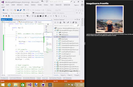
To support tablets and desktop computers running Windows, you'll need to use Windows UWP support, which builds universal apps that run on Windows 10.
Apps running on Windows tablets and desktops can be resized to arbitrary dimensions in addition to running full-screen.
Optimize for Tablet and Desktop
You can adjust your Xamarin.Forms user interface depending on whether a phone or tablet/desktop device is being used. This means you can optimize the user-experience for large-screen devices such as tablets and desktop computers.
Device.Idiom
You can use the Device
class to change the behavior of your app or user interface. Using the Device.Idiom
enumeration you can
if (Device.Idiom == TargetIdiom.Phone)
{
    HeroImage.Source = ImageSource.FromFile("hero.jpg");
} else {
    HeroImage.Source = ImageSource.FromFile("herotablet.jpg");
}
This approach can be expanded to make significant changes to individual page layouts, or even to render entirely different pages on larger screens.
Leverage FlyoutPage
The FlyoutPage
is ideal for larger screens, especially on the iPad
where it uses the UISplitViewController
to provide a native iOS experience.
Review this Xamarin blog post
to see how you can adapt your user interface so that phones use one
layout and larger screens can use another (with the FlyoutPage).

