Xamarin.Forms StackLayout
A StackLayout organizes child views in a one-dimensional stack, either horizontally or vertically. By default, a StackLayout is oriented vertically. In addition, a StackLayout can be used as a parent layout that contains other child layouts.
The StackLayout class defines the following properties:
Orientation, of typeStackOrientation, represents the direction in which child views are positioned. The default value of this property isVertical.Spacing, of typedouble, indicates the amount of space between each child view. The default value of this property is six device-independent units.
These properties are backed by BindableProperty objects, which means that the properties can be targets of data bindings and styled.
The StackLayout class derives from the Layout<T> class, which defines a Children property of type IList<T>. The Children property is the ContentProperty of the Layout<T> class, and therefore does not need to be explicitly set from XAML.
Tip
To obtain the best possible layout performance, follow the guidelines at Optimize layout performance.
Vertical orientation
The following XAML shows how to create a vertically oriented StackLayout that contains different child views:
<ContentPage xmlns="http://xamarin.com/schemas/2014/forms"
             xmlns:x="http://schemas.microsoft.com/winfx/2009/xaml"
             x:Class="StackLayoutDemos.Views.VerticalStackLayoutPage"
             Title="Vertical StackLayout demo">
    <StackLayout Margin="20">
        <Label Text="Primary colors" />
        <BoxView Color="Red" />
        <BoxView Color="Yellow" />
        <BoxView Color="Blue" />
        <Label Text="Secondary colors" />
        <BoxView Color="Green" />
        <BoxView Color="Orange" />
        <BoxView Color="Purple" />
    </StackLayout>
</ContentPage>
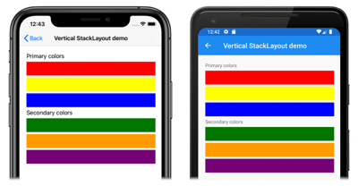
This example creates a vertical StackLayout containing Label and BoxView objects. By default, there are six device-independent units of space between the child views:
The equivalent C# code is:
public class VerticalStackLayoutPageCS : ContentPage
{
    public VerticalStackLayoutPageCS()
    {
        Title = "Vertical StackLayout demo";
        Content = new StackLayout
        {
            Margin = new Thickness(20),
            Children =
            {
                new Label { Text = "Primary colors" },
                new BoxView { Color = Color.Red },
                new BoxView { Color = Color.Yellow },
                new BoxView { Color = Color.Blue },
                new Label { Text = "Secondary colors" },
                new BoxView { Color = Color.Green },
                new BoxView { Color = Color.Orange },
                new BoxView { Color = Color.Purple }
            }
        };
    }
}
Note
The value of the Margin property represents the distance between an element and its adjacent elements. For more information, see Margin and Padding.
Horizontal orientation
The following XAML shows how to create a horizontally oriented StackLayout by setting its Orientation property to Horizontal:
<ContentPage xmlns="http://xamarin.com/schemas/2014/forms"
             xmlns:x="http://schemas.microsoft.com/winfx/2009/xaml"
             x:Class="StackLayoutDemos.Views.HorizontalStackLayoutPage"
             Title="Horizontal StackLayout demo">
    <StackLayout Margin="20"
                 Orientation="Horizontal"
                 HorizontalOptions="Center">
        <BoxView Color="Red" />
        <BoxView Color="Yellow" />
        <BoxView Color="Blue" />
        <BoxView Color="Green" />
        <BoxView Color="Orange" />
        <BoxView Color="Purple" />
    </StackLayout>
</ContentPage>
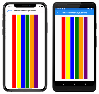
This example creates a horizontal StackLayout containing BoxView objects, with six device-independent units of space between the child views:
The equivalent C# code is:
public HorizontalStackLayoutPageCS()
{
    Title = "Horizontal StackLayout demo";
    Content = new StackLayout
    {
        Margin = new Thickness(20),
        Orientation = StackOrientation.Horizontal,
        HorizontalOptions = LayoutOptions.Center,
        Children =
        {
            new BoxView { Color = Color.Red },
            new BoxView { Color = Color.Yellow },
            new BoxView { Color = Color.Blue },
            new BoxView { Color = Color.Green },
            new BoxView { Color = Color.Orange },
            new BoxView { Color = Color.Purple }
        }
    };
}
Space between child views
The spacing between child views in a StackLayout can be changed by setting the Spacing property to a double value:
<ContentPage xmlns="http://xamarin.com/schemas/2014/forms"
             xmlns:x="http://schemas.microsoft.com/winfx/2009/xaml"
             x:Class="StackLayoutDemos.Views.StackLayoutSpacingPage"
             Title="StackLayout Spacing demo">
    <StackLayout Margin="20"
                 Spacing="0">
        <Label Text="Primary colors" />
        <BoxView Color="Red" />
        <BoxView Color="Yellow" />
        <BoxView Color="Blue" />
        <Label Text="Secondary colors" />
        <BoxView Color="Green" />
        <BoxView Color="Orange" />
        <BoxView Color="Purple" />
    </StackLayout>
</ContentPage>
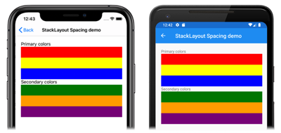
This example creates a vertical StackLayout containing Label and BoxView objects that have no spacing between them:
Tip
The Spacing property can be set to negative values to make child views overlap.
The equivalent C# code is:
public class StackLayoutSpacingPageCS : ContentPage
{
    public StackLayoutSpacingPageCS()
    {
        Title = "StackLayout Spacing demo";
        Content = new StackLayout
        {
            Margin = new Thickness(20),
            Spacing = 0,
            Children =
            {
                new Label { Text = "Primary colors" },
                new BoxView { Color = Color.Red },
                new BoxView { Color = Color.Yellow },
                new BoxView { Color = Color.Blue },
                new Label { Text = "Secondary colors" },
                new BoxView { Color = Color.Green },
                new BoxView { Color = Color.Orange },
                new BoxView { Color = Color.Purple }
            }
        };
    }
}
Position and size of child views
The size and position of child views within a StackLayout depends upon the values of the child views' HeightRequest and WidthRequest properties, and the values of their HorizontalOptions and VerticalOptions properties. In a vertical StackLayout, child views expand to fill the available width when their size isn't explicitly set. Similarly, in a horizontal StackLayout, child views expand to fill the available height when their size isn't explicitly set.
The HorizontalOptions and VerticalOptions properties of a StackLayout, and its child views, can be set to fields from the LayoutOptions struct, which encapsulates two layout preferences:
- Alignment determines the position and size of a child view within its parent layout.
- Expansion indicates if the child view should use extra space, if it's available.
Tip
Don't set the HorizontalOptions and VerticalOptions properties of a StackLayout unless you need to. The default values of LayoutOptions.Fill and LayoutOptions.FillAndExpand allow for the best layout optimization. Changing these properties has a cost and consumes memory, even when setting them back to the default values.
Alignment
The following XAML example sets alignment preferences on each child view in the StackLayout:
<ContentPage xmlns="http://xamarin.com/schemas/2014/forms"
             xmlns:x="http://schemas.microsoft.com/winfx/2009/xaml"
             x:Class="StackLayoutDemos.Views.AlignmentPage"
             Title="Alignment demo">
    <StackLayout Margin="20">
        <Label Text="Start"
               BackgroundColor="Gray"
               HorizontalOptions="Start" />
        <Label Text="Center"
               BackgroundColor="Gray"
               HorizontalOptions="Center" />
        <Label Text="End"
               BackgroundColor="Gray"
               HorizontalOptions="End" />
        <Label Text="Fill"
               BackgroundColor="Gray"
               HorizontalOptions="Fill" />
    </StackLayout>
</ContentPage>
In this example, alignment preferences are set on the Label objects to control their position within the StackLayout. The Start, Center, End, and Fill fields are used to define the alignment of the Label objects within the parent StackLayout:
A StackLayout only respects the alignment preferences on child views that are in the opposite direction to the StackLayout orientation. Therefore, the Label child views within the vertically oriented StackLayout set their HorizontalOptions properties to one of the alignment fields:
Start, which positions theLabelon the left-hand side of theStackLayout.Center, which centers theLabelin theStackLayout.End, which positions theLabelon the right-hand side of theStackLayout.Fill, which ensures that theLabelfills the width of theStackLayout.
The equivalent C# code is:
public class AlignmentPageCS : ContentPage
{
    public AlignmentPageCS()
    {
        Title = "Alignment demo";
        Content = new StackLayout
        {
            Margin = new Thickness(20),
            Children =
            {
                new Label { Text = "Start", BackgroundColor = Color.Gray, HorizontalOptions = LayoutOptions.Start },
                new Label { Text = "Center", BackgroundColor = Color.Gray, HorizontalOptions = LayoutOptions.Center },
                new Label { Text = "End", BackgroundColor = Color.Gray, HorizontalOptions = LayoutOptions.End },
                new Label { Text = "Fill", BackgroundColor = Color.Gray, HorizontalOptions = LayoutOptions.Fill }
            }
        };
    }
}
Expansion
The following XAML example sets expansion preferences on each Label in the StackLayout:
<ContentPage xmlns="http://xamarin.com/schemas/2014/forms"
             xmlns:x="http://schemas.microsoft.com/winfx/2009/xaml"
             x:Class="StackLayoutDemos.Views.ExpansionPage"
             Title="Expansion demo">
    <StackLayout Margin="20">
        <BoxView BackgroundColor="Red"
                 HeightRequest="1" />
        <Label Text="Start"
               BackgroundColor="Gray"
               VerticalOptions="StartAndExpand" />
        <BoxView BackgroundColor="Red"
                 HeightRequest="1" />
        <Label Text="Center"
               BackgroundColor="Gray"
               VerticalOptions="CenterAndExpand" />
        <BoxView BackgroundColor="Red"
                 HeightRequest="1" />
        <Label Text="End"
               BackgroundColor="Gray"
               VerticalOptions="EndAndExpand" />
        <BoxView BackgroundColor="Red"
                 HeightRequest="1" />
        <Label Text="Fill"
               BackgroundColor="Gray"
               VerticalOptions="FillAndExpand" />
        <BoxView BackgroundColor="Red"
                 HeightRequest="1" />
    </StackLayout>
</ContentPage>
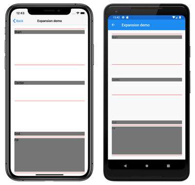
In this example, expansion preferences are set on the Label objects to control their size within the StackLayout. The StartAndExpand, CenterAndExpand, EndAndExpand, and FillAndExpand fields are used to define the alignment preference, and whether the Label will occupy more space if available within the parent StackLayout:
A StackLayout can only expand child views in the direction of its orientation. Therefore, the vertically oriented StackLayout can expand Label child views that set their VerticalOptions properties to one of the expansion fields. This means that, for vertical alignment, each Label occupies the same amount of space within the StackLayout. However, only the final Label, which sets its VerticalOptions property to FillAndExpand has a different size.
Tip
When using a StackLayout, ensure that only one child view is set to LayoutOptions.Expands. This property ensures that the specified child will occupy the largest space that the StackLayout can give to it, and it is wasteful to perform these calculations more than once.
The equivalent C# code is:
public ExpansionPageCS()
{
    Title = "Expansion demo";
    Content = new StackLayout
    {
        Margin = new Thickness(20),
        Children =
        {
            new BoxView { BackgroundColor = Color.Red, HeightRequest = 1 },
            new Label { Text = "StartAndExpand", BackgroundColor = Color.Gray, VerticalOptions = LayoutOptions.StartAndExpand },
            new BoxView { BackgroundColor = Color.Red, HeightRequest = 1 },
            new Label { Text = "CenterAndExpand", BackgroundColor = Color.Gray, VerticalOptions = LayoutOptions.CenterAndExpand },
            new BoxView { BackgroundColor = Color.Red, HeightRequest = 1 },
            new Label { Text = "EndAndExpand", BackgroundColor = Color.Gray, VerticalOptions = LayoutOptions.EndAndExpand },
            new BoxView { BackgroundColor = Color.Red, HeightRequest = 1 },
            new Label { Text = "FillAndExpand", BackgroundColor = Color.Gray, VerticalOptions = LayoutOptions.FillAndExpand },
            new BoxView { BackgroundColor = Color.Red, HeightRequest = 1 }
        }
    };
}
Important
When all the space in a StackLayout is used, expansion preferences have no effect.
For more information about alignment and expansion, see Layout Options in Xamarin.Forms.
Nested StackLayout objects
A StackLayout can be used as a parent layout that contains nested child StackLayout objects, or other child layouts.
The following XAML shows an example of nesting StackLayout objects:
<ContentPage xmlns="http://xamarin.com/schemas/2014/forms"
             xmlns:x="http://schemas.microsoft.com/winfx/2009/xaml"
             x:Class="StackLayoutDemos.Views.CombinedStackLayoutPage"
             Title="Combined StackLayouts demo">
    <StackLayout Margin="20">
        ...
        <Frame BorderColor="Black"
               Padding="5">
            <StackLayout Orientation="Horizontal"
                         Spacing="15">
                <BoxView Color="Red" />
                <Label Text="Red"
                       FontSize="Large"
                       VerticalOptions="Center" />
            </StackLayout>
        </Frame>
        <Frame BorderColor="Black"
               Padding="5">
            <StackLayout Orientation="Horizontal"
                         Spacing="15">
                <BoxView Color="Yellow" />
                <Label Text="Yellow"
                       FontSize="Large"
                       VerticalOptions="Center" />
            </StackLayout>
        </Frame>
        <Frame BorderColor="Black"
               Padding="5">
            <StackLayout Orientation="Horizontal"
                         Spacing="15">
                <BoxView Color="Blue" />
                <Label Text="Blue"
                       FontSize="Large"
                       VerticalOptions="Center" />
            </StackLayout>
        </Frame>
        ...
    </StackLayout>
</ContentPage>
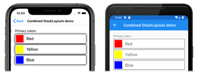
In this example, the parent StackLayout contains nested StackLayout objects inside Frame objects. The parent StackLayout is oriented vertically, while the child StackLayout objects are oriented horizontally:
Important
The deeper you nest StackLayout objects and other layouts, the more the nested layouts will impact performance. For more information, see Choose the correct layout.
The equivalent C# code is:
public class CombinedStackLayoutPageCS : ContentPage
{
    public CombinedStackLayoutPageCS()
    {
        Title = "Combined StackLayouts demo";
        Content = new StackLayout
        {
            Margin = new Thickness(20),
            Children =
            {
                new Label { Text = "Primary colors" },
                new Frame
                {
                    BorderColor = Color.Black,
                    Padding = new Thickness(5),
                    Content = new StackLayout
                    {
                        Orientation = StackOrientation.Horizontal,
                        Spacing = 15,
                        Children =
                        {
                            new BoxView { Color = Color.Red },
                            new Label { Text = "Red", FontSize = Device.GetNamedSize(NamedSize.Large, typeof(Label)), VerticalOptions = LayoutOptions.Center }
                        }
                    }
                },
                new Frame
                {
                    BorderColor = Color.Black,
                    Padding = new Thickness(5),
                    Content = new StackLayout
                    {
                        Orientation = StackOrientation.Horizontal,
                        Spacing = 15,
                        Children =
                        {
                            new BoxView { Color = Color.Yellow },
                            new Label { Text = "Yellow", FontSize = Device.GetNamedSize(NamedSize.Large, typeof(Label)), VerticalOptions = LayoutOptions.Center }
                        }
                    }
                },
                new Frame
                {
                    BorderColor = Color.Black,
                    Padding = new Thickness(5),
                    Content = new StackLayout
                    {
                        Orientation = StackOrientation.Horizontal,
                        Spacing = 15,
                        Children =
                        {
                            new BoxView { Color = Color.Blue },
                            new Label { Text = "Blue", FontSize = Device.GetNamedSize(NamedSize.Large, typeof(Label)), VerticalOptions = LayoutOptions.Center }
                        }
                    }
                },
                // ...
            }
        };
    }
}

