Container layouts
Containers such as Container, Column, TableCell, or an Adaptive Card itself support three different types of layouts:
- Layout.Stack stacks elements on top of each other and is the default layout.
- Layout.Flow spreads elements horizontally and wraps them across multiple rows, as needed.
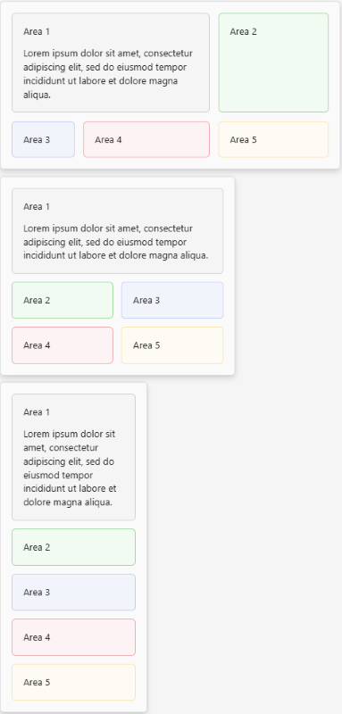
- Layout.AreaGrid divides the container into named
areasin to which elements can be placed through thegrid.areaproperty which can be set on any element.
Layout.Stack
A layout that stacks elements on top of each other. Layout.Stack is the default layout used by an Adaptive Card and all containers.
Here are the properties of the Layout.Stack layout:
| Name | Required | Type | Description |
|---|---|---|---|
type |
✔️ | String | Must be Layout.Stack. |
targetWidth |
String | Controls the card width for which the layout must be used. If targetWidth isn't specified, the element is rendered at all card widths. Using targetWidth makes it possible to author responsive cards that adapt their layout to the available horizontal space.For more information, see Adaptive Card responsive layout. Allowed values: VeryNarrow, Narrow, Standard, Wide, atLeast:VeryNarrow, atMost:VeryNarrow, atLeast:Narrow, atMost:Narrow, atLeast:Standard, atMost:Standard, atLeast:Wide, atMost:Wide |
Layout.Flow
A layout that spreads elements horizontally and wraps them across multiple rows, as needed.
Use Layout.Flow to lay out lists of elements such as images without having to worry about the amount of horizontal space available. The width and alignment of elements can be tuned as desired. Each row automatically gets the appropriate height, and spacing between columns and rows is configurable and automatically enforced.
Examples
Top-left alignment
Horizontally and vertically centered
Always fill the available space on each row
Tip
Don't use the maxItemWidth property with itemFit: fill. By definition, maxItemWidth prevents items from exceeding a certain width, which is incompatible with filling the remaining available space on a row by slightly enlarging each element in that row. Use the itemWidth property instead.
Here are the properties of the Layout.Stack layout:
| Name | Type | Default | Description |
|---|---|---|---|
type |
String | Must be Layout.Stack. |
|
columnSpacing |
String | "Default" | The space between items. Allowed values: None, ExtraSmall, Small, Default, Medium, Large, ExtraLarge, Padding |
horizontalItemsAlignment |
String | "Center" | Controls how the content of the container must be horizontally aligned. Allowed values: Left, Center, Right |
itemFit |
String | "Fit" | Controls how item must fit inside the container. Allowed values: Fit, Fill |
itemWidth |
String | The width, in pixels, of each item, in the <number>px format. Mustn't be used if maxItemWidth or minItemWidth, or both are set.Allowed values: <number>px |
|
maxItemWidth |
String | The maximum width, in pixels, of each item, in the <number>px format. Mustn't be used if itemWidth is set.Allowed values: <number>px |
|
minItemWidth |
String | 0 | The minimum width, in pixels, of each item, in the <number>px format. Mustn't be used if itemWidth is set.Allowed values: <number>px |
rowSpacing |
String | Default |
The space between rows of items. Allowed values: None, ExtraSmall, Small, Default, Medium, Large, ExtraLarge, Padding |
targetWidth |
String | Controls for which card width the layout must be used. If targetWidth isn't specified, the element is rendered at all card widths. Using targetWidth makes it possible to author responsive cards that adapt their layout to the available horizontal space.For more information, see Adaptive Card responsive layout. Allowed values: VeryNarrow, Narrow, Standard, Wide, atLeast:VeryNarrow, atMost:VeryNarrow, atLeast:Narrow, atMost:Narrow, atLeast:Standard, atMost:Standard, atLeast:Wide, atMost:Wide |
|
verticalItemsAlignment |
String | Top |
Controls how the content of the container must be vertically aligned. Allowed values: Top, Center, Bottom |
Layout.AreaGrid
A layout that divides a container into named areas into which elements can be placed.
Use Layout.AreaGrid to organize elements in an Adaptive Card, Container, Column, or TableCell into a grid. Layout.AreaGrid is useful for designing responsive cards: define multiple Layout.AreaGrid layouts on a single container and target them at different card widths to automatically switch from one layout to another at runtime according to the available width. To assign an element in the container to a specific area in the grid, its grid.area property must be set.
Example
Here are the properties of the Layout.AreaGrid layout:
| Name | Type | Default | Description |
|---|---|---|---|
type |
String | Must be Layout.AreaGrid. |
|
areas |
Array of objects | The areas in the grid layout. Allowed values: GridArea |
|
columns |
Array of numbers or strings | The columns in the grid layout, defined as a percentage of the available width or in pixels using the <number>px format. |
|
columnSpacing |
String | Default |
The space between columns. Allowed values: None, ExtraSmall, Small, Default, Medium, Large, ExtraLarge, Padding. |
rowSpacing |
String | Default |
The space between rows. Allowed values: None, ExtraSmall, Small, Default, Medium, Large, ExtraLarge, Padding. |
targetWidth |
String | Controls for which card width the layout must be used. Mustn't be used if itemWidth is set. If targetWidth isn't specified, the element is rendered at all card widths. Using targetWidth makes it possible to author responsive cards that adapt their layout to the available horizontal space.For more information, see Adaptive Card responsive layout. Allowed values: VeryNarrow, Narrow, Standard, Wide, atLeast:VeryNarrow, atMost:VeryNarrow, atLeast:Narrow, atMost:Narrow, atLeast:Standard, atMost:Standard, atLeast:Wide, atMost:Wide |
GridArea
Defines an area in a Layout.AreaGrid layout.
Here are the properties of the GridArea array:
| Name | Type | Default | Description |
|---|---|---|---|
columns |
Number | 1 | The start column index of the area. Column indices start at 1. |
columnSpan |
Number | 1 | Defines how many columns the area must span. |
name |
String | The name of the area. To place an element in this area, set its grid.area property to match the name of the area. |
|
row |
Number | 1 | The start row index of the area. Row indices start at 1. |
rowSpan |
Number | 1 | Defines how many rows the area must span. |
Using Container layouts to implement responsive layout
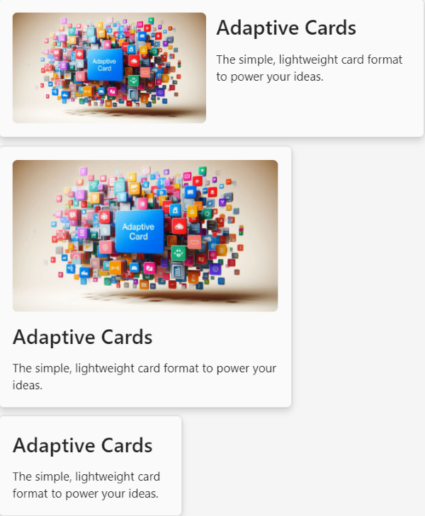
Container layouts can be used to implement responsive layouts, as it's possible to associate multiple layouts with a single container, each dedicated to a specific card width. At runtime, the appropriate layout is automatically used to arrange elements in the available width.
For example, if you want to define a card with a typical layout where:
- There's an image on the left
- Text on the right of the image
However, the text must appear below the image when there isn't enough horizontal space.
This can be done using Layout.AreaGrid:
How it works
Here, the layouts property is defined on the whole card:
{
    "type": "Layout.AreaGrid",
    "targetWidth": "atLeast:standard",
    "columns": [
        60
    ],
    "areas": [
        {
            "name": "image"
        },
        {
            "name": "text",
            "column": 2
        }
    ]
}
Which means:
- Organize elements in the card in a grid layout only when the width of the card is at least
standard(which corresponds to the typical width of a card in a Teams chat, for example).- If the width of the card is less than
standard, use the default layout,Layout.Stack.
- If the width of the card is less than
- The grid layout has at least one column that must use 60% of the available space. The grid might have other columns (depending on how
areasare defined) but because they aren't defined, they each share an equal portion of the remaining space. - Two areas are defined:
- One for the image, which maps to the first column and first row of the grid.
- One for the text, which covers the second column and first row.
Tip
Specifying the layouts property is not required. When no explicit layout is specified, the container will use a Layout.Stack layout.
The elements in the card's body are assigned a grid area through the grid.area property:
{
    "type": "Container",
    "grid.area": "textArea", // The text container is assigned to the textArea
    "items": [
      ...
    ]
}
{
    "type": "Image",
    "url": "...",
    "grid.area": "imageArea", // The Image is assigned to the imageArea
    "style": "RoundedCorners",
    "targetWidth": "atLeast:narrow" // Also notice the image is set to not display at all at the "very narrow" width
}
Code sample
| Name | Description | .Node.js | .NET |
|---|---|---|---|
| Cards Formatting | This sample app demonstrates the various container layouts in Adaptive Cards. | View | View |
See also
Platform Docs


