TableView
The .NET Multi-platform App UI (.NET MAUI) TableView displays a table of scrollable items that can be grouped into sections. A TableView is typically used for displaying items where each row has a different appearance, such as presenting a table of settings.
While TableView manages the appearance of the table, the appearance of each item in the table is defined by a Cell. .NET MAUI includes five cell types that are used to display different combinations of data, and you can also define custom cells that display any content you want.
TableView defines the following properties:
Intent, of typeTableIntent, defines the purpose of the table on iOS.HasUnevenRows, of typebool, indicates whether items in the table can have rows of different heights. The default value of this property isfalse.Root, of typeTableRoot, defines the child of the TableView.RowHeight, of typeint, determines the height of each row whenHasUnevenRowsisfalse.
The HasUnevenRows and RowHeight properties are backed by BindableProperty objects, which means that they can be targets of data bindings, and styled.
The value of the Intent property helps to define the TableView appearance on iOS only. This property should be set to a value of the TableIntent enumeration, which defines the following members:
Menu, for presenting a selectable menu.Settings, for presenting a table of configuration settings.Form, for presenting a data input form.Data, for presenting data.
Note
TableView isn't designed to support binding to a collection of items.
Create a TableView
To create a table, create a TableView object and set its Intent property to a TableIntent member. The child of a TableView must be a TableRoot object, which is parent to one or more TableSection objects. Each TableSection consists of an optional title whose color can also be set, and one or more Cell objects.
The following example shows how to create a TableView:
<TableView Intent="Menu">
    <TableRoot>
        <TableSection Title="Chapters">
            <TextCell Text="1. Introduction to .NET MAUI"
                      Detail="Learn about .NET MAUI and what it provides." />
            <TextCell Text="2. Anatomy of an app"
                      Detail="Learn about the visual elements in .NET MAUI" />
            <TextCell Text="3. Text"
                      Detail="Learn about the .NET MAUI controls that display text." />
            <TextCell Text="4. Dealing with sizes"
                      Detail="Learn how to size .NET MAUI controls on screen." />
            <TextCell Text="5. XAML vs code"
                      Detail="Learn more about creating your UI in XAML." />
        </TableSection>
    </TableRoot>
</TableView>
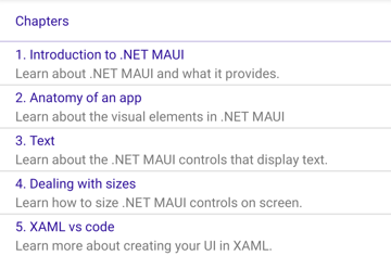
In this example, the TableView defines a menu using TextCell objects:

Note
Each TextCell can execute a command when tapped, provided that the Command property is set to a valid ICommand implementation.
Define cell appearance
Each item in a TableView is defined by a Cell object, and the Cell type used defines the appearance of the cell's data. .NET MAUI includes the following built-in cells:
- TextCell, which displays primary and secondary text on separate lines.
- ImageCell, which displays an image with primary and secondary text on separate lines.
- SwitchCell, which displays text and a switch that can be switched on or off.
- EntryCell, which displays a label and text that's editable.
- ViewCell, which is a custom cell whose appearance is defined by a View. This cell type should be used when you want to fully define the appearance of each item in a TableView.
Text cell
A TextCell displays primary and secondary text on separate lines. TextCell defines the following properties:
Text, of typestring, defines the primary text to be displayed.TextColor, of type Color, represents the color of the primary text.Detail, of typestring, defines the secondary text to be displayed.DetailColor, of type Color, indicates the color of the secondary text.Command, of type ICommand, defines the command that's executed when the cell is tapped.CommandParameter, of typeobject, represents the parameter that's passed to the command.
These properties are backed by BindableProperty objects, which means that they can be targets of data bindings, and styled.
The following example shows using a TextCell to define the appearance of items in a TableView:
<TableView Intent="Menu">
    <TableRoot>
        <TableSection Title="Chapters">
            <TextCell Text="1. Introduction to .NET MAUI"
                      Detail="Learn about .NET MAUI and what it provides." />
            <TextCell Text="2. Anatomy of an app"
                      Detail="Learn about the visual elements in .NET MAUI" />
            <TextCell Text="3. Text"
                      Detail="Learn about the .NET MAUI controls that display text." />
            <TextCell Text="4. Dealing with sizes"
                      Detail="Learn how to size .NET MAUI controls on screen." />
            <TextCell Text="5. XAML vs code"
                      Detail="Learn more about creating your UI in XAML." />
        </TableSection>
    </TableRoot>
</TableView>
The following screenshot shows the resulting cell appearance:

Image cell
An ImageCell displays an image with primary and secondary text on separate lines. ImageCell inherits the properties from TextCell, and defines the ImageSource property, of type ImageSource, which specifies the image to be displayed in the cell. This property is backed by a BindableProperty object, which means it can be the target of data bindings, and be styled.
The following example shows using an ImageCell to define the appearance of items in a TableView:
<TableView Intent="Menu">
    <TableRoot>
        <TableSection Title="Learn how to use your XBox">
            <ImageCell Text="1. Introduction"
                       Detail="Learn about your XBox and its capabilities."
                       ImageSource="xbox.png" />
            <ImageCell Text="2. Turn it on"
                       Detail="Learn how to turn on your XBox."
                       ImageSource="xbox.png" />
            <ImageCell Text="3. Connect your controller"
                       Detail="Learn how to connect your wireless controller."
                       ImageSource="xbox.png" />
            <ImageCell Text="4. Launch a game"
                       Detail="Learn how to launch a game."
                       ImageSource="xbox.png" />
        </TableSection>
    </TableRoot>
</TableView>
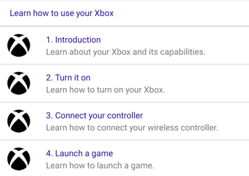
The following screenshot shows the resulting cell appearance:

Switch cell
A SwitchCell displays text and a switch that can be switched on or off. SwitchCell defines the following properties:
Text, of typestring, defines the text to display next to the switch.On, of typebool, represents whether the switch is on or off.OnColor, of type Color, indicates the color of the switch when in it's on position.
These properties are backed by BindableProperty objects, which means that they can be targets of data bindings, and styled.
SwitchCell also defines an OnChanged event that's raised when the switch changes state. The ToggledEventArgs object that accompanies this event defines a Value property, that indicates whether the switch is on or off.
The following example shows using a SwitchCell to define the appearance of items in a TableView:
<TableView Intent="Settings">
    <TableRoot>
        <TableSection>
            <SwitchCell Text="Airplane Mode"
                        On="False" />
            <SwitchCell Text="Notifications"
                        On="True" />
        </TableSection>
    </TableRoot>
</TableView>
The following screenshot shows the resulting cell appearance:

Entry cell
An EntryCell displays a label and text data that's editable. EntryCell defines the following properties:
HorizontalTextAlignment, of type TextAlignment, represents the horizontal alignment of the text.Keyboard, of typeKeyboard, determines the keyboard to display when entering text.- Label, of type
string, represents the text to display to the left of the editable text. LabelColor, of type Color, defines the color of the label text.Placeholder, of typestring, represents the text that's displayed when theTextproperty is empty.Text, of typestring, defines the text that's editable.VerticalTextAlignment, of type TextAlignment, represents the vertical alignment of the text.
These properties are backed by BindableProperty objects, which means that they can be targets of data bindings, and styled.
EntryCell also defines a Completed event that's raised when the user hits the return key, to indicate that editing is complete.
The following example shows using an EntryCell to define the appearance of items in a TableView:
<TableView Intent="Settings">
    <TableRoot>
        <TableSection>
            <EntryCell Label="Login"
                       Placeholder="username" />
            <EntryCell Label="Password"
                       Placeholder="password" />
        </TableSection>
    </TableRoot>
</TableView>
The following screenshot shows the resulting cell appearance:

View cell
A ViewCell is a custom cell whose appearance is defined by a View. ViewCell defines a View property, of type View, which defines the view that represents the content of the cell. This property is backed by a BindableProperty object, which means it can be the target of data bindings, and be styled.
Note
The View property is the content property of the ViewCell class, and therefore does not need to be explicitly set from XAML.
The following example shows using a ViewCell to define the appearance of an item in a TableView:
<TableView Intent="Settings">
    <TableRoot>
        <TableSection Title="Silent">
            <ViewCell>
                <Grid RowDefinitions="Auto,Auto"
                      ColumnDefinitions="0.5*,0.5*">
                    <Label Text="Vibrate"
                           Margin="10,10,0,0"/>
                    <Switch Grid.Column="1"
                            HorizontalOptions="End" />
                    <Slider Grid.Row="1"
                            Grid.ColumnSpan="2"
                            Margin="10"
                            Minimum="0"
                            Maximum="10"
                            Value="3" />
                </Grid>
            </ViewCell>
        </TableSection>
    </TableRoot>
</TableView>
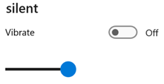
Inside the ViewCell, layout can be managed by any .NET MAUI layout. The following screenshot shows the resulting cell appearance:

Size items
By default, all cells of the same type in a TableView have the same height. However, this behavior can be changed with the HasUnevenRows and RowHeight properties. By default, the HasUnevenRows property is false.
The RowHeight property can be set to an int that represents the height of each item in the TableView, provided that HasUnevenRows is false. When HasUnevenRows is set to true, each item in the TableView can have a different height. The height of each item will be derived from the contents of each cell, and so each item will be sized to its content.
Individual cells can be programmatically resized at runtime by changing layout related properties of elements within the cell, provided that the HasUnevenRows property is true. The following example changes the height of the cell when it's tapped:
void OnViewCellTapped(object sender, EventArgs e)
{
    label.IsVisible = !label.IsVisible;
    viewCell.ForceUpdateSize();
}
In this example, the OnViewCellTapped event handler is executed in response to the cell being tapped. The event handler updates the visibility of the Label object and the Cell.ForceUpdateSize method updates the cell's size. If the Label has been made visible the cell's height will increase. If the Label has been made invisible the cell's height will decrease.
Warning
Overuse of dynamic item sizing can cause TableView performance to degrade.
Right-to-left layout
TableView can layout its content in a right-to-left flow direction by setting its FlowDirection property to RightToLeft. However, the FlowDirection property should ideally be set on a page or root layout, which causes all the elements within the page, or root layout, to respond to the flow direction:
<ContentPage xmlns="http://schemas.microsoft.com/dotnet/2021/maui"
             xmlns:x="http://schemas.microsoft.com/winfx/2009/xaml"
             x:Class="TableViewDemos.RightToLeftTablePage"
             Title="Right to left TableView"
             FlowDirection="RightToLeft">
    <TableView Intent="Settings">
        ...
    </TableView>
</ContentPage>
The default FlowDirection for an element with a parent is MatchParent. Therefore, the TableView inherits the FlowDirection property value from the ContentPage.
 Browse the sample