Adaptive Card Renderer Specification
The following specification describes how implement an Adaptive Card renderer on any native UI platform.
Important
This content is a work in progress and may be missing some details. Please let us know if you have any questions or feedback.
Parsing JSON
Error conditions
- A parser MUST check that it's valid JSON content
- A parser MUST validate against the schema (required properties, etc)
- The above errors MUST be reported to the host app (exception or equivalent)
Unknown types
- If unknown "types" are encountered they MUST BE DROPPED from the result
- Any alterations of the payload (like above) SHOULD be reported as warnings to the host app
Unknown properties
- A parser MUST include additional properties on elements
Additional considerations
- The
speakproperty MAY contain SSML markup and MUST be returned to the host app as-specified
Parsing Host Config
- TODO
Versioning
- A renderer MUST implement a particular version of the schema.
- The
AdaptiveCardconstructor MUST give theversionproperty a default value based on the current schema version - If a renderer encounters a
versionproperty in theAdaptiveCardthat is higher than the supported version, it MUST return thefallbackTextinstead.
Rendering
An AdaptiveCard consists of a body and actions. The body is a collection of CardElements that a renderer will enumerate and render in order.
- Each Element MUST stretch to the width of its parent (think
display: blockin HTML). - A renderer MUST ignore any unknown element types it encounters and continue rendering the rest of the payload.
Text, TextBlock and RichTextBlock
- A TextBlock MUST take up a single line unless the
wrapproperty istrue. - The text block SHOULD trim any excess text with an ellipsis (...)
Markdown
- Adaptive Cards allow for a subset of Markdown and SHOULD be supported in
TextBlock. - RichTextBlock DOES NOT support Markdown, and must be styled using the properties that are exposed.
- See full markdown requirements
Formatting functions
TextBlockallows DATE/TIME formatting functions that MUST be supported on every renderer.- ALL FAILURES MUST display the raw string in the card. No friendly message attempted. (The goal being to make the developer immediately aware there is a problem)
Images
- A renderer SHOULD allow host apps to know when all HTTP images have been downloaded and the card is "fully rendered"
- A renderer MUST inspect the Host Config
maxImageSizeparam when downloading HTTP images - A renderer MUST support
.pngand.jpeg - A renderer SHOULD support
.gifimages
Advanced Layout Behavior
The Renderer MUST take care to the following behaviors when rendering card elements with respect to the attributes mentioned in this doc.
The renderer should manage Constraints taking into account the various factors such as margin, padding, height and width etc configuration of the card elements and its children.
Width
- Allowed values -
auto,stretchand fixed values in terms ofpixelsandweight autoprovides sufficient space for expansion of width (supports min expansion)stretchtakes up the remaining width (supports max expansion)
Below below scenarios describes how the constraints are affected with different width combinations for columns
auto vs stretch
- Columns with
autoandstretchwidth.

- The first column with
autowidth takes sufficient space to display the content and the second column withstretchwidth takes up the entire space.
- Columns with only
stretchwidth

- Columns with only stretch width takes up the remaining spaces after dividing it equally.
auto,stretchandauto

The first and third columns width is adjusted first to accommodate the elements sufficiently and the second column with stretched width takes up the remaining space.
- Order of displaying elements with
autowidth columns

- Columns with
autowill position themselves to provide ample space for the content to render. - In case of Image views, images will downscale to fit the remaining width.
- Note: Images will downscale only for
stretchandautoimage size, but not for fixed width and height in pixels.
weights vs pixels
- Columns with
weightandpixelwidth combination

- The above card has three columns with the following width configuration -
Column1: Weight 50,Column2: 100px,Column3: Weight 50- The width of Column 2 is determined by the
pixel value - The width of Column 1 and 3 is adjusted based on the
weightsand the calculatedweight ratio.
- Columns with
weight,pixel widthandautoattributes

- The above card has four columns with the following width configuration -
Column1: Weight 50,Column2: 100px,Column3: Weight 50, andColumn4: auto- Note: Image view with
autowidth column downscales to adjust to the remaining space.
Precedence order of displaying elements with the width attribute
px > weight > auto > stretch
Height
Allowed values - auto and stretch
Below scenarios describes how the constraints are affected with different height combinations for card elements
- Elements expand freely vertically when card is not of fixed height

- Both the columns can expand sufficiently vertically irrespective of
autoandstretchvalues - This is with the
wrapproperty disabled for the text block.
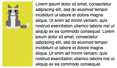
- The card below has the
wrapproperty enabled for the text block.
Spacing and Separator
- The
spacingproperty on every element influences the amount of space between the CURRENT element and the one BEFORE it. - Spacing MUST ONLY apply when there actually is an element preceding it. (E.g., won't apply to the first item in an array)
- A renderer MUST look up the amount of space to use from the
hostConfigspacing for the enum value applied to the current element. - If the element has a
separatorvalue oftrue, then a visible line MUST be drawn between the current element and the one before it. - The separator line MUST be drawn using the
container.style.default.foregroundColor. - A separator MUST ONLY be drawn if the item IS NOT the first in the array.
- Spacing - Allowed values
none,small,default,medium,large,extra largeandpadding
- Spacing attribute adds spacing between this element and the preceding element.
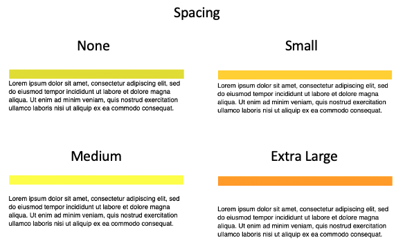
- Spacing attribute does not have any effect when its the first element in the view container.
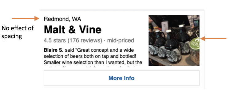
- The elements marked with arrow are the first elements among its siblings, so spacing has no effect.
- Separator - Possible values (on/off toggle)
- Draws a seperating line at the top of the element.
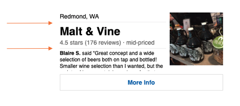
- Spacing and Seperator combination
- The constraints of the spacing and the seperator combination are illustrated below.
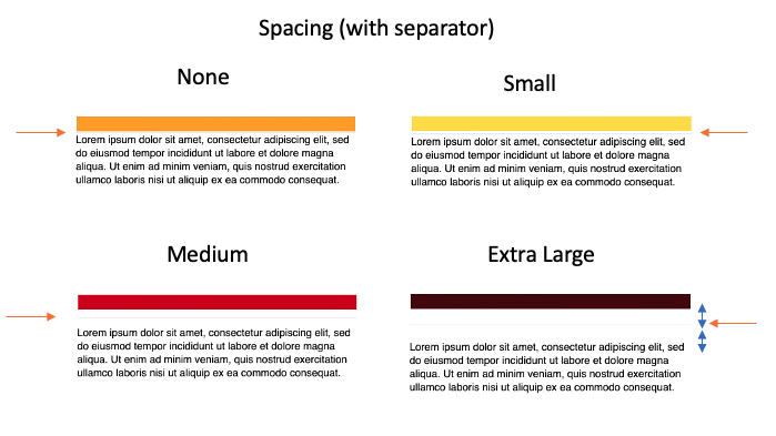
- The overall spacing distance is maintained with respect to the values provided.
- The seperator is added halfway in the middle of the spaced distance.
[Note. Need to confirm the distance where the seperator is inserted in the spacing area. Seems like the middle]
Container Styles
- Provides styling hints for containers such as columns and columnset
- Allowed values
none,default,emphasis,good,attention,warningandaccent - These predefined style options provides padding for the elements within the container and background color
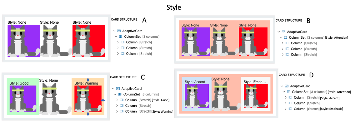
- Card A illustrates columns and columnset with no style options
- Card B illustrates columnset with Attention style. Notice the padding within the columnset container and the change in background color.
- Card C illustrates columns with styling only. Similar to the previous one, column includes padding and background change.
- Card D illustrates columns and columnset both with style options.
[Note. Need to check how the padding amount is determined. Is it determined by the host? ]
Bleed
- This property allows the container such as columns and columnset to bleed through its parent.
- Possible values
onandoff.
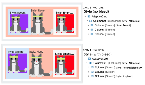
- Card A illustrates columns and columnset with regular styling.
- Card B illustrates the first column with bleed option. The content just bleeds through its boundaries to its parent's.
Image Size
Size attribute
- Allowed values -
auto,stretch,small,medium,large auto: Images will scale down to fit if needed, but will not scale up to fill the area.stretch: Image with both scale down and up to fit as needed.small,mediumandlarge: Image is displayed with a fixed width, where the width is determined by the host.
autovsstretch
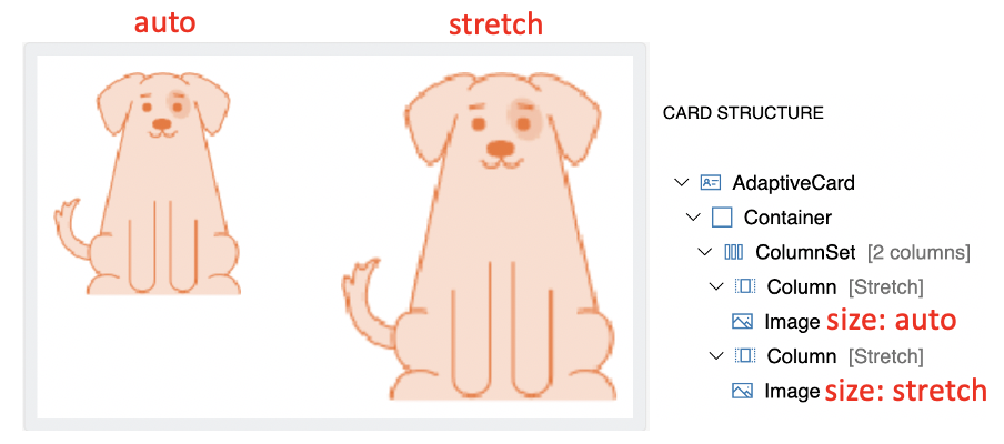
- Column width and Image Size combination
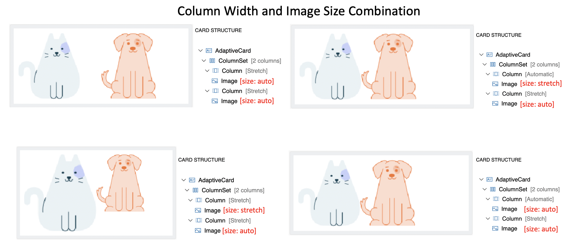
- Generally, Columns with
stretchwidth allow images to upscale freely withstretchsize. - Columns with
autowidth allows image to occupy exact space irrespective ofautoandstretchsize of image. - Column width takes more precedence in determining the image size in this arrangement.
Image Width (in pixels) attribute
- This provides the desired on-screen width of the image.
sizeproperty is overriden when a value is specified
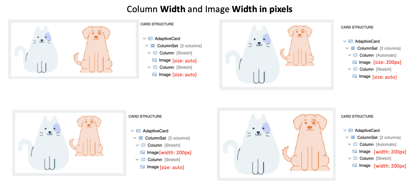
- The column with
autowidth will have more precedence thanstretchin providing room for image content in this arrangement.
Column Width (weight and pixel) and Image size (auto and stretch) Combination
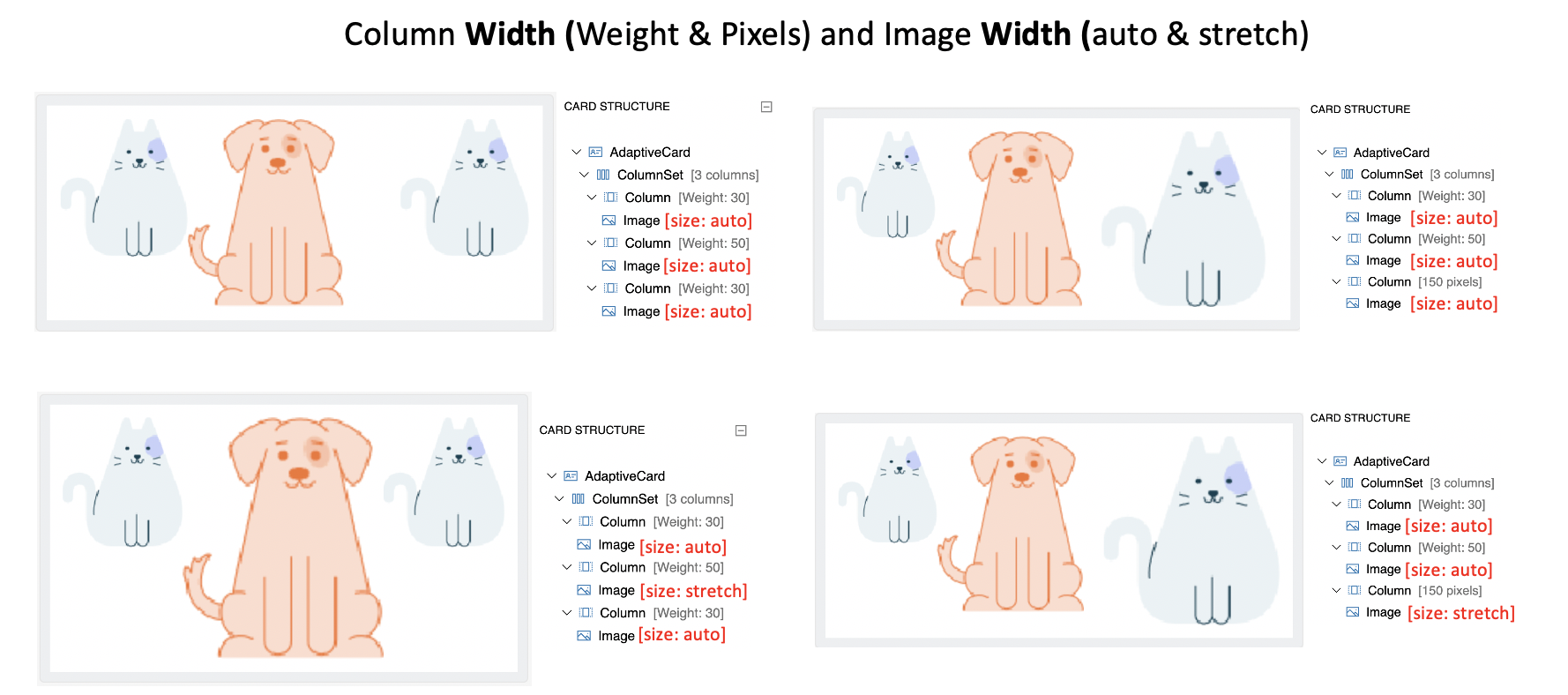
- Images with
autosize takes sufficient space for expansion (or downscales) within the column constraints ofweightandpixelwidth. - Images with
stretchsize can expand to fill the remaining space within the constraints of columnweightandpixelwidth.
Advanced Layout Summary
- Column width takes more precedence in determining the size of the image than its image size (auto, stretch, min width etc).
- The precedence of the column width taken to display its content sufficiently -
px>weight>auto>stretch - Image
size(auto, stretch) is ignored when Imagewidthandheightin px is provided. - Image
stretchsize attribute will upscale the image only when there is remaining space and column auto is notauto. - An image stretches itself to the limit where it maintain its aspect ratio in the space available in the column. In turn, the height expands freely.
Spacingattribute will not have any effect when its the first or the only element among its sibling.
Actions
- If HostConfig
supportsInteractivityisfalse, a renderer MUST NOT render any actions. - The
actionsproperty MUST be rendered as buttons in some kind of action bar, usually at the bottom of the card. - When a button is tapped it MUST allow the host app to handle the event.
- The event MUST pass along all associated properties with the action
- The event MUST pass along the
AdaptiveCardwhich was executed
| Action | Behavior |
|---|---|
| Action.OpenUrl | Open an external URL for viewing |
| Action.ShowCard | Requests a sub-card to be shown to the user. |
| Action.Submit | Ask for all of the input elements to be gathered up into an object which is then sent to you through some method defined by the host application. |
| Action.Execute | (Introduced in v1.4) Ask for all of the input elements to be gathered up into an object which is then sent to you through the "universal action pipeline" |
Action.OpenUrl
Action.OpenUrlSHOULD open a URL using the native platform mechanism- If this is not possible it MUST raise an event to the host app to handle opening the URL. This event MUST allow the host app to override the default behavior. E.g., let them open the URL within their own app.
Action.ShowCard
Action.ShowCardMUST be supported in some way, based on the hostConfig setting. There are two modes: inline, and popup. Inline cards SHOULD toggle the card visibility automatically. In popup mode, an event SHOULD be fired to the host app to show the card in some way.
Action.Submit
Action.Submitelement gathers input fields, merges with optional data field, and sends an event to the client.- A significant difference in the element behavior is present between 1.x and 2.x version of the ACL renderer.
The Submit Action behaves like an HTML form submit, except that where HTML typically triggers an HTTP post, Adaptive Cards leaves it up to each host app to determine what "submit" means to them.
- When this MUST raise an event the user taps the action invoked.
- The
dataproperty MUST be included in the callback payload. - For
Action.Submit, a renderer MUST gather all inputs on the card and retrieve their values.
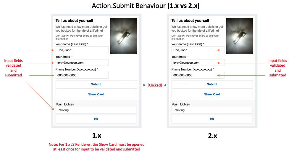
1.x Renderer- The inputs are collected from all fields irrespective of the where in the hierarchy the input field is present.2.x Renderer- The inputs are collected from fields present in parent container or as a sibling of theAction.Submitelement.
Action.Execute (Details coming later)
Action.Execute was introduced in version 1.4. We will provide implementation guidance for SDKs at a later date. Please reach out if you have questions on this topic.
selectAction
- If Host Config
supportedInteractivityisfalsethen aselectActionMUST NOT render as a touch target. Image,ColumnSet, andColumnoffer aselectActionproperty, which SHOULD be executed when the user invokes it, e.g., by tapping the element.
Inputs
- If HostConfig
supportsInteractivityisfalsea renderer MUST NOT render any inputs. - Inputs SHOULD render with the highest fidelity possible. For example, an
Input.Datewould ideally offer a date picker to a user, but if this isn't possible on your UI stack, then the renderer MUST fall back to rendering a standard text box. - A renderer SHOULD display the
placeholderTextif possible - Input value binding MUST be properly escaped
- Prior to v1.3, A renderer DOES NOT have to implement validation of the input. Users of Adaptive Cards must plan to validate any received data on their end.
- Input Labels and Validation were introduced in v1.3 of the Adaptive Cards Schema. Extra care must be taken to render the associated label, validation hints and error messages.
Styling, Customization and Extensibility APIs
Each SDK should provide a certain level of flexibilty to Host Apps in order to control the overall styling, and extend the schema as they see fit.
Host Config
- TODO: What should the defaults be? Should they all share it? Should we embed a common hostConfig.json file in the binaries?
HostConfig is a shared configuration object that specifies how an Adaptive Card Renderer generates UI.
This allows properties which are platform agnostic to be shared among renderers on different platforms and devices. It also allows tooling to be created which gives you an idea of the look and feel that card would have for a given environment.
- Renderers MUST expose a Host Config parameter to host apps
- All elements MUST be styled according to their respective Host Config settings
Native platform styling
- Each element type SHOULD attach a native platform style with the generated UI element. E.g., in HTML we added a CSS class to the element types, and in XAML we assign a specific Style.
Extensibility
- A renderer MUST allow host apps to override default element renderers. E.g., replace
TextBlockrendering with their own logic. - A renderer MUST allow host apps to register custom element types. E.g., add support for a custom
Ratingelement - A renderer MUST allow host apps to remove support for a default element. E.g., remove
Action.Submitif they don't want it supported.
Events
- A renderer SHOULD fire an event when an element's visibility has changed, allowing the host app to scroll the card into position.