Highlight content and enhance the functionality of SharePoint-hosted SharePoint Add-ins with the callout control
Important
The SharePoint Add-In model in SharePoint Online has been deprecated as of November 27th 2023, checkout the full retirement announcement to learn more.
Deprecation means that the feature will not get any new investments, but it's still supported. SharePoint add-in model is retired fully on April 2nd, 2026 and is no longer available after that time. Primary replacement technology for the SharePoint add-in model is SharePoint Framework (SPFx) which continues to be supported also in future.
The SharePoint callout control provides a flexible way to engage your user and showcase your SharePoint-hosted add-in's functionality. You can configure it in a variety of ways to suit your add-in's UI. You can construct this control, add it to your page, and customize its appearance and behavior.
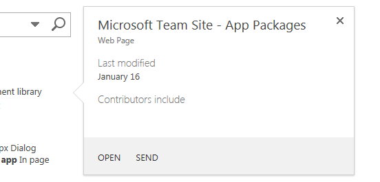
When you do searches in a SharePoint site, you'll see examples of the callout control in action because it appears whenever you hover over a search result.
The following figure shows the callout for a single search result and shows a few of the typical things in a content control: a title, some information about the item on the page, and actions (Open and Send) that you can take on the item.
In this case, the information and actions are relatively simple, but you can already see two advantages to using it. First, it lets you show additional information about elements on a page when that's needed, and second, it gives you an elegant way of adding functionality to the page.
Example of the callout control on a SharePoint search results page

Make the control available to your HTML page by including the callout.js file
This example uses the SP.SOD.executeFunc method to ensure that the script file loads before you run any code that depends on it.
SP.SOD.executeFunc("callout.js", "Callout", function () {
    });
The function that you pass to the SP.SOD.executeFunc function contains the code that you want to run after the callout.js file loads. After you load those files, you use the CalloutManager object to create a Callout object for each page element that needs to have a callout control associated with it.
The CalloutManager is a singleton that stores references to every Callout object on a page inside an associative array.
The Callout object has only two required members: ID and launchPoint. The ID member is the key that is mapped to the Callout object in the CalloutManager: CalloutManager["value of the callout's ID member"]. The launchPoint member is an HTML page element.
You can, for example, create or get a div element on your page and pass it as a member of the Callout object. By default, the callout control appears whenever a user selects the launchPoint element.
This example shows you how to create the simplest possible callout control with only the two required members and a title string.
var calloutPageElement = document.createElement("div");
var callout = CalloutManager.createNew({
   ID: "unique identifier",
   launchPoint: calloutPageElement,
   title: "callout title"
});
This particular callout appears and displays a title at the top of the control whenever a user selects the page element. You use the optional members to customize the control's appearance, behavior, positioning, and actions in some very powerful ways. The callout control also has a set method that you can use to set a value for any parameter after you create an instance of the control.
callout.set({openOptions:{event: "hover"}});
You can also set values for all of the callout members in a CalloutOptions object, and then pass that object to the createNew method.
var calloutPageElement = document.createElement("div");
var calloutOptions = new CalloutOptions();
calloutOptions.ID = unique identifier;
calloutOptions.launchPoint = calloutPageElement;
calloutOptions.title = callout title;
var callout = CalloutManager.createNew(calloutOptions);
Customize the appearance of the callout control
You can use these members to control the display of callout.
| Member | Purpose | Valid values (default in bold) |
|---|---|---|
| title | Display a title at the top of the control. | string, null, string containing HTML |
| content | Display HTML inside the control whenever there is no value for the contentElement member. |
string containing HTML, null, must be null if contentElement has a value |
| contentElement | Display an HTML element inside the control when there is no value for the content member. |
Any HTML element, null, must be null if content has a value |
| contentWidth | Specify the width in pixels of the callout body container. This container also has a 1-pixel border and 15-pixel padding on each side, so the control is 32 pixels wider than the body width that you specify. The control's CSS overflow property is set to hidden, so your content is clipped if it does not fit inside the width that you specify.If you set this member on an open callout, the change takes effect immediately. This is not true of the other members. |
Any number between 240 and 610, 350 (making the control 382 pixels wide by default) |
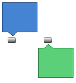
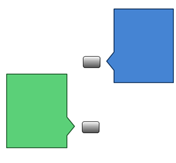
| beakOrientation | Specify the orientation of the beak or pointer of the callout control. | topBottom orientation leftRight orientation  |
Customize the behavior of the callout control
You can use the following members to control the behavior of the callout. Begin with the important openOptions member because it lets you specify how the control opens and closes when the user interacts with it on the page.
Use these values for the openOptions member |
Purpose |
|---|---|
{event: "click", closeCalloutOnBlur: true} |
Make the callout control appear when the user selects the launchPoint element with a mouse, and close whenever a user moves the mouse away from the launchPoint element.Because the value of event is click, the value of the showCloseButton option is true by default and can't be changed.This is the default combination of values. |
{event: "hover", showCloseButton: true} |
Make the callout control appear when the user hovers over the launchPoint element with a mouse, and close whenever the user selects an X button in the upper-right corner of the control.Because the value of event is hover, the value of closeCalloutOnBlur is not applicable and can't be set. |
{event: "click", closeCalloutOnBlur: false} |
Make the callout control appear when the user hovers over the launchPoint element with a mouse, and close only whenever the user selects an X button in the upper-right corner of the control.Because the value of event is click, the value of the showClosebutton option is true by default and can't be changed. |
These are the other members that you can set to control the callout's behavior.
| Use this member | Purpose | Valid values (default in bold) |
|---|---|---|
| onOpeningCallback | Perform actions that must happen before the callout control is rendered on the page. Because the Callout object must be passed as a parameter to the function that you supply, you can use this member to set values for any of the control's properties before the control is rendered.You can also use this member to begin asynchronous actions that add or change the content of the control. You can set a value for this member only once. |
function(callout /*=Callout*/) {...}null |
| onOpenedCallback | Perform actions that must happen after the callout control is rendered on the page and fully animated. You might use this member to manipulate the Document Object Model (DOM) of the control. You can set a value for this member only once. |
function(callout /*=Callout*/) {...}null |
| onClosingCallback | Perform actions that must happen while the callout control is closing but before it has fully been removed from the page. You can set a value for this member only once. |
function(callout /*=Callout*/) {...} null |
| onClosedCallback | Perform actions that must happen after the callout control has closed and been removed from the page. You can set a value for this member only once. |
function(callout /*=Callout*/) {...}null |
Use the callout control methods
You can use these methods to customize the behavior of the callout control.
| Use this method | Purpose | Valid parameter values |
|---|---|---|
| set({member:value}) | Set values for members after you have constructed an instance of the control. | A name/value pair that defines a value for any callout control member.var callout = new Callout({openOptions:{event: "click"}});callout.set({openOptions:{event: "hover"}}); |
| getOrientation() | Return a CalloutOrientation object that indicates which way the callout control is pointing.This object has four Boolean members: up, down, left, and right.While the control is open, two of these values will be true and two will be false ( up and right, for example). |
No parameters |
| addEventCallback(string eventName, CalloutCallback callback | Register a callback function that is called whenever the callout control changes to the state specified by the eventName parameter. |
The eventName parameter must be one of these values: opening, open, closing, closed.The callback parameter must be a function that takes an instance of the callout control as its first parameter. |
| open() | Display the control. If the control is already open or opening, this method returns false and does nothing. |
No parameters |
| close(bool useAnimation) | Hide the control. If the control is closed or already closing, this method returns false and does nothing. |
A Boolean value that specifies whether the control closes with animation. Animation is off by default. |
| toggle() | Toggle the control's open/close state. | No parameters |
| addAction(CallOutAction calloutAction) | Add a new CalloutAction to the callout control's array of CalloutAction objects.These objects define the actions to show in the footer of the control. The Add actions to the callout control section explains how to construct these objects. You can add actions only after creating an instance of the control. The control can have no more than three actions, and if you try to add more you'll get an exception. |
A CalloutAction object. |
| refreshActions() | Reload all of the actions that have been added to the control. You can use this method to change, enable, or disable actions while the control is open. |
No parameters |
Add actions to the callout control
You add actions after you've created an instance of the callout control. A callout action can consist of either a single action or a menu of actions. You can add up to three actions to a callout control. After you have created a callout action, you add it to the CalloutControl object with its addAction method. This sample action opens a new window in your browser after the user selects the text.
//Create CalloutAction
var calloutAction = new CalloutAction({
            text: "Open window"
            onClickCallback: function() {
                window.open(url);
            }
        });

//Add Action to an instance of the CalloutControl
        myCalloutControl.addAction(calloutAction);
You can also set values for all of the CalloutAction members in a CalloutActionOptions object and pass that object to the CalloutAction constructor.
//Create CalloutAction
var calloutActionOptions = new CalloutActionOptions();
calloutActionOptions.text = "Open window";
actionOptions.onClickCallback = function() {
    window.open(url);
};
var calloutAction = new CalloutAction(calloutActionOptions);

//Add Action to an instance of the CalloutControl
        myCalloutControl.addAction(calloutAction);
You can use these members to define the behavior of a callout action.
| Use this member | Purpose | Valid values (default in bold) |
|---|---|---|
| text (required) | Display a text label for the action. | string, null |
| onClickCallback | Define the action that occurs when the user selects the callout action label. | function(calloutAction /*=CalloutAction*/) {...}null |
| isEnabledCallback | Define a callback function that runs before the callout displays, and determines whether the action is enabled. If this function returns true, the callout displays the enabled action. If it returns false, the callout displays the action text, but disables the action. |
function(calloutAction /*=CalloutAction*/) {...} null |
| isVisibleCallback | Define a callback function that runs before the callout displays and determines whether the action text displays. If this function returns true, the callout displays the action text. If it returns false, the callout hides the action text. Additional actions move left to take the place of the hidden action. |
function(calloutAction /*=CalloutAction*/) {...}null |
| tooltip | Display text when the user hovers over the callout action text. | string, null |
| disabledTooltip | Display text when the user hovers over the callout action text and the callout action has been disabled (when the isEnabledCallback function returns false ). |
string, null |
| menuEntries | Define a menu of actions instead of a single action. | [ CalloutActionMenuEntry, ...]null |
The next section explains how to create a CalloutActionMenuEntry and add it to a CalloutAction object.
Add action menus to the callout control
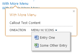
When a callout action contains a menu instead of a single action, the user sees a down arrow next to the callout action text, as in the following figure.
A callout action displays a menu when a user selects the arrow next to the action label

You can create as many menu entries as you want and add them to the callout action by passing them in an array as the value of the menuEntries member of the CalloutAction object.
//Create two menu entries.
var menuEntry1 = new CalloutActionMenuEntry("Entry One", calloutActionCallbackFunction, "/_layouts/images/DOC16.GIF");
var menuEntry2 = new CalloutActionMenuEntry("Some Other Entry", calloutActionCallbackFunction, "/_layouts/images/XLS16.GIF");

//Add the menu entries to the callout action.
var calloutAction = new CalloutAction({
   text: "MENU W/ ICONS",
   menuEntries: [menuEntry1, menuEntry2]
})

//Add the callout action to the callout control.
callout.addAction(calloutAction);
The CalloutActionMenuEntry constructor takes three parameters. The first two parameters are required. The third is optional, but it can be helpful because it lets you display an icon with the text.
Pass a string as the first parameter to display a text label for each menu entry.
Pass a function as the second parameter to define the action that occurs when the user clicks on the menu entry text.
Pass a string that contains the URL for the icon that you want to display to the left of the text label.
Use the CalloutManager to create and manage instances of the callout control
The CalloutManager singleton object stores references to every Callout object on a page. It stores each instance of the callout control in an associative array where the ID value of each control is the key. The CalloutManager contains methods that help you create and manage the Callout objects that it stores.
| Use this method | Purpose | Valid parameter values |
|---|---|---|
| createNew(members) | Create a new Callout object.When you do this, the CalloutManager adds an entry for the control in its associative array, with the value of the required member ID as the key. |
An associative array that assigns values to each member that you want to use. The ID and launchPoint members are required. |
| createNewIfNecessary (members) | Create a Callout object if the launchPoint that you pass as a parameter doesn't have a callout control assigned to it already. |
An associative array that assigns values to each member that you want to use. The ID and launchPoint members are required. |
| getFromLaunchPoint: function (/@type(HTMLElement)/launchPoint) | Get the Callout object associated with the launchPoint provided in the function.This method throws an exception if the launchPoint doesn't have a Callout object assigned to it. |
No parameters |
| getFromLaunchPointIfExists: function (/@type(HTMLElement)/launchPoint) | Get the Callout object associated with the launchPoint provided in the function.This method returns null if the launchPoint doesn't have a Callout object assigned to it. |
No parameters |
| getFromCalloutDescendant: function (/@type(HTMLElement)/descendant) | Get the Callout object associated with the HTML element provided in the function given element.This element can be any descendent of the callout element. For example, you could pass the value of the contentElement member that you assigned when you created the Callout object.This method throws an exception if the descendant doesn't have a Callout object associated with it. |
No parameters |
| closeAll() | Closes all open Callout objects.This method returns true if it closes at least one callout. |
No parameters |
| isAtLeastOneCalloutOpen() | Check to see if at least one callout is open. | No parameters |
Position the callout control on the page
| Use this member | Purpose | Valid values (default in bold) |
|---|---|---|
| boundingBox | Specify the HTML element that will serve as the equivalent of the offsetParent of the callout control.By default, the default value for this is the callout control's offsetParent, but you can use this member to make sure that the control is positioned correctly.The callout control attempts to position itself so that it's visible within this box. It changes direction (from top to bottom or from left to right, depending on the beak orientation) to remain visible within it. |
Any HTML element, the offsetParent of the HTML element that contains the callout control |
| positionAlgorithm | Override the default positioning algorithm for the callout control. | CalloutOptions.prototype.defaultPositionAlgorithmfunction(calloutPositioningProxy) { ... } |
The following section describes how to use the calloutPositioningProxy object to write positioning algorithms for the callout control.
Write positioning algorithms with calloutPositioningProxy
The calloutPositioningProxy object contains methods and properties that you can use to override the positioning logic that the callout control uses by default. For example, if you want the control to appear below and to the right of the launchPoint element all the time, you write a positioning algorithm that looks like the following.
function alwaysGoDownAndRight(calloutPositioningProxy)  {
    calloutPositioningProxy.moveDownAndRight();
}
You would then pass that function as the value of the Callout object's positionAlgorithm member. You can do that when you create the Callout, or later by setting the value.
callout.set({positionAlgorithm: alwaysGoDownAndRight});
You can always take a look at the default positioning logic by launching your browser's JavaScript console (the Internet Explorer F12 Developer Tools, for example).
CalloutOptions.prototype.positionAlgorithm.toString()
You can use these methods in the CalloutPositioningProxy object to write your own positioning logic.
| Method | Description |
|---|---|
| isCalloutTooFarTop() | Returns Boolean. |
| isCalloutTooFarRight() | Returns Boolean. |
| isCalloutTooFarBottom() | Returns Boolean. |
| isCalloutTooFarLeft() | Returns Boolean. |
| isCalloutLeftOfHardBoundingBox() | Returns Boolean. If true, the left side of the control sits outside its container element. It's not visible and the user can't scroll to it. |
| isCalloutRightOfHardBoundingBox() | Returns Boolean. If true, the right side of the control sits outside its container element. It is not visible and the user can't scroll to it. |
| isCalloutAboveHardBoundingBox() | Returns Boolean. If true, the top of the control sits outside its container element. It's not visible and the user can't scroll to it. |
| isCalloutBelowHardBoundingBox() | Returns Boolean. If true, the bottom of the control sits outside its container element. It's not visible and the user can't scroll to it. |
| isOrientedUp() | Returns Boolean. |
| isOrientedDown() | Returns Boolean. |
| isOrientedLeft() | Returns Boolean. |
| isOrientedRight() | Returns Boolean. |
| moveUpAndRight() | Returns nothing. Changes the direction of the control. |
| moveUpAndLeft() | Returns nothing. Changes the direction of the control. |
| moveDownAndRight() | Returns nothing. Changes the direction of the control. |
| moveDownAndLeft() | Returns nothing. Changes the direction of the control. |
| moveTowardsOppositeQuadrant() | Returns nothing. Changes the direction of the control. |
| flipHorizontal() | Returns nothing. Changes the direction of the control. |
| flipVertical() | Returns nothing. Changes the direction of the control. |
| numberOfEdgesCollidingWithBoundingBox() | Returns an integer between 0 and 4 that represents the number of edges where the callout collides with the visible bounding box. For example, if the top of the control is clipped by the top of the document body after you call the moveUpAndRight() method, the numberOfEdgesCollidingWithBoundingBox() method returns a number greater than 1. |
This positioning algorithm makes the control go above or below the text. The isRTL property of the CalloutPositioningProxy tells you whether the text is displaying a right-to-left language. You check for this property to ensure that the control is always positioned correctly in relation to the text on the page.
function examplePositionAlgorithm(calloutPositioningProxy) {
    if (!calloutPositioningProxy.isRTL) {
        calloutPositioningProxy.moveDownAndRight();
        if (calloutPositioningProxy.isCalloutTooFarBottom()) {
            calloutPositioningProxy.moveUpAndRight();
        }
    }
    else {
        calloutPositioningProxy.moveDownAndLeft();
        if (calloutPositioningProxy.isCalloutTooFarBottom()) {
            calloutPositioningProxy.moveUpAndLeft();
        }
    }
}
callout.set({positionAlgorithm: examplePositionAlgorithm});
This positioning algorithm changes the default direction of the control to downAndRight instead of upAndRight, but it uses the default algorithm if there are any collisions.
function tryDownAndRightThenGoDefault(calloutPositioningProxy) {
    if (!calloutPositioningProxy.isRTL)
        calloutPositioningProxy.moveDownAndRight();
    else
        calloutPositioningProxy.moveDownAndLeft();

    if (calloutPositioningProxy.numberOfEdgesCollidingWithBoundingBox() > 0)
        return CalloutOptions.prototype.positionAlgorithm.apply(this, arguments);
};
callout.set({positionAlgorithm: tryDownAndRightThenGoDefault});