Charts in Adaptive Cards
You can visually represent data through charts in Adaptive Cards. You can use charts for performance dashboards, budget allocations, project management, customer insights, and more.
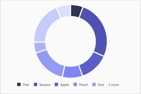
Donut chart
You can use the Chart.Donut element to add a donut chart in an Adaptive Card.
Here are the properties of the Chart.Donut element:
| Property | Required | Type | Description |
|---|---|---|---|
type |
✔️ | String | Must be Chart.Donut. |
colorSet |
String | The name of the set of colors to use to render the chart. | |
data |
✔️ | Array of objects | The data to display in the chart. |
fallback |
Object or String | An alternate element to render if this type of element is unsupported or if the host application doesn't support all the capabilities specified in the requires property.Allowed values: Container, ActionSet, ColumnSet, Media, RichTextBlock, Table, TextBlock, FactSet, ImageSet, Image, Input.Text, Input.Date, Input.Time, Input.Number, Input.Toggle, Input.ChoiceSet, Input.Rating, Rating, CompoundButton, Icon, Chart.Donut, Chart.Pie, Chart.VerticalBar.Grouped, Chart.VerticalBar, Chart.HorizontalBar, Chart.HorizontalBar.Stacked, Chart.Line, Chart.Gauge, CodeBlock, drop |
|
grid.area |
String | The area of a Layout.AreaGrid layout in which an element must be displayed. |
|
height |
String | The height of the element. When set to stretch, the element uses the remaining vertical space in its container.Allowed values: auto, stretchDefault value: auto |
|
horizontalAlignment |
String | Controls how the element must be horizontally aligned. Allowed values: Left, Center, Right |
|
id |
String | A unique identifier for the element or action. | |
isVisible |
Boolean | Controls the visibility of the element. Default value: true |
|
lang |
String | The locale associated with the input element. | |
requires |
Object | A list of capabilities the element requires the host application to support. If the host application doesn't support at least one of the listed capabilities, the element isn't rendered or its fallback is rendered, if provided. Allowed values: HostCapabilities |
|
separator |
Boolean | Controls whether a separator line must be displayed above the element to visually separate it from the previous element. No separator is displayed for the first element in a container, even if this property is set to true.Default value: false |
|
spacing |
String | Controls the amount of space between this element and the previous one. No space is added for the first element in a container. Allowed values: None, Small, Default, Medium, Large, ExtraLarge, PaddingDefault value: Default |
|
targetWidth |
String | Controls the card width for which the element must be displayed. If targetWidth isn't specified, the element is rendered at all card widths. Using targetWidth makes it possible to author responsive cards that adapt their layout to the available horizontal space.For more information, see Adaptive Card responsive layout. Allowed values: VeryNarrow, Narrow, Standard, Wide, atLeast:VeryNarrow, atMost:VeryNarrow, atLeast:Narrow, atMost:Narrow, atLeast:Standard, atMost:Standard, atLeast:Wide, atMost:Wide |
|
title |
String | The title of the chart. |
Here are the properties of the data array:
| Property | Required | Type | Description |
|---|---|---|---|
color |
String | The color to use for the data point. Allowed values: good, warning, attention, neutral, categoricalRed, categoricalPurple, categoricalLavender, categoricalBlue, categoricalLightBlue, categoricalTeal, categoricalGreen, categoricalLime, categoricalMarigold, sequential1, sequential2, sequential3, sequential4, sequential5, sequential6, sequential7, sequential8, divergingBlue, divergingLightBlue, divergingCyan, divergingTeal, divergingYellow, divergingPeach, divergingLightRed, divergingRed, divergingMaroon, divergingGray |
|
legend |
String | The legend of the chart. | |
value |
Number | The value associated with the data point. |
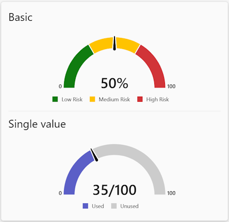
Gauge chart
You can use the Chart.Gauge element to add a gauge chart in an Adaptive Card.
Here are the properties of the Chart.Gauge element:
| Property | Required | Type | Description |
|---|---|---|---|
type |
✔️ | String | Must be Chart.Gauge. |
colorSet |
String | The name of the set of colors to use to render the chart. | |
fallback |
Object or String | An alternate element to render if this type of element is unsupported or if the host application doesn't support all the capabilities specified in the requires property.Allowed values: Container, ActionSet, ColumnSet, Media, RichTextBlock, Table, TextBlock, FactSet, ImageSet, Image, Input.Text, Input.Date, Input.Time, Input.Number, Input.Toggle, Input.ChoiceSet, Input.Rating, Rating, CompoundButton, Icon, Chart.Donut, Chart.Pie, Chart.VerticalBar.Grouped, Chart.VerticalBar, Chart.HorizontalBar, Chart.HorizontalBar.Stacked, Chart.Line, Chart.Gauge, CodeBlock, drop |
|
grid.area |
String | The area of a Layout.AreaGrid layout in which an element must be displayed. |
|
height |
String | The height of the element. When set to stretch, the element uses the remaining vertical space in its container.Allowed values: auto, stretchDefault value: auto |
|
horizontalAlignment |
String | Controls how the element must be horizontally aligned. Allowed values: Left, Center, Right |
|
id |
String | A unique identifier for the input element. | |
isVisible |
Boolean | Controls if the element is visible. Default value: true |
|
lang |
String | The locale associated with the input element. | |
max |
Number | The maximum value of the gauge. | |
min |
Number | The minimum value of the gauge. | |
requires |
Object | A list of capabilities the element requires the host application to support. If the host application doesn't support at least one of the listed capabilities, the element isn't rendered or its fallback is rendered, if provided. Allowed values: HostCapabilities |
|
segments |
Array of objects | The segments to display in the gauge. | |
separator |
Boolean | Controls whether a separator line must be displayed above the element to visually separate it from the previous element. No separator is displayed for the first element in a container, even if this property is set to true.Default value: false |
|
showLegend |
Boolean | Controls if the legend must be displayed. Default value: true |
|
showMinMax |
Boolean | Controls if the min or max values must be displayed. Default value: true |
|
spacing |
String | Controls the amount of space between this element and the previous one. No space is added for the first element in a container. Allowed values: None, Small, Default, Medium, Large, ExtraLarge, PaddingDefault value: Default |
|
subLabel |
String | The sub-label of the gauge. | |
targetWidth |
String | Controls the card width for which the element must be displayed. If targetWidth isn't specified, the element is rendered at all card widths. Using targetWidth makes it possible to author responsive cards that adapt their layout to the available horizontal space.For more information, see Adaptive Card responsive layout. Allowed values: VeryNarrow, Narrow, Standard, Wide, atLeast:VeryNarrow, atMost:VeryNarrow, atLeast:Narrow, atMost:Narrow, atLeast:Standard, atMost:Standard, atLeast:Wide, atMost:Wide |
|
title |
String | The title of the chart. | |
value |
Number | The value of the gauge. Default value: 0 |
|
valueFormat |
String | The format used to display the gauge's value. Allowed values: Percentage, FractionDefault value: Percentage |
Here are the properties of the segments array:
| Property | Required | Type | Description |
|---|---|---|---|
color |
String | The color to use for the segment. Allowed values: good, warning, attention, neutral, categoricalRed, categoricalPurple, categoricalLavender, categoricalBlue, categoricalLightBlue, categoricalTeal, categoricalGreen, categoricalLime, categoricalMarigold, sequential1, sequential2, sequential3, sequential4, sequential5, sequential6, sequential7, sequential8, divergingBlue, divergingLightBlue, divergingCyan, divergingTeal, divergingYellow, divergingPeach, divergingLightRed, divergingRed, divergingMaroon, divergingGray |
|
legend |
String | The legend text associated with the segment. | |
value |
Number | The size of the segment. Default value: 0 |
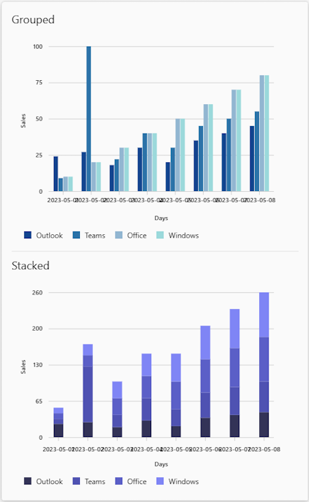
Grouped vertical bar chart
You can use the Chart.VerticalBar.Grouped element to add a grouped or a stacked vertical bar chart in an Adaptive Card.
Here are the properties of the Chart.VerticalBar.Grouped element:
| Property | Required | Type | Description |
|---|---|---|---|
type |
✔️ | String | Must be Chart.VerticalBar.Grouped. |
color |
String | The color to use for all data points. Allowed values: good, warning, attention, neutral, categoricalRed, categoricalPurple, categoricalLavender, categoricalBlue, categoricalLightBlue, categoricalTeal, categoricalGreen, categoricalLime, categoricalMarigold, sequential1, sequential2, sequential3, sequential4, sequential5, sequential6, sequential7, sequential8, divergingBlue, divergingLightBlue, divergingCyan, divergingTeal, divergingYellow, divergingPeach, divergingLightRed, divergingRed, divergingMaroon, divergingGray |
|
colorSet |
String | The name of the set of colors to use to render the chart. | |
data |
Array of objects | The data points in the chart. | |
fallback |
Object or String | An alternate element to render if this element is unsupported or if the host application doesn't support all the capabilities specified in the requires property.Allowed values: Container, ActionSet, ColumnSet, Media, RichTextBlock, Table, TextBlock, FactSet, ImageSet, Image, Input.Text, Input.Date, Input.Time, Input.Number, Input.Toggle, Input.ChoiceSet, Input.Rating, Rating, CompoundButton, Icon, Chart.Donut, Chart.Pie, Chart.VerticalBar.Grouped, Chart.VerticalBar, Chart.HorizontalBar, Chart.HorizontalBar.Stacked, Chart.Line, Chart.Gauge, CodeBlock, drop |
|
grid.area |
String | The area of a Layout.AreaGrid layout in which an element must be displayed. |
|
height |
String | Controls the height of the element. When set to stretch, the element uses the remaining vertical space in its container.Allowed values: auto, stretchDefault value: auto |
|
horizontalAlignment |
String | Controls how the element must be horizontally aligned. Allowed values: Left, Center, Right |
|
id |
String | A unique identifier for the input element or action. | |
isVisible |
Boolean | Controls if the element is visible. Default value: true |
|
lang |
String | The locale associated with the input element. | |
requires |
Object | A list of capabilities the element requires the host application to support. If the host application doesn't support at least one of the listed capabilities, the element isn't rendered or its fallback is rendered, if provided. Supported value: HostCapabilities |
|
separator |
Boolean | Controls whether a separator line must be displayed above the element to visually separate it from the previous element. No separator is displayed for the first element in a container, even if this property is set to true.Default value: false |
|
showBarValues |
Boolean | Controls if the bar values must be displayed. Default value: false |
|
spacing |
String | Controls the amount of space between this element and the previous one. No space is added for the first element in a container. Allowed values: None, Small, Default, Medium, Large, ExtraLarge, PaddingDefault value: Default |
|
targetWidth |
String | Controls the card width for which the element must be displayed. If targetWidth isn't specified, the element is rendered at all card widths. Using targetWidth makes it possible to author responsive cards that adapt their layout to the available horizontal space.For more information, see Adaptive Card responsive layout. Allowed values: VeryNarrow, Narrow, Standard, Wide, atLeast:VeryNarrow, atMost:VeryNarrow, atLeast:Narrow, atMost:Narrow, atLeast:Standard, atMost:Standard, atLeast:Wide, atMost:Wide |
|
title |
String | The title of the chart. | |
xAxisTitle |
String | The title of the x axis. | |
yAxisTitle |
String | The title of the y axis. |
Here are the properties of the data array:
| Property | Required | Type | Description |
|---|---|---|---|
color |
String | The color to use for the data point. Allowed values: good, warning, attention, neutral, categoricalRed, categoricalPurple, categoricalLavender, categoricalBlue, categoricalLightBlue, categoricalTeal, categoricalGreen, categoricalLime, categoricalMarigold, sequential1, sequential2, sequential3, sequential4, sequential5, sequential6, sequential7, sequential8, divergingBlue, divergingLightBlue, divergingCyan, divergingTeal, divergingYellow, divergingPeach, divergingLightRed, divergingRed, divergingMaroon, divergingGray |
|
legend |
String | The legend of the chart. | |
values |
Number | The data points in the series. |
Here are the properties of values:
| Property | Required | Type | Description |
|---|---|---|---|
x |
String | The x axis value of the data point. | |
y |
Number | The y axis value of the data point. |
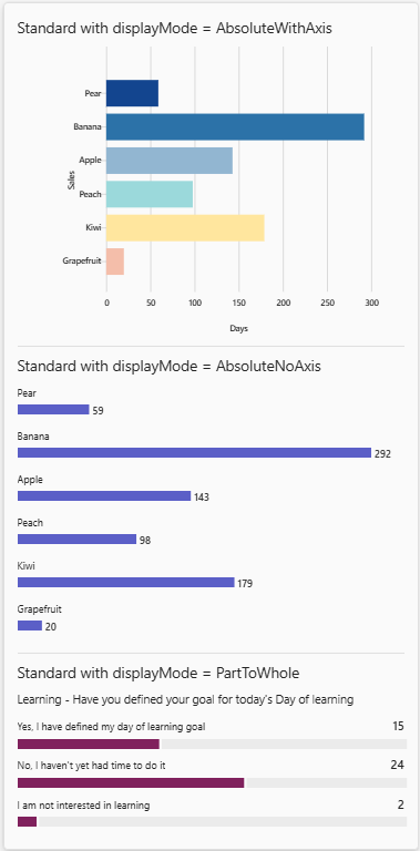
Horizontal bar chart
You can use the Chart.HorizontalBar element to add a horizontal bar chart in an Adaptive Card.
Here are the properties of the Chart.HorizontalBar element:
| Property | Required | Type | Description |
|---|---|---|---|
type |
✔️ | String | Must be Chart.HorizontalBar. |
color |
String | The color to use for all data points. Allowed values: good, warning, attention, neutral, categoricalRed, categoricalPurple, categoricalLavender, categoricalBlue, categoricalLightBlue, categoricalTeal, categoricalGreen, categoricalLime, categoricalMarigold, sequential1, sequential2, sequential3, sequential4, sequential5, sequential6, sequential7, sequential8, divergingBlue, divergingLightBlue, divergingCyan, divergingTeal, divergingYellow, divergingPeach, divergingLightRed, divergingRed, divergingMaroon, divergingGray |
|
colorSet |
String | The name of the set of colors to use to render the chart. | |
data |
Array of objects | The data points in the chart. | |
displayMode |
String | Controls how the chart must be visually laid out. Allowed values: AbsoluteWithAxis,AbsoluteNoAxis,PartToWhole Default value: AbsoluteWithAxis |
|
fallback |
Object or String | An alternate element to render if this element is unsupported or if the host application doesn't support all the capabilities specified in the requires property.Allowed values: Container, ActionSet, ColumnSet, Media, RichTextBlock, Table, TextBlock, FactSet, ImageSet, Image, Input.Text, Input.Date, Input.Time, Input.Number, Input.Toggle, Input.ChoiceSet, Input.Rating, Rating, CompoundButton, Icon, Chart.Donut, Chart.Pie, Chart.VerticalBar.Grouped, Chart.VerticalBar, Chart.HorizontalBar, Chart.HorizontalBar.Stacked, Chart.Line, Chart.Gauge, CodeBlock, drop |
|
grid.area |
String | The area of a Layout.AreaGrid layout in which an element must be displayed. |
|
height |
String | Controls the height of the element. When set to stretch, the element uses the remaining vertical space in its container.Allowed values: auto, stretchDefault value: auto |
|
horizontalAlignment |
String | Controls how the element must be horizontally aligned. Allowed values: Left, Center, Right |
|
id |
String | A unique identifier for the input element or action. | |
isVisible |
Boolean | Controls if the element is visible. Default value: true |
|
lang |
String | The locale associated with the input element. | |
requires |
Object | A list of capabilities the element requires the host application to support. If the host application doesn't support at least one of the listed capabilities, the element isn't rendered or its fallback is rendered, if provided. Supported value: HostCapabilities |
|
separator |
Boolean | Controls whether a separator line must be displayed above the element to visually separate it from the previous element. No separator is displayed for the first element in a container, even if this property is set to true.Default value: false |
|
spacing |
String | Controls the amount of space between this element and the previous one. No space is added for the first element in a container. Allowed values: None, Small, Default, Medium, Large, ExtraLarge, PaddingDefault value: Default |
|
targetWidth |
String | Controls the card width for which the element must be displayed. If targetWidth isn't specified, the element is rendered at all card widths. Using targetWidth makes it possible to author responsive cards that adapt their layout to the available horizontal space.For more information, see Adaptive Card responsive layout. Allowed values: VeryNarrow, Narrow, Standard, Wide, atLeast:VeryNarrow, atMost:VeryNarrow, atLeast:Narrow, atMost:Narrow, atLeast:Standard, atMost:Standard, atLeast:Wide, atMost:Wide |
|
title |
String | The title of the chart. | |
xAxisTitle |
String | The title of the x axis. | |
yAxisTitle |
String | The title of the y axis. |
Here are the properties of the data array:
| Property | Required | Type | Description |
|---|---|---|---|
color |
String | The color to use for the data point. Allowed values: good, warning, attention, neutral, categoricalRed, categoricalPurple, categoricalLavender, categoricalBlue, categoricalLightBlue, categoricalTeal, categoricalGreen, categoricalLime, categoricalMarigold, sequential1, sequential2, sequential3, sequential4, sequential5, sequential6, sequential7, sequential8, divergingBlue, divergingLightBlue, divergingCyan, divergingTeal, divergingYellow, divergingPeach, divergingLightRed, divergingRed, divergingMaroon, divergingGray |
|
x |
String | The x axis value of the data point. | |
y |
Number | The y axis value of the data point. |
Line chart
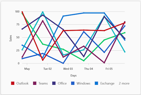
You can use the Chart.Line element to add a line chart in an Adaptive Card.
Here are the properties of the Chart.Line element:
| Property | Required | Type | Description |
|---|---|---|---|
type |
✔️ | String | Must be Chart.Line. |
color |
String | The color to use for all data points. Allowed values: good, warning, attention, neutral, categoricalRed, categoricalPurple, categoricalLavender, categoricalBlue, categoricalLightBlue, categoricalTeal, categoricalGreen, categoricalLime, categoricalMarigold, sequential1, sequential2, sequential3, sequential4, sequential5, sequential6, sequential7, sequential8, divergingBlue, divergingLightBlue, divergingCyan, divergingTeal, divergingYellow, divergingPeach, divergingLightRed, divergingRed, divergingMaroon, divergingGray |
|
colorSet |
String | The name of the set of colors to use to render the chart. | |
data |
Array of objects | The data points in the chart. | |
fallback |
Object or String | An alternate element to render if this element is unsupported or if the host application doesn't support all the capabilities specified in the requires property.Allowed values: Container, ActionSet, ColumnSet, Media, RichTextBlock, Table, TextBlock, FactSet, ImageSet, Image, Input.Text, Input.Date, Input.Time, Input.Number, Input.Toggle, Input.ChoiceSet, Input.Rating, Rating, CompoundButton, Icon, Chart.Donut, Chart.Pie, Chart.VerticalBar.Grouped, Chart.VerticalBar, Chart.HorizontalBar, Chart.HorizontalBar.Stacked, Chart.Line, Chart.Gauge, CodeBlock, drop |
|
grid.area |
String | The area of a Layout.AreaGrid layout in which an element must be displayed. |
|
height |
String | Controls the height of the element. When set to stretch, the element uses the remaining vertical space in its container.Allowed values: auto, stretchDefault value: auto |
|
horizontalAlignment |
String | Controls how the element must be horizontally aligned. Allowed values: Left, Center, Right |
|
id |
String | A unique identifier for the input element or action. | |
isVisible |
Boolean | Controls if the element is visible. Default value: true |
|
lang |
String | The locale associated with the input element. | |
requires |
Object | A list of capabilities the element requires the host application to support. If the host application doesn't support at least one of the listed capabilities, the element isn't rendered or its fallback is rendered, if provided. Supported value: HostCapabilities |
|
separator |
Boolean | Controls whether a separator line must be displayed above the element to visually separate it from the previous element. No separator is displayed for the first element in a container, even if this property is set to true.Default value: false |
|
spacing |
String | Controls the amount of space between this element and the previous one. No space is added for the first element in a container. Allowed values: None, Small, Default, Medium, Large, ExtraLarge, PaddingDefault value: Default |
|
targetWidth |
String | Controls the card width for which the element must be displayed. If targetWidth isn't specified, the element is rendered at all card widths. Using targetWidth makes it possible to author responsive cards that adapt their layout to the available horizontal space.For more information, see Adaptive Card responsive layout. Allowed values: VeryNarrow, Narrow, Standard, Wide, atLeast:VeryNarrow, atMost:VeryNarrow, atLeast:Narrow, atMost:Narrow, atLeast:Standard, atMost:Standard, atLeast:Wide, atMost:Wide |
|
title |
String | The title of the chart. | |
xAxisTitle |
String | The title of the x axis. | |
yAxisTitle |
String | The title of the y axis. |
Here are the properties of the data array:
| Property | Required | Type | Description |
|---|---|---|---|
color |
String | The color to use for the data point. Allowed values: good, warning, attention, neutral, categoricalRed, categoricalPurple, categoricalLavender, categoricalBlue, categoricalLightBlue, categoricalTeal, categoricalGreen, categoricalLime, categoricalMarigold, sequential1, sequential2, sequential3, sequential4, sequential5, sequential6, sequential7, sequential8, divergingBlue, divergingLightBlue, divergingCyan, divergingTeal, divergingYellow, divergingPeach, divergingLightRed, divergingRed, divergingMaroon, divergingGray |
|
legend |
String | The legend of the chart. | |
values |
Array of objects | The data points in the series. |
Here are the properties of values:
| Property | Required | Type | Description |
|---|---|---|---|
x |
One of number or string | The x axis value of the data point. | |
y |
Number | The y axis value of the data point. |
Pie chart
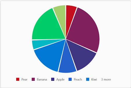
You can use the Chart.Pie element to add a pie chart in an Adaptive Card.
Here are the properties of the Chart.Pie element:
| Property | Required | Type | Description |
|---|---|---|---|
type |
✔️ | String | Must be Chart.Pie. |
colorSet |
String | The name of the set of colors to use to render the chart. | |
data |
Array of objects | The data to display in the chart. | |
fallback |
Object or String | An alternate element to render if this element is unsupported or if the host application doesn't support all the capabilities specified in the requires property.Allowed values: Container, ActionSet, ColumnSet, Media, RichTextBlock, Table, TextBlock, FactSet, ImageSet, Image, Input.Text, Input.Date, Input.Time, Input.Number, Input.Toggle, Input.ChoiceSet, Input.Rating, Rating, CompoundButton, Icon, Chart.Donut, Chart.Pie, Chart.VerticalBar.Grouped, Chart.VerticalBar, Chart.HorizontalBar, Chart.HorizontalBar.Stacked, Chart.Line, Chart.Gauge, CodeBlock, drop |
|
grid.area |
String | The area of a Layout.AreaGrid layout in which an element must be displayed. |
|
height |
String | Controls the height of the element. When set to stretch, the element uses the remaining vertical space in its container.Allowed values: auto, stretchDefault value: auto |
|
horizontalAlignment |
String | Controls how the element must be horizontally aligned. Allowed values: Left, Center, Right |
|
id |
String | A unique identifier for the input element or action. | |
isVisible |
Boolean | Controls if the element is visible. Default value: true |
|
lang |
String | The locale associated with the input element. | |
requires |
Object | A list of capabilities the element requires the host application to support. If the host application doesn't support at least one of the listed capabilities, the element isn't rendered or its fallback is rendered, if provided. Supported value: HostCapabilities |
|
separator |
Boolean | Controls whether a separator line must be displayed above the element to visually separate it from the previous element. No separator is displayed for the first element in a container, even if this property is set to true.Default value: false |
|
spacing |
String | Controls the amount of space between this element and the previous one. No space is added for the first element in a container. Allowed values: None, Small, Default, Medium, Large, ExtraLarge, PaddingDefault value: Default |
|
targetWidth |
String | Controls the card width for which the element must be displayed. If targetWidth isn't specified, the element is rendered at all card widths. Using targetWidth makes it possible to author responsive cards that adapt their layout to the available horizontal space.For more information, see Adaptive Card responsive layout. Allowed values: VeryNarrow, Narrow, Standard, Wide, atLeast:VeryNarrow, atMost:VeryNarrow, atLeast:Narrow, atMost:Narrow, atLeast:Standard, atMost:Standard, atLeast:Wide, atMost:Wide |
|
title |
String | The title of the chart. |
Here are the properties of the data array:
| Property | Required | Type | Description |
|---|---|---|---|
color |
String | The color to use for the data point. Allowed values: good, warning, attention, neutral, categoricalRed, categoricalPurple, categoricalLavender, categoricalBlue, categoricalLightBlue, categoricalTeal, categoricalGreen, categoricalLime, categoricalMarigold, sequential1, sequential2, sequential3, sequential4, sequential5, sequential6, sequential7, sequential8, divergingBlue, divergingLightBlue, divergingCyan, divergingTeal, divergingYellow, divergingPeach, divergingLightRed, divergingRed, divergingMaroon, divergingGray |
|
legend |
String | The legend of the chart. | |
value |
Number | The value associated with the data point. |
Stacked horizontal bar chart
You can use the Chart.HorizontalBar.Stacked element to add a stacked horizontal bar chart in an Adaptive Card.
Here are the properties of the Chart.HorizontalBar.Stacked element:
| Property | Required | Type | Description |
|---|---|---|---|
type |
✔️ | String | Must be Chart.HorizontalBar.Stacked. |
color |
String | The color to use for all data points. Allowed values: good, warning, attention, neutral, categoricalRed, categoricalPurple, categoricalLavender, categoricalBlue, categoricalLightBlue, categoricalTeal, categoricalGreen, categoricalLime, categoricalMarigold, sequential1, sequential2, sequential3, sequential4, sequential5, sequential6, sequential7, sequential8, divergingBlue, divergingLightBlue, divergingCyan, divergingTeal, divergingYellow, divergingPeach, divergingLightRed, divergingRed, divergingMaroon, divergingGray |
|
colorSet |
String | The name of the set of colors to use to render the chart. | |
data |
Array of objects | The data points in the chart. | |
fallback |
Object or String | An alternate element to render if this element is unsupported or if the host application doesn't support all the capabilities specified in the requires property.Allowed values: Container, ActionSet, ColumnSet, Media, RichTextBlock, Table, TextBlock, FactSet, ImageSet, Image, Input.Text, Input.Date, Input.Time, Input.Number, Input.Toggle, Input.ChoiceSet, Input.Rating, Rating, CompoundButton, Icon, Chart.Donut, Chart.Pie, Chart.VerticalBar.Grouped, Chart.VerticalBar, Chart.HorizontalBar, Chart.HorizontalBar.Stacked, Chart.Line, Chart.Gauge, CodeBlock, drop |
|
grid.area |
String | The area of a Layout.AreaGrid layout in which an element must be displayed. |
|
height |
String | Controls the height of the element. When set to stretch, the element uses the remaining vertical space in its container.Allowed values: auto, stretchDefault value: auto |
|
horizontalAlignment |
String | Controls how the element must be horizontally aligned. Allowed values: Left, Center, Right |
|
id |
String | A unique identifier for the input element or action. | |
isVisible |
Boolean | Controls if the element is visible. Default value: true |
|
lang |
String | The locale associated with the input element. | |
requires |
Object | A list of capabilities the element requires the host application to support. If the host application doesn't support at least one of the listed capabilities, the element isn't rendered or its fallback is rendered, if provided. Supported value: HostCapabilities |
|
separator |
Boolean | Controls whether a separator line must be displayed above the element to visually separate it from the previous element. No separator is displayed for the first element in a container, even if this property is set to true.Default value: false |
|
spacing |
String | Controls the amount of space between this element and the previous one. No space is added for the first element in a container. Allowed values: None, Small, Default, Medium, Large, ExtraLarge, PaddingDefault value: Default |
|
targetWidth |
String | Controls the card width for which the element must be displayed. If targetWidth isn't specified, the element is rendered at all card widths. Using targetWidth makes it possible to author responsive cards that adapt their layout to the available horizontal space.For more information, see Adaptive Card responsive layout. Allowed values: VeryNarrow, Narrow, Standard, Wide, atLeast:VeryNarrow, atMost:VeryNarrow, atLeast:Narrow, atMost:Narrow, atLeast:Standard, atMost:Standard, atLeast:Wide, atMost:Wide |
|
title |
String | The title of the chart. | |
xAxisTitle |
String | The title of the x axis. | |
yAxisTitle |
String | The title of the y axis. |
Here are the properties of the data array:
| Property | Required | Type | Description |
|---|---|---|---|
data |
Array of objects | The data points in the series. | |
title |
String | The title of the series. |
Here are the properties of the nested data array:
| Property | Required | Type | Description |
|---|---|---|---|
color |
String | The color to use for the data point. Allowed values: good, warning, attention, neutral, categoricalRed, categoricalPurple, categoricalLavender, categoricalBlue, categoricalLightBlue, categoricalTeal, categoricalGreen, categoricalLime, categoricalMarigold, sequential1, sequential2, sequential3, sequential4, sequential5, sequential6, sequential7, sequential8, divergingBlue, divergingLightBlue, divergingCyan, divergingTeal, divergingYellow, divergingPeach, divergingLightRed, divergingRed, divergingMaroon, divergingGray |
|
legend |
String | The legend associated with the data point. | |
value |
Number | The value of the data point. |
Vertical bar chart
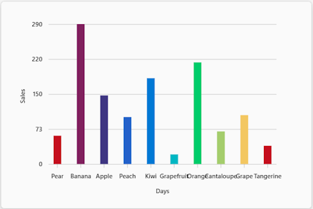
You can use the Chart.VerticalBar element to add a vertical bar chart in an Adaptive Card.
Here are the properties of the Chart.VerticalBar element:
| Property | Required | Type | Description |
|---|---|---|---|
type |
✔️ | String | Must be Chart.VerticalBar. |
color |
String | The color to use for all data points. Allowed values: good, warning, attention, neutral, categoricalRed, categoricalPurple, categoricalLavender, categoricalBlue, categoricalLightBlue, categoricalTeal, categoricalGreen, categoricalLime, categoricalMarigold, sequential1, sequential2, sequential3, sequential4, sequential5, sequential6, sequential7, sequential8, divergingBlue, divergingLightBlue, divergingCyan, divergingTeal, divergingYellow, divergingPeach, divergingLightRed, divergingRed, divergingMaroon, divergingGray |
|
colorSet |
String | The name of the set of colors to use to render the chart. | |
data |
Array of objects | The data points in the chart. | |
fallback |
Object or String | An alternate element to render if this element is unsupported or if the host application doesn't support all the capabilities specified in the requires property.Allowed values: Container, ActionSet, ColumnSet, Media, RichTextBlock, Table, TextBlock, FactSet, ImageSet, Image, Input.Text, Input.Date, Input.Time, Input.Number, Input.Toggle, Input.ChoiceSet, Input.Rating, Rating, CompoundButton, Icon, Chart.Donut, Chart.Pie, Chart.VerticalBar.Grouped, Chart.VerticalBar, Chart.HorizontalBar, Chart.HorizontalBar.Stacked, Chart.Line, Chart.Gauge, CodeBlock, drop |
|
grid.area |
String | The area of a Layout.AreaGrid layout in which an element must be displayed. |
|
height |
String | Controls the height of the element. When set to stretch, the element uses the remaining vertical space in its container.Allowed values: auto, stretchDefault value: auto |
|
horizontalAlignment |
String | Controls how the element must be horizontally aligned. Allowed values: Left, Center, Right |
|
id |
String | A unique identifier for the input element or action. | |
isVisible |
Boolean | Controls if the element is visible. Default value: true |
|
lang |
String | The locale associated with the input element. | |
requires |
Object | A list of capabilities the element requires the host application to support. If the host application doesn't support at least one of the listed capabilities, the element isn't rendered or its fallback is rendered, if provided. Supported value: HostCapabilities |
|
separator |
Boolean | Controls whether a separator line must be displayed above the element to visually separate it from the previous element. No separator is displayed for the first element in a container, even if this property is set to true.Default value: false |
|
showBarValues |
Boolean | Controls if the bar values must be displayed. Default value: false |
|
spacing |
String | Controls the amount of space between this element and the previous one. No space is added for the first element in a container. Allowed values: None, Small, Default, Medium, Large, ExtraLarge, PaddingDefault value: Default |
|
targetWidth |
String | Controls the card width for which the element must be displayed. If targetWidth isn't specified, the element is rendered at all card widths. Using targetWidth makes it possible to author responsive cards that adapt their layout to the available horizontal space.For more information, see Adaptive Card responsive layout. Allowed values: VeryNarrow, Narrow, Standard, Wide, atLeast:VeryNarrow, atMost:VeryNarrow, atLeast:Narrow, atMost:Narrow, atLeast:Standard, atMost:Standard, atLeast:Wide, atMost:Wide |
|
title |
String | The title of the chart. | |
xAxisTitle |
String | The title of the x axis. | |
yAxisTitle |
String | The title of the y axis. |
Here are the properties of the data array:
| Property | Required | Type | Description |
|---|---|---|---|
color |
String | The color to use for the data point. Allowed values: good, warning, attention, neutral, categoricalRed, categoricalPurple, categoricalLavender, categoricalBlue, categoricalLightBlue, categoricalTeal, categoricalGreen, categoricalLime, categoricalMarigold, sequential1, sequential2, sequential3, sequential4, sequential5, sequential6, sequential7, sequential8, divergingBlue, divergingLightBlue, divergingCyan, divergingTeal, divergingYellow, divergingPeach, divergingLightRed, divergingRed, divergingMaroon, divergingGray |
|
x |
One of number or string | The x axis value of the data point. | |
y |
Number | The y axis value of the data point. |
Code sample
| Name | Description | .Node.js | .NET |
|---|---|---|---|
| Cards Formatting | This sample app demonstrates the various charts in Adaptive Cards. | View | View |
See also
Platform Docs
