Loop component design guidelines
Microsoft Loop components are live, actionable units of productivity that stay in sync and move freely across Microsoft 365 apps. They allow users to share live content and collaborate with others in Microsoft Teams chats and meetings, Microsoft Outlook emails, Microsoft Whiteboard, or Loop app. You can create Loop components by either updating an existing Adaptive Card into a Loop component or creating a new Adaptive Card-based Loop component.
Loop components were first released in Teams followed by other Microsoft 365 apps such as Outlook, Whiteboard, and Loop app. For more information, see overview of Loop components in the Microsoft 365 ecosystem.
Loop component key features
The following table lists the key features of a Loop component:
| Feature | Description |
|---|---|
| Live | The latest information is populated in the card. If there are multiple instances, they remain in sync as updates are made. |
| Embedded | Cards can be placed into documents and conversations that are separate from the rest of the content. |
| Actionable | Tasks can be completed inline. |
| Portable | Components can work across the Microsoft 365 app that supports Loop components. |
Live: Your Adaptive Card must be self-updating when the card is loaded, such as when opening an email or chat, to reflect the latest information.
Embedded: Adaptive Cards are embedded, so there's nothing specific needed from you.
Actionable: Loop components allow the user to take action to complete a flow within the component itself; beyond simply viewing information or opening a browser. If your Adaptive Card is a view-only experience, look for opportunities to make it actionable, as this is a core card element to delight users. Ensure that an Adaptive Card with view-only experience doesn't change to a Loop component, in this case, it must remain an Adaptive Card only.
Note
Certain user permissions or modes of your component might not be actionable, but the common cases must be actionable.
You can make your Adaptive Card actionable by including any of the following actions:
- Approve an expense report
- Add a comment
- Update a date
- Update price, such as dollar amount
- Change an assignment or status value
- Add or update data
Portable: Adding the URL attribute as required in the developer guidance ensures that your component can be live-copied anywhere the Adaptive Card-based Loop component is supported.
Loop component elements
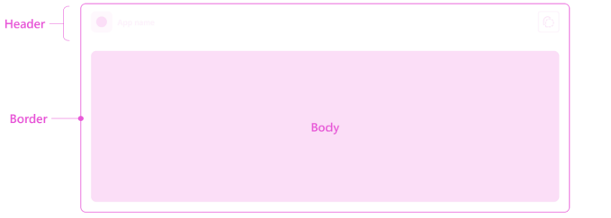
An Adaptive Card-based Loop component comprises of the body, header, and border.

| Loop component element | Developer provides | Platform provides |
|---|---|---|
| Body | Contents fully controlled by you | Rendering and styling of controls based on your code. |
| Header | Icon and name | Elements and layout are standard and provided by platform. |
| Border | NA | Standard border for all Loop components. |
Loop component body
The Loop component body makes your component unique. You can give your users a positive experience and grow usage and retention by building a component that embodies the Loop component attributes and provides customer value.
Your users’ specific needs and scenarios determine the component body.

The following are the best practices for a Loop component body:
- To understand the basics and core design principles of Adaptive Cards, see Adaptive Cards overview.
- Follow the Adaptive Card design guidelines, which include tools, examples, notes about responsive design, and pixel density.
- The following list provides the Loop component-specific considerations:
- Ensure that your component is true to the Loop components attributes such as, live, actionable, embedded, and portable.
- Don’t add a separate button to open in browser.
- Don’t add a duplicate header or border.
Don’t add a separate button to open in browser
The Loop component header provides a standard way to open a browser-based view of the component based on your URL. Thus, there's no need to add a separate button to your component for actions such as View Details or Open on Web.
You can add buttons or links for more specific views, for example, View Related Items. When possible, provide the required information and interaction within the card.
Don’t add a duplicate header or border
All Loop components have a standard header and border. Ensure that your Adaptive Card code doesn't duplicate the header and border. You can have an item-specific title for your component but ensure that the app name and icon aren't the same.
Loop component header
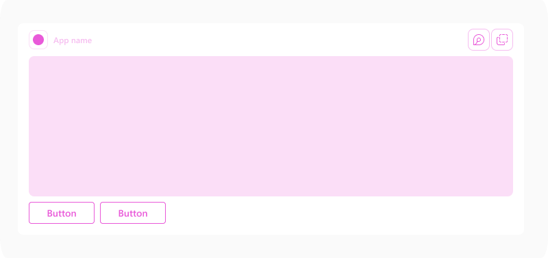
The platform provides the component header, which includes standard elements such as the app logo, app name, and a Copy component ![]() button.
button.

| Counter | Description |
|---|---|
| 1 | App logo: Full color app logo of your app |
| 2 | App name: Full name of your app |
| 3 | Copy component button |
App name is defined in your app manifest. We recommend using a concise name for your app.
App logo is defined in your app manifest. Ensure that the logo provided works on both light and dark backgrounds since the same asset is used for light, dark, and high contrast themes in Teams.
Loop component border
The component border separates your component from the content around it. It helps users understand that the Loop component is live and separate from the contents surrounding it, such as email or chat.
The border appears automatically.
Next step
See also
First things to know about Loop components in Microsoft Teams
Platform Docs