WPF Content Model
Windows Presentation Foundation (WPF) is a presentation platform that provides many controls and control-like types whose primary purpose is to display different types of content. To determine which control to use or which control to derive from, you should understand the kinds of objects a particular control can best display.
This topic summarizes the content model for WPF control and control-like types. The content model describes what content can be used in a control. This topic also lists the content properties for each content model. A content property is a property that is used to store the content of the object.
Classes That Contain Arbitrary Content
Some controls can contain an object of any type, such as a string, a DateTime object, or a UIElement that is a container for additional items. For example, a Button can contain an image and some text; or a CheckBox can contain the value of DateTime.Now.
WPF has four classes that can contain arbitrary content. The following table lists the classes, which inherit from Control.
| Class that contains arbitrary content | Content |
|---|---|
| ContentControl | A single arbitrary object. |
| HeaderedContentControl | A header and a single item, both of which are arbitrary objects. |
| ItemsControl | A collection of arbitrary objects. |
| HeaderedItemsControl | A header and a collection of items, all of which are arbitrary objects. |
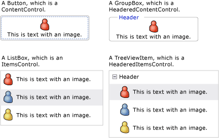
Controls that inherit from these classes can contain the same type of content and treat the content in the same way. The following illustration shows one control from each content model that contains an image and some text:

Controls That Contain a Single Arbitrary Object
The ContentControl class contains a single piece of arbitrary content. Its content property is Content. The following controls inherit from ContentControl and use its content model:
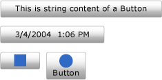
The following illustration shows four buttons whose Content is set to a string, a DateTime object, a Rectangle, and a Panel that contains an Ellipse and a TextBlock:

For an example of how to set the Content property, see ContentControl.
Controls That Contain a Header and a Single Arbitrary Object
The HeaderedContentControl class inherits from ContentControl and displays content with a header. It inherits the content property, Content, from ContentControl and defines the Header property that is of type Object; therefore, both can be an arbitrary object.
The following controls inherit from HeaderedContentControl and use its content model:
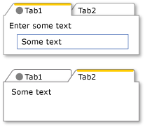
The following illustration shows two TabItem objects. The first TabItem has UIElement objects as the Header and the Content. The Header is set to a StackPanel that contains an Ellipse and a TextBlock. The Content is set to a StackPanel that contains a TextBlock and a Label. The second TabItem has a string in the Header and a TextBlock in the Content.

For an example of how to create TabItem objects, see HeaderedContentControl.
Controls That Contain a Collection of Arbitrary Objects
The ItemsControl class inherits from Control and can contain multiple items, such as strings, objects, or other elements. Its content properties are ItemsSource and Items. ItemsSource is typically used to populate the ItemsControl with a data collection. If you do not want to use a collection to populate the ItemsControl, you can add items by using the Items property.
The following controls inherit from ItemsControl and use its content model:
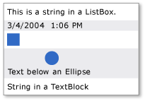
The following illustration shows a ListBox that contains these types of items:

Controls That Contain a Header and a Collection of Arbitrary Objects
The HeaderedItemsControl class inherits from ItemsControl and can contain multiple items, such as strings, objects, or other elements, and a header. It inherits the ItemsControl content properties, ItemsSource, and Items, and it defines the Header property that can be an arbitrary object.
The following controls inherit from HeaderedItemsControl and use its content model:
Classes That Contain a Collection of UIElement Objects
The Panel class positions and arranges child UIElement objects. Its content property is Children.
The following classes inherit from the Panel class and use its content model:
For more information, see Panels Overview.
Classes That Affect the Appearance of a UIElement
The Decorator class applies visual effects onto or around a single child UIElement. Its content property is Child. The following classes inherit from Decorator and use its content model:
The following illustration shows a TextBox that has (is decorated with) a Border around it.

TextBlock that has a Border
Classes That Provide Visual Feedback About a UIElement
The Adorner class provides visual cues to a user. For example, use an Adorner to add functional handles to elements or provide state information about a control. The Adorner class provides a framework so that you can create your own adorners. WPF does not provide any implemented adorners. For more information, see Adorners Overview.
Classes That Enable Users to Enter Text
WPF provides three primary controls that enable users to enter text. Each control displays the text differently. The following table lists these three text-related controls, their capabilities when they display text, and their properties that contain the control's text.
| Control | Text is displayed as | Content property |
|---|---|---|
| TextBox | Plain text | Text |
| RichTextBox | Formatted text | Document |
| PasswordBox | Hidden text (characters are masked) | Password |
Classes That Display Your Text
Several classes can be used to display plain or formatted text. You can use TextBlock to display small amounts of text. If you want to display large amounts of text, use the FlowDocumentReader, FlowDocumentPageViewer, or FlowDocumentScrollViewer controls.
The TextBlock has two content properties: Text and Inlines. When you want to display text that uses consistent formatting, the Text property is often your best choice. If you plan to use different formatting throughout the text, use the Inlines property. The Inlines property is a collection of Inline objects, which specify how to format text.
The following table lists the content property for FlowDocumentReader, FlowDocumentPageViewer, and FlowDocumentScrollViewer classes.
| Control | Content property | Content property type |
|---|---|---|
| FlowDocumentPageViewer | Document | IDocumentPaginatorSource |
| FlowDocumentReader | Document | FlowDocument |
| FlowDocumentScrollViewer | Document | FlowDocument |
The FlowDocument implements the IDocumentPaginatorSource interface; therefore, all three classes can take a FlowDocument as content.
Classes That Format Your Text
TextElement and its related classes allow you to format text. TextElement objects contain and format text in TextBlock and FlowDocument objects. The two primary types of TextElement objects are Block elements and Inline elements. A Block element represents a block of text, such as a paragraph or list. An Inline element represents a portion of text in a block. Many Inline classes specify formatting for the text to which they are applied. Each TextElement has its own content model. For more information, see the TextElement Content Model Overview.
See also
.NET Desktop feedback
