SharePoint Framework: Visually Enhance Dropdowns with Office UI Fabric Icons
Overview
Dropdown is one of the commonly used control on any data capturing forms. It allows users to choose a value from the predefined list. By default, dropdowns appeal users with a list of options to read, analyze and select. It would be great if we can help visualize users with an icon representing the selection option. This will help users to visualize and understand the options better.
In this article, we will explore the capabilities provided by Office UI Fabric dropdown control and how we can extend it to visually enhance our dropdowns to make them more appealing to the end users.
Office UI Fabric Dropdown Control
The Office UI Fabric offers numerous dropdown variations including basic, multi-select, controlled single-select, controlled multi-select, and customized. The customized dropdown option allows us to add options to dropdown with Office UI Fabric icons.
Most of Ul Fabric icons come with inverse, fill, reversed, or solid styling which inverse the colors (black and white). For example, the variation of Circle icon offers CircleRing and CircleShapeSolid.
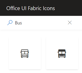
Bus icons offer Bus and BusSolid variations as below:
We can effectively use these variations of inverse, fill, reversed, or solid styling to visually enhance our dropdown controls.
↑ Back to top
Visually Enhance the Dropdowns
We will use the Dropdown control from Office UI Fabric controls.
Add below imports:
import { Dropdown, IDropdownOption, IDropdownProps } from 'office-ui-fabric-react/lib/Dropdown';
import { Icon } from 'office-ui-fabric-react/lib/Icon';
Define an array to hold the custom choice of colors.
private dropdownOptions: { key: string, text: string, data: any }[] = [];
Inside render method, add few colors to our array.
public constructor(props) {
    super(props);

    this.dropdownOptions.push({
      key: "Red",
      text: "Red",
      data: { icon: 'CircleShapeSolid', colorName: "#ff0000" }
    });

    this.dropdownOptions.push({
      key: "Green",
      text: "Green",
      data: { icon: 'CircleShapeSolid', colorName: "#00ff00" }
    });

    this.dropdownOptions.push({
      key: "Blue",
      text: "Blue",
      data: { icon: 'CircleShapeSolid', colorName: "#0000ff" }
    });

    this.dropdownOptions.push({
      key: "Purple",
      text: "Purple",
      data: { icon: 'CircleShapeSolid', colorName: "#800080" }
    });

    this.dropdownOptions.push({
      key: "Orange",
      text: "Orange",
      data: { icon: 'CircleShapeSolid', colorName: "#ffa500" }
    });
  }
Use the Dropdown control inside render method and provide the above array as an option to render inside dropdown:
<Dropdown
  label="Color"
  onChange={this.onSelectionChanged}
  onRenderTitle={this.onRenderTitle}
  onRenderOption={this.onRenderOption}
  onRenderCaretDown={this.onRenderCaretDown}
  options={this.dropdownOptions}
/>
We will make use of below dropdown events:
Event |
Description |
onChange |
Callback issued when the selected option changes. |
onRenderTitle |
Optional custom renderer for selected option displayed in the input. |
onRenderOption |
Optional custom renderer for option in dropdown. |
onRenderCaretDown |
Optional custom renderer for chevron icon. |
Implement onRenderOption event to uplift our dropdown by showing colored icon next to dropdown option.
private onRenderOption(option: IDropdownOption): JSX.Element {
  return (
    <div>
      {option.data && option.data.icon && (
        <Icon style={{ marginRight: '8px', color: option.data.colorName }} iconName={option.data.icon} aria-hidden="true" title={option.data.icon} />
      )}
      <span>{option.text}</span>
    </div>
  );
}
Implement onRenderTitle event to show the selected option with colored icon.
private onRenderTitle(options: IDropdownOption[]): JSX.Element {
  const option = options[0];

  return (
    <div>
      {option.data && option.data.icon && (
        <Icon style={{ marginRight: '8px', color: option.data.colorName }} iconName={option.data.icon} aria-hidden="true" title={option.data.icon} />
      )}
      <span>{option.text}</span>
    </div>
  );
}
Implement onRenderCaretDown event to implement custom renderer for chevron icon.
private onRenderCaretDown(props: IDropdownProps): JSX.Element{
    return <Icon iconName="CirclePlus" />;
}
Implement onSelectionChanged event to get the selected option and process further.
private onSelectionChanged(ev: React.FormEvent<HTMLDivElement>, item: IDropdownOption): void  {
  console.log(item.key.toString() + ": " + item.text);
}
Visually Enhanced Dropdown in Action
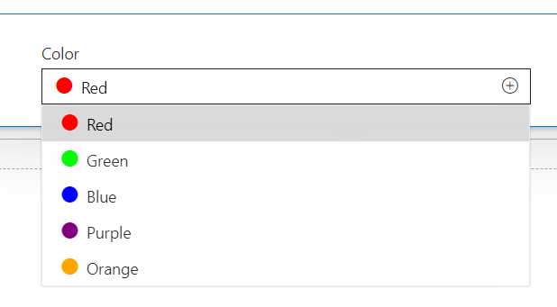
The dropdown, when added to any web part, displays the color next to the dropdown option and make it appealing for the users to visualize the options better.

Practical Scenarios
Here are some other examples built on the same theme.
Example 1: Commuting modes
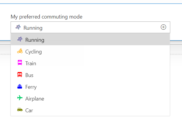
The below example will help to visualize commuting modes better:
// Commuting modes
this.dropdownOptions.push({
  key: "Running",
  text: "Running",
  data: { icon: "Running", colorName: "#201584" }
});

this.dropdownOptions.push({
  key: "Cycling",
  text: "Cycling",
  data: { icon: "Cycling", colorName: "#ffa500" }
});

this.dropdownOptions.push({
  key: "Train",
  text: "Train",
  data: { icon: "TrainSolid", colorName: "#FF00FF" }
});

this.dropdownOptions.push({
  key: "Bus",
  text: "Bus",
  data: { icon: "BusSolid", colorName: "#ff0000" }
});

this.dropdownOptions.push({
  key: "Ferry",
  text: "Ferry",
  data: { icon: "FerrySolid", colorName: "#0000FF" }
});

this.dropdownOptions.push({
  key: "Airplane",
  text: "Airplane",
  data: { icon: "AirplaneSolid", colorName: "#00CC66" }
});

this.dropdownOptions.push({
  key: "Car",
  text: "Car",
  data: { icon: "ParkingMirroredSolid", colorName: "#7e8509" }
The visually enhanced dropdown will present the options as below:

↑ Back to top
Example 2: Office 365 Apps
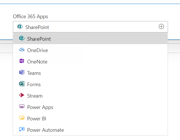
The below example will help to visualize Office 365 apps better:
// Office 365 Apps
this.dropdownOptions.push({
  key: "SharePoint",
  text: "SharePoint",
  data: { icon: "SharepointAppIcon16", colorName: "#0B828C" }
});

this.dropdownOptions.push({
  key: "OneDrive",
  text: "OneDrive",
  data: { icon: "OneDriveLogo", colorName: "#0364b8" }
});

this.dropdownOptions.push({
  key: "OneNote",
  text: "OneNote",
  data: { icon: "OneNoteEduLogoInverse", colorName: "#7719aa" }
});

this.dropdownOptions.push({
  key: "Teams",
  text: "Teams",
  data: { icon: "TeamsLogo16", colorName: "#4b53bc" }
});

this.dropdownOptions.push({
  key: "Forms",
  text: "Forms",
  data: { icon: "OfficeFormsLogo16", colorName: "#035a5d" }
});

this.dropdownOptions.push({
  key: "Stream",
  text: "Stream",
  data: { icon: "StreamLogo", colorName: "#af1946" }
});

this.dropdownOptions.push({
  key: "PowerApps",
  text: "Power Apps",
  data: { icon: "PowerApps", colorName: "#5c0e68" }
});

this.dropdownOptions.push({
  key: "PowerBI",
  text: "Power BI",
  data: { icon: "PowerBILogo", colorName: "#fdc941" }
});

this.dropdownOptions.push({
  key: "PowerAutomate",
  text: "Power Automate",
  data: { icon: "MicrosoftFlowLogo", colorName: "#0077ff" }
});
The visually enhanced dropdown will present the options as below:

Conclusion
The dropdown allows users to choose a value from the predefined list. We can effectively use the variations of inverse, fill, reversed, or solid styling of Office UI Fabric icons to visually enhance our dropdown controls.
Download
The code developed during this article can be downloaded from Github.
References
- Office UI Fabric: Dropdown control
- Office UI Fabric: Icon
- Overview of the SharePoint Framework
- Build your first SharePoint client-side web part
