Follow-up #2: How do I have access keys shown on buttons in my UWP XAML app?
This post describes a question arising from the discussion detailed at More tips on building accessible Windows apps, including a couple of things introduced with the Windows 10 Anniversary Update.
Access keys can make a huge difference to the keyboard accessibility of an app. Rather than forcing a customer to press the Tab key many times in order for them to reach some control of interest, access keys can mean that the customer might be able to trigger the control’s functionality with say 2 or 3 key presses.
Accessibility isn’t just about being technically accessible; it’s about being accessible and efficient.
It was pointed out during the discussion that it’s straightforward for a Win32 app dev to have access keys shown in their app when their customer presses the Alt key. And indeed, all the dev needs to do is add a ‘&’ to a resource string being used for a control’s label, and hey-presto, the character following the ampersand gets underlined when the Alt key is pressed. And if the customer then presses that character on their keyboard, the control associated with the string label will get invoked.
So the question was raised on how to have access keys shown in a UWP XAML app.
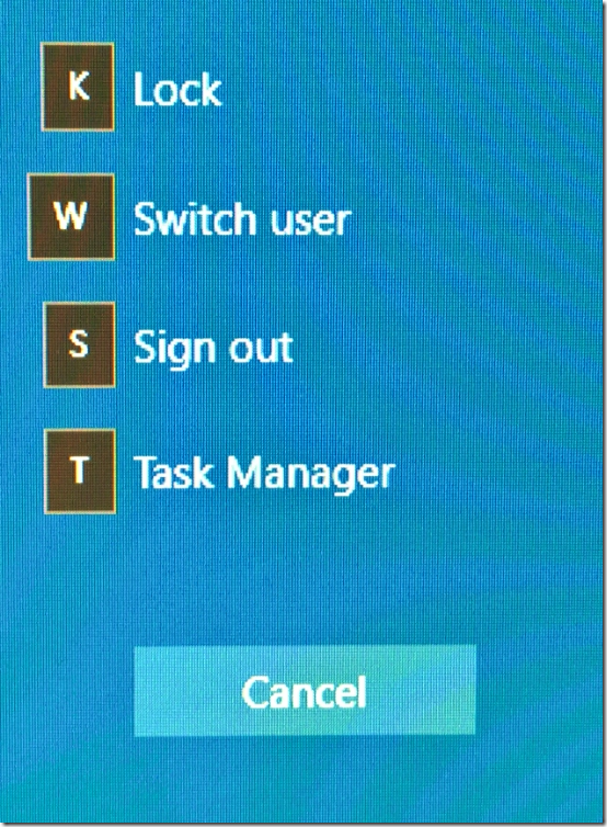
As it happens, support for access keys is now available in the shipping Windows 10 Anniversary Update. An example of where this is used today in Windows UI, is at the screen that appears when you press Ctrl+Alt+Del.
Figure 1: Access keys shown in the Windows 10 Anniversary Update UI.
(There’s no access key shown on the Cancel button on the screen shown in Figure 1, because the Escape key is the fast way to trigger that button’s action via the keyboard.)
All the details on how to leverage this very helpful functionality in your own app are up at Access Keys.
At some point I’d like to read that MSDN page, but in typical fashion I simply copied/pasted the snippets into my demo app, and tried running it without reading the documentation or studying exactly what the snippets did.
Important: I did need to update my app’s properties to target the Win10 Anniversary Update, otherwise the access key functionality won’t be available.
I tweaked the XAML to give one of my buttons an access key of “CK”, as shown below.
<Button Content="♚" FontSize="100" Margin="10"
AccessKey="CK"
AccessKeyDisplayDismissed="OnAccessKeyDisplayDismissed"
AccessKeyDisplayRequested="OnAccessKeyDisplayRequested"
Click="DoSomething" />
While a one-character access key would work perfectly well here, I used a two-character access key combination in this test simply because I wanted to get a feel for the experience.
Having done that, when I pressed the Alt key, I was informed of the access key that was now associated with my button.
Figure 2: Access key UI appearing over a button.
The snippet that I’d copied into my app included the event handlers associated with showing and hiding the access key UI. I could add these same event handlers to as many buttons as I want to in my app, because I want the access keys to have the same type of visuals on all buttons. The event handler just refers to “sender”, and doesn’t care exactly which button it’s dealing with.
As a test, I removed the use of custom colors from the event handler which displays the access key visuals over the button.
private void OnAccessKeyDisplayRequested(
UIElement sender,
AccessKeyDisplayRequestedEventArgs args)
{
var tooltip = ToolTipService.GetToolTip(sender) as ToolTip;
if (tooltip == null)
{
tooltip = new ToolTip();
tooltip.Padding = new Thickness(4, 4, 4, 4);
tooltip.VerticalOffset = -20;
tooltip.Placement = PlacementMode.Bottom;
ToolTipService.SetToolTip(sender, tooltip);
}
if (string.IsNullOrEmpty(args.PressedKeys))
{
tooltip.Content = sender.AccessKey;
}
else
{
tooltip.Content = sender.AccessKey.Remove(0, args.PressedKeys.Length);
}
tooltip.IsOpen = true;
}
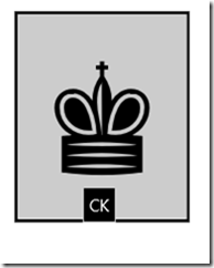
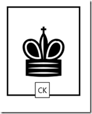
Having done that, I found the visuals automatically respect whatever high contrast theme is active.
Figure 3: Access keys automatically respecting system colors from the High Contrast Black theme.
Figure 4: Access keys automatically respecting system colors from the High Contrast White theme.
If I did still want to use custom colors when the default theme was active, I would take steps to make sure those colors were not shown when a high contrast theme was active. The code below checks for the state of high contrast, and uses system colors from the current high contrast theme when a high contrast theme is active.
private void OnAccessKeyDisplayRequested(
UIElement sender,
AccessKeyDisplayRequestedEventArgs args)
{
var tooltip = ToolTipService.GetToolTip(sender) as ToolTip;
if (tooltip == null)
{
tooltip = new ToolTip();
var accSettings = new AccessibilitySettings();
var uiSettings = new UISettings();
tooltip.Background = new SolidColorBrush(
accSettings.HighContrast ?
uiSettings.GetColorValue(UIColorType.Background) :
Windows.UI.Colors.Black);
tooltip.Foreground = new SolidColorBrush(
accSettings.HighContrast ?
uiSettings.GetColorValue(UIColorType.Foreground) :
Windows.UI.Colors.White);
tooltip.Padding = new Thickness(4, 4, 4, 4);
tooltip.VerticalOffset = -20;
tooltip.Placement = PlacementMode.Bottom;
ToolTipService.SetToolTip(sender, tooltip);
}
…
By using the above code, the access key visuals changed as I changed the state of high contrast.
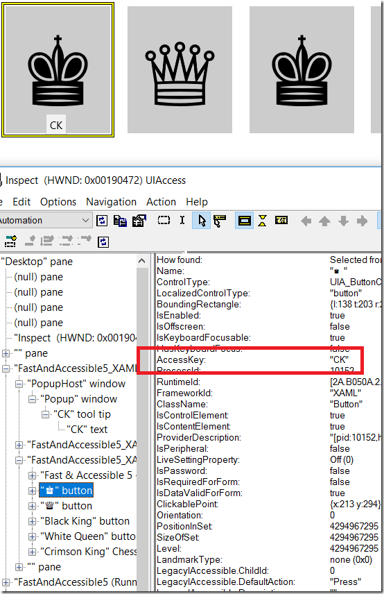
Having set the access key on the button, I then pointed the Inspect SDK tool at the app’s UI, to see what effect the change had had on its programmatic representation. The access key UI was exposed through UIA as at tooltip, and that’s because I’d implemented the UI as a tooltip. And it was particularly interesting to see that the button’s UIA AccessKey property is now “CK”. That means a screen reader can expose that information to your customers in whatever way the screen reader feels is most helpful.
Figure 5: The Inspect SDK tool reporting the UIA AccessKey property of the button.
This approach to having access keys shown in a UWP XAML app is an important step forward in the accessibility of Windows 10 apps.
Guy
Posts in this series:
Follow-up #2: How do I have access keys shown on buttons in my UWP XAML app?


