Visualisation of Data with Power BI
Power BI is an amazing business analytics service that enables anyone to visualise and analyse data.
In this tutorial were going to complete the following
Create an online dashboard on the Power BI service.
Populate the PowerBI dashboard with visualizations
Share the dashboard with colleagues.
Step 1. Install the Power PI Desktop Tool
Go to https://app.powerbi.com If prompted, sign in with your MSA account.
From the top-right menu, click on the downward arrow icon.
Click Power BI Desktop.
Click Run in the pop-up to install the application.
Follow the steps in the installation wizard.
When the installation is complete make sure Launch Microsoft Power BI Desktop is checked.
Click Finish.
Power BI Desktop will automatically launch.
Step 2. Getting Started with PowerBI Dashboard
A large yellow and black “Getting Started” window with links to videos and other resources to help you learn all of the rich features of Power BI Desktop may appear.
If this black and yellow window appears, click X in its top right corner to close it
You can explore this information on your own later.
We should be at the blank canvas of the Power BI Desktop application.
Step 3. Adding Data to PowerBI
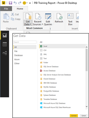
In the main ribbon menu, click the Get Data button icon (not the arrow pointing downward.)
In the dialog window that appears, select Excel, and click the Connect button.
Navigate to the Excel File
Click Open.
Note: you can important data into PowerBI from various data sources for this tutorial were looking at Excel dataset
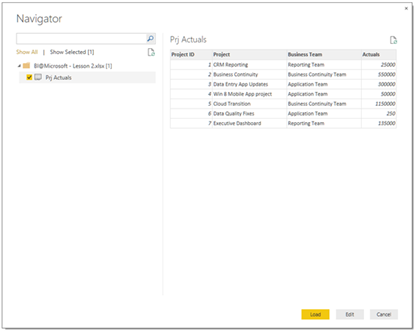
After Power BI Desktop opens the Excel file, the Navigator window should appear, showing the tables and objects available in the file.
Now we will select the data we want to import from the Excel file.
Check Sheet to indicate we want to import that data.
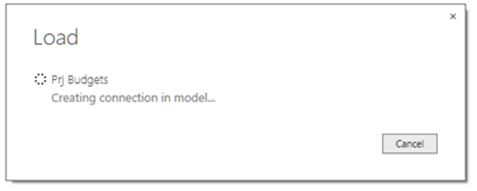
Click the Load button to load the data in Power BI Desktop.
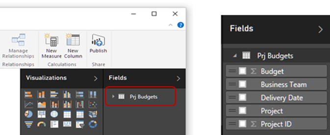
Power BI Desktop loads the data, and shows the imported object, our table, in the right navigation menu, under Fields.
•Click Excel Sheet to expand the field list. NOTE Fields are the table columns
Step 4. Create a visualisation.
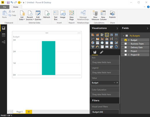
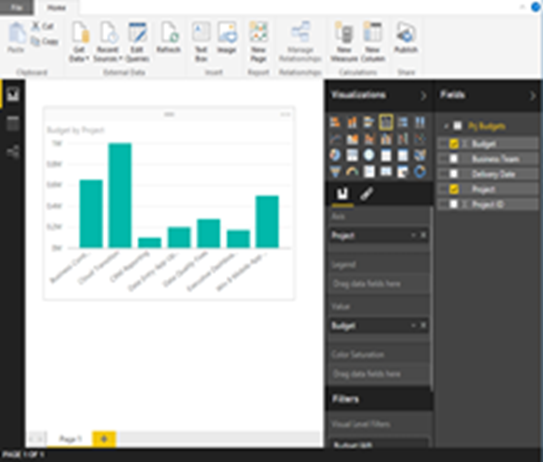
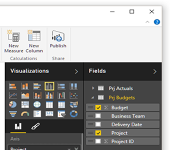
Drag the field which you want to visualised in your PowerBI report for this example I will be using the Budget (the one with the small Σ symbol on its left) you simply drop it in the empty area of the canvas.
A bar chart appears with the overall amount of the budget.
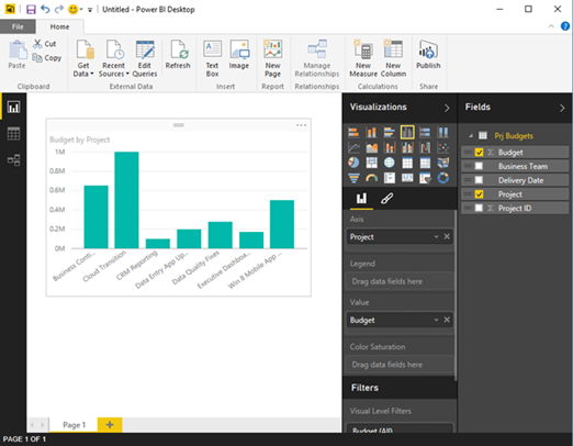
To visualize the budget by project.
I simply drag the field Project and drop it on the existing bar chart.
Note: handles can be used on the bar chart visualization edges to resize it for better viewing.
We have successfully imported data and created a report with a visualization.
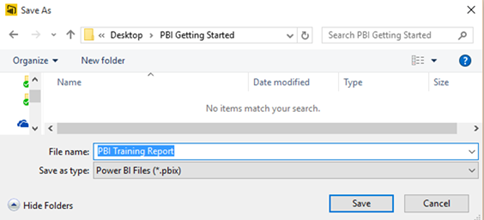
Let’s save the report.
Use the save button in the top-left to save the Power BI Desktop file (.pbix)
Step 5. Publishing the PowerBI Report
Let’s publish the report and its associated dataset in the Power BI service (https://app.powerbi.com):
In the ribbon menu Home, click the Publish button.
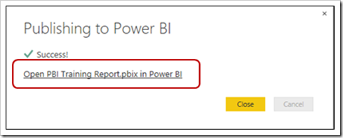
When the publishing is complete click the link in the pop-up window Open .pbix in Power BI to view the report you just published
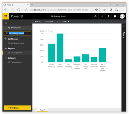
In the left menu you will see your list of dashboards, reports and datasets. If there is a large list we can quickly find a specific item by using the Filter
Type the name of your report in the text box with a small magnifying lens to filter out the other items.
Note: The report and dataset we created are named using the filename we chose are now listed under the appropriate section, on the left menu.
Step 6. Combing Multiple Data Sources and creating Data Visualisation
We now want to add data from another sources in our case we will be using another Excel file.
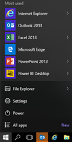
Start the Power BI Desktop application.
Open the Power BI Desktop file:
Open the File menu.
Click Open.
Navigate to the folder and select the .pbix file we saved.
Click the Open button.
In Power BI Desktop, in the main ribbon menu, click the Get Data button icon
(not the arrow pointing downward.)
In the dialog that appears, select Excel.
Navigate to the Excel file
Select the Excel file.
Click Open.
After Power BI Desktop opens the Excel file, the Navigator window should appear, showing the available tables and objects in the file.
Now select the data to be loaded from your data source.
Click Excel file to indicate you want this data to be loaded.
Click Load to load the data in Power BI Desktop.
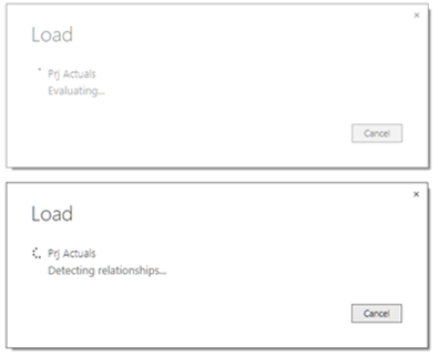
Power BI Desktop loads the data, and attempts to detect existing relationships between the existing data and the data being imported.
In my case the two files contain one field with the same name, Project ID. Power BI Desktop will automatically detect the field and join the data.
When the Load is completed the imported object, is visible in the right navigation menu, under Fields
To Add Visualisation which use the combined data sets
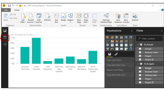
Click the Data icon on the left pane of the canvas to model your data.
Select the field to model:
Select Excel Table in the Field right menu.
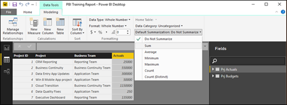
Select the column Actuals in the table.
Verify that Default Summarization is set to Sum:
If the drop-down menu says Default Summarization: Do Not Summarize:
Click the menu, and select Sum.
Repeat the steps above to verify also the field Budget of the other table has Default Summarization: Sum.
Now that we have the data in the tool model the way we want, we can create new visualizations in a few clicks
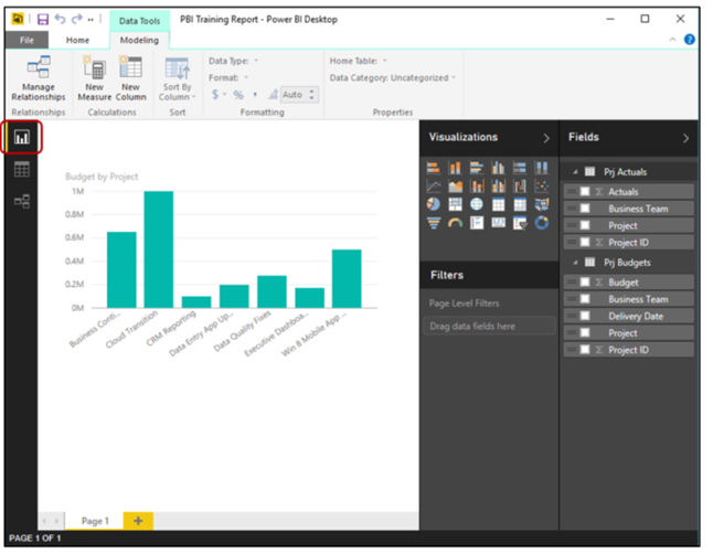
Click the Chart icon in the left pane of the canvas to return to the report visuals.
Click on the first Excel Table Name to expand the field list.
Click any part of the blank canvas until you do not see a box around your chart and no fields in the field list are selected.
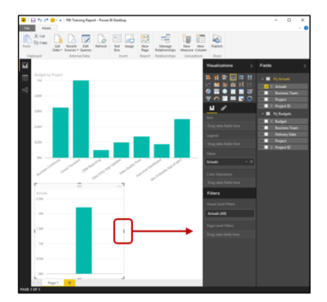
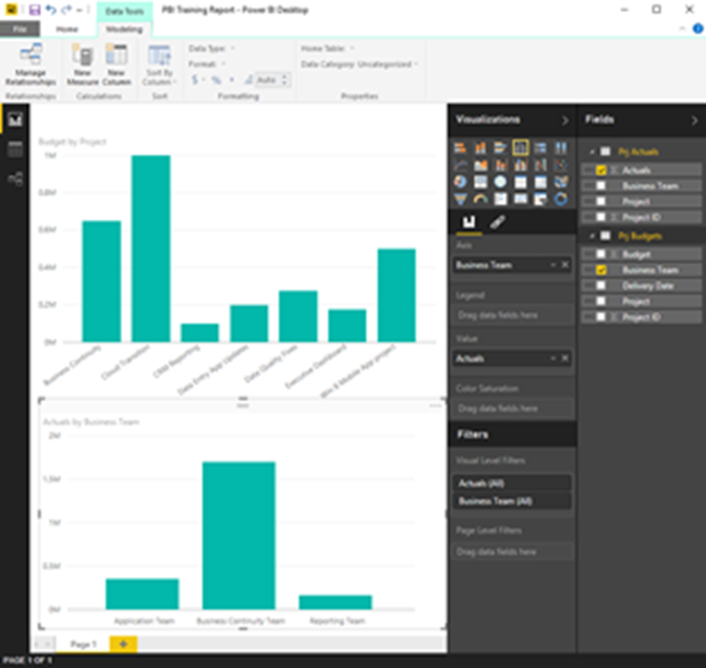
Click the checkbox besides Actuals, and a column chart with the sum of all actuals will appear.
Use handles on the bar chart visualization edges to resize it so that it fits on the canvas.
Drag the new a field and drop it on the visualization with the Actuals bar chart to show a updated dashboard
Since Power BI automatically detected the relationship between the Excel files, the two different files are correctly associated with each other.
The data imported from both the Excel files is really joined together.
To test this, click on any bar of the visualizations.
The visualizations are interactive and update basing on your selection.
Let’s save, publish in the Power BI service
Use the save button in the top-left to save the Power BI Desktop file (.pbix).
In the ribbon menu Home, click the Publish icon.
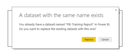
In the dialog that appears, click Replace.
Note: If we had saved the Power BI Desktop file with another name, a new report and dataset would have been created in the Power BI online service instead of updating the existing ones
When the publishing is complete click the link in the pop-up window Open PBI Training Report.pbix in Power BI to view the report you just published
Ok so we have created a PowerBI dashboard but now we want to be able to share this.
Step 7. Sharing a Dashboard with colleagues
We are going to create a dashboard in which we will add the visualizations we like from our report.
Go to the Power BI Service: https://app.powerbi.com. If prompted, sign in with your MSA account.
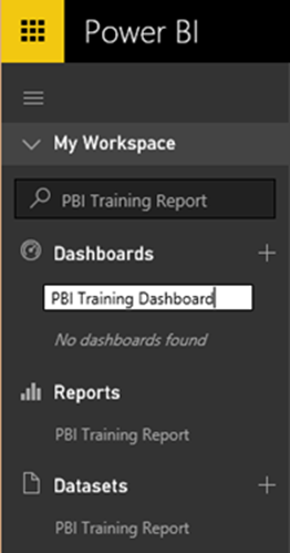
Click on the + symbol on the right of the section named Dashboards.
Type a name for our new dashboard
Click the Enter key on your keyboard to confirm.
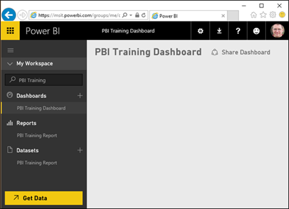
A new dashboard is created, with a blank canvas that can be populated.
Filter the objects in the service:
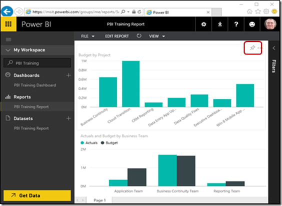
Type the name of the previous reports the box next to the magnifying lens to filter the reports and data sets to our content
Click the pin to pin the visual to the dashboard.
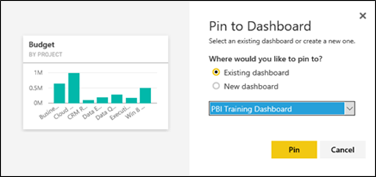
In the pop-up window select the Dashboard as location where to pin the visual
Click the Pin button. A confirmation balloon that the visual was successfully pinned appears
Repeat the above steps for the other visual in your report.
As we have now pinned new visualizations to the dashboard, let’s see how it looks. In the left menu, under the section Dashboards, click the Dashboard name to see the updated dashboard.
Step 8. Arranging the charts and data on the Dashboard
Drag the right tile and drop it under the left one.
Resize the lower tile by hovering the mouse pointer over the corner of the visualization until the mouse cursor turns into a two headed arrow and drag the visual to the size you want.
Note: the tile will snap to predefined sizes, drag the tile until you see it snap to a size
Click a dashboard visualization to drill to the underlying report.
The dashboard is now ready. Let’s share it.
Step 9. Sharing the Dashboard
If you drilled into the report in the previous step you need to navigate back to the dashboard.
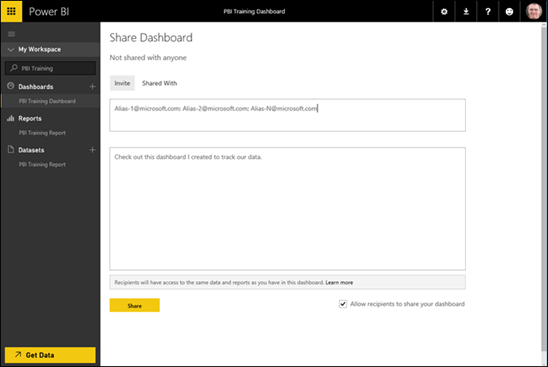
Click Share Dashboard in the main window next to the name of the dashboard
Enter the complete e-mail address of one or more colleagues.
Click Share to send an invitation e-mail to your colleagues. you can also Copy & Paste the URL of the dashboard from the browser, and send it directly to our colleague(s), or include in a personalized e-mail
Note: shared dashboards are read-only. If you want to allow others to edit, you can explore advanced features such as O365 Groups and Content Packs
In this tutorial you have:
•Created an online dashboard on the Power BI service.
•Populated the dashboard with visualizations form a Data Set.
•Combined data sets for visualisation
•Populated the dashboard with visualizations from your previously created report.
•Shared the dashboard with colleagues.
Resources
For more details on PowerBI see https://powerbi.microsoft.com
Watch some great training videos at https://www.youtube.com/user/mspowerbi
See more details on Power BI at https://channel9.msdn.com
Complete online training courses on PowerBI at Microsoft Virtual Academy https://mva.microsoft.com
![image_thumb[24] image_thumb[24]](https://msdntnarchive.z22.web.core.windows.net/media/2016/08/image_thumb24_thumb.png)
![image_thumb[22] image_thumb[22]](https://msdntnarchive.z22.web.core.windows.net/media/2016/08/image_thumb22_thumb.png)
![image_thumb[27] image_thumb[27]](https://msdntnarchive.z22.web.core.windows.net/media/2016/08/image_thumb27_thumb.png)
![image_thumb[16] image_thumb[16]](https://msdntnarchive.z22.web.core.windows.net/media/2016/08/image_thumb16_thumb.png)
![image_thumb[28] image_thumb[28]](https://msdntnarchive.z22.web.core.windows.net/media/2016/08/image_thumb28_thumb.png)
![image_thumb[29] image_thumb[29]](https://msdntnarchive.z22.web.core.windows.net/media/2016/08/image_thumb29_thumb.png)
