Getting started with the charting controls
Recently I thought I would check out the charting controls in the Silverlight Toolkit. I’d been meaning to for awhile, but I was distracted by other tasks such as writing the documentation for the Silverlight 4 beta release. Well, those docs have gone out so I had some time on my hands. I fired up my machine with Silverlight 3 and the Toolkit for Silverlight 3 installed and got busy.
The Data
I thought I’d start with a pie chart, because everyone loves pie charts, right? Okay, maybe it’s pie that everyone loves, but I do enjoy a good pie chart as well. One of the things we are always looking at on the User Education team is what a particular writer owns compared with other writers. This is one of the pieces of data we use to determine who should own new features. A pie chart is an easy way to visualize this data. For example, let’s say we have three writers with the following type distribution that I want to represent in a chart:
| Writer | Types Owned |
| Chris Sells | 114 |
| Luka Albrus | 225 |
| Jim Hance | 140 |
To get started, I created a Silverlight project and added a very simple class to represent a writer and type ownership:
public class Writer
{
public Writer() { }
public Writer(string writerName, int numOfTypes)
{
Name = writerName;
Types = numOfTypes;
}
public string Name { get; set; }
public int Types { get; set; }
}
Next, in the constructor for my page, I created an ObservableCollection that contains the writers.
public MainPage()
{
InitializeComponent();
ObservableCollection<Writer> Team = new ObservableCollection<Writer>
{
new Writer("Chris Sells", 114),
new Writer("Luka Abrus", 225),
new Writer("Jim Hance", 140)
};
}
Adding the Chart
A cool feature of the Toolkit for Silverlight 3 is the great designer support. The Toolkit controls display in the Visual Studio Toolbox so you can simply drag the desire controls onto the XAML editing surface. Doing so adds the necessary references, using statements and XAML namespace qualifiers to the XAML and code files.
There are a few key steps to adding a chart to your application.
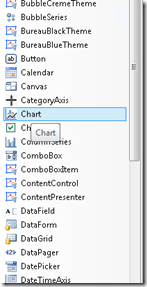
First, drag a Chart control to the XAML editor. Here’s the Toolbox:
I set the chart’s name and title properties.
<chartingToolkit:Chart x:Name="MyPie" Title="Writer Assignments" Width="400" >
</chartingToolkit:Chart>
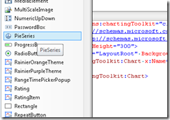
Then you’ll need to add a chartNameSeries control inside the Chart control. In this case, I’ll add a PieSeries by dragging it from the ToolBox to the XAML editor, inside the <Chart> tags.
I set the ItemsSource property to a {Binding}, the IndependentValue path to Name, which means my pie chart will have an entry for each writer name. and the DependentValuePath to Types so my pie chart will display the number of types that each writer is assigned as a portion of the pie.
<chartingToolkit:Chart x:Name="MyPie" Title="Writer Assignments" Width="400" >
<chartingToolkit:PieSeries ItemsSource="{Binding}" IndependentValuePath="Name"
DependentValuePath="Types">
</chartingToolkit:PieSeries>
</chartingToolkit:Chart>
Lastly, in the code-behind file, I set the data context for MyPie to the collection of writers.
MyPie.DataContext = Team;
I pressed F5 and look at the beautiful pie chart I got:
This chart is nice, and it was incredibly easy to create, but I decided I wanted to see this data in bar-chart format. I swapped my PieSeries for a BarSeries, keeping the same property settings (yes, I even left it named “MyPie” for now). Here’s the XAML:
<chartingToolkit:Chart x:Name="MyPie" Title="Writer Assignments" Width="400" >
<chartingToolkit:BarSeries ItemsSource="{Binding}" IndependentValuePath="Name"
DependentValuePath="Types">
</chartingToolkit:BarSeries>
</chartingToolkit:Chart>
When I pressed F5, I got the this bar chart:
This bar chart is okay, but the default scale the data is presented in makes Chris look like a slacker. Since I know he’s not (for the record, these names are out of our fictitious names list), I wanted to change the scale a bit. Also the “Series 1” title isn’t very helpful.
Fixing the “Series 1” was easy…I added a title to my bar series.
<chartingToolkit:BarSeries Title="# of Types" ItemsSource="{Binding}" IndependentValuePath="Name"
DependentValuePath="Types">
</chartingToolkit:BarSeries>
I discovered that in order to change the scale in which my data is displayed, I needed to add some Axes to my chart. A Chart object has an Axes property that you set to a collection of Axis objects. There are many different types of axis for displaying different kinds of data. These different types of axis all derive from Axis are generally named using the following convention: DescriptionOfFunctionAxis. For my chart I’ll use a LinearAxis since I am displaying numbers. I set the properties of my LinearAxis to the following values:
| Property | Value |
| Title | Types Owned |
| Orientation | X |
| Minimum | 0 |
| Maximum | 300 |
| Interval | 50 |
| ShowGridLines | True |
| FontStyle | Italic |
With these settings I adjust the scale of the X-axis to 0-300, with intervals of 50. I also opted to show gridlines and decided to use an italic font.
Getting fancy now, I also added a CategoryAxis, used for displaying category information, with its Title property set to Writer, and an Orientation set to Y. This will add “Writer” along the Y-axis for clarity. When I was finished, my XAML looked like this (the newly added portion is in a bold font) :
<chartingToolkit:Chart x:Name="MyPie" Title="Writer Assignments" Width="400" >
<chartingToolkit:Chart.Axes>
<chartingToolkit:CategoryAxis Title="Writer" Orientation="Y" />
<chartingToolkit:LinearAxis Title="Types owned" Orientation="X" Minimum="0" Maximum="300"
Interval="50" ShowGridLines="True" FontStyle='Italic'/>
</chartingToolkit:Chart.Axes>
<chartingToolkit:BarSeries Title="# of Types" ItemsSource="{Binding}" IndependentValuePath="Name"
DependentValuePath="Types">
</chartingToolkit:BarSeries>
</chartingToolkit:Chart>
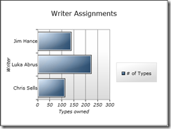
I pressed F5 and here’s what I got:
Yeah! Chris suddenly looks much more productive, and I’ve gotten started with charting!
Comments
Anonymous
February 28, 2011
The comment has been removedAnonymous
March 15, 2012
Hi Josh, try using ColumnSeries instead of BarSeries and that will do the trick.Anonymous
November 05, 2012
Hello, can you tell me why i am not getting Chart control i toolbox ?? I have install silverlight toolkit from codeplex.Anonymous
February 03, 2013
is there a way to remove title, it takes up too much space. Rather have a larger chart pic.Anonymous
September 03, 2013
can you please give me any idea of how i can implement funnel charts in silverlight 5, as there is no funnel chart control in the toolkitAnonymous
May 01, 2014
hello everyone, i have started to use this charting toolkit for work and i am not sure how to change the color of the background to my scatter series chart??? i am so lost and every example that i have seen seems to be for a different type of graph and not the scatter series. I am so lost with the properties of these charting tools, there seems to be no official documentation out there only forums. SO FRUSTRATING!!!! THANK YOU FOR LISTENING.Anonymous
September 13, 2015
The comment has been removed


