Expander の概要
Expander コントロールは、ウィンドウに似たヘッダーを含む展開可能な領域にコンテンツを提供する方法を提供します。
シンプルな拡張子の作成
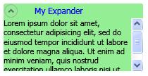
次の例は、単純な Expander コントロールを作成する方法を示しています。 次の使用例は、前の図のような Expander を作成します。
<Expander Name="myExpander" Background="Tan"
          HorizontalAlignment="Left" Header="My Expander"
          ExpandDirection="Down" IsExpanded="True" Width="100">
  <TextBlock TextWrapping="Wrap">
    Lorem ipsum dolor sit amet, consectetur
    adipisicing elit, sed do eiusmod tempor incididunt ut
    labore et dolore magna aliqua
  </TextBlock>
</Expander>
Expander の Content と Header には、RadioButton や Image オブジェクトなどの複雑なコンテンツを含めることもできます。
展開するコンテンツ領域の方向を設定する
ExpandDirection プロパティを使用して、Expander コントロールのコンテンツ領域を 4 つの方向 (Down、Up、Left、または Right) のいずれかで展開するように設定できます。 コンテンツ領域を折りたたむと、ExpanderHeader とそのトグル ボタンのみが表示されます。 方向矢印を表示する Button コントロールは、コンテンツ領域を展開または折りたたむ切り替えボタンとして使用されます。 展開すると、Expander はウィンドウのような領域にすべてのコンテンツを表示しようとします。
パネル内のエキスパンダーのサイズを制御する
Expander コントロールが、StackPanelなどの Panelから継承されるレイアウト コントロール内にある場合は、ExpandDirection プロパティが Down または Upに設定されている場合、Expander の Height を指定しないでください。 同様に、ExpandDirection プロパティが Left または Rightに設定されている場合は、Expander に Width を指定しないでください。
展開されたコンテンツが表示される方向に Expander コントロールにサイズ ディメンションを設定すると、Expander はコンテンツで使用される領域を制御し、その周囲に境界線を表示します。 コンテンツが折りたたまれている場合でも、境界線が表示されます。 展開されたコンテンツ領域のサイズを設定するには、Expanderのコンテンツにサイズ寸法を設定します。または、スクロール機能が必要な場合は、コンテンツを囲む ScrollViewer にサイズ寸法を設定します。
Expander コントロールが DockPanelの最後の要素である場合、Windows Presentation Foundation (WPF) は、DockPanelの残りの領域と等しい Expander ディメンションを自動的に設定します。 この既定の動作を回避するには、DockPanel オブジェクトの LastChildFill プロパティを falseに設定するか、Expander が DockPanelの最後の要素ではないことを確認します。
スクロール可能なコンテンツの作成
コンテンツ領域のサイズに対してコンテンツが大きすぎる場合は、スクロール可能なコンテンツを提供するために、Expander のコンテンツを ScrollViewer でラップできます。 Expander コントロールは、スクロール機能を自動的に提供しません。 次の図は、Expander コントロールが ScrollViewer コントロールを含んでいることを示しています。
ScrollViewer 内のエキスパンダー
Expander コントロールを ScrollViewerに配置する場合は、Expander コンテンツが開く方向に対応する ScrollViewer ディメンション プロパティを、Expander コンテンツ領域のサイズに設定します。 たとえば、Expander の ExpandDirection プロパティを Down に設定する場合 (コンテンツ領域が開き、ScrollViewer コントロールの Height プロパティをコンテンツ領域に必要な高さに設定します。 代わりにコンテンツ自体に高さ寸法を設定した場合、ScrollViewer はこの設定を認識しないため、スクロール可能なコンテンツは提供されません。
次の例は、複雑なコンテンツを含み、ScrollViewer コントロールを含む Expander コントロールを作成する方法を示しています。 次の使用例は、このセクションの最初の図のような Expander を作成します。
void MakeExpander()
{
  //Create containing stack panel and assign to Grid row/col
  StackPanel sp = new StackPanel();
  Grid.SetRow(sp, 0);
  Grid.SetColumn(sp, 1);
  sp.Background = Brushes.LightSalmon;

  //Create column title
  TextBlock colTitle = new TextBlock();
  colTitle.Text = "EXPANDER CREATED FROM CODE";
  colTitle.HorizontalAlignment= HorizontalAlignment.Center;
  colTitle.Margin.Bottom.Equals(20);
  sp.Children.Add(colTitle);

  //Create Expander object
  Expander exp = new Expander();

  //Create Bullet Panel for Expander Header
  BulletDecorator bp = new BulletDecorator();
  Image i = new Image();
  BitmapImage bi= new BitmapImage();
  bi.UriSource = new Uri(@"pack://application:,,/images/icon.jpg");
  i.Source = bi;
  i.Width = 10;
  bp.Bullet = i;
  TextBlock tb = new TextBlock();
  tb.Text = "My Expander";
  tb.Margin = new Thickness(20,0,0,0);
  bp.Child = tb;
  exp.Header = bp;

  //Create TextBlock with ScrollViewer for Expander Content
  StackPanel spScroll = new StackPanel();
  TextBlock tbc = new TextBlock();
  tbc.Text =
          "Lorem ipsum dolor sit amet, consectetur adipisicing elit," +
          "sed do eiusmod tempor incididunt ut labore et dolore magna" +
          "aliqua. Ut enim ad minim veniam, quis nostrud exercitation" +
          "ullamco laboris nisi ut aliquip ex ea commodo consequat." +
          "Duis aute irure dolor in reprehenderit in voluptate velit" +
          "esse cillum dolore eu fugiat nulla pariatur. Excepteur sint" +
          "occaecat cupidatat non proident, sunt in culpa qui officia" +
          "deserunt mollit anim id est laborum.";
  tbc.TextWrapping = TextWrapping.Wrap;

  spScroll.Children.Add(tbc);
  ScrollViewer scr = new ScrollViewer();
  scr.Content = spScroll;
  scr.Height = 50;
  exp.Content = scr;

  exp.Width=200;
  exp.HorizontalContentAlignment= HorizontalAlignment.Stretch;
  //Insert Expander into the StackPanel and add it to the
  //Grid
  sp.Children.Add(exp);
  myGrid.Children.Add(sp);
}
Sub MakeExpander()

    'Create containing stack panel and assign to Grid row/col
    Dim sp As StackPanel = New StackPanel()
    Grid.SetRow(sp, 0)
    Grid.SetColumn(sp, 1)
    sp.Background = Brushes.LightSalmon

    'Create column title
    Dim colTitle As TextBlock = New TextBlock()
    colTitle.Text = "EXPANDER CREATED FROM CODE"
    colTitle.HorizontalAlignment = HorizontalAlignment.Center
    colTitle.Margin.Bottom.Equals(20)
    sp.Children.Add(colTitle)

    'Create Expander object
    Dim exp As Expander = New Expander()

    'Create Bullet Panel for Expander Header
    Dim bp As BulletDecorator = New BulletDecorator()
    Dim i As Image = New Image()
    Dim bi As BitmapImage = New BitmapImage()
    bi.UriSource = New Uri("pack://application:,,./images/icon.jpg")
    i.Source = bi
    i.Width = 10
    bp.Bullet = i
    Dim tb As TextBlock = New TextBlock()
    tb.Text = "My Expander"
    tb.Margin = New Thickness(20, 0, 0, 0)
    bp.Child = tb
    exp.Header = bp

    'Create TextBlock with ScrollViewer for Expander Content
    Dim spScroll As StackPanel = New StackPanel()
    Dim tbc As TextBlock = New TextBlock()
    tbc.Text = _
            "Lorem ipsum dolor sit amet, consectetur adipisicing elit," + _
            "sed do eiusmod tempor incididunt ut labore et dolore magna" + _
            "aliqua. Ut enim ad minim veniam, quis nostrud exercitation" + _
            "ullamco laboris nisi ut aliquip ex ea commodo consequat." + _
            "Duis aute irure dolor in reprehenderit in voluptate velit" + _
            "esse cillum dolore eu fugiat nulla pariatur. Excepteur sint" + _
            "occaecat cupidatat non proident, sunt in culpa qui officia" + _
            "deserunt mollit anim id est laborum."
    tbc.TextWrapping = TextWrapping.Wrap

    spScroll.Children.Add(tbc)
    Dim scr As ScrollViewer = New ScrollViewer()
    scr.Content = spScroll
    scr.Height = 50
    exp.Content = scr

    'Insert Expander into the StackPanel and add it to the
    'Grid
    exp.Width = 200
    exp.HorizontalContentAlignment = HorizontalAlignment.Stretch
    sp.Children.Add(exp)
    myGrid.Children.Add(sp)
End Sub
<Expander Width="200" HorizontalContentAlignment="Stretch">
   <Expander.Header>
     <BulletDecorator>
       <BulletDecorator.Bullet>
         <Image Width="10" Source="images\icon.jpg"/>
       </BulletDecorator.Bullet>
       <TextBlock Margin="20,0,0,0">My Expander</TextBlock>
     </BulletDecorator>
   </Expander.Header>
   <Expander.Content>
     <ScrollViewer Height="50">
       <TextBlock TextWrapping="Wrap">
         Lorem ipsum dolor sit amet, consectetur adipisicing elit,
         sed do eiusmod tempor incididunt ut labore et dolore magna
         aliqua. Ut enim ad minim veniam, quis nostrud exercitation
         ullamco laboris nisi ut aliquip ex ea commodo consequat.
         Duis aute irure dolor in reprehenderit in voluptate velit
         esse cillum dolore eu fugiat nulla pariatur. Excepteur sint
         occaecat cupidatat non proident, sunt in culpa qui officia
         deserunt mollit anim id est laborum.
       </TextBlock>
     </ScrollViewer>
   </Expander.Content>
 </Expander>
配置プロパティの使用
Expander コントロールの HorizontalContentAlignment プロパティと VerticalContentAlignment プロパティを設定することで、コンテンツを配置できます。 これらのプロパティを設定すると、配置はヘッダーと展開されたコンテンツにも適用されます。
関連項目
.NET Desktop feedback