Managing distributed, part-time and virtual teams – Part 5 … Which visuali[s|z]ation catches your eye?
We continue from Objectives and repetition, Prioritization, Normali[s|z]ed estimations, Portfolio, flights, teams, epics and VSO, with a quick detour into visualization and trying to differentiate value from noise.
This time we need your candid feedback!
NOTE: 2014/07/15 – The blue theme has no significance, other than than I cut the images from a blue-theme slide deck.
context
We have 19 hypothetical project ideas, titled A-S, prioritized as discussed in Prioriti[s|z]ation of ideas, features and stories.
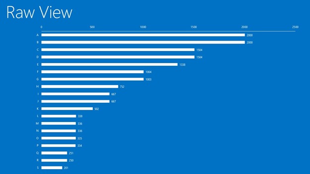
view 1 – raw triage
The first view comes from the triage using the size, business value and priority as defined by the stakeholders from the ALM community and ALM Rangers. Based on this view the top two ideas would be A and B.
?.1 What do you like and/or dislike about this view? Value or noise?
view 2 – normalised quadrant
The next view is generated after the ALM Ranger PMs have normalised the raw data, collaborating with Product Group PMs and other stakeholders. The intention is to position each idea in one of four quadrants: Community, Ranger Project, PG Project or Reject. The quadrant that contains the real gems is top-right, which has a high Ranger and PG value … a win-win. We notice that both idea A and B are included, as well as E which received a confidence boost during the raw data normalisation.
?.2 What do you like and/or dislike about this view? Value or noise?
view 3 – others
If we present the quadrant view as stacked bars we get this visualization:

The following two visualizations are additional attempts to highlight value and help us “visually identify” win-win gems.
A, B and E light up as gems in the first.

… we finish with a colourful doughnut.
?.3 What do you like and/or dislike about these views? Value or noise?
reference information
More information n program managers, flight board and our VSO dog-fooding can be found in this section.
- Program Manager (PM)
- Flight Board
- VSO
- This series
- Part 1 - Normali[s|z]ed estimations
- Part 2 - Portfolio, flights, teams, epics and VSO
- Part 3 - Prioriti[s|z]ation of ideas, features and stories
- Part 4 - Sprint objectives and repetition rule!
?.5 Clear as mud?
Comments
Anonymous
July 10, 2014
Number 1 is the one we're used to. I like it that it's very easy to see the relative value. What could help is split the bar in two colors for Ranger value and PG value. The second one is very readable. I think however that it's hard to add the project names without generating extra clutter. I find view 3 hard to read.Anonymous
July 10, 2014
The comment has been removedAnonymous
July 10, 2014
The comment has been removed


