Using the Silverlight Toolkit LayoutTransformer Control for Angled Column Header Text
I recently inherited the DataGrid control and, after reading over customer feedback and forum posts, one of the tasks I gave myself was to create a code example for the DataGrid.ColumnHeaderStyle property. After poking around I thought it would be interesting, and hopefully useful, to show how to angle the content of column headers using the ColumnHeaderStyle property. This would save screen real estate since headers, which by default are property names, can be lengthy, and the displayed values are often short. I mucked around and came up with the following:
<UserControl
…
xmlns:my="clr-namespace:System.Windows.Controls;assembly=System.Windows.Controls.Data"
xmlns:primitives="clr-namespace:System.Windows.Controls.Primitives;assembly=System.Windows.Controls.Data"
…
>
…
<my:DataGrid.ColumnHeaderStyle>
<Style TargetType="primitives:DataGridColumnHeader" >
<Setter Property="FontSize" Value="10" />
<Setter Property="ContentTemplate" >
<Setter.Value>
<DataTemplate >
<TextBlock Text="{Binding}" >
<TextBlock.RenderTransform>
<RotateTransform Angle="-35" />
</TextBlock.RenderTransform>
</TextBlock>
</DataTemplate>
</Setter.Value>
</Setter>
</Style>
</my:DataGrid.ColumnHeaderStyle>
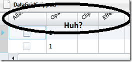
Here’s the column headers when I ran the code. (In this example, for simplicity, I’ve bound the DataGrid to the Children property of LayoutRoot)
Unfortunately, the tops of the headers were cut off and I couldn’t figure out why. I consulted my friend Margaret, who used to own the Silverlight layout docs and the WPF Datagrid docs up until recently, and she pointed out that the transform is done after the measure and layout pass so the layout slot allowed for the content reflects the pre-transformed data.
(As a side note, our conversation resulted in her posting about this problem on the WPF UE team blog. You can check out here.)
Here’s the info about how rotated elements are clipped from the Silverlight Layout System topic:
The following illustration shows a child element that is rotated and now extends beyond its assigned layout slot.

In this case, the layout system clips the child element and displays only the portion of the element that fits inside the layout slot.
Now I understood why my headers where being cut off, but I didn’t know how to fix it. As a result, I did some searching and I ended up at David Anson’s blog. He created a control for Silverlight that operates in much the same way that the LayoutTransform control does in WPF. The WPF LayoutTransform control performs the transform before the measure and layout passes so the correct layout slot is allocated for the control content.
It turns out that since David wrote this post, his control, now named the LayoutTransformer, has been added to the Silverlight Toolkit. I already had the Toolkit installed, so it was just a matter of referencing the correct assembly, which is the System.Windows.Control.Layout.Toolkit assembly, adding the XAML namespace mapping, and adding the control to my XAML. Here’s my new code:
<UserControl
…
xmlns:my="clr-namespace:System.Windows.Controls;assembly=System.Windows.Controls.Data"
xmlns:primitives="clr-namespace:System.Windows.Controls.Primitives;assembly=System.Windows.Controls.Data"
xmlns:layout="clr-namespace:System.Windows.Controls;assembly=System.Windows.Controls.Layout.Toolkit"
…
>
<my:DataGrid.ColumnHeaderStyle>
<Style TargetType="primitives:DataGridColumnHeader" >
<Setter Property="FontSize" Value="10" />
<Setter Property="ContentTemplate" >
<Setter.Value>
<DataTemplate >
<layout:LayoutTransformer>
<layout:LayoutTransformer.LayoutTransform>
<RotateTransform Angle="-35"/>
</layout:LayoutTransformer.LayoutTransform>
<TextBlock Text="{Binding}" />
</layout:LayoutTransformer>
</DataTemplate>
</Setter.Value>
</Setter>
</Style>
</my:DataGrid.ColumnHeaderStyle>
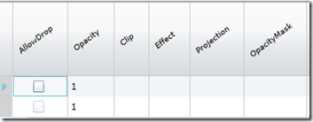
Here’s what my revised code looks like when I run it:
Angled content, and it’s all on the screen. Woo Hoo!
--Cheryl
Comments
Anonymous
December 17, 2009
That's cool, but it's not really doing what you set out to do: To decrease the width of the column. Look for instance at Opacity. The value is "1" but the name is still a lot wider. Looking something like this would make more sense: http://www.ithelpdesk.qut.edu.au/KPAKS/Microsoft%20Excel%202003/090468723536138.JPGAnonymous
December 17, 2009
Yes, I agree I didn't create an angled column, just angled text within the column. Your example is a harder problem to solve, but one I've got on my to-do list.Anonymous
October 16, 2011
Thanks very much. Helped solve this issue for me.Anonymous
July 30, 2012
its gud..Anonymous
November 22, 2012
Thanks for this, you've saved me a lot of time with this post!

