Windows 8.1 design principles hand developers back their sanity
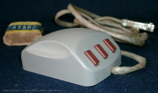
 When the computer mouse was new, it was simple to use but unfamiliar to users. As a result, user manuals could not say “click the red X”. Instead, they had to say, “move the mouse on your desk to control the pointer on your screen”. The idea of the mouse was new – the conversation had to start several steps back. After the mouse was successfully socialized and established as an input modality, user manuals could confidently say “click the red X”.
When Windows 8.0 was new, design principles were simple and few but unfamiliar to designers and developers. As a result, design principles could not be adequately communicated without the use of pedantic design guidelines, explicit margin pixels, and font sizes. These were to help coach new apps toward the design principles. They did so. However, like the computer mouse, designers and developers can now understand the design principles without explicit guidelines – in part, thanks to excellent, reference Store apps and a history of applied guidelines.
And, therein lies the rub
 Fraking left-brained engineers (like me) were never really looking for principles. We had never had them before. We were looking for specifications. Design principles were uncomfortable and ethereal while the guidelines were comfortable, precise, and specific.
Soon, and inaccurately, some designers (and every developer) perceived the guidelines as the principles. Navigation models they could understand. Margin pixels and font sizes they could understand. Apps without an 80 pixel gutter or not using Segoe UI fonts were labeled as “not metro” and, sometimes, even rejected by our own Store certification team as incompliant with the design principles. Those were early, painful days.