5 Steps to a Great SharePoint User Experience
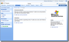
How many times have you visited a team site and seen this?
Or a site where a web part for every list in the site has been squashed into the home page?
But helping visitors get the most out of your site needn't be hard work. Here are five simple tips to make your SharePoint site a pleasure to use.
1. Make the Site's Purpose Clear
Start the home page with a sentence or two that describes the purpose of the site. It's important that first time visitors to your site know quickly whether they are in the right place to accomplish the task they are trying to do.
2. Help Users Get Their Jobs Done
What are the main tasks a user coming to your site will want to perform? Think in a task-oriented way and provide a simple way for people to perform these activities. In prototypes I often use big prominent buttons to highlight the main tasks. PowerPoint is a great tool for making professional looking buttons in seconds.
3. Make it Easy to Access Relevant Content
Provide simple clear navigation to content in the site and elsewhere. Is there information that users always need at-a-glance access to? If so put it right there on the home page. For example on a site managing committee documents and meetings you might want to see a link to the most recent set of minutes. On a purchase request site list the user's outstanding orders and current status. SharePoint views make this easy.
4. Less Is More
People scan a page looking for key words and phrases to enable them to quickly find what they want. Putting too much clutter on a page makes it hard for them to do that. It's tempting to fill up a site's home page with web parts showing every bit of information in the site. But don't be afraid of white space. Keep the home page clean and uncluttered. Focus on simple navigation and only the most vital information.
5. Make Appropriate Use of Graphics
Images are powerful communicators when used judiciously - helping illustrate content and guide users to items of interest. Office ships with a set of clip art that is a great starting point. But be careful, don't over use graphics and always make sure the your images are relevant if you want this to succeed.
Technorati tags: SharePoint, Usability, MOSS 2007, User Experience
Comments
- Anonymous
June 18, 2009
PingBack from http://adirondackchairshub.info/story.php?id=3556
