CSS viewport segments media query for dual-screen detection
The spanning CSS media feature can be used to test whether the output device is a dual-screen (or foldable) and the browser viewport is spanned across the two display regions. Environment variables are also available to calculate the visible areas on the screens, and the hinge area (if any) between them.
This API is available in Microsoft Edge version 97 and newer.
Viewport Segments
CSS syntax to declare styles for when the browser is spanned across a horizontal or vertical hinge:
@media (horizontal-viewport-segments: <count>) { }
@media (vertical-viewport-segments: <count>) { }
For Surface Duo, the values that will match the dual-screen display are:
horizontal-viewport-segments: 2
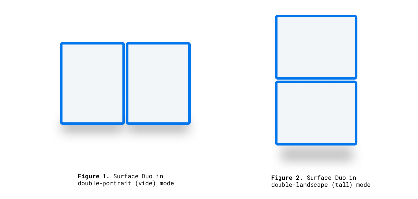
- Describes the state of when the browser viewport is spanning across a single fold (two display regions) and the fold posture is vertical. This value matches Surface Duo in double-portrait (wide) mode.
vertical-viewport-segments: 2
- Describes the state of when the browser viewport is spanning across a single fold (two display regions) and the fold posture is horizontal. This value matches Surface Duo in double-landscape (tall) mode.
This example CSS snippet shows how to use the -viewport-segments media features to apply styles on a Surface Duo:
@media (horizontal-viewport-segments: 2) {
   /* styles applied in double-portrait (wide) mode */
   /* matches Figure 1. below */
}
@media (vertical-viewport-segments: 2) {
   /* styles applied in double-landscape (tall) mode */
   /* matches Figure 2. below */
}
CSS environment variables
Web developers can utilize browser-defined environment variables to get the geometry of the display region (or regions) on and calculate the geometry of the obscured hinge area (if present). The properties of each viewport can be queried with the following environment variable definitions (using the coordinates of the top-leftmost segment):
env(viewport-segment-width <x> <y>);
env(viewport-segment-height <x> <y>);
env(viewport-segment-top <x> <y>);
env(viewport-segment-left <x> <y>);
env(viewport-segment-bottom <x> <y>);
env(viewport-segment-right <x> <y>);
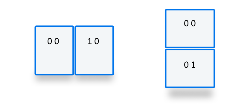
The coordinates are assigned from the top-left segment:
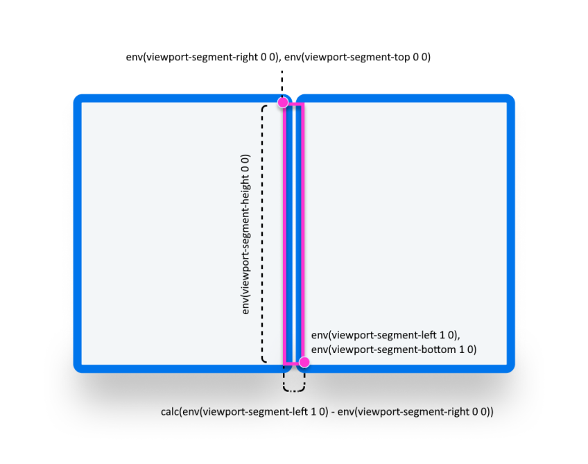
These values can be used to infer the coordinates of hinge areas:
/* double-portrait */
env(viewport-segment-right 0 0);      /* hinge left */
env(viewport-segment-left 1 0);       /* hinge right*/
calc(env(viewport-segment-left 1 0) - env(viewport-segment-right 0 0))
                                      /* hinge width */
/* double-landscape */
env(viewport-segment-bottom 0 0);     /* hinge top */
env(viewport-segment-top 0 1);        /* hinge bottom */
calc(env(viewport-segment-top 0 1) - env(viewport-segment-bottom 0 0))
                                      /* hinge height */
Examples
Basic
Create a responsive page where the <body> background-color is set to yellow on phones and green on dual-screen devices in any posture.
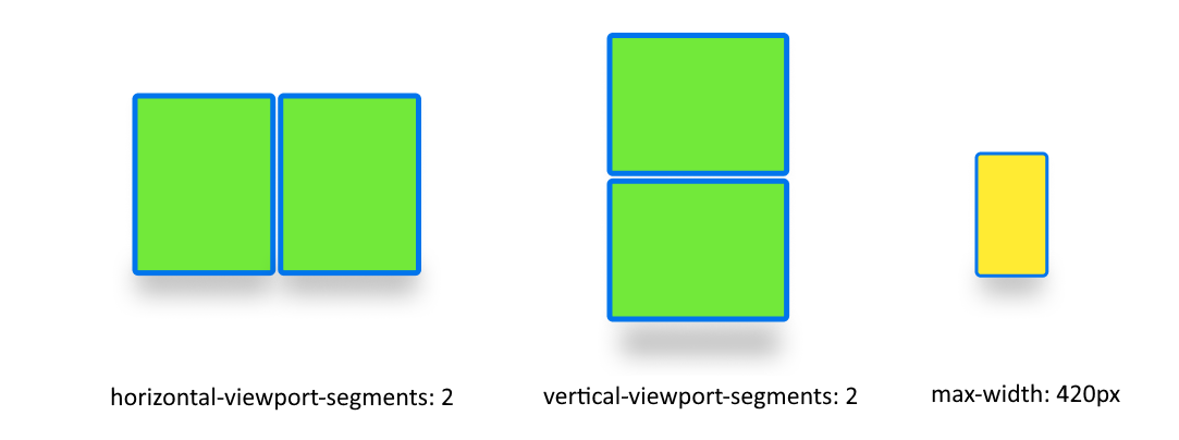
/* maximum width of our customers phones is 420px */
/* spanning: none is optional in this case */
@media (max-width: 420px) {
   body {
      background-color: yellow;
   }
}

/* Separating media features with comma `,` is equivalent to the logical operation OR  */
@media (horizontal-viewport-segments: 2), (vertical-viewport-segments: 2) {
   body {
      background-color: green;
   }
}
Flexbox
Use flexbox to create a gap-aware two column layout where the first column contains a scrollable description and the second column contains the image.
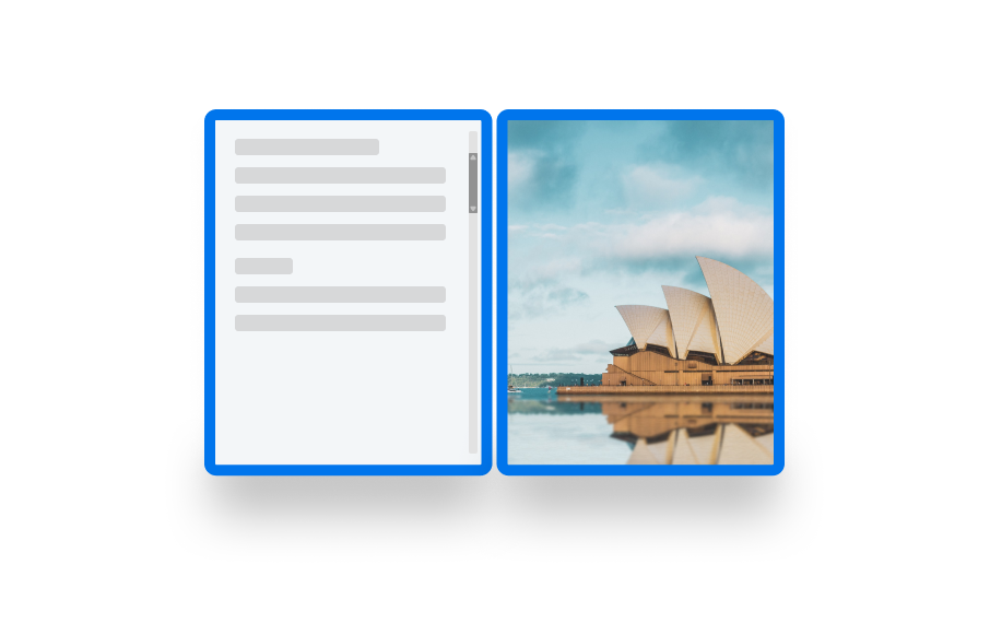
The HTML and CSS to create this layout is shown below:
   <body>
      <article class="article">
         ...
      </article>
      <figure class="figure">
         <img src="/sydney-opera-house.jpg"
               alt="Sydney Opera House">
      </figure>
   </body>
body {
   height: 100vh;
   display: flex;
}

.article {
   /* grow: no, shrink: no, basis: fold-left */
   flex: 0 0 env(viewport-segment-right 0 0);

   /* equals to margin-right when writing mode is left-to-right (english)  */
   /* equals to margin-left when writing mode is right-to-left (arabic, hebrew)  */
   /* this will prevent content from being rendered behind the device mask */
   margin-inline-end: calc(env(viewport-segment-left 1 0) - env(viewport-segment-right 0 0)) ; /* hinge width */

   overflow-y: scroll;
}

.figure {
   /* fill the rest of the space */
   flex: 1;

   margin: 0;
   overflow: hidden;
}

.figure img {
   height: 100%;
}