List detail design pattern
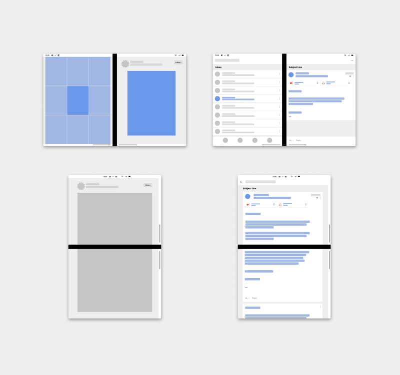
The list detail pattern has a main pane and a details pane for content. The main pane is usually a list view. When an item in the list is selected, the details pane is updated. This pattern is naturally good for when you have a wider viewing area. It is frequently used for email and address books.
Taking advantage of the two distinct screens and snapping to the natural boundary, you could use one screen to show the items list and the other to show details of the selected item.
Separating navigation or overview from details allows users to drill deeper into content while staying grounded regarding their position in the overall list or aggregate.
Best practices
Here are some scenarios to help guide you when applying this design pattern:
| Do | Don't |
|---|---|
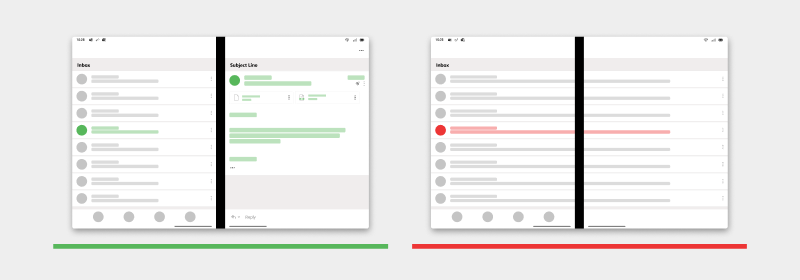
| Use left side of the screen to display a list and the right side to display the details of the selected item from the list. | Don't display the list across the two screens, use the second screen for a detail view. |
| Do | Don't |
|---|---|
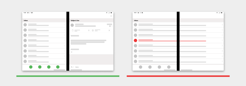
| Have a bottom menu navigation on the left screen in relation to the list on the left screen. | Don't have a bottom menu navigation on the left screen and the list spanned across two screens. |
| Do | Don't |
|---|---|
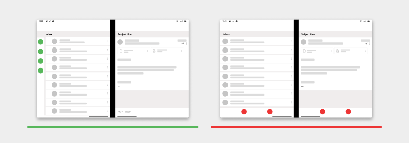
| Use a side menu navigation with the list on the left screen and details on the right screen. | Don't have a bottom menu navigation across two screens in list-detail. |
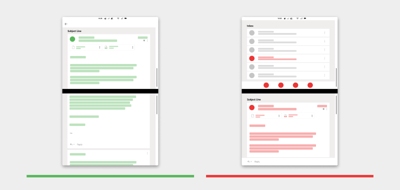
| Do | Don't |
|---|---|
| Display details when the device is rotated into a double landscape orientation (with a back button to return to the list). | Don't display list on one screen and details on the other screen when the device is rotated into a double landscape orientation. |
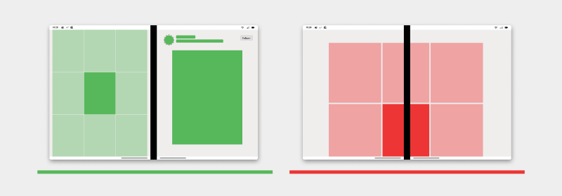
| Do | Don't |
|---|---|
| Use the second screen to display a larger image from the list of image gallery. | Don't display the list gallery across two displays passing through the hinge. |
Types of apps that may benefit from this pattern
- Apps that have lists or galleries
- Mail apps
- Scheduling apps
- Photos or image curation apps
- Music apps with playlists and song details
- Apps with strong navigation structure
Code examples
These projects show a simple implementation of the list detail design pattern that you can use in your apps:
Note
When working on a list-detail view
Make sure that when you move from a single screen to a spanned list-detail mode, you select an item to show the user for the detail view. Otherwise the detail view screen can feel broken to the user. It can annoy the user, requiring action to fill it with information.
Some options include the last touched item in the list view, or the top item in the list, or the last modified item.
Next steps
Consider these other design patterns: