Custom app theming using data binding on Windows 10 XAML Store Apps
XAML provides a rich framework for providing beautiful, responsive designs with many built in controls to simplify the building of apps. However, it is often a requirement to allow the user to choose from a set of themes in order to change the appearance of the entire app. For example, a dark and a light theme, maybe a blue or a red theme, or maybe you want to implement a daytime and night-time mode. The ThemeResource scheme is available in UWP apps, but does not allow the theme to be changed dynamically at runtime.
In this article I outline a simple extensible method based on data binding that allows you to define an unlimited set of themes for your app, and to allow the user to pick from them dynamically.
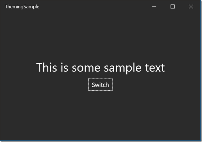
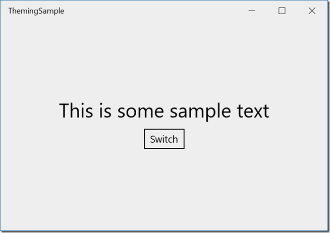
Here are some screenshots of the sample in both dark and light themes.
By clicking the “Switch” button, the app changes appearance completely. Notice that the app title bar also changes colour.
We start by defining a class in Theme.cs that contains properties for all of the different colours used in our UI. This is completely extensible, you can add as many colour properties as you like for each theme, but the more you add, the more work it is to define a new custom theme. In the sample we really only use a small number of properties, but you can define mouse over properties and disabled properties to control all aspects of your UI. This is also not limited to brushes and colours, you could add other data types to this.
Then, App.xaml, we define the themes. We only defined two, a light and a dark theme, but you can have as many as you like:
<local:ThemeManager x:Key="ThemeManager"/>
<local:Theme x:Key="DarkTheme" ForegroundColor="#123456" BackgroundColor="Black"
TextColor="White" PanelBackgroundColor="#FF2b2b2b"
PopupPanelBackgroundColor="#12345678" SettingsBackgroundColor="#12345678"
ViewerBackgroundColor="#FF222222"/>
<local:Theme x:Key="LightTheme" ForegroundColor="#123456" BackgroundColor="White"
TextColor="Black" PanelBackgroundColor="#FFEEEEEE"
PopupPanelBackgroundColor="#12345678" SettingsBackgroundColor="#12345678"
ViewerBackgroundColor="White"/>
Notice also the definition for ThemeManager. This is the class that will maintain the current theme for us and allow us to switch themes. ThemeManager is a singleton, and we add some code to our ViewModel to allow us to access the ThemeManager from code behind.
private ThemeManager themeManager = null;
public ThemeManager ThemeManager
{
get
{
if (this.themeManager == null)
{
App app = (App.Current) as App;
this.themeManager = app.Resources["ThemeManager"] as ThemeManager;
}
return this.themeManager;
}
}
This is important to make sure we are accessing the same ThemeManager instance in code as we do declaratively in the XAML markup.
Then, somewhere convenient, we load the themes:
private void MainPage_Loaded(object sender, RoutedEventArgs e)
{
this.DataContext = ViewModel.Current;
ViewModel.Current.ThemeManager.Load();
}
Now all we need to do is in our XAML definitions of our UI, we must not use fixed colours but must always reference the theme colours:
<TextBlock Foreground="{Binding CurrentTheme.TextBrush, Source={StaticResource ThemeManager}}" FontSize="30" Text="This is some sample text" Grid.Row="1" HorizontalAlignment="Center"/>
<Button Content="Switch" FontSize="15" Grid.Row="2" Margin="0,10" HorizontalAlignment="Center" Click="Button_Click"
Foreground="{Binding CurrentTheme.TextBrush, Source={StaticResource ThemeManager}}"
BorderBrush="{Binding CurrentTheme.TextBrush, Source={StaticResource ThemeManager}}" BorderThickness="1"/>
Now when we change the CurrentTheme property in code, possibly from our settings page, all of our UI changes colour as the databinding NotifyPropertyChanged will fire.
Because it is dynamic, the user gets immediate feedback of how the UI will look with the new theme. It is also easy to save the current theme index in a local settings file and restore it when the app starts up, so that the user’s preferences are kept (I have commented out this code). If you add themes, add them to the end of the list for backwards compatibility, so that older versions of your settings file will reference the correct chosen colour scheme.
I have included a sample project with all the code. You are free to use it in your code, even for commercial use.
https://theuxblog20160710035436.azurewebsites.net/themingsample.zip
Enjoy!
Paul Tallett, UX Global Practice, Microsoft UK
Disclaimer: The information on this site is provided "AS IS" with no warranties, confers no rights, and is not supported by the authors or Microsoft Corporation. Use of included script samples are subject to the terms specified in the Terms of Use.

