Behind the Mobile View in SharePoint 2010
Mobile view in SharePoint 2010 has been greatly enhanced from SharePoint Server 2007. Now Excel, Word and PowerPoint files can be viewed in mobile browsers directly. But, there’re so many different mobile browsers (even it may be the same browser, considering the experience on different phone models, the capability maybe vary), and new devices are coming out every month, what kind of supportability will SharePoint 2010 provide?
To answer this question, let’s go over how the mobile view is created by SharePoint. It is quite similar to 2007, but a few enhancements do help with the experience.
When user try to browse SharePoint 2010 site from his/her phone, the mobile browser submits a HTTP GET request to the website. In this request, a User Agent string is attached so the website can identify the browser and even the phone model. SharePoint analyzes this UA string,if it is a phone or mobile device, SharePoint will redirect the browser automatically to the mobile view and render the view based on the capability of the browser/phone type. A browser definition file is needed in this process to let SharePoint know what this browser can do.
Take one of my SharePoint 2010 farm as an example.
The browser definition file of a SharePoint Web Application which listening port 80 by default locates at
C:\inetpub\wwwroot\wss\VirtualDirectories\80\App_Browsers\compat.browser
In this file, you can find a very big list of different browsers and phone models. The schema of this file can be found in .Net Framework reference: Browser Definition File Schema (browsers Element)
My phone is AT&T HTC Fuze, it is also called HTC Touch Pro, or T7272. IE6 Mobile is the default browser. Here’s the section for it:
<!-- IE Mobile 6 plus browser -->
<!-- note: some IE Mobile 6 devices call itself as IEMobile 7+ -->
<!-- sample UA "HTC_Touch_Pro_T7272 Mozilla/4.0 (compatible; MSIE 6.0; Windows CE; IEMobile 7.11)" -->
<!-- sample UA "SAMSUNG-SGH-i908/1.0 Release/03.07 Browser/IE6 Profile/MIDP-2.0 Configuration/CLDC-1.1 (compatible; MSIE 6.0; Windows CE; IEMobile 7.11)" -->
<browser id="IEMobile6Plus" parentID="Mozilla">
<identification>
<userAgent match="Windows CE" />
<userAgent match="IEMobile (?'version'((?'major'([6-9])+)(?'minor'\.\d*)))" />
</identification>
<capabilities>
<capability name="browser" value="IE Mobile" />
<capability name="canInitiateVoiceCall" value="true" />
<capability name="isMobileDevice" value="true" />
<capability name="javascript" value="true" />
<capability name="optimumPageWeight" value="1500" />
<capability name="tables" value="true" />
<capability name="version" value="${version}" />
</capabilities>
</browser>
As a SharePoint Administrator, you can add more browsers definitions into the file. These definitions can also be updated by SharePoint updates.
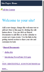
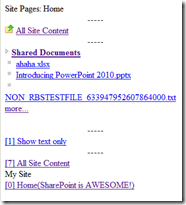
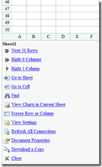
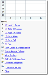
Here’s the render difference example between a decent big touch screen phone and a Nokia 3120 (a 6 years old typical non-touch screen S40 phone). Please note this is not a real one – I changed my browser’s user agent to let SharePoint believe it’s a Nokia 3120.
(Left – modern touch screen mobile browser experience; Right – Nokia 3120 )
Home page – despite the styles difference, the text content on the page is not displayed directly on 3120. It can be accessed through button 1 – Show text only.
Excel Mobile Viewer commands – it shows more rows and columns to fit into the modern phone screen.
Don’t forget to check out Mobile administration section on TechNet!
Jie.


