GP Logos through the years
 I thought that I would have a little fun and be nostalgic for a bit. I have been working with Great Plains Dynamics since version 2.00 in 1994. The company I was with did look at version 1.00, but decided not to become a reseller at that time. Instead we watched the progress of the product closely and when version 2.00 was released, we became the reseller for Western Australia.
While I have been involved with Great Plains we have seen many changes in corporate image and ownership and I thought it would be interesting to see how the logos have changed over time. Maybe this will bring back some memories for the old timers among us.
 1985: The original Great Plains Software logo with the sun and wheat image. This shows the heritage of the company being based in a wheat growing and farming region. This is from the first version of Great Plains Accounting (GPA).
 1991: The logo changed from the original orange sun to the red sun. According to my sources, this was because it was cheaper to print red rather than orange on the marketing materials.
 1993: The original Dynamics product branding.
 1994: The Dynamics Globe logo used on version 2.0.
At the bottom of this post I have attached the "Welcome to Dynamics" wave sound file that used to play when launching Dynamics.
I can reveal that the voice behind this sound file is Deb Reynolds, the wife of Todd Reynolds. Deb no longer works with the company (having a family took priority), but Todd remains working in the Dynamics development group at Microsoft.
If you want the sound back in your system see the VBA - Welcome to Dynamics Example.
[Edit] See update in the following post, Revisiting: "Welcome to Dynamics".
 1995: Then it was time to drop the Software part as Great Plains was selling entire solutions and not just software.
 1996: It was during this Great Plains era that we had Dynamics for the ISAM versions.
 And Dynamics C/S+ for the Client Server versions. Later when version 3.15 (& 3.17) was released we had Dynamcs C/S+ for SQL.
 Even Dexterity along with the other customisation and integration tools had their own logo.
 Dexterity itself had a great logo on its splash screen. This was known as the "Exploding Head" logo.
The blank area underneath the Dexterity name was used to show the Dexterity version and build numbers.
 If you load Dexterity and look at the Help >> About Dexterity window you will still see the original Dexterity logo included on this window.
 So they would not feel left out, the training branch of Great Plains, the Great Plains University, also had a logo.
 1997: Then after a year of work and millions of dollars, the logo was modernised, but the sun and wheat is still visible.. well sort of.
 We still had the Dynamics product for the ISAM database platforms.
 But Dynamics C/S+ for SQL was renamed to eEnterprise.
 2001: The next stage in the evolution was with the Microsoft acquisition. It was a bit of a mouthful, but it showed where the Business Solutions division came from.
 When Navision was acquired and the Business Solutions division grew to more than one product, the Great Plains logo and name were dropped. Well... we knew it would happen. Now we had a new name but the designers had not done their bit.

2003: There we go, that's better.
Make sure you use the correct pantone colours for the three shades of blue otherwise the logo police might visit you.

The final step was to brand all of the Business Solutions products under a single brand name. And guess what name Microsoft already owned the trademark for (inherited from Great Plains). The only problem is they did not have a logo.
 2005: Eventually, the design guys worked out the three ski jumps/sails/ice scrapers logo and the current branding was complete.
 2013: With the changes to the Microsoft Logo and Windows Logo, the Microsoft Dynamics Logo has been updated to the match the monochrome theme.
Now here is the fun bit. When the old red sun and wheat logo was going to be replaced by the new blue and yellow logo, there was a lot of secrecy about the new corporate image. Then the day before the new logo was going to be unveiled a picture swept through the partner channel explaining how the new logo concept was designed.

I found out that it was Todd Lefor who created this joke image for an internal newsletter. Below is the original image that started the whole joke.

Quote:
The actual “Homer's head” logo takes the GP logo and places it on Homer's head. What struck me as interesting is that I made NO modifications to the GP logo in order to make it fit into Homer's head. The skull lines of Homer fit perfectly with the angle of the sun.
Say no more.
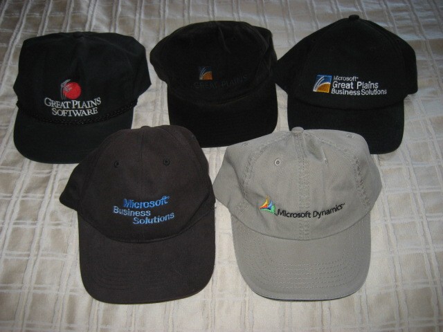
Just to show how sad I am, here is my Great Plains baseball cap collection:

Please feel free to add your comments about how many of these logos you remember.
David
PS: Thanks to John, Leslie, Jon, Tom, Andrew and Todd for sending me some of the additional logos.
12-Aug-2008: Updated posting to name the people behind the welcome wave and Homer's head.
26-Aug-2008: Added Dexterity Exploding Head Logo.
28-Aug-2008: Added Dexterity About window logo.
09-Sep-2008: Added Link for "Welcome to Dynamics" VBA example.
01-Oct-2008: For a bit of fun, go have a look Mariano Gomez's posting GP splash bitmap files over the years.
14-Oct-2008: Added Baseball Caps picture.
31-Mar-2010: Add link to Revisiting: "Welcome to Dynamics" post.
28-May-2013: Added new 2013 Microsoft Dynamics Logo.
Comments
Anonymous
July 28, 2008
The comment has been removedAnonymous
July 28, 2008
How fun! In addition to JohnR's. I'll add Small Business Manager (Dynamics Lite - Project Blue) and CS+ to the mix.Anonymous
July 29, 2008
I love this kind of stuff, does anyone have any more? I'd love it if you would make all of the logo images available for download. Great for my jeopardy game! LeslieAnonymous
July 29, 2008
Exceptionally done David. I have been working in GP from v5.5, and you threw the light on the history of GP, which is an amazing fact to know, being in that business . Hats off to you David. You are THE guy... :-)Anonymous
July 29, 2008
This is great, David. We all got a big kick out of this post, thanks! I remember the 'Homer Simpson' era, Dynamics, eEnterprise. That logo will always remind me of the sunflower seeds, we miss those little packages of sunflower seeds!Anonymous
July 29, 2008
Posted for Mariano Gomez: David, Once again, thanks for bring in back exceptional memories from a (not so) distant past. GPU? For you newbies, that's Great Plains University and yes, it was a vibrant training center of former Great Plains Software. I had to cross half the hemisphere to get there for training from Bogota, Colombia... not the place you want to be in winter. On a side note, not sure I really liked the coffee at GPU, ugh!Anonymous
July 29, 2008
This is great! Wasn't there a separate eEnterprise logo? A blue/grey e or something? I looked around, but could not find it. And what about SBM/SBF? Or do we not even count that? :-)Anonymous
July 29, 2008
Wow. Nice work David. I think, I have seen Gp only from version 7.0 onwards. Its a wonderful thing to actually see the history of the product, that you are working on, over the years. Great Job.Anonymous
July 31, 2008
David, I just e-mailed you the e-Enterprise 'e' I think Victoria was talking about.Anonymous
July 31, 2008
Maybe next we could see a "where are they now" video segment on all the people from the various login/splash screens and training manuals. A "Behind the Application" if you will. 3 ski jumps? I always thought they looked like sails. Not that either one makes much sense in the context of Fargo. MarkAnonymous
August 01, 2008
Man, that's just stinking funny. Thanks for the laugh!Anonymous
August 01, 2008
Comment from Mark Polino's Blog Hi Mark, I looked at the blog for the GP Logo's. It was interesting to see how the earlier logo evolved to the Blue/Yellow logo. That's probably the one logo that I was familiar with and always wondered what two sticks on a setting sun had to do with the software. Now I see the earlier logo's had the image of wheat stalks blowing accross the plains. That make more sense.Anonymous
August 04, 2008
Posting on VSToolsForum.com http://vstoolsforum.com/forums/p/524/1208.aspx#1208Anonymous
August 04, 2008
Posting from DynamicAccounting.net http://msdynamicsgp.blogspot.com/2008/07/dynamics-gp-logos-throughout-years.htmlAnonymous
August 04, 2008
Posting from Dynamics GP Blogster http://dynamicsgpblogster.blogspot.com/2008/07/microsoft-dynamics-gps-history-from.htmlAnonymous
August 22, 2008
David, You have to get a copy of the eOrder and eCommerce logos as well! =) VincentAnonymous
August 24, 2008
This is so hilarious... who would have think that GP is inspired by Homer?Anonymous
August 25, 2008
The comment has been removedAnonymous
August 29, 2008
I started working with Great Plains on version 3.15. I thought the logos for both Great Plains and Dexterity were kind of creepy, in a Pink Floyd sort of way. I was glad when they went with the Homer's hair version of the logo. It didn't make me feel weird. :)Anonymous
September 08, 2008
For those of you who have been involved with the Great Plains product for a while, you will rememberAnonymous
September 30, 2008
Microsoft Business Solutions - Great Plains v8.00 was the last version to include a splash.bmp file.Anonymous
October 01, 2008
This article is about being nostalgic and fun for those of you whom have been working with Dynamics GPAnonymous
October 01, 2008
Posting from the US Dynamics GP Field Team http://blogs.msdn.com/dynamicsgp/archive/2008/10/01/gp-logos-through-the-years.aspxAnonymous
October 03, 2008
The comment has been removedAnonymous
February 11, 2009
For anyone who has an interest in the "roots" of Dynamics SL (formerly Solomon) - check out the Solomon "museum" - www.SolomonHistory.orgAnonymous
March 03, 2009
The comment has been removedAnonymous
March 12, 2009
A little while ago I was sent a document which has the release dates for every release of Great Plains/MicrosoftAnonymous
March 12, 2009
A little while ago I was sent a document which has the release dates for every release of Great PlainsAnonymous
April 21, 2009
Post from Doug Pitcher http://rbsgp.blogspot.com/2009/04/dynamics-as-second-language.htmlAnonymous
May 07, 2009
Who remembers the 'Welcome to Dynamics' wav file that played when you launched....Version 2?...did it carry on in later versions? Is it still available?...I had one customer who never disabled it..and never got sick of hearing it! Great post. Lots of memories of pens and coffee mugs collected at Fargo and Doug Burgum arriving on a Harley to Stampede and telling his story about Polynesian sailors. And the FRx breakfasts?Anonymous
June 17, 2009
The comment has been removedAnonymous
August 12, 2009
Posting from DynamicsGP.ie http://dynamicsgp.wordpress.com/2009/07/03/gp-logos-through-the-years/Anonymous
December 20, 2010
Great posting David. I'll be linking to it tomorrow, Dec 21 (Fargo time zone) on the Dynamics Partner Community blog.Anonymous
January 09, 2011
Posting by Kevin Machayya from the Microsoft Partner Community Blog blogs.msdn.com/.../where-were-you-10-years-ago-today-microsoft-to-acquire-great-plains-software-inc.aspxAnonymous
February 17, 2012
I was an authorized consultant since 1991, and remember ALL the logos. Boy does it bring back memories!Anonymous
September 13, 2012
Posting by Mariano Gomez, The Dynamics GP Blogster dynamicsgpblogster.blogspot.com.au/.../microsoft-dynamics-gp-technical-airlift_2590.htmlAnonymous
July 20, 2013
I've always love this article. :-) don't forget to include a reference to the sister article to this post, GP splash images over the years, at dynamicsgpblogster.blogspot.com/.../gp-splash-bitmap-files-over-years.htmlAnonymous
November 04, 2014
Only somebody who is truly passionate about MSDGP would go to this trouble. Thanks David it is a really interesting and nostalgic look at Great Plains to MSDGP over the years.Anonymous
June 25, 2015
Great comment David. For me when I first certified on Great Plains Accounting DOS v6.0 in 1989 an awful lot has happened since then. I was in Fargo when Great Plains Dynamics was launched. I remember it as chucky peanut butter. Really smooth but with a few lumps. It got better after version 2.0. Really appreciate the effort of history you have put in. Well done.Anonymous
March 31, 2016
Actually, I started working at Great Plains in 1981, and we had the logo then. There was an earlier logo, similar to the first logo you displayed, that was developed by Steve Larson, brother-in-law to the founder. The very first logo was "Great Plains Computers," as the company started originally as a computer store for Apple 2s. (Didn't take them long to realize that software development would help them sell the computers... and soon the computer sales were gone.)I just ran into someone today who uses Great Plains software -- I'm glad to hear you are still producing a good product. I had a lot of fun there, back in my day...- Anonymous
March 31, 2016
Hi KatrinaGreat to hear from an "old timer". I have met quite a few of the early team members over the years. Hope you enjoyed the trip down memory lane.David
- Anonymous