Real-Time Intelligence tutorial part 5: Create a Real-Time Dashboard
Note
This tutorial is part of a series. For the previous section, see: Tutorial part 4: Query streaming data.
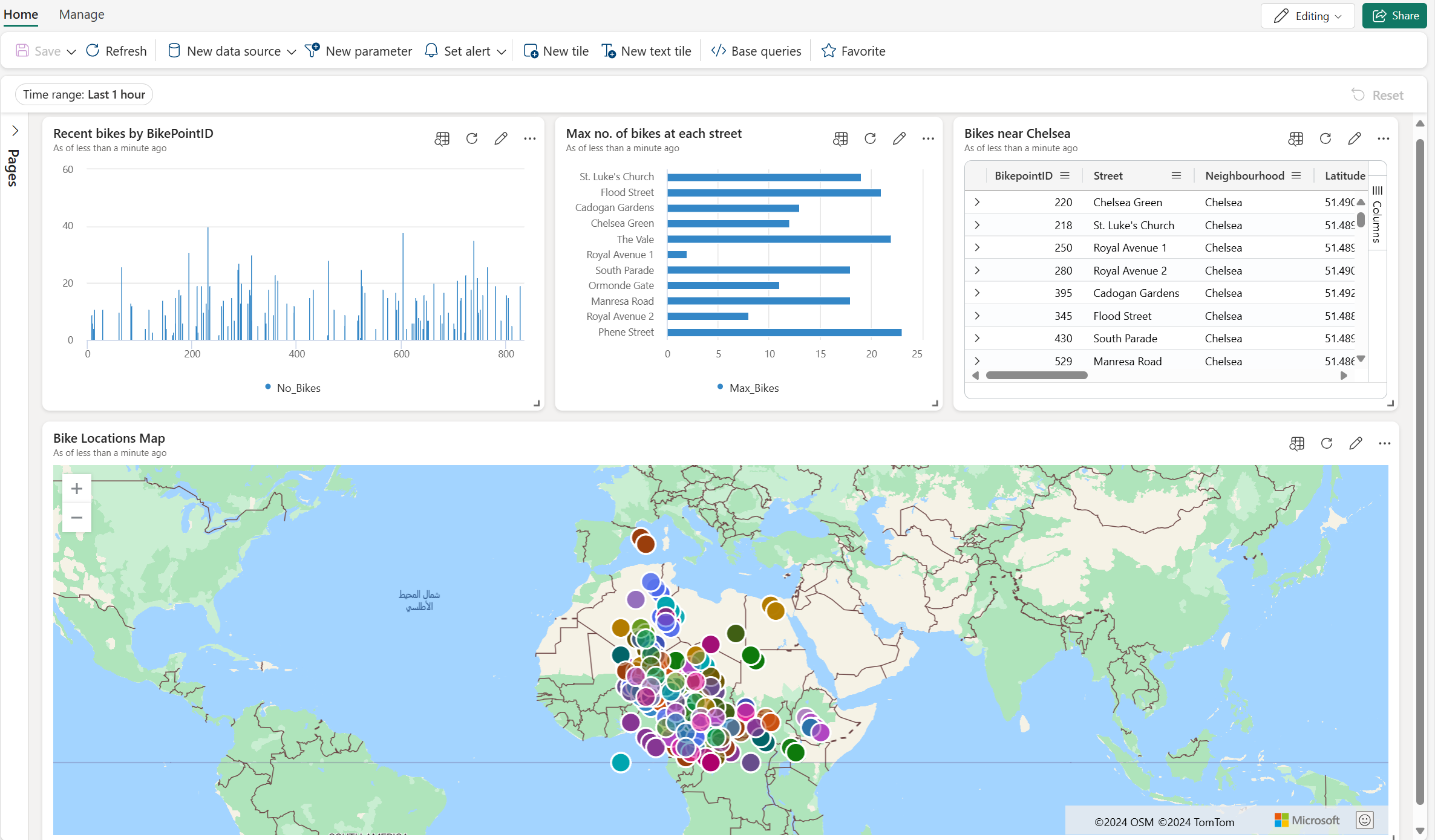
In this part of the tutorial, you learn how to create a Real-Time Dashboard in Real-Time Intelligence. You create a Kusto Query Language (KQL) query, create a Real-Time Dashboard, add a new tile to the dashboard, and explore the data visually by adding an aggregation.
Create a Real-Time Dashboard
In your KQL queryset, copy/paste, and run the following query. This query might already have been run from the previous section in this tutorial. This query returns a column chart showing the most recent number of bikes by BikepointID.
AggregatedData
| sort by BikepointID
| render columnchart with (ycolumns=No_Bikes,xcolumn=BikepointID)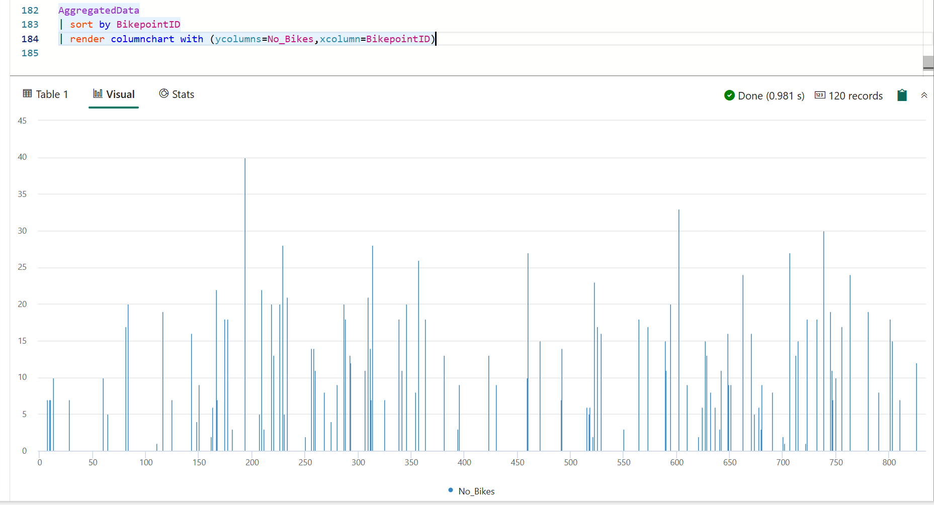
Select Pin to dashboard.
Enter the following information:
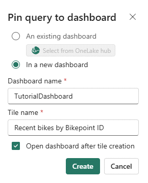
Field Value Create new tile In a new dashboard Dashboard name TutorialDashboard Tile name Recent bikes by Timepoint Open dashboard after creation Selected Select Create.
Since you've selected Open dashboard after creation, the new Real-Time dashboard, TutorialDashboard, opens with the Recent bikes by Bikepoint tile. You can also access the Real-Time dashboard by browsing to your workspace and selecting the desired item.
Add a new tile to the dashboard
On the top menu bar, toggle from Viewing mode to Editing mode.
Select New tile
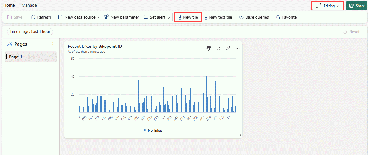
In the query editor, enter the following query:
RawData
| where Neighbourhood == "Chelsea"
From the menu ribbon, Select Apply changes. A new tile is created.
Rename the tile by selecting the More menu [...] on the top right corner of the tile > Rename tile.
Enter the new name Chelsea bikes to rename the tile.
Explore the data visually by adding an aggregation
On the new Chelsea bikes tile, select the Explore icon.

Select + Add > Aggregation.
Select Operator > max and Column > No_Bikes.
Under Display Name, enter Max_Bikes.
Select + Add grouping.
Select Group by > Street.
Select Apply.
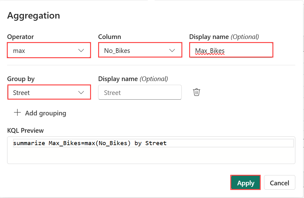
Notice that the query elements are updated to include the max(No_Bikes) by Street aggregation. The resulting table changed to show the total count of bike locations by street.
Change the Visual type to Bar chart.
Select Pin to dashboard > In this dashboard.
Add a map tile
Select New tile.
In the query editor, enter and run the following query:
RawData
| where Timestamp > ago(1h)
Above the results pane, select + Add visual.
In the Visual formatting pane, enter the following information:
Field Value Tile name Bike locations Map Visual type Map Define location by Latitude and longitude Latitude column Latitude Longitude column Longitude Label column BikepointID Select Apply changes. You can resize the tiles and zoom in on the map as desired.
Save the dashboard by selecting the Save icon on the top left corner of the dashboard.
Related content
For more information about tasks performed in this tutorial, see:
