Navigation concepts
This articles describes the primary navigation concepts including the dashboard, the new navigation search feature, the navigation pane, workspaces, and tiles.
Navigation concepts
The primary navigation concepts are:
- Dashboard
- Navigation pane
- Workspaces
- Tiles
- Navigation search
The dashboard is a new concept, whereas the navigation pane and workspaces are updates to existing concepts. To implement the navigation concepts, the user interface model uses several standard page types. When you create an application, you should follow the conventions for these pages to present a consistent experience for the user. The following sections provide more detail about the pages that underlie these concepts, and include information about the modeling of these and other types of pages.
Dashboard
The dashboard is the first page that users see when they access the client. The dashboard contains tiles that show important details from the system. Content that was previously displayed in Cues on Role Center pages in Microsoft Dynamics AX 2012 is now available on the dashboard. You can return to the dashboard at any time by clicking Dynamics 365 on the navigation bar at the top of the application frame.
The dashboard primarily consists of a large section of workspace tiles. There might also be a Getting Started tool, which isn't shown in the preceding screenshot. The dashboard's workspace tile section is built from a menu structure that has its root in the NavPaneMenu menu. The menu is modified by a set of menu extensions, and those extensions contain one or more tile references that correspond to the tiles that users see in that section.
Navigation pane
The navigation pane provides access to workspaces, main menu elements, recently opened forms, and user-defined favorites. The user can open the navigation pane by clicking the Show navigation pane button under the navigation bar. The navigation pane consists of four collapsible sections. The Favorites section provides quick access to the list of forms the user has explicitly marked as a favorite. Marking a form as a favorite is accomplished by clicking the star icon next to the form in the navigation pane. The Recent section lists the forms the user has most recently visited. The set of workspaces a user has access to is conveniently shown in the Workspaces section. Finally, the Modules section provides the full list of modules. Clicking on a module will open the right side of the navigation pane, where the user can navigate to the desired page in that module.
Like the workspace tiles on the dashboard, the elements that are listed in the navigation pane are generated at runtime, based on a menu structure. The same root menu (NavPaneMenu) that defines the set of workspaces on the dashboard also defines the navigation pane. Here's an example of the logical structure for the navigation pane:
- NavPaneMenu (menu)
- NavPaneMenuFleet (menu extension)
- "Reservation management" (tile reference)
- NavPaneMenuFleet (menu extension)
Workspaces
Workspaces are activity-oriented pages that are designed to increase a user's productivity by providing information that answers the targeted user's most pressing activity-related questions and allows the user to initiate their more frequent tasks. Access to the various workspaces depends on the roles that users have in the organization. Much of the list and business intelligence (BI) content from the old Role Center pages is exposed on workspaces. To navigate to a workspace, you can click a tile on the dashboard, click a link in the navigation pane, or find the workspace using the navigation search feature (see the next section).
Workspaces are simply a different type of modeled forms. The system differentiates workspaces by Form.Design.Style=Workspace (this value is defined as part of the Workspace form pattern). A workspace consists of a caption (which is defined on Form.Design.Caption) and a panorama (that is, a tab control). A panorama contains sections of content that are relevant to the task for which the workspace is intended. These sections are modeled as tab pages. The first section will generally be a set of tiles that users can click to begin new tasks or access lists of items. The second section contains a set of relevant lists for the activity. The last section contains a number of links to pages that are important but not frequently used for this activity. In between the list and links section are a few optional sections that might contain charts and graphs. One important distinction of workspaces is that they do not have a data source. If the content (such as a list or chart) requires a data source, you must model that content on an independent form of type Form part, and then reference that form part on the workspace. Form parts can be hosted on other forms, and each can have its own data source.
Tiles
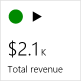
Windows 8 introduced the concept of tiles, and you will see them used in the client. A tile is a rectangular button that behaves like a menu item button. It is used to navigate to or open pages. In addition, tiles can display relevant data, such as counts or key performance indicators (KPIs). A tile can include images that provide the user with additional visual context. You can create the following types of tiles.
For modeling, you first create a tile element, which is an abstract element. The tile element is then referenced on a form by a tile button element. Multiple tile button elements can refer to a single tile. Tiles are defined first by the Type property (which has valid values of Standard, Count, KPI, and Link). After you specify the type, you specify the following minimum properties for each type:
- Standard and Count:
- Label
- Menu Item Name
- Menu Item Type
- KPI:
- Label
- KPI
- Link:
- Label
- URL
After these properties are defined, your tile is complete. To make the user experience richer, you can optionally extend tiles of the Standard and Link types so that they include images. Use the following properties to add images.
| Property | Description |
|---|---|
| Image Location | See the information about basic button behavior in Actions. |
| Normal Image | See the information about basic button behavior in Actions. |
| Tile Display | Define how the image appears on the tile. |
The following are the valid options and corresponding behaviors for the Tile Display property.
| Value | Description |
|---|---|
| Auto | The behavior is the same as the behavior for TextAndImage. |
| TextAndImage | The tile shows the specified label and the image in a small container above it. For example, the App links tile uses this value. |
| TextOnly | The other two image-related properties are ignored, and only the label is shown. |
| ImageOnly | The label is ignored, and only the image is shown. |
| BackgroundImage | The specified image is expanded to fill the tile from edge to edge, and the label is overlaid on the image in the same location. Shading is applied behind the text to ensure that it remains legible. |
Note: The following limitations apply when the BackgroundImage value is used:
- If a symbol is used, it isn't displayed.
- The image that you specify isn't resized. Therefore, you must create an image of the appropriate size to guarantee that it fills the tile correctly. Currently, a standard-sized tile is a square that is 130 pixels on each side.
Navigation search
There is a convenient search mechanism for finding and navigating to forms and workspaces that appear in the navigation pane and on the dashboard. For example, a search on the keywords "all sales order" returns a list of navigation elements that match those keywords.
The search keywords are matched not only to the caption of the navigation elements but also to the corresponding path. For example, a search on the keywords "ven bal report" returns results that match "vendor balance" in the caption and "report" in the path.


