A tip on how to find some high contrast bugs
This post suggest a quick way to detect some severe bugs that can impact your customers who use high contrast themes.
Thinking about high contrast is not all black and white
When designing your app, you’ll have spent a lot of time and effort choosing the default colors shown in your UI. And many of your customers will love those colors! The app looks so cool!
Other customers however will find it more practical to leverage all the great functionality in your app by having specific colors shown which work best for them. Perhaps white or yellow text on a black background will make it quick and easy for them to use your app. So those customers might go to the Ease of Access section in the Settings app, and select a High Contrast theme. The screenshot below shows the theme called “High Contrast Black” being selected in the Settings app.
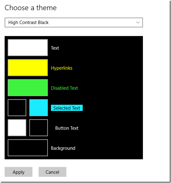
Figure 1: Selecting the High Contrast Black theme in the Settings app.
A very important point here is that many customers who choose to use high contrast themes, will customize the colors shown to be the colors that work best for them. So perhaps a customer might select the theme called “High Contrast Black” as a fair starting point, but then they’ll change specific elements of that theme in whatever way they prefer. For example, maybe the colors used for selected text and its background might be changed.
And this is why it’s so important for app devs to consider how UI will be presented when a high contrast theme is active. That is, we never think of specific colors like (say) black or white, but instead we think of UI elements like selected text and selected text background.
So what can my customer customize?
In the screenshot above, there are eight UI element colors that your customer can customize. These are:
Text
Background
Button text
Button text background
Selected text
Selected text background
Disabled text
Hyperlink text
If you present a Button and don’t customize its colors, then it’ll look just fine when a high contrast theme is active. Its text will be presented using whatever color your customer’s chosen for button text, and its background will be presented using whatever color your customer’s chosen for button text background. So you had to take no action whatsoever to respect your customer’s wishes.
But once you start presenting custom colors, your customers will need you to specify what colors should be used when a high contrast theme is active. Building accessible Windows Universal apps: Colors and contrast discusses how by specifying SystemColorButtonTextColor and SystemColorButtonFaceColor, you don’t have to care what color is being used for the button text, but you’ll know it’s what your customer wants.
In order for you to consider what’s best for your customers, you need a mapping from the UI elements shown in the Settings app, to the various SystemColor* colors that you’ll specify in your code. And this is one of the reasons why Mike’s post at XAML theme resources is so valuable. It includes a table with the following data in it.
| Key | Ease of Access name |
| SystemColorWindowTextColor | Text |
| SystemColorWindowColor | Background |
| SystemColorButtonTextColor | Button Text (foreground) |
| SystemColorButtonFaceColor | Button Text (background) |
| SystemColorHighlightTextColor | Selected Text (foreground) |
| SystemColorHighlightColor | Selected Text (background) |
| SystemColorGrayTextColor | Disabled Text |
| SystemColorHotlightColor | Hyperlinks |
So if you feel that some custom UI in your app should show text in the selected text color, with a background of the selected text background color, then in your code you’d specify SystemColorHighlightTextColor for the text and SystemColorHighlightColor for the background.
<Button …
Background="{ThemeResource MyButtonBackground}"
Foreground="{ThemeResource MyButtonForeground}" />
<Application.Resources>
<ResourceDictionary>
<ResourceDictionary.ThemeDictionaries>
<ResourceDictionary x:Key="Default">
…
</ResourceDictionary>
<ResourceDictionary x:Key="Light">
…
</ResourceDictionary>
<ResourceDictionary x:Key="HighContrast">
<SolidColorBrush x:Key="MyButtonBackground"
Color="{ThemeResource SystemColorButtonFaceColor}" />
<SolidColorBrush x:Key="MyButtonForeground"
Color="{ThemeResource SystemColorButtonTextColor}" />
</ResourceDictionary>
</ResourceDictionary.ThemeDictionaries>
</ResourceDictionary>
</Application.Resources>
More information on implementing high contrast UI can be found at Supporting high-contrast themes (XAML) and Supporting high contrast themes (HTML).
So what’s the tip on finding bugs?
When designing your UI, you’ll be considering which of the various UI element colors are most appropriate for you to show. For example, if you have a custom UI that behaves like a link, then your customer will expect the text to be shown using the color appropriate for links. From the table above I can see that I’d use SystemColorHotlightColor for that. Similarly, disabled text would be shown with SystemColorGrayTextColor.
But something occurred to me recently. What would happen if I did a test where I’d customize all text to be in one color, and all background to be in another? Doing that would be no help at all in detecting problems where the wrong color amongst text, button text, selected text, disabled text or hyperlink text was being used, but maybe some big problems would immediately jump out at me. Perhaps I’d find some text and its background both being shown in a text color, or both being shown in a background color, such that the text becomes invisible.
Actually, one thing I’d have to be careful of is where text and its background are shown in both the same color, and that color is the same as the background around it. In that case some UI might be invisible and as a sighted user, I wouldn’t know it’s missing.
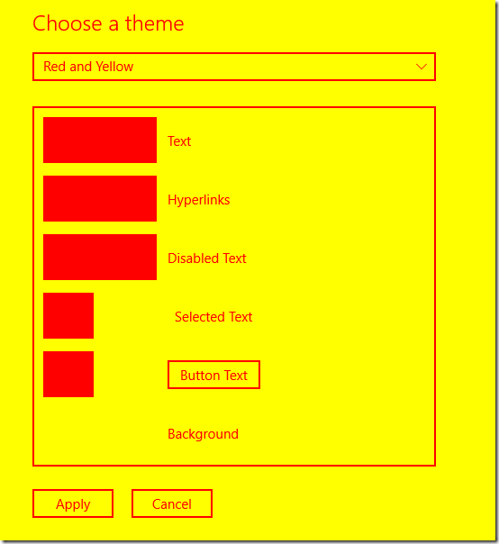
So I gave this a go. I set all text to be red, and all backgrounds to be yellow. I didn’t want to use a darker color for the text, as then I might have a hard time recognizing when text was being shown in black inappropriately. (Remembering that a classic high contrast bug is when the UI uses a hard-coded black or white color.)
I called this new custom theme “Red and Yellow”. I made sure to restart any feature I was going to examine after changing the theme, in case the feature only picked up the custom colors when the feature was started.
Figure 2: Creating a new custom theme called “Red and Yellow” in the Settings app.
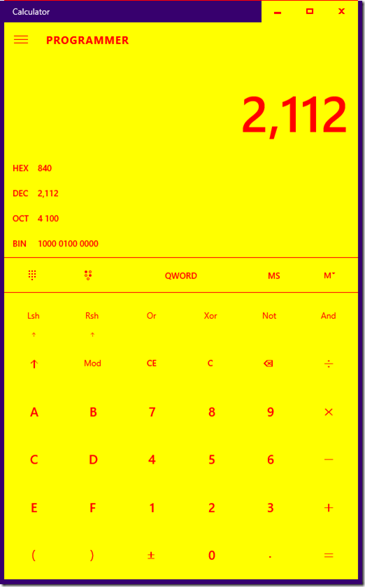
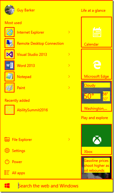
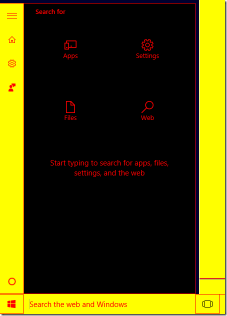
Overall, things looked pretty good in most of the UI that I then examined. The screenshots below show some UI respecting my custom colors for text and the background behind text.
Figure 3: Calculator app respecting custom theme colors.
Figure 4: Start Menu respecting custom theme colors.
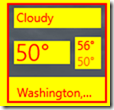
Having said that, in the screenshot above, I’d imagine that on the tiles where the backgrounds are solid yellow and the app icons are white, it’d be preferable if the app icons were shown in red. Also, there are some cases where text bumps up next to the edge of the solid background color behind it. It’d seem preferable if there was some background color padding around the text. For example, the mock screenshot below shows the Weather tile with some padding around the text, to provide an increased and consistent contrast between its text and the background around the text. (In some cases, I expect the tile dev would feel it's most helpful to the customer to only show theme colors in the tile when a high contrast theme is active.)
Figure 5: Start Menu tile with more background color shown around its text.
So a bunch of apps did a great job at respecting my custom colors. However, there also seemed to be some UI which didn’t respect my choice of colors. I hit a few types of problems, including the following:
1. Some text which by default appeared white on a gradient black background, appeared with my custom theme as red text on a transparent background. Given that a photo was shown beneath the text, the text became invisible depending on the contents of the photo. Instead of using a transparent background, I’d imagine it’d be best if the background was shown in a solid background color. (One of SystemColorWindowColor, SystemColorButtonFaceColor or SystemColorHighlightColor depending on which color was being used for the text.)
2. A few apps contained buttons where the buttons vanished completely when I hovered the mouse over them.
3. The UI shown in the screenshot below had a black background, and so the text shown was red on black, with relatively low contrast. So it seems that the black background was hard-coded for that UI, rather than using the SystemColorWindowColor color, (or another background color depending on what color was being used for the text).
Figure 6: A background shown in black, instead of a background color from my custom theme.
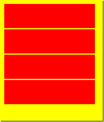
4. And I also hit one app where some big blocks containing text changed to be filled with one solid color, as shown in the screenshot below.
Figure 7: App showing four UI elements where text and the text background are presented in the same color.
I was particularly curious about this last point, where the app was showing the text and background in the same color. So I went back to my custom theme, and tweaked it such that different types of text and background were shown in different colors. By doing that, I could learn that the problematic text was being shown in the Selected Text color, and its background in the Hyperlinks text color. So both text and background were being shown in colors meant for text. Assuming the text should be shown in the Selected Text color, then the customer will want the background to be shown in the Selected Text Background color. And that means this bug can be fixed by changing the background color from SystemColorHotlightColor (meant for link text) to SystemColorHighlightColor (meant for selected text background).
Conclusion
It only takes a few seconds to create a test theme where all text is one color, and all backgrounds are another color. If you then whizz through all your app’s UI, you can quickly get a feel for where a text color or a background color might be being used inappropriately.
This can help avoid a number of bugs which are commonly hit close to shipping, relating to the use of the “High Contrast White” theme. During development, devs often stick to testing with only one high contrast theme, such as “High Contrast Black” or “High Contrast #1”. But while their UI might seem ok in the theme they’re using, testing with only one theme might hide bugs where some text or background has been hard-coded with a color similar to one in the theme they’re using. So the dev thinks all is well, until someone else tries running their app with the “High Contrast White” theme, and a bunch of bugs are logged with little time to fix them before shipping.
A quick test with a custom theme as described in this post could help to get a head start on some of the high contrast bugs that are heading towards your customer. And then a more careful examination using both a light-on-dark theme and dark-on-light theme, (such as “High Contrast Black” and “High Contrast White” respectively,) will give you confidence that your customer will get the colors they want and need for text, button text, selected text, disabled text and hyperlink text.
Guy
Comments
- Anonymous
March 28, 2016
The comment has been removed- Anonymous
March 29, 2016
Hi Goli, There's nothing in UIA which provides access to image data. As you point out, you can get certain properties of the elements relating to images through UIA, but not the image data itself. But having said that, depending on the situation, the fact that UIA can help determine the location and size of an image, might sometimes help to create a useful solution.So if...1. The UI is accurately describing itself through UIA. For example, elements showing images represent themselves as having an Image control type. And their BoundingRectangle properties are correct.2. The image is not obscured by other UI, and your process has access to the screen data where the image is being shown....you could use UIA to find where images are on the screen, and then access the image data through other APIs. I tested out the code below and it seemed to work ok. In this example, I look for an image beneath the mouse cursor. But I could have used FindFirstBuildCache() or FindAllBuildCache() to find Image elements beneath some window. So while this isn’t really what you were after, maybe in some cases it could be useful.Thanks,Guy// Use the CUIAutomation8 to make the code more robust against unresponsive providers.IUIAutomation automation = new CUIAutomation8();// Grab a few things defined in UIAutomationClient.h because the managed wrapper// doesn't expose those as I'd like.int propertyIdBoundingRectangle = 30001;int propertyIdControlType = 30003;int controlTypeImage = 50006;// Cache the control type and bounding rect so that we can get them with the // same call that gets us the element of interest.IUIAutomationCacheRequest cacheRequest = automation.CreateCacheRequest();cacheRequest.AddProperty(propertyIdBoundingRectangle);cacheRequest.AddProperty(propertyIdControlType);// Get the element beneath the mouse cursor.tagPOINT pt;Point ptCursor = Cursor.Position;pt.x = ptCursor.X;pt.y = ptCursor.Y;IUIAutomationElement element = automation.ElementFromPointBuildCache(pt, cacheRequest);// We're only interested in images here.if (element.CachedControlType == controlTypeImage){ // Copy the screen at the bounds reported by the image. tagRECT rect = element.CachedBoundingRectangle; int width = rect.right - rect.left; int height = rect.bottom - rect.top; Bitmap bitmap = new Bitmap(width, height); Graphics graphics = Graphics.FromImage(bitmap); graphics.CopyFromScreen( rect.left, rect.top, 0, 0, bitmap.Size); bitmap.Save("\MyTestImage.jpeg");} - Anonymous
March 29, 2016
The comment has been removed
- Anonymous
