Thematic Mapping and Heat Maps with Virtual Earth
I’ve had a couple inquiries about heat maps of late, so wanted to ensure people are aware of the capabilities enabled and resources available for creating heat maps with Virtual Earth.
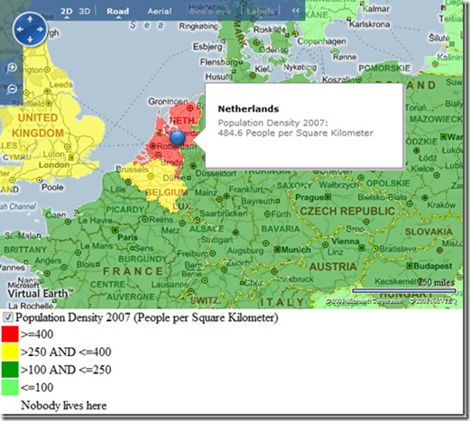
First off, my esteemed colleague Johannes Kebeck has just finished authoring a two part series on overlaying data atop of Virtual Earth. The first is “Creating Thematic Maps with Virtual Earth and SQL Server 2008” which illustrates the ability to shade different geo-entities by pulling information out of SQL Server 2008 and rendering it over Virtual Earth maps. Once the data is rendered, it is then clickable and searchable by the exposed lat/lons in Virtual Earth via the PixelToLatLong method. You can click (or, better yet, right click) anywhere on the map, convert the pixel to a latitude / longitude, then send it to Microsoft SQL Server 2008 (or some other database) for spatial analysis and return the data to the map for display.
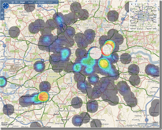
Johannes’ second article, “Creating Heat Maps with Virtual Earth and SQL Server 2008” illustrates how to take information from SQL Server 2008 (he’s quite the expert) and create a rasterized heat map which can then be geo-annotated (using Map Cruncher or based on the Virtual Earth Tile System documentation) and overlain atop a Virtual Earth-based application. Although there is another layer (and, there can be many layers!) this map is still interactive in that you can overlay vector information or grab lat/lons for spatial analysis.
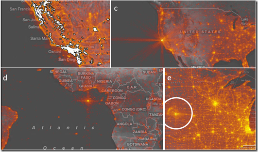
Lastly, a while back Danyel Fisher from Microsoft Research published “Hotmap: Looking at Geographic Attention” which discussed the create of a heat map tool for tracking web site traffic. In fact, there’s a demonstration of this application online dubbed, “Hotmap: The Use of Virtual Earth” which “shows where people have looked at when using Virtual Earth , the engine that powers Live Search Maps : the darker a point, the more times it has been downloaded. ”
In many of my speeches I’ve referred to the power of mapping as an analysis tool. The map can illustrate so much more relevant location data than any spreadsheet, database table or graph will show you. Imagine taking all of your web server logs for the last 10 years, crunching through them to identify where your users are coming from, then overlaying that information in a heat map (incorporate a time slider for fun). It’s just so much easier to visualize where your target audience is, where your business focus should be and where your sales prospects are.
CP
Comments
- Anonymous
June 02, 2009
Hello Chris, I've been following your Virtual Earth blog for some time and figured I would share a recent blog entry of mine that leveraged some of the techniques described in this (and Johannes Kebeck's) posting. In this instance, we took data from stimuluswatch.org and created a series of heatmaps of stimulus funding requests, user votes etc. See the link below. Enjoy... http://www.strategi-consulting.com/OurIdeas/Blog/tabid/108/EntryId/4/Visualizing-Recovery-Funding-Requests-and-Spending.aspx Cheers, Ari


