Changing the Look of your PerformancePoint Dashboards with SharePoint Themes
Hello, I’m Kevin Beto, the Test Manager for the Office BI team and co-author of Microsoft PerformancePoint Services for SharePoint 2010 UNLEASHED, and I’d like to tell you about some of the changes we made to support the SharePoint “Change the Look” functionality that we’re delivering to you in the SharePoint 2013 release.
How to change your theme
Changing the theme is pretty simple as long as you have “Owner” level permissions on the site. First thing you need to do is go to the Site Settings page found under the little gear icon in the upper right corner of your SharePoint site:
Select “Change the look” under the “Look and Feel” section:
From there you are presented with a gallery of some default themes. Sea Monster is my personal favorite, but you can pick your own favorite theme. You can even publish your own templates for more options! Click on a theme you want to go with:
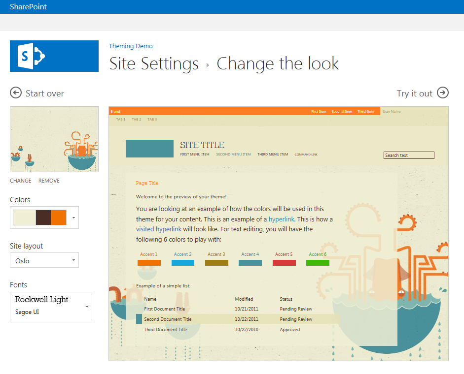
At this point you see a very light preview of what this theme entails, and you have the option to tweak it a little if you are feeling especially creative today. Go ahead and click the “Try it out” button in the upper right.
From there, you get an opportunity to preview what that new theme would look like. Go ahead and accept it by clicking the “Yes keep it” button in the upper right to make the change permanent throughout the site.
Scorecards
Being a relatively new parent, I want to make sure my kids have names that are unique, but not so unique that they are the only person in the world with that name. And since I am a consummate nerd, I made a scorecard that evaluated the uniqueness of names across the United States. Here is that scorecard with the “City” theme:

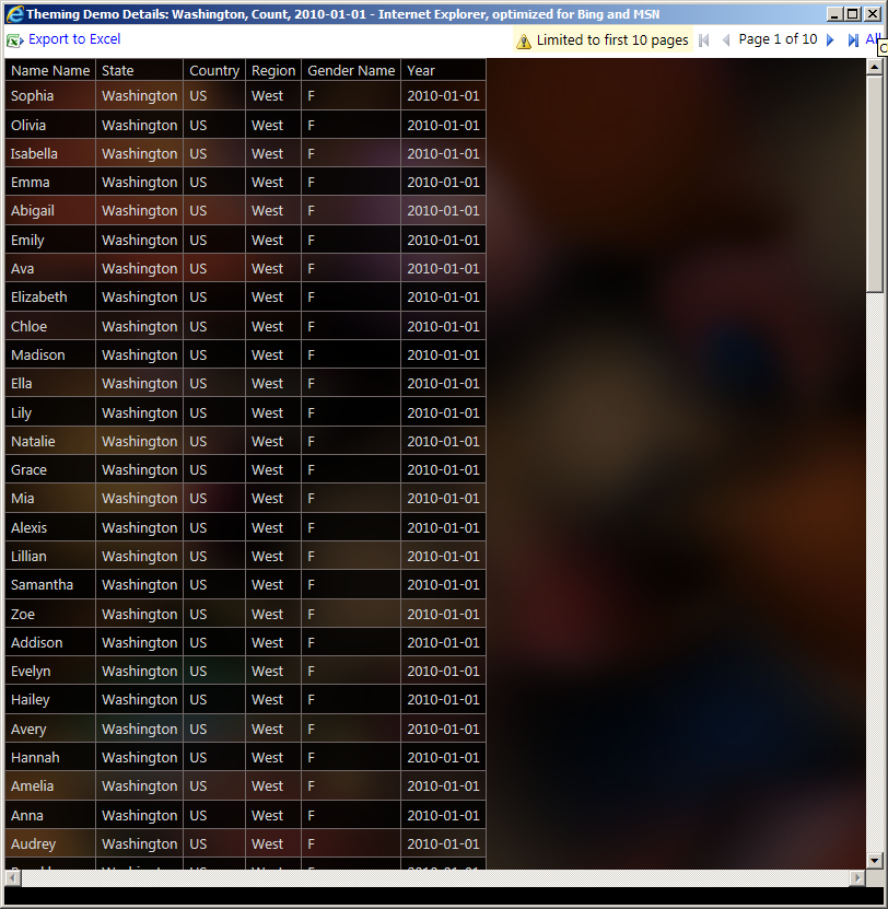
If hot pink highlights don’t scream uniqueness, I don’t know what does! As you can see, the great state of Washington is pretty middle-of-the-road for name uniqueness in the Western region of the US in 2010. We’ve got about 2200 unique names given out in 2010, way behind California’s 6700, but well ahead of Wyoming’s 300. I can get more details on this, and see the theme continue on my “Show Details” page.

And here’s a list generated by PerformancePoint that I can export to Excel and work further in if I wanted to.
Analytic Grids
If I wanted to see specific stats on the names chosen for my boys, an Analytic Grid is a much better option. This is what Analytic Grids could look like with the Sea Monster Theme:

Love the new background, gives it a much better look than the stark white of 2010. The data is telling me that maybe we went a little overboard with Vincenzo’s name as only 6 others were born with his name in Washington in 2010. Oh well, he can always move to California after he grows up if he wants to start a club.
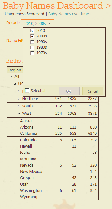
We have also extended the themes to filters, like so:
Caveats
Of course, as a Test Manager, my team and I spend a lot of time finding problems with the product and there are a few notable places where we don’t handle this feature well that I’d like to call out.
Analytic Charts – Theming changes don’t apply to Analytic Charts. We made this decision for technical reasons. Since we currently render this as an image, there would have to be an extra round trip to the server which would have had performance implications. We tried to make good decisions on the defaults so it looks at least pretty good in most themes, but there are a few out there that don’t look great. If this is a big problem for you, definitely let us know, and in the meantime I’d recommend trying to implement your dashboard using Excel Services reports as we’ve added some new ad hoc exploration features that offer a comparable experience in SharePoint 2013. Or if you want a more customized experience, Reporting Services reports also fit the bill.
Decomposition trees also don’t inherit theming changes. This whole feature is implemented in Silverlight, so the theming styles don’t necessarily map directly to concepts in this feature, and it pops up in a separate window when you are looking at it. You’ll always get the white background on this feature and that classic experience that you know and love so much.
Conclusion
Thanks for reading this far, and let’s keep the conversation going in the comments section. I’d love to hear about your experiences, both good and bad, with both this feature and your general experiences with BI offerings from Microsoft.
Kevin Beto
Test Manager, Office BI
Comments
Anonymous
August 30, 2012
Hi Kevin, Is there a demo machine VHD file available for BI? I've seen the Information Worker VHD for SharePoint 2010 in general, but it would be nice to have something with PowerView and the new SQL2012 BI features. BI has a lot of promise. But we need more education to realize that potential. Robust live demos would allow SharePoint-ers like myself to better convey that message to business end users.Anonymous
April 02, 2014
The comment has been removedAnonymous
June 16, 2014
Hi Michael, As I know in SharePoint 2013, you can hide the left pane in any page by switching "Extending" on the top-left.Anonymous
December 05, 2014
Hi Kevin, Thanks for this post and here's some delayed feedback ;-) First of all, trying to use the MS BI Stacks is to say the least a very frustrating experience. None of the products (SP2013 BI including Performance Point, PowerViews, Excel Services, SSRS) integrate the same blend of features... in fact little integration int he presentation layer... For example: Chart Type and Colors are cool in Power View but very limited in PerformancePoint and SSRS... Can't change the Bar Chart Color or Bar position in Performance Point and Charts are ugly in SSRS... Above I said PowerView dashboard are cool... but like the decomp tree, it's running on Sliverlight. Not a + since MS is planning to decommission it in the near future. So how's Microsoft going to fix it and offer a blended stack of BI Tools with a common set of look and feel customization features? When you look at how Tableau, Splunk or MicroStrategy are dealing with that, it make me wonder why I'm still fighting with MS tools... Regards, Simon BAnonymous
February 15, 2015
Well said Simon


