Getting started with Hub control in Windows Store Applications
Let’s talk about the very basics of Hub control for Windows Store applications. We’ll step by step build a simple app design using Hub control (the source code is attached). Start with a new Blank Application (I’m going to use XAML & C# for the purpose of this post).
A hub control helps you crate multiple sections all under one Hub. Let’s make a blank Hub control on the main page that encompasses entire screen,
 <Hub>
</Hub>
The first thing you should ideally worry about defining a Header of the Hub and you can place arbitrarily anything from a text block to an image to an entire grid in the header. I’m placing an application logo with a Text Block inside the grid,
  <Hub.Header>
 <Grid Margin="0,20,0,0">
 <Grid.ColumnDefinitions>
 <ColumnDefinition Width="80"/>
 <ColumnDefinition Width="*"/>
 </Grid.ColumnDefinitions>
 <Image Source="/images/logo.png" Margin="-30,-14,0,0" />
 <TextBlock x:Name="pageTitle" Text="My Hub Sample" Style="{StaticResource HeaderTextBlockStyle}" Grid.Column="1"
 IsHitTestVisible="false" TextWrapping="NoWrap" VerticalAlignment="Top"/>
 </Grid>
 </Hub.Header>
Now let’s create a couple of sections. A section has a Header (you can always define a custom template for the header) and is defined using HubSection,
  <HubSection Header="Overview" >
 </HubSection>
 <HubSection Header="Videos" >
 </HubSection>
 <HubSection Header="Audios" >
 </HubSection>
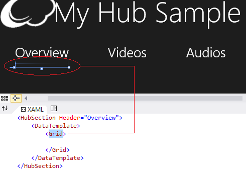
As sections will increase, the horizontal scroll will appear automatically so you don’t need to worry about that. Each section can have its respective content area by enclosing that inside a DataTemplate as follows,
  <HubSection Header="Overview">
  <DataTemplate>
  <Grid>
  <!--Bind data here using GridView, List or what ever serves the need-->
  </Grid>
  </DataTemplate>
 </HubSection>
To make the app view look elegant, let’s add a new section without a header, make its size 1000 pixels wide and specify a background image for that section that will make this primary section and give a cool look to end users,
  <HubSection Width="1000">
 <HubSection.Background>
 <ImageBrush ImageSource="/images/map.png"></ImageBrush>
 </HubSection.Background>
 </HubSection>
Finally let’s speak about making the sections header navigate-able. Set the IsHeaderInteractive property to True in the section declaration and you’ll notice that it will add a marker > in section header and header will change colors upon mouse over and during click or tap during execution.
  <HubSection Header="Videos" IsHeaderInteractive="True" >
 </HubSection>
However clicking the header won’t yield a result so far since we haven’t defined a selection header click event. To do so add the event in Hub tag deceleration,
<Hub SectionHeaderClick="Hub_SectionHeaderClick" >
And give each header section a name to make a decision between which header was clicked,
  <HubSection Header="Videos" IsHeaderInteractive="True" Name="Videos" >
 </HubSection>
 <HubSection Header="Audios" IsHeaderInteractive="True" Name="Audios" >
 </HubSection>
Here’s how the code to handler event looks like,
  private void Hub_SectionHeaderClick(object sender, HubSectionHeaderClickEventArgs e)
 {
 switch (e.Section.Name)
 {
 case "Videos":
 //Navigate or take action here
 break;
 case "Audios":
 //Navigate or take action here
 break;
 default:
 break;
 }
 }
Here's how the final app looks like,
Comments
Anonymous
December 28, 2013
thanksAnonymous
January 19, 2014
That's a nice and outstanding Concepts ...ThanksAnonymous
January 20, 2014
thnxAnonymous
January 20, 2014
This Post really Help me and Clear my conceptsAnonymous
January 25, 2014
Thanxs.... :-)Anonymous
July 14, 2015
I want to make title in hub section


