An overview of UI Controls from Win RT XAML Toolkit
Are you looking for third party UI controls for Windows 8 app development? Win RT XAML Toolkit has recently released an updated version which nonetheless makes a great addition in RT apps experience. This blog post intends to briefly discuss some important and simple controls offered in this toolkit to help you build richer Windows 8 apps (we’ll deep dive into various extensions and tools offered in this toolkit later in another post)

(If you are a newbie, download the build from https://winrtxamltoolkit.codeplex.com/ , extract and open WinRTXamlToolkit solution file in VS 2012 and hit F5 after selecting “WinRTXamlToolkit.Sample” as startup project to explore offered controls)
Image Button and Toggle Image Button
Handling visual states of images (hover, pressed) in conventional Button of Windows 8 requires a bit of interaction with either Expression Blend or good understanding of XAML but Image Button (and respective Toggle Image Button) control makes it easier to specify various visual states,

<controls:ImageButton
NormalStateImageSource ="/Assets/Images/Normal.png"
HoverStateImageSource ="/Assets/Images/Hover.png"
PressedStateImageSource ="/Assets/Images/Pressed.png" />
Watermark TextBox
Watermark TextBox supports two important properties WatermarkStyle and WatermarkText both of them are shown in action below,
<Page.Resources>
<Style TargetType="TextBlock" x:Name="WatermarkStyle">
<Setter Property="FontSize" Value="20"></Setter>
<Setter Property="Foreground" Value="Green"></Setter>
<Setter Property="Margin" Value="10,5,10,10"></Setter>
</Style>
<Page.Resources>
<xc:WatermarkTextBox Name="WatermarkTextBox" WatermarkText="Username" WatermarkStyle="{StaticResource WatermarkStyle}" Width="300" Height="40" />
That’s how it will look like,

Numeric Up Down
A simple control
<controls:NumericUpDown />
and an extended one
<controls:NumericUpDown
lGrid.Column="2"
Width="200"
Minimum="-100"
Maximum="100"
SmallChange="0.1"
LargeChange="10"
Margin="0" />
will result in a display much similar,

Hold on the + or – button and it will smoothly transition between values which is good that you don’t have to press the buttons again and again.
Color Picker Primitives
The snapshot below renders two controls namely Color Ring and Color Triangle to provide a detailed color selector. You can additionally apply Hue, Saturation and Lightness (HSL) or RGB properties.
<controls:HueRingPicker
x:Name="hueRing"
VerticalAlignment="Stretch" HorizontalAlignment="Stretch"
ValueChanged="hueRing_ValueChanged_1"/>
On Value Changes event the values is determined between range of 0 – 360 (clockwise)
private void hueRing_ValueChanged_1(object sender, Windows.UI.Xaml.Controls.Primitives.RangeBaseValueChangedEventArgs e)
{
TextBoxSelectedValueRing.Text = hueRing.Value.ToString();
}

Countdown Control
A simple and beautiful look and look closely that the call to animation is Async (non-UI blocking call),
await myCountdownControl.StartCountdownAsync(3);
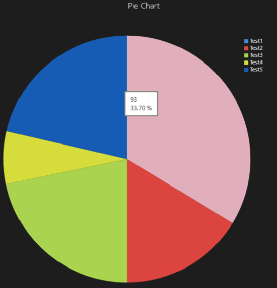
Chart
Chart controls works on series and supports various different chart types,


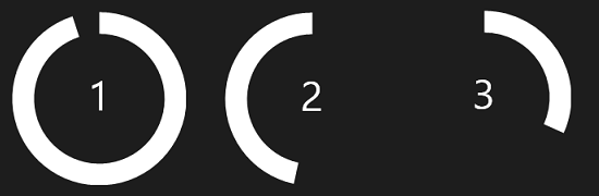
RingSlice & PieSlice

<controls:RingSlice
Fill="White"
Grid.Column="1"
Grid.Row="2"
InnerRadius="10"
Radius="20"
StartAngle="23"
EndAngle="227" />
<controls:PieSlice
Fill="White"
Grid.Column="2"
Grid.Row="2"
Radius="20"
StartAngle="23"
EndAngle="227" />
Custom Grid Splitter
A much needed control,

Do let us know if this post was helpful? Given your comments, we might follow up with a detailed post on this topic.
Comments
Anonymous
February 18, 2013
Thanks for the overview. Do note that the color picker is non-functional so far though the primitives might be useful in building your own. Also the NumericUpDown supports gestures on the value, so you can swipe to reduce/increase value.Anonymous
February 19, 2013
The comment has been removedAnonymous
February 19, 2013
Good work Usman! You have brought the lights to Microsoft Pakistan's blog otherwise it was as dead as a graveyard.Anonymous
December 07, 2014
Hi! Can you please provide tutorial on how to implement WinRT Charts for windows phone 8.0/8.1?