A master/detail view with navigation
I don’t remember what got me thinking about it, but somewhere along the line I wanted a master/detail view with a navigation bar. E.g., when you change selection in the master view, you can navigate back to the previous selection.
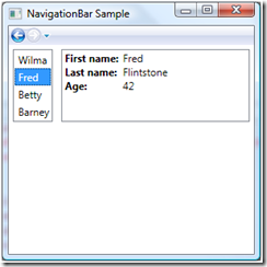
Here’s an example (here my selection started on “Wilma”, then I changed it to “Fred”, which is why the Back button of the navigation bar is enabled):
It looks like a Frame, and it is, but I just used the Frame for its navigation UI and its journaling functionality; I didn’t put anything (visible anyway) into the Content of the Frame.
Here’s the basic markup for the above Window sample:
<StackPanel>
<navbar:NavigationBar
JournaledValue="{Binding SelectedItem, ElementName=_listBox, Mode=TwoWay}"
NavigationUIVisibility="Visible"/>
<Grid>
<Grid.ColumnDefinitions>
<ColumnDefinition Width="Auto" />
<ColumnDefinition Width="*" />
</Grid.ColumnDefinitions>
<!-- Master view -->
<ListBox ItemsSource="{Binding}" Name='_listBox' Margin="5">
<ListBox.ItemTemplate>
<DataTemplate>
<TextBlock Text="{Binding FirstName}" Margin="2"/>
</DataTemplate>
</ListBox.ItemTemplate>
</ListBox>
<!-- Details view (more on this later) -->
...
</Grid>
</StackPanel>
What does this do? The NavigationBar control has the navigation UI (forward/backward button). It also journals whatever you put in the JournaledValue property. That means:
- If you change NavigationBar.JournaledValue, the old value will be added to the navigation service’s “BackStack”, and the Back button will become enabled.
- If you then click on the Back button, NavigationBar.JournaledValue will be restored to its previous value.
So the way the properties are bound in this example, if the ListBox.SelectedItem changes, the old value gets journaled by the NavigationBar. If you then click the Back button, the ListBox.SelectedItem gets restored to that previous value. And of course, in the full example, the details view is similarly bound to the ListBox.SelectedItem, so it updates as well.
The NavigationBar control just has a couple of properties and a default ControlTemplate. The properties are JournaledValue (which drives, and is driven by, the navigation bar UI), and NavigationUIVisibility (Automatic, Visible, or Hidden). Here’s the control code:
public class NavigationBar : Control
{
static NavigationBar()
{
DefaultStyleKeyProperty.OverrideMetadata(
typeof(NavigationBar),
new FrameworkPropertyMetadata(typeof(NavigationBar)));
}
// The JournaledValue property is the value that controls the navigation bar UI.
public object JournaledValue
{
get { return (object)GetValue(JournaledValueProperty); }
set { SetValue(JournaledValueProperty, value); }
}
public static readonly DependencyProperty JournaledValueProperty =
DependencyProperty.Register("JournaledValue", typeof(object), typeof(NavigationBar));
// The NavigationUIVisibility property is aliased to the
// Frame.NavigationUIVisibility property.
public NavigationUIVisibility NavigationUIVisibility
{
get { return (NavigationUIVisibility)GetValue(NavigationUIVisibilityProperty); }
set { SetValue(NavigationUIVisibilityProperty, value); }
}
public static readonly DependencyProperty NavigationUIVisibilityProperty =
Frame.NavigationUIVisibilityProperty.AddOwner(typeof(NavigationBar));
}
The NavigationBar’s ControlTemplate simplify forwards everything to a Frame. Frame has the UI for the navigation controls, and journals its Content property. So for journaling, I just bound the NavigationBar.JournaledValue to Frame.Content, and Frame takes care of the rest. (Note that NavigationBar.NavigationUIVisibility is also bound to the corresponding property on Frame.) The only trick is, I didn’t want the JournaledValue to actually get displayed by the Frame, so I put an empty ContentTemplate on it. This leads to:
<ControlTemplate TargetType="{x:Type local:NavigationBar}">
<Frame NavigationUIVisibility
='{TemplateBinding local:NavigationBar.NavigationUIVisibility}'
Content='{Binding JournaledValue,
RelativeSource={RelativeSource TemplatedParent},
Mode=TwoWay}'
Background="{TemplateBinding Background}"
BorderBrush="{TemplateBinding BorderBrush}"
BorderThickness="{TemplateBinding BorderThickness}" >
<!-- Don't show the frame content, we're just using Frame
for it's navigation UI and journaling -->
<Frame.ContentTemplate>
<DataTemplate />
</Frame.ContentTemplate>
</Frame>
</ControlTemplate>
That’s it for the NavigationBar control. Here’s the rest of the sample app too. For the details view, I used an ItemsControl to list the “fields” of the selected object, where each field is a HeaderedContentControl. To get the right look, I then templated HeaderedContentControl. Easier to show the markup. First, the sample data:
<Window.DataContext>
<x:Array Type="local:Person">
<local:Person FirstName="Wilma" LastName="Flintstone" Age="41" />
<local:Person FirstName="Fred" LastName="Flintstone" Age="42" />
<local:Person FirstName="Betty" LastName="Rubble" Age="36" />
<local:Person FirstName="Barney" LastName="Rubble" Age="35" />
</x:Array>
</Window.DataContext>
… and then the details view:
<!-- Details view -->
<ItemsControl
DataContext="{Binding SelectedItem, ElementName=_detailsView}"
Grid.IsSharedSizeScope="True"
Grid.Column="1"
Margin="5" >
<!-- For the selected item, show the first name, last name, and age -->
<HeaderedContentControl Header="First name:" Content="{Binding FirstName}" />
<HeaderedContentControl Header="Last name:" Content="{Binding LastName}" />
<HeaderedContentControl Header="Age:" Content="{Binding Age}" />
<!-- Create a HeaderedContentControl template to display each item
as "Label: Value", e.g. "Age: 42" -->
<ItemsControl.Resources>
<Style TargetType="HeaderedContentControl">
<Setter Property="Template">
<Setter.Value>
<ControlTemplate TargetType="HeaderedContentControl">
<Grid>
<Grid.ColumnDefinitions>
<ColumnDefinition SharedSizeGroup="FirstColumn"
Width="Auto" />
<ColumnDefinition SharedSizeGroup="SecondColumn" />
</Grid.ColumnDefinitions>
<TextBlock Text="{TemplateBinding Header}" Grid.Column="0"
Margin="0,0,5,0" FontWeight="Bold"/>
<TextBlock Text="{TemplateBinding Content}" Grid.Column="1"
Margin="0,0,5,0"/>
</Grid>
</ControlTemplate>
</Setter.Value>
</Setter>
</Style>
</ItemsControl.Resources>
</ItemsControl>
Comments
Anonymous
January 09, 2009
PingBack from http://www.codedstyle.com/a-masterdetail-view-with-navigation/Anonymous
March 16, 2009
<!-- Don't show the frame content, we're just using Frame for it's navigation UI and journaling --> ...this is a code smell. Are there plans to allow s client API users to not have to write such unclear code? To me, this is a great example of how WPF missed the ball on the navigation model. It should have used an Object-Oriented Hypermedia model of navigation, allowing for extensibility and adjustable notion of navigation. Instead, it hardcodes in the horrible but standard Browser model.Anonymous
March 19, 2009
Frame wraps up a bunch of things into a single control: journaling, interaction with the NavigationService, UI chrome (the forward/backward buttons), and visual display (adding the Content property to the visual tree). And yes, we do discuss this packaging. In this case, I wanted 3 out of the 4 (journaling, NavigationService, and UI chrome), so while the empty template isn't that pretty, it was an easy solution, and I like how it's hidden as a detail inside the NavigationBar control; the page author that uses the control doesn't need to know that there's a Frame inside.
